- Flex - Home
- Flex - Overview
- Flex - Environment
- Flex - Applications
- Flex - Create Application
- Flex - Deploy Application
- Flex - Life Cycle Phases
- Flex - Style with CSS
- Flex - Style with Skin
- Flex - Data Binding
- Flex - Basic Controls
- Flex - Form Controls
- Flex - Complex Controls
- Flex - Layout Panels
- Flex - Visual Effects
- Flex - Event Handling
- Flex - Custom Controls
- Flex - RPC Services
- Flex - FlexUnit Integration
- Flex - Debug Application
- Flex - Internationalization
- Flex - Printing Support
Flex - ToggleButton Control
Introduction
The ToggleButton component defines a toggle button. Clicking the button toggles the button between the up and an down states. When you click the button while it is in the up state, it toggles to the down state and so on.
Class Declaration
Following is the declaration for spark.components.ToggleButton class −
public class ToggleButton
   extends ToggleButtonBase
Public Methods
| Sr.No | Method & Description |
|---|---|
| 1 | ToggleButton() Constructor. |
Methods Inherited
This class inherits methods from the following classes −
- spark.components.supportClasses.ToggleButtonBase
- spark.components.supportClasses.ButtonBase
- spark.component.supportClasses.SkinnableComponent
- mx.core.UIComponent
- mx.core.FlexSprite
- flash.display.Sprite
- flash.display.DisplayObjectContainer
- flash.display.InteractiveObject
- flash.display.DisplayObject
- flash.events.EventDispatcher
- Object
Flex ToggleButton Control Example
Let us follow the following steps to check usage of ToggleButton control in a Flex application by creating a test application −
| Step | Description |
|---|---|
| 1 | Create a project with a name HelloWorld under a packagecom.tutorialspoint.client as explained in the Flex - Create Application chapter. |
| 2 | Modify HelloWorld.mxml as explained below. Keep rest of the files unchanged. |
| 3 | Compile and run the application to make sure business logic is working as per the requirements. |
Following is the content of the modified mxml file src/com.tutorialspoint/HelloWorld.mxml.
<?xml version = "1.0" encoding = "utf-8"?>
<s:Application xmlns:fx = "http://ns.adobe.com/mxml/2009"
   xmlns:s = "library://ns.adobe.com/flex/spark"
   xmlns:mx = "library://ns.adobe.com/flex/mx"
   width = "100%" height = "100%" minWidth = "500" minHeight = "500">

   <fx:Style source = "/com/tutorialspoint/client/Style.css" />
   <fx:Script>
      <![CDATA[
         import mx.controls.Alert;
         import mx.events.FlexEvent;

         protected function button_clickHandler(event:MouseEvent):void {
            Alert.show("Hello World!");
         }
      ]]>
   </fx:Script>

   <s:BorderContainer width = "550" height = "400" id = "mainContainer"
      styleName = "container">
      <s:VGroup width = "100%" height = "100%" gap = "50"
         horizontalAlign = "center" verticalAlign = "middle">
         <s:Label id = "lblHeader" text = "Form Controls Demonstration"
            fontSize = "40" color = "0x777777" styleName = "heading" />

         <s:Panel id = "toggleButtonPanel" title = "Using ToggleButton"
            width = "420" height = "200">
            <s:layout>
               <s:HorizontalLayout  gap = "10" verticalAlign = "middle"
                  horizontalAlign = "center" />
            </s:layout>

            <s:ToggleButton id = "clickMeToggleButton" label = "Click Me"
               click = "button_clickHandler(event)" />
            <s:ToggleButton id = "disabledToggleButton" label = "Disabled Button"
               enabled = "false" />
         </s:Panel>
      </s:VGroup>
   </s:BorderContainer>
</s:Application>
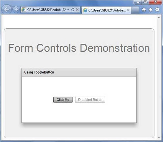
Once you are ready with all the changes done, let us compile and run the application in normal mode as we did in Flex - Create Application chapter. If everything is fine with your application, it will produce the following result: [ Try it online ]