- Flex - Home
- Flex - Overview
- Flex - Environment
- Flex - Applications
- Flex - Create Application
- Flex - Deploy Application
- Flex - Life Cycle Phases
- Flex - Style with CSS
- Flex - Style with Skin
- Flex - Data Binding
- Flex - Basic Controls
- Flex - Form Controls
- Flex - Complex Controls
- Flex - Layout Panels
- Flex - Visual Effects
- Flex - Event Handling
- Flex - Custom Controls
- Flex - RPC Services
- Flex - FlexUnit Integration
- Flex - Debug Application
- Flex - Internationalization
- Flex - Printing Support
Flex - SkinnableContainer
Introduction
The SkinnableContainer class is the base class for all the skinnable containers that have visual content.
Class Declaration
Following is the declaration for spark.components.SkinnableContainer class −
public class SkinnableContainer
   extends SkinnableContainerBase
      implements IDeferredContentOwner, IVisualElementContainer
Public Properties
| Sr.No | Property & Description |
|---|---|
| 1 | autoLayout : Boolean If true, measurement and layout are done when the position or size of a child is changed. |
| 2 | creationPolicy : String Content creation policy for this component. |
| 3 | deferredContentCreated : Boolean [read-only] Contains true if deferred content has been created. |
| 4 | layout : LayoutBase The layout object for this container. |
| 5 | mxmlContent : Array [write-only] The visual content children for this Group. |
| 6 | mxmlContentFactory : IDeferredInstance [write-only] A factory object that creates the initial value for the content property. |
| 7 | numElements : int [read-only] The number of visual elements in this container. |
Public Methods
| Sr.No | Method & Description |
|---|---|
| 1 | SkinnableContainer() Constructor. |
| 2 | addElement(element:IVisualElement):IVisualElement Adds a visual element to this container. |
| 3 | addElementAt(element:IVisualElement, index:int):IVisualElement Adds a visual element to this container. |
| 4 | createDeferredContent():void Create the content for this component. |
| 5 | getElementAt(index:int):IVisualElement Returns the visual element at the specified index. |
| 6 | getElementIndex(element:IVisualElement):int Returns the index position of a visual element. |
| 7 | removeAllElements():void Removes all visual elements from the container. |
| 8 | removeElement(element:IVisualElement):IVisualElement Removes the specified visual element from the child list of this container. |
| 9 | removeElementAt(index:int):IVisualElement Removes a visual element from the specified index position in the container. |
| 10 | setElementIndex(element:IVisualElement, index:int):void Changes the position of an existing visual element in the visual container. |
| 11 | swapElements(element1:IVisualElement, element2:IVisualElement):void Swaps the index of the two specified visual elements. |
| 12 | swapElementsAt(index1:int, index2:int):void Swaps the visual elements at the two specified index positions in the container. |
Protected Methods
| Sr.No | Method & Description |
|---|---|
| 1 | createChildren():void [override] Create content children, if the creationPolicy property is not equal to none. |
| 2 | partAdded(partName:String, instance:Object):void [override] Called when a skin part is added. |
| 3 | partRemoved(partName:String, instance:Object):void [override] Called when an instance of a skin part is being removed. |
Events
| Sr.No | Event & Description |
|---|---|
| 1 | contentCreationComplete Dispatched after the content for this component has been created. |
| 2 | elementAdd Dispatched when a visual element is added to the content holder. |
| 3 | elementRemove Dispatched when a visual element is removed from the content holder. |
Methods Inherited
This class inherits methods from the following classes −
- spark.components.supportClasses.SkinnableContainerBase
- mx.core.UIComponent
- mx.core.FlexSprite
- flash.display.Sprite
- flash.display.DisplayObjectContainer
- flash.display.InteractiveObject
- flash.display.DisplayObject
- flash.events.EventDispatcher
- Object
Flex SkinnableContainer Example
Let us follow the following steps to check usage of SkinnableContainer in a Flex application by creating a test application −
| Step | Description |
|---|---|
| 1 | Create a project with a name HelloWorld under a packagecom.tutorialspoint.client as explained in the Flex - Create Application chapter. |
| 2 | Create a skin SkinnableContainerSkin for a host Component SkinnableContainerunder a package com.tutorialspoint.skin as explained in Flex - Style with skinchapter. Keep rest of the files unchanged. |
| 3 | Modify HelloWorld.mxml as explained below. Keep rest of the files unchanged. |
| 4 | Compile and run the application to make sure business logic is working as per the requirements. |
Following is the content of the modified mxml file src/com.tutorialspoint/skin/SkinnableContainerSkin.mxml.
<?xml version = "1.0" encoding = "utf-8"?>
<s:Skin xmlns:fx = "http://ns.adobe.com/mxml/2009"
   xmlns:s = "library://ns.adobe.com/flex/spark"
   xmlns:fb = "http://ns.adobe.com/flashbuilder/2009" alpha.disabled = "0.5">

   <fx:Metadata>
      <![CDATA[
         /**
         * @copy spark.skins.spark.ApplicationSkin#hostComponent
         */
         [HostComponent("spark.components.SkinnableContainer")]
      ]]>
   </fx:Metadata>

   <s:states>
      <s:State name = "normal" />
      <s:State name = "disabled" />
   </s:states>

   <s:Rect left = "0" right = "0" top = "0"
      bottom = "0" radiusX = "5" radiusY = "5">
      <s:stroke>
         <s:LinearGradientStroke weight = "2" />
      </s:stroke>
      <s:fill>
         <s:LinearGradient rotation = "90">
            <s:entries>
               <s:GradientEntry color = "0xdddddd" />
               <s:GradientEntry color = "0x020202" alpha = ".5" />
            </s:entries>
         </s:LinearGradient>
      </s:fill>
   </s:Rect>

   <s:Group id = "contentGroup" left = "0" right = "0"
      top = "0" bottom = "0" minWidth = "0" minHeight = "0">
      <s:layout>
         <s:BasicLayout/>
      </s:layout>
   </s:Group>
</s:Skin>
Following is the content of the modified mxml file src/com.tutorialspoint/HelloWorld.mxml.
<?xml version = "1.0" encoding = "utf-8"?>
<s:Application xmlns:fx = "http://ns.adobe.com/mxml/2009"
   xmlns:s = "library://ns.adobe.com/flex/spark"
   xmlns:mx = "library://ns.adobe.com/flex/mx
   width = "100%" height = "100%" minWidth = "500" minHeight = "500">

   <fx:Style source = "/com/tutorialspoint/client/Style.css" />
   <s:BorderContainer width = "630" height = "480" id = "mainContainer"
      styleName = "container">
      <s:VGroup width = "100%" height = "100%" gap = "50"
         horizontalAlign = "center" verticalAlign = "middle">
         <s:Label id = "lblHeader" text = "Layout Panels Demonstration"
            fontSize = "40" color = "0x777777" styleName = "heading" />

         <s:Panel id = "skinnableContainerPanel" title = "Using SkinnableContainer"
            width = "500" height = "300" >
            <s:layout>
               <s:VerticalLayout  gap = "10" verticalAlign = "middle"
                  horizontalAlign = "center" />
            </s:layout>

            <s:SkinnableContainer
               skinClass = "com.tutorialspoint.skin.SkinnableContainerSkin"
               width = "50%" height = "50%" horizontalCenter = "0"
               verticalCenter = "0">

               <s:HGroup horizontalCenter = "0" verticalCenter = "0">
                  <s:BorderContainer width = "50" height = "50"
                     borderWeight = "2" color = "0x323232" />
                  <s:BorderContainer width = "50" height = "50"
                     borderWeight = "2" color = "0x323232" />
                  <s:BorderContainer width = "50" height = "50"
                     borderWeight = "2" color = "0x323232" />
               </s:HGroup>
            </s:SkinnableContainer>
         </s:Panel>
      </s:VGroup>
   </s:BorderContainer>
</s:Application>
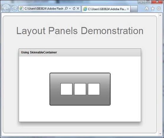
Once you are ready with all the changes done, let us compile and run the application in normal mode as we did in Flex - Create Application chapter. If everything is fine with your application, it will produce the following result: [ Try it online ]