- Flex - Home
- Flex - Overview
- Flex - Environment
- Flex - Applications
- Flex - Create Application
- Flex - Deploy Application
- Flex - Life Cycle Phases
- Flex - Style with CSS
- Flex - Style with Skin
- Flex - Data Binding
- Flex - Basic Controls
- Flex - Form Controls
- Flex - Complex Controls
- Flex - Layout Panels
- Flex - Visual Effects
- Flex - Event Handling
- Flex - Custom Controls
- Flex - RPC Services
- Flex - FlexUnit Integration
- Flex - Debug Application
- Flex - Internationalization
- Flex - Printing Support
Flex - RadioButton Control
Introduction
The RadioButton control allows the user make a single choice within a set of mutually exclusive choices.
Class Declaration
Following is the declaration for spark.components.RadioButton class −
public class RadioButton
   extends ToggleButtonBase
      implements IFocusManagerGroup
Public Properties
| Sr.No | Properties & Description |
|---|---|
| 1 | enabled : Boolean [override] The RadioButton component is enabled if the RadioButtonGroup is enabled and the RadioButton itself is enabled. |
| 2 | group : RadioButtonGroup The RadioButtonGroup component to which this RadioButton belongs. |
| 3 | groupName : String Specifies the name of the group to which this RadioButton component belongs, or specifies the value of the id property of a RadioButtonGroup component if this RadioButton is part of a group defined by a RadioButtonGroup component. |
| 4 | value : Object Optional user-defined value that is associated with a RadioButton component. |
Public Methods
| Sr.No | Method & Description |
|---|---|
| 1 | RadioButton() Constructor. |
Methods Inherited
This class inherits methods from the following classes −
- spark.components.supportClasses.ToggleButtonBase
- spark.components.supportClasses.ButtonBase
- spark.components.supportClasses.SkinnableComponent
- mx.core.UIComponent
- mx.core.FlexSprite
- flash.display.Sprite
- flash.display.DisplayObjectContainer
- flash.display.InteractiveObject
- flash.display.DisplayObject
- flash.events.EventDispatcher
- Object
Flex RadioButton Control Example
Let us follow the following steps to check usage of RadioButton control in a Flex application by creating a test application −
| Step | Description |
|---|---|
| 1 | Create a project with a name HelloWorld under a packagecom.tutorialspoint.client as explained in the Flex - Create Application chapter. |
| 2 | Modify HelloWorld.mxml as explained below. Keep rest of the files unchanged. |
| 3 | Compile and run the application to make sure business logic is working as per the requirements. |
Following is the content of the modified mxml file src/com.tutorialspoint/HelloWorld.mxml.
<?xml version = "1.0" encoding = "utf-8"?>
<s:Application xmlns:fx = "http://ns.adobe.com/mxml/2009"
   xmlns:s = "library://ns.adobe.com/flex/spark"
   xmlns:mx = "library://ns.adobe.com/flex/mx"
   width = "100%" height = "100%" minWidth = "500" minHeight = "500">

   <fx:Style source = "/com/tutorialspoint/client/Style.css" />
   <fx:Script>
      <![CDATA[
         [Bindable]
         private var selectedOption:String = "";
         protected function option_clickHandler(event:MouseEvent):void {
            var radioButton:RadioButton = event.target as RadioButton;
            switch (radioButton.id) {
               case option1.id:
                  selectedOption = option1.label;
                  break;
               case option2.id:
                  selectedOption = option2.label;
                  break;
               case option3.id:
                  selectedOption = option3.label;
                  break;
               case option4.id:
                  selectedOption = option4.label;
                  break;
            }
         }
      ]]>
   </fx:Script>

   <s:BorderContainer width = "550" height = "400" id = "mainContainer"
      styleName = "container">
      <s:VGroup width = "100%" height = "100%" gap = "50"
         horizontalAlign = "center" verticalAlign = "middle">
         <s:Label id = "lblHeader" text = "Form Controls Demonstration"
            fontSize = "40" color = "0x777777" styleName = "heading" />

         <s:Panel id = "radioButtonPanel" title = "Using RadioButton"
            width = "420" height = "200" >
            <s:layout>
               <s:VerticalLayout  gap = "10" verticalAlign = "middle"
                  horizontalAlign = "center" />
            </s:layout>

            <s:RadioButton groupName = "options" id = "option1"
               label = "item #1" width="150"
               click = "option_clickHandler(event)" />
            <s:RadioButton groupName = "options" id = "option2"
               label = "item #2" width="150"
               click = "option_clickHandler(event)" />
            <s:RadioButton groupName = "options" id = "option3"
               label = "item #3" width="150"
               click = "option_clickHandler(event)" />
            <s:RadioButton groupName = "options" id = "option4"
               label = "item #4" width = "150"
               click = "option_clickHandler(event)" />
            <s:Label id = "selectedOptionLabel" fontWeight = "bold"
               text = "Item selected: {selectedOption}" width = "150" />
         </s:Panel>
      </s:VGroup>
   </s:BorderContainer>
</s:Application>
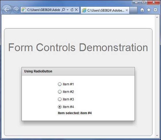
Once you are ready with all the changes done, let us compile and run the application in normal mode as we did in Flex - Create Application chapter. If everything is fine with your application, it will produce the following result: [ Try it online ]