- Flex - Home
- Flex - Overview
- Flex - Environment
- Flex - Applications
- Flex - Create Application
- Flex - Deploy Application
- Flex - Life Cycle Phases
- Flex - Style with CSS
- Flex - Style with Skin
- Flex - Data Binding
- Flex - Basic Controls
- Flex - Form Controls
- Flex - Complex Controls
- Flex - Layout Panels
- Flex - Visual Effects
- Flex - Event Handling
- Flex - Custom Controls
- Flex - RPC Services
- Flex - FlexUnit Integration
- Flex - Debug Application
- Flex - Internationalization
- Flex - Printing Support
Flex - NumericStepper Control
The NumericStepper control lets you select a number from an ordered set. The NumericStepper provides a TextInput control so that you can directly edit the value of the component.
The NumericStepper control also provides a pair of arrow buttons for stepping through the possible values. The Up Arrow and Down Arrow keys and the mouse wheel also cycle through the values.
Class Declaration
Following is the declaration for spark.components.NumericStepper class −
public class NumericStepper
   extends Spinner
      implements IFocusManagerComponent, IIMESupport
Public Properties
| Sr.No | Property & Description |
|---|---|
| 1 | enableIME : Boolean [read-only] A flag that indicates whether the IME should be enabled when the component receives focus. |
| 2 | imeMode : String Specifies the IME (Input Method Editor) mode. |
| 3 | maxChars : int The maximum number of characters that can be entered in the field. |
| 4 | maximum : Number [override] Number which represents the maximum value possible for value. |
| 5 | valueFormatFunction : Function Callback function that formats the value displayed in the skin's textDisplay property. |
| 6 | valueParseFunction : Function Callback function that extracts the numeric value from the displayed value in the skin's textDisplay field. |
Public Methods
| Sr.No | Method & Description |
|---|---|
| 1 | NumericStepper() Constructor. |
Methods Inherited
This class inherits methods from the following classes −
- spark.components.Spinner
- spark.components.supportClasses.Range
- spark.components.supportClasses.SkinnableComponent
- mx.core.UIComponent
- mx.core.FlexSprite
- flash.display.Sprite
- flash.display.DisplayObjectContainer
- flash.display.InteractiveObject
- flash.display.DisplayObject
- flash.events.EventDispatcher
- Object
Flex DropDownList Control Example
Let us follow the following steps to check usage of DropDownList control in a Flex application by creating a test application −
| Step | Description |
|---|---|
| 1 | Create a project with a name HelloWorld under a package com.tutorialspoint.client as explained in the Flex - Create Application chapter. |
| 2 | Modify HelloWorld.mxml as explained below. Keep rest of the files unchanged. |
| 3 | Compile and run the application to make sure business logic is working as per the requirements. |
Following is the content of the modified mxml file src/com.tutorialspoint/HelloWorld.mxml.
<?xml version = "1.0" encoding = "utf-8"?>
<s:Application xmlns:fx = "http://ns.adobe.com/mxml/2009"
   xmlns:s = "library://ns.adobe.com/flex/spark"
   xmlns:mx = "library://ns.adobe.com/flex/mx"
   width = "100%" height = "100%" minWidth = "500" minHeight = "500">

   <fx:Style source = "/com/tutorialspoint/client/Style.css" />
   <s:BorderContainer width = "550" height = "400" id = "mainContainer"
      styleName = "container">
      <s:VGroup width = "100%" height = "100%" gap = "50" horizontalAlign = "center"
         verticalAlign = "middle">
         <s:Label id = "lblHeader" text = "Form Controls Demonstration"
            fontSize = "40" color = "0x777777" styleName = "heading" />

         <s:Panel id = "numbericStepperPanel" title = "Using NumericStepper"
            width = "420" height = "200">
            <s:layout>
               <s:VerticalLayout  gap = "10" verticalAlign = "middle"
                  horizontalAlign = "center" />
            </s:layout>
            <s:NumericStepper id = "numericStepper" width = "150"
               value = "0" stepSize = "5" minimum = "0" maximum = "50" />

            <s:HGroup>
               <s:Label text = "Selected Value :" />
               <s:Label text = "{numericStepper.value}" fontWeight = "bold" />
            </s:HGroup>
         </s:Panel>
      </s:VGroup>
   </s:BorderContainer>
</s:Application>
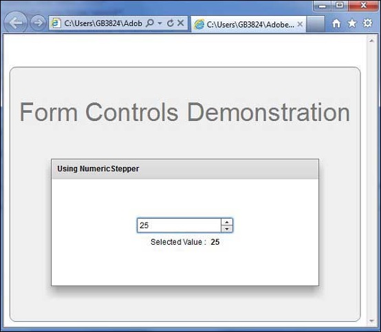
Once you are ready with all the changes done, let us compile and run the application in normal mode as we did in Flex - Create Application chapter. If everything is fine with your application, it will produce the following result: [ Try it online ]