- Flex - Home
- Flex - Overview
- Flex - Environment
- Flex - Applications
- Flex - Create Application
- Flex - Deploy Application
- Flex - Life Cycle Phases
- Flex - Style with CSS
- Flex - Style with Skin
- Flex - Data Binding
- Flex - Basic Controls
- Flex - Form Controls
- Flex - Complex Controls
- Flex - Layout Panels
- Flex - Visual Effects
- Flex - Event Handling
- Flex - Custom Controls
- Flex - RPC Services
- Flex - FlexUnit Integration
- Flex - Debug Application
- Flex - Internationalization
- Flex - Printing Support
Flex - Menu Control
Introduction
The Menu control creates a pop-up menu of singly selectable choices or menuitems. The popped up menu can have as many levels of submenus as needed.
Class Declaration
Following is the declaration for mx.controls.Menu class −
public class Menu
   extends List
      implements IFocusManagerContainer
Public Properties
| Sr.No | Property & Description |
|---|---|
| 1 | dataDescriptor : IMenuDataDescriptor The object that accesses and manipulates data in the data provider. |
| 2 | hasRoot : Boolean [read-only] A flag that indicates that the current data provider has a root node; for example, a single top node in a hierarchical structure. |
| 3 | parentMenu : Menu The parent menu in a hierarchical chain of menus, where the current menu is a submenu of the parent. |
| 4 | showRoot : Boolean A Boolean flag that specifies whether to display the data provider's root node. |
Public Methods
| Sr.No | Method & Description |
|---|---|
| 1 | Menu() Constructor. |
| 2 | createMenu(parent:DisplayObjectContainer, mdp:Object, showRoot:Boolean = true):Menu [static] Creates and returns an instance of the Menu class. |
| 3 | hide():void Hides the Menu control and any of its submenus if the Menu control is visible. |
| 4 | popUpMenu(menu:Menu, parent:DisplayObjectContainer, mdp:Object):void [static] Sets the dataProvider of an existing Menu control and places the Menu control in the specified parent container. |
| 5 | show(xShow:Object = null, yShow:Object = null):void Shows the Menu control. |
Protected Methods
| Sr.No | Method & Description |
|---|---|
| 1 | makeListData(data:Object, uid:String, rowNum:int):BaseListData [override] Creates a new MenuListData instance and populates the fields based on the input data provider item. |
| 2 | measure():void [override] Calculates the preferred width and height of the Menu based on the widths and heights of its menu items. |
| 3 | setMenuItemToggled(item:Object, toggle:Boolean):void Toggles the menu item. |
Events
| Sr.No | Event & Description |
|---|---|
| 1 | change Dispatched when selection changes as a result of user interaction. |
| 2 | itemClick Dispatched when a menu item is selected. |
| 3 | itemRollOut Dispatched when a user rolls the mouse out of a menu item. |
| 4 | itemRollOver Dispatched when a user rolls the mouse over a menu item. |
| 5 | menuHide Dispatched when a menu or submenu is dismissed. |
| 6 | menuShow Dispatched when a menu or submenu opens. |
Methods Inherited
This class inherits methods from the following classes −
- mx.controls.List
- mx.controls.listClasses.ListBase
- mx.core.ScrollControlBase
- mx.core.UIComponent
- mx.core.FlexSprite
- flash.display.Sprite
- flash.display.DisplayObjectContainer
- flash.display.InteractiveObject
- flash.display.DisplayObject
- flash.events.EventDispatcher
- Object
Flex Menu Control Example
Let us follow the following steps to check usage of Menu control in a Flex application by creating a test application −
| Step | Description |
|---|---|
| 1 | Create a project with a name HelloWorld under a package com.tutorialspoint.client as explained in the Flex - Create Application chapter. |
| 2 | Modify HelloWorld.mxml as explained below. Keep rest of the files unchanged. |
| 3 | Compile and run the application to make sure business logic is working as per the requirements. |
Following is the content of the modified mxml file src/com.tutorialspoint/HelloWorld.mxml.
<?xml version = "1.0" encoding = "utf-8"?>
<s:Application xmlns:fx = "http://ns.adobe.com/mxml/2009"
   xmlns:s = "library://ns.adobe.com/flex/spark"
   xmlns:mx = "library://ns.adobe.com/flex/mx"
   width = "100%" height = "100%" minWidth = "500" minHeight = "500">

   <fx:Style source = "/com/tutorialspoint/client/Style.css" />
   <fx:Script>
      <![CDATA[
         import mx.controls.Menu;
         import mx.events.MenuEvent;

         protected var menu:Menu;
         protected function showMenu(event:MouseEvent):void {
            menu = Menu.createMenu(null, menuData, false);
            menu.labelField = "@label";
            menu.show(mainContainer.x+menuPanel.x+ 2,
            mainContainer.y +menuPanel.y+32);
            menu.addEventListener(MenuEvent.CHANGE,onMenuChange);
         }

         protected function hideMenu(event:MouseEvent):void {
            menu.hide();
         }

         protected function onMenuChange(event:MenuEvent):void {
            lblSelected.text =  event.label;
         }
      ]]>
   </fx:Script>

   <fx:Declarations>
      <fx:XML format = "e4x" id = "menuData">
         <root>
            <menuitem label = "Menu Item A" >
               <menuitem label = "SubMenu Item A 1" enabled = "false" />
               <menuitem label = "SubMenu Item A 2" />
            </menuitem>

            <menuitem label = "Menu Item B" type = "check" toggled = "true" />
            <menuitem label = "Menu Item C" type = "check" toggled = "false" />
            <menuitem type = "separator" />

            <menuitem label = "Menu Item D" >
               <menuitem label = "SubMenu Item D 1" type = "radio"
                  groupName = "one" />
               <menuitem label = "SubMenu Item D 2" type = "radio"
                  groupName = "one" toggled = "true" />
               <menuitem label = "SubMenu Item D 3" type = "radio"
                  groupName = "one" />
            </menuitem>
         </root>
      </fx:XML>
   </fx:Declarations>

   <s:BorderContainer width = "630" height = "480" id = "mainContainer"
      styleName = "container">
      <s:VGroup width = "100%" height = "100%" gap = "50"
         horizontalAlign = "center" verticalAlign = "middle">
         <s:Label id = "lblHeader" text = "Complex Controls Demonstration"
            fontSize = "40" color = "0x777777" styleName = "heading" />

         <s:Panel id = "menuPanel" title = "Using Menu" width = "500"
            height = "300">
            <s:layout>
               <s:VerticalLayout  gap = "10" verticalAlign = "middle"
                  horizontalAlign = "center" />
            </s:layout>

            <s:HGroup>
               <s:Button label = "Show Menu" click = "showMenu(event)" />
               <s:Button label = "Hide Menu" click = "hideMenu(event)" />
            </s:HGroup>

            <s:HGroup>
               <s:Label text = "Menu Item selected:" />
               <s:Label id = "lblSelected" fontWeight = "bold" />
            </s:HGroup>
         </s:Panel>
      </s:VGroup>
   </s:BorderContainer>
</s:Application>
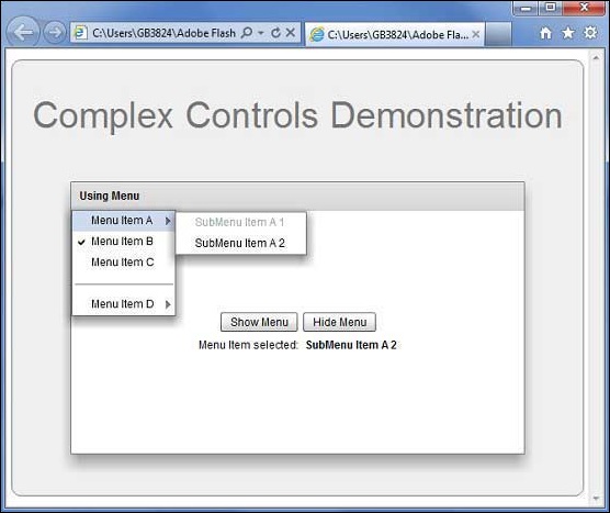
Once you are ready with all the changes done, let us compile and run the application in normal mode as we did in Flex - Create Application chapter. If everything is fine with your application, it will produce the following result: [ Try it online ]