- Flex - Home
- Flex - Overview
- Flex - Environment
- Flex - Applications
- Flex - Create Application
- Flex - Deploy Application
- Flex - Life Cycle Phases
- Flex - Style with CSS
- Flex - Style with Skin
- Flex - Data Binding
- Flex - Basic Controls
- Flex - Form Controls
- Flex - Complex Controls
- Flex - Layout Panels
- Flex - Visual Effects
- Flex - Event Handling
- Flex - Custom Controls
- Flex - RPC Services
- Flex - FlexUnit Integration
- Flex - Debug Application
- Flex - Internationalization
- Flex - Printing Support
Flex - Form
Introduction
The Form container lets you control the layout of a form, mark form fields as required or optional, handle error messages, and bind your form data to the Flex data model to perform data checking and validation. It also lets you use style sheets to configure the appearance of your forms.
Class Declaration
Following is the declaration for spark.components.Form class −
public class Form
   extends Container
Public Properties
| Sr.No | Property & Description |
|---|---|
| 1 | invalidElements : Array [read-only] A sorted Array of descendant elements that are in an invalid state. |
Public Methods
| Sr.No | Method & Description |
|---|---|
| 1 | Form() Constructor. |
Methods Inherited
This class inherits methods from the following classes −
- mx.core.Component
- mx.core.UIComponent
- mx.core.FlexSprite
- flash.display.Sprite
- flash.display.DisplayObjectContainer
- flash.display.InteractiveObject
- flash.display.DisplayObject
- flash.events.EventDispatcher
- Object
Flex Form Example
Let us follow the following steps to check usage of Form in a Flex application by creating a test application −
| Step | Description |
|---|---|
| 1 | Create a project with a name HelloWorld under a package com.tutorialspoint.client as explained in the Flex - Create Application chapter. |
| 2 | Modify HelloWorld.mxml as explained below. Keep rest of the files unchanged. |
| 3 | Compile and run the application to make sure business logic is working as per the requirements. |
Following is the content of the modified mxml file src/com.tutorialspoint/HelloWorld.mxml.
<?xml version = "1.0" encoding = "utf-8"?>
<s:Application xmlns:fx = "http://ns.adobe.com/mxml/2009"
   xmlns:s = "library://ns.adobe.com/flex/spark"
   xmlns:mx = "library://ns.adobe.com/flex/mx
   width = "100%" height = "100%" minWidth = "500" minHeight = "500">

   <fx:Style source = "/com/tutorialspoint/client/Style.css" />
   <fx:Declarations>
      <mx:StringValidator source = "{fname}" property = "text"
         minLength = "4" maxLength = "12" />
      <mx:PhoneNumberValidator source = "{phone}" property = "text" />
      <mx:EmailValidator source = "{email}" property = "text" />
   </fx:Declarations>

   <s:BorderContainer width = "630" height = "480" id = "mainContainer"
      styleName = "container">
      <s:VGroup width = "100%" height = "100%" gap = "50"
         horizontalAlign = "center" verticalAlign = "middle">
         <s:Label id = "lblHeader" text = "Layout Panels Demonstration"
            fontSize = "40" color = "0x777777" styleName = "heading" />

         <s:Panel id = "formPanel" title = "Using Form"
            width = "500" height = "300"
            includeInLayout = "true" visible = "true">

            <s:Form >
               <s:FormItem label = "First name">
                  <s:TextInput id = "fname" width = "200" />
               </s:FormItem>

               <s:FormItem label = "E-mail">
                  <s:TextInput id = "email" width = "200" />
               </s:FormItem>

               <s:FormItem label = "Phone">
                  <s:TextInput id = "phone" width = "200" />
               </s:FormItem>
            </s:Form>
         </s:Panel>
      </s:VGroup>
   </s:BorderContainer>
</s:Application>
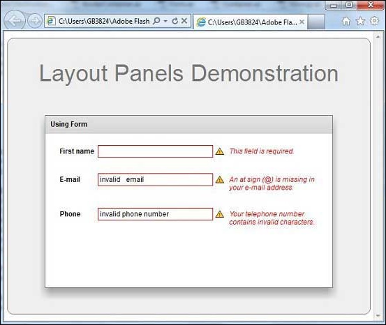
Once you are ready with all the changes done, let us compile and run the application in normal mode as we did in Flex - Create Application chapter. If everything is fine with your application, it will produce the following result: [ Try it online ]