- Flex - Home
- Flex - Overview
- Flex - Environment
- Flex - Applications
- Flex - Create Application
- Flex - Deploy Application
- Flex - Life Cycle Phases
- Flex - Style with CSS
- Flex - Style with Skin
- Flex - Data Binding
- Flex - Basic Controls
- Flex - Form Controls
- Flex - Complex Controls
- Flex - Layout Panels
- Flex - Visual Effects
- Flex - Event Handling
- Flex - Custom Controls
- Flex - RPC Services
- Flex - FlexUnit Integration
- Flex - Debug Application
- Flex - Internationalization
- Flex - Printing Support
Flex - DateChooser Control
The DateChooser control is used to display the name of a month, the year, and a grid of the days of the month, with columns labeled for the day of the week.
The DateChooser control let the user to select a date, a range of dates, or multiple dates. The control contains forward and back arrow buttons for changing the month and year.
Class Declaration
Following is the declaration for mx.controls.DateChooser class −
public class DateChooser
   extends UIComponent
      implements IFocusManagerComponent, IFontContextComponent
Public Properties
| Sr.No | Property & Description |
|---|---|
| 1 | allowDisjointSelection : Boolean If true, specifies that non-contiguous(disjoint) selection is allowed in the DateChooser control. |
| 2 | allowMultipleSelection : Boolean If true, specifies that multiple selection is allowed in the DateChooser control. |
| 3 | dayNames : Array The weekday names for DateChooser control. |
| 4 | disabledDays : Array The days to disable in a week. |
| 5 | disabledRanges : Array Disables single and multiple days. |
| 6 | displayedMonth : int Used together with the displayedYear property, the displayedMonth property specifies the month displayed in the DateChooser control. |
| 7 | displayedYear : int Used together with the displayedMonth property, the displayedYear property specifies the year displayed in the DateChooser control. |
| 8 | firstDayOfWeek : Object Number representing the day of the week to display in the first column of the DateChooser control. |
| 9 | maxYear : int The last year selectable in the control. |
| 10 | minYear : int The first year selectable in the control. |
| 11 | monthNames : Array Names of the months displayed at the top of the DateChooser control. |
| 12 | monthSymbol : String This property is appended to the end of the value specified by the monthNames property to define the names of the months displayed at the top of the DateChooser control. |
| 13 | selectableRange : Object Range of dates between which dates are selectable. |
| 14 | selectedDate : Date Date selected in the DateChooser control. |
| 15 | selectedRanges : Array Selected Date ranges. |
| 16 | showToday : Boolean If true, specifies that today is highlighted in the DateChooser control. |
| 17 | yearNavigationEnabled : Boolean Enables year navigation. |
| 18 | yearSymbol : String This property is appended to the end of the year displayed at the top of the DateChooser control. |
Protected Properties
| Sr.No | Property & Description |
|---|---|
| 1 | calendarLayoutStyleFilters : Object [read-only] The set of styles to pass from the DateChooser to the calendar layout. |
| 2 | nextMonthStyleFilters : Object [read-only] The set of styles to pass from the DateChooser to the next month button. |
| 3 | nextYearStyleFilters : Object [read-only] The set of styles to pass from the DateChooser to the next year button. |
| 4 | prevMonthStyleFilters : Object [read-only] The set of styles to pass from the DateChooser to the previous month button. |
| 5 | prevYearStyleFilters : Object [read-only] The set of styles to pass from the DateChooser to the previous year button. |
Public Methods
| Sr.No | Method & Description |
|---|---|
| 1 | DateChooser() Constructor. |
Events
| Sr.No | Event & Description |
|---|---|
| 1 | change Dispatched when a date is selected or changed. |
| 2 | scroll Dispatched when the month changes due to user interaction. |
Methods Inherited
This class inherits methods from the following classes −
- mx.core.UIComponent
- mx.core.FlexSprite
- flash.display.Sprite
- flash.display.DisplayObjectContainer
- flash.display.InteractiveObject
- flash.display.DisplayObject
- flash.events.EventDispatcher
- Object
Flex DateChooser Control Example
Let us follow the following steps to check usage of DateChooser control in a Flex application by creating a test application −
| Step | Description |
|---|---|
| 1 | Create a project with a name HelloWorld under a packagecom.tutorialspoint.client as explained in the Flex - Create Application chapter. |
| 2 | Modify HelloWorld.mxml as explained below. Keep rest of the files unchanged. |
| 3 | Compile and run the application to make sure business logic is working as per the requirements. |
Following is the content of the modified mxml file src/com.tutorialspoint/HelloWorld.mxml.
<?xml version = "1.0" encoding = "utf-8"?>
<s:Application xmlns:fx = "http://ns.adobe.com/mxml/2009"
   xmlns:s = "library://ns.adobe.com/flex/spark"
   xmlns:mx = "library://ns.adobe.com/flex/mx"
   width = "100%" height = "100%" minWidth = "500" minHeight = "500"
   applicationComplete = "application_applicationCompleteHandler(event)">

   <fx:Style source = "/com/tutorialspoint/client/Style.css" />
   <fx:Script>
      <![CDATA[
         import mx.events.CalendarLayoutChangeEvent;
         import mx.events.FlexEvent;

         [Bindable]
         private var selectedDate:String = "";
         protected function dateChooser_changeHandler
            event:CalendarLayoutChangeEvent):void {
            var date:Date = DateChooser(event.target).selectedDate;
            selectedDate = dateFormatter.format(date);
         }

         protected function application_applicationCompleteHandler
            (event:FlexEvent):void {
            selectedDate = dateFormatter.format(new Date());
         }
      ]]>
   </fx:Script>

   <s:BorderContainer width = "550" height = "400" id = "mainContainer"
      styleName = "container">
      <s:VGroup width = "100%" height = "100%" gap = "50"
         horizontalAlign = "center" verticalAlign = "middle">
         <s:Label id = "lblHeader" text = "Form Controls Demonstration"
            fontSize = "40" color = "0x777777" styleName = "heading" />

         <s:Panel id = "dateChooserPanel" title = "Using DateChooser" width = "400"
            height = "300" includeInLayout = "true" visible = "true">
            <s:layout>
               <s:HorizontalLayout  gap = "10" verticalAlign = "middle"
                  horizontalAlign = "center" />
            </s:layout>

            <mx:DateChooser id = "dateChooser" yearNavigationEnabled = "true"
               change = "dateChooser_changeHandler(event)" />
            <s:Label id = "selection" fontWeight = "bold"
               text = "Date selected: {selectedDate}" />
         </s:Panel>
      </s:VGroup>
   </s:BorderContainer>
</s:Application>
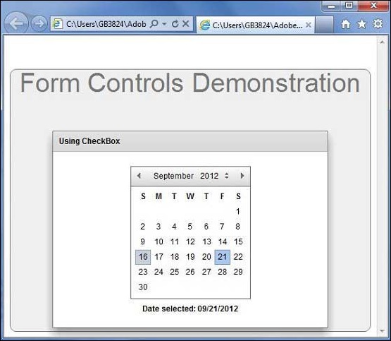
Once you are ready with all the changes done, let us compile and run the application in normal mode as we did in Flex - Create Application chapter. If everything is fine with your application, it will produce the following result: [ Try it online ]