- Flex - Home
- Flex - Overview
- Flex - Environment
- Flex - Applications
- Flex - Create Application
- Flex - Deploy Application
- Flex - Life Cycle Phases
- Flex - Style with CSS
- Flex - Style with Skin
- Flex - Data Binding
- Flex - Basic Controls
- Flex - Form Controls
- Flex - Complex Controls
- Flex - Layout Panels
- Flex - Visual Effects
- Flex - Event Handling
- Flex - Custom Controls
- Flex - RPC Services
- Flex - FlexUnit Integration
- Flex - Debug Application
- Flex - Internationalization
- Flex - Printing Support
Flex - DataGrid Control
Introduction
The DataGrid control displays a row of column headings above a scrollable grid.
Class Declaration
Following is the declaration for spark.components.DataGrid class −
public class DataGrid
   extends SkinnableContainerBase
      implements IFocusManagerComponent, IIMESupport
Public Properties
Following are the Public Properties for DataGrid Control.
| Sr.No | Property & Description |
|---|---|
| 1 | columnsLength : int [read-only] Returns the value of columns.length if the columns IList was specified, otherwise 0. |
| 2 | dataProvider : IList A list of data items that correspond to the rows in the grid. |
| 3 | dataProviderLength : int [read-only] Returns the value of dataProvider.length if the dataProvider IList was specified, otherwise 0. |
| 4 | dataTipField : String The name of the field in the data provider to display as the datatip. |
| 5 | dataTipFunction : Function Specifies a callback function to run on each item of the data provider to determine its data tip. |
| 6 | editable : Boolean The default value for the GridColumn editable property, which indicates if a corresponding cell's data provider item can be edited. |
| 7 | editorColumnIndex : int [read-only] The zero-based column index of the cell that is being edited. |
| 8 | editorRowIndex : int [read-only] The zero-based row index of the cell that is being edited. |
| 9 | enableIME : Boolean [read-only] A flag that indicates whether the IME should be enabled when the component receives focus. |
| 10 | imeMode : String The default value for the GridColumn imeMode property, which specifies the IME (Input Method Editor) mode. |
| 11 | itemEditor : IFactory The default value for the GridColumn itemEditor property, which specifies the IGridItemEditor class used to create item editor instances. |
| 12 | itemEditorInstance : IGridItemEditor [read-only] A reference to the currently active instance of the item editor, if it exists. |
| 13 | itemRenderer : IFactory The item renderer that's used for columns that do not specify one. |
| 14 | preserveSelection : Boolean If true, the selection is preserved when the data provider refreshes its collection. |
| 15 | requestedColumnCount : int The measured width of this grid is large enough to display the first requestedColumnCount columns. |
| 16 | requestedMaxRowCount : int The measured height of the grid is large enough to display no more than requestedMaxRowCount rows. |
| 17 | requestedMinColumnCount : int The measured width of this grid is large enough to display at least requestedMinColumnCount columns. |
| 18 | requestedMinRowCount : int The measured height of this grid is large enough to display at least requestedMinRowCount rows. |
| 19 | requestedRowCount : int The measured height of this grid is large enough to display the first requestedRowCount rows. |
| 20 | requireSelection : Boolean If true and the selectionMode property is not GridSelectionMode.NONE, an item must always be selected in the grid. |
| 21 | resizableColumns : Boolean Indicates whether the user can change the size of the columns. |
| 22 | rowHeight : Number If variableRowHeight is false, then this property specifies the actual height of each row, in pixels. |
| 23 | selectedCell : CellPosition If selectionMode is GridSelectionMode.SINGLE_CELL or GridSelectionMode.MULTIPLE_CELLS, returns the first selected cell starting at row 0 column 0 and progressing through each column in a row before moving to the next row. |
| 24 | selectedCells : Vector.<CellPosition> If selectionMode is GridSelectionMode.SINGLE_CELL or GridSelectionMode.MULTIPLE_CELLS, returns a Vector of CellPosition Objects representing the positions of the selected cells in the grid. |
| 25 | selectedIndex : int If selectionMode is GridSelectionMode.SINGLE_ROW or GridSelectionMode.MULTIPLE_ROWS, returns the rowIndex of the first selected row. |
| 26 | selectedIndices : Vector.<int> If selectionMode is GridSelectionMode.SINGLE_ROW or GridSelectionMode.MULTIPLE_ROWS, returns a Vector of the selected rows indices. |
| 27 | selectedItem : Object If selectionMode is GridSelectionMode.SINGLE_ROW or GridSelectionMode.MULTIPLE_ROWS, returns the item in the the data provider that is currently selected or undefined if no rows are selected. |
| 28 | selectedItems : Vector.<Object> If selectionMode is GridSelectionMode.SINGLE_ROW or GridSelectionMode.MULTIPLE_ROWS, returns a Vector of the dataProvider items that are currently selected. |
| 29 | selectionLength : int [read-only] If selectionMode is GridSelectionMode.SINGLE_ROW or GridSelectionMode.MULTIPLE_ROWS, returns the number of selected rows. |
| 30 | selectionMode : String The selection mode of the control. |
| 31 | showDataTips : Boolean If true then a dataTip is displayed for all visible cells. |
| 32 | sortableColumns : Boolean Specifies whether the user can interactively sort columns. |
| 33 | typicalItem : Object The grid's layout ensures that columns whose width is not specified is wide enough to display an item renderer for this default data provider item. |
| 34 | variableRowHeight : Boolean If true, each row's height is the maximum of preferred heights of the cells displayed so far. |
| 35 | columns : IList The list of GridColumn Objects displayed by this grid. |
Public Methods
Following are the Public Properties for DataGrid Control.
| Sr.No | Method & Description |
|---|---|
| 1 | DataGrid() Constructor. |
| 2 | addSelectedCell(rowIndex:int, columnIndex:int):Boolean If selectionMode is GridSelectionMode.SINGLE_CELL or GridSelectionMode.MULTIPLE_CELLS, adds the cell to the selection and sets the caret position to the cell. |
| 3 | addSelectedIndex(rowIndex:int):Boolean If selectionMode is GridSelectionMode.MULTIPLE_ROWS, adds this row to the selection and sets the caret position to this row. |
| 4 | clearSelection():Boolean Removes all of the selected rows and cells, if selectionMode is not GridSelectionMode.NONE. |
| 5 | endItemEditorSession(cancel:Boolean = false):Boolean Closes the currently active editor and optionally saves the editor's value by calling the item editor's save() method. |
| 6 | ensureCellIsVisible(rowIndex:int, columnIndex:int = -1):void If necessary, set the verticalScrollPosition and horizontalScrollPosition properties so that the specified cell is completely visible. |
| 7 | invalidateCell(rowIndex:int, columnIndex:int):void If the specified cell is visible, it is redisplayed. |
| 8 | invalidateTypicalItem():void |
| 9 | removeSelectedCell(rowIndex:int, columnIndex:int):Boolean If selectionMode is GridSelectionMode.SINGLE_CELL or GridSelectionMode.MULTIPLE_CELLS, removes the cell from the selection and sets the caret position to the cell. |
| 10 | removeSelectedIndex(rowIndex:int):Boolean If selectionMode is GridSelectionMode.SINGLE_ROW or GridSelectionMode.MULTIPLE_ROWS, removes this row from the selection and sets the caret position to this row. |
| 11 | selectAll():Boolean If selectionMode is GridSelectionMode.MULTIPLE_ROWS, selects all rows and removes the caret or if selectionMode is GridSelectionMode.MULTIPLE_CELLS selects all cells and removes the caret. |
| 12 | selectCellRegion(rowIndex:int, columnIndex:int, rowCount:uint, columnCount:uint):Boolean If selectionMode is GridSelectionMode.MULTIPLE_CELLS, sets the selection to all the cells in the cell region and the caret position to the last cell in the cell region. |
| 13 | selectIndices(rowIndex:int, rowCount:int):Boolean If selectionMode is GridSelectionMode.MULTIPLE_ROWS, sets the selection to the specfied rows and the caret position to endRowIndex. |
| 14 | selectionContainsCell(rowIndex:int, columnIndex:int):Boolean If selectionMode is GridSelectionMode.SINGLE_CELL or GridSelectionMode.MULTIPLE_CELLS, returns true if the cell is in the current selection. |
| 15 | selectionContainsCellRegion(rowIndex:int, columnIndex:int, rowCount:int, columnCount:int):Boolean If selectionMode is GridSelectionMode.MULTIPLE_CELLS, returns true if the cells in the cell region are in the current selection. |
| 16 | selectionContainsIndex(rowIndex:int):Boolean If selectionMode is GridSelectionMode.SINGLE_ROW or GridSelectionMode.MULTIPLE_ROWS, returns true if the row at index is in the current selection. |
| 17 | selectionContainsIndices(rowIndices:Vector.<int>):Boolean If selectionMode is GridSelectionMode.MULTIPLE_ROWS, returns true if the rows in indices are in the current selection. |
| 18 | setSelectedCell(rowIndex:int, columnIndex:int):Boolean If selectionMode is GridSelectionMode.SINGLE_CELL or GridSelectionMode.MULTIPLE_CELLS, sets the selection and the caret position to this cell. |
| 19 | setSelectedIndex(rowIndex:int):Boolean If selectionMode is GridSelectionMode.SINGLE_ROW or GridSelectionMode.MULTIPLE_ROWS, sets the selection and the caret position to this row. |
| 20 | sortByColumns(columnIndices:Vector.<int>, isInteractive:Boolean = false):Boolean Sort the DataGrid by one or more columns, and refresh the display. |
| 21 | startItemEditorSession(rowIndex:int, columnIndex:int):Boolean Starts an editor session on a selected cell in the grid. |
Protected Methods
| Sr.No | Method & Description |
|---|---|
| 1 | commitCaretPosition(newCaretRowIndex:int, newCaretColumnIndex:int):void Updates the grid's caret position. |
| 2 | commitInteractiveSelection(selectionEventKind:String, rowIndex:int, columnIndex:int, rowCount:int = 1, columnCount:int = 1):Boolean In response to user input (mouse or keyboard) which changes the selection, this method dispatches the selectionChanging event. |
Events
| Sr.No | Event & Description |
|---|---|
| 1 | caretChange Dispatched by the grid skin part when the caret position, size, or visibility has changed due to user interaction or being programmatically set. |
| 2 | gridClick Dispatched by the grid skin part when the mouse is clicked over a cell. |
| 3 | gridDoubleClick Dispatched by the grid skin part when the mouse is double-clicked over a cell. |
| 4 | gridItemEditorSessionCancel Dispatched after the item editor has been closed without saving its data. |
| 5 | gridItemEditorSessionSave Dispatched after the data in item editor has been saved into the data provider and the editor has been closed. |
| 6 | gridItemEditorSessionStart Dispatched immediately after an item editor has been opened. |
| 7 | gridItemEditorSessionStarting Dispatched when a new item editor session has been requested. |
| 8 | gridMouseDown Dispatched by the grid skin part when the mouse button is pressed over a grid cell. |
| 9 | gridMouseDrag Dispatched by the grid skin part after a gridMouseDown event if the mouse moves before the button is released. |
| 10 | gridMouseUp Dispatched by the grid skin part after a gridMouseDown event when the mouse button is released, even if the mouse is no longer within the grid. |
| 11 | gridRollOut Dispatched by the grid skin part when the mouse leaves a grid cell. |
| 12 | gridRollOver Dispatched by the grid skin part when the mouse enters a grid cell. |
| 13 | selectionChange Dispatched when the selection has changed. |
| 14 | selectionChanging Dispatched when the selection is going to change. |
| 15 | sortChange Dispatched after the sort has been applied to the data provider's collection. |
| 16 | sortChanging Dispatched before the sort has been applied to the data provider's collection. |
Methods Inherited
This class inherits methods from the following classes −
- spark.components.supportClasses.SkinnableContainerBase
- spark.components.supportClasses.SkinnableComponent
- mx.core.UIComponent
- mx.core.FlexSprite
- flash.display.Sprite
- flash.display.DisplayObjectContainer
- flash.display.InteractiveObject
- flash.display.DisplayObject
- flash.events.EventDispatcher
- Object
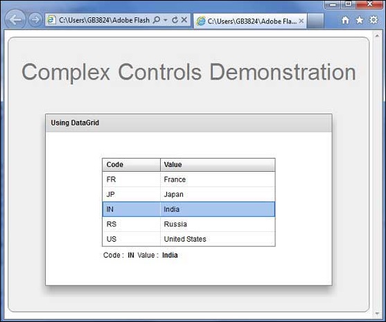
Flex DataGrid Control Example
Let us follow the following steps to check usage of DataGrid control in a Flex application by creating a test application −
| Step | Description |
|---|---|
| 1 | Create a project with a name HelloWorld under a package com.tutorialspoint.client as explained in the Flex - Create Application chapter. |
| 2 | Modify HelloWorld.mxml as explained below. Keep rest of the files unchanged. |
| 3 | Compile and run the application to make sure business logic is working as per the requirements. |
Following is the content of the modified mxml file src/com.tutorialspoint/HelloWorld.mxml.
<?xml version = "1.0" encoding = "utf-8"?>
<s:Application xmlns:fx = "http://ns.adobe.com/mxml/2009"
   xmlns:s = "library://ns.adobe.com/flex/spark"
   xmlns:mx = "library://ns.adobe.com/flex/mx"
   width = "100%" height = "100%" minWidth = "500" minHeight = "500">

   <fx:Style source = "/com/tutorialspoint/client/Style.css" />
   <fx:Script>
      <![CDATA[
         import mx.collections.ArrayCollection;
         [Bindable]
         public var data:ArrayCollection = new ArrayCollection ([
            {value:"France", code:"FR"},
            {value:"Japan", code:"JP"},
            {value:"India", code:"IN"},
            {value:"Russia", code:"RS"},
            {value:"United States", code:"US"}
         ]);
      ]]>
   </fx:Script>

   <s:BorderContainer width = "630" height = "480" id = "mainContainer"
      styleName = "container">
      <s:VGroup width = "100%" height = "100%" gap = "50"
         horizontalAlign = "center" verticalAlign = "middle">
         <s:Label id = "lblHeader" text = "Complex Controls Demonstration"
            fontSize = "40" color = "0x777777" styleName = "heading" />

         <s:Panel id = "dataGridPanel" title = "Using DataGrid"
            width = "500" height = "300">
            <s:layout>
               <s:VerticalLayout  gap = "10" verticalAlign = "middle"
                  horizontalAlign = "center" />
            </s:layout>

            <s:DataGrid dataProvider = "{data}" id = "dataGrid">
               <s:columns>
                  <s:ArrayList>
                     <s:GridColumn dataField = "code" width = "100"
                        headerText = "Code" />
                     <s:GridColumn dataField = "value" width = "200"
                        headerText = "Value" />
                  </s:ArrayList>
               </s:columns>
            </s:DataGrid>

            <s:HGroup width = "60%">
               <s:Label text = "Code :" />
               <s:Label text = "{dataGrid.selectedItem.code}" fontWeight = "bold" />
               <s:Label text = "Value :" />
               <s:Label text = "{dataGrid.selectedItem.value}" fontWeight = "bold" />
            </s:HGroup>
         </s:Panel>
      </s:VGroup>
   </s:BorderContainer>
</s:Application>
Once you are ready with all the changes done, let us compile and run the application in normal mode as we did in Flex - Create Application chapter. If everything is fine with your application, it will produce the following result: [ Try it online ]