- Flex - Home
- Flex - Overview
- Flex - Environment
- Flex - Applications
- Flex - Create Application
- Flex - Deploy Application
- Flex - Life Cycle Phases
- Flex - Style with CSS
- Flex - Style with Skin
- Flex - Data Binding
- Flex - Basic Controls
- Flex - Form Controls
- Flex - Complex Controls
- Flex - Layout Panels
- Flex - Visual Effects
- Flex - Event Handling
- Flex - Custom Controls
- Flex - RPC Services
- Flex - FlexUnit Integration
- Flex - Debug Application
- Flex - Internationalization
- Flex - Printing Support
Flex - ColorPicker Control
The ColorPicker control provides user a way to choose a color from a swatch list.The default mode is to show a single swatch in a square button.
When the user clicks the swatch button, the swatch panel appears and displays the entire swatch list.
Class Declaration
Following is the declaration for mx.controls.ColorPicker class −
public class ColorPicker
   extends ComboBase
Public Properties
| Sr.No | Property & Description |
|---|---|
| 1 | colorField : String Name of the field in the objects of the dataProvider Array that specifies the hexadecimal values of the colors that the swatch panel displays. |
| 2 | labelField : String Name of the field in the objects of the dataProvider Array that contain text to display as the label in the SwatchPanel object text box. |
| 3 | selectedColor : uint The value of the currently selected color in the SwatchPanel object. |
| 4 | selectedIndex : int [override] Index in the dataProvider of the selected item in the SwatchPanel object. |
| 5 | showTextField : Boolean Specifies whether to show the text box that displays the color label or hexadecimal color value. |
Protected Properties
| Sr.No | Property & Description |
|---|---|
| 1 | swatchStyleFilters : Object [read-only] Set of styles to pass from the ColorPicker through to the preview swatch. |
Public Methods
| Sr.No | Method & Description |
|---|---|
| 1 | ColorPicker() Constructor. |
| 2 | close(trigger:Event = null):void Hides the drop-down SwatchPanel object. |
| 3 | open():void Displays the drop-down SwatchPanel object that shows colors that users can select. |
Events
| Sr.No | Event & Description |
|---|---|
| 1 | change Dispatched when the selected color changes as a result of user interaction. |
| 2 | close Dispatched when the swatch panel closes. |
| 3 | enter Dispatched if the ColorPicker editable property is set to true and the user presses Enter after typing in a hexadecimal color value. |
| 4 | itemRollOut Dispatched when the user rolls the mouse out of a swatch in the SwatchPanel object. |
| 5 | itemRollOver Dispatched when the user rolls the mouse over a swatch in the SwatchPanel object. |
| 6 | open Dispatched when the color swatch panel opens. |
Methods Inherited
This class inherits methods from the following classes −
- mx.controls.comboBase
- mx.core.UIComponent
- mx.core.FlexSprite
- flash.display.Sprite
- flash.display.DisplayObjectContainer
- flash.display.InteractiveObject
- flash.display.DisplayObject
- flash.events.EventDispatcher
- Object
Flex ColorPicker Control Example
Let us follow the following steps to check usage of ColorPicker control in a Flex application by creating a test application &minuss;
| Step | Description |
|---|---|
| 1 | Create a project with a name HelloWorld under a packagecom.tutorialspoint.client as explained in the Flex - Create Application chapter. |
| 2 | Modify HelloWorld.mxml as explained below. Keep rest of the files unchanged. |
| 3 | Compile and run the application to make sure business logic is working as per the requirements. |
Following is the content of the modified mxml file src/com.tutorialspoint/HelloWorld.mxml.
<?xml version = "1.0" encoding = "utf-8"?>
<s:Application xmlns:fx = "http://ns.adobe.com/mxml/2009"
   xmlns:s = "library://ns.adobe.com/flex/spark"
   xmlns:mx = "library://ns.adobe.com/flex/mx"
   width = "100%" height = "100%" minWidth = "500" minHeight = "500">

   <fx:Style source = "/com/tutorialspoint/client/Style.css" />
   <s:BorderContainer width = "550" height = "400" id = "mainContainer"
      styleName = "container">
      <s:VGroup width = "100%" height = "100%" gap = "50"
         horizontalAlign = "center" verticalAlign = "middle">
         <s:Label id = "lblHeader" text = "Form Controls Demonstration"
            fontSize = "40" color = "0x777777" styleName = "heading" />

         <s:Panel id = "colorPickerPanel"
            backgroundColor = "{colorPicker.selectedColor}"
            title = "Using ColorPicker" width = "420" height = "200">
            <s:layout>
               <s:HorizontalLayout  gap = "10" verticalAlign = "middle"
                  horizontalAlign = "center" />
            </s:layout>

            <s:Label width = "150" color = "black"
               text = "Select background color: " fontWeight = "bold" />
            <mx:ColorPicker id = "colorPicker"
               showTextField = "true" selectedColor = "0xFFFFFF" />
         </s:Panel>
      </s:VGroup>
   </s:BorderContainer>
</s:Application>
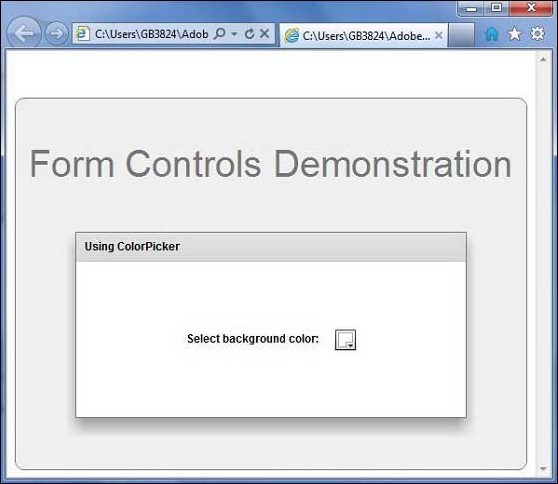
Once you are ready with all the changes done, let us compile and run the application in normal mode as we did in Flex - Create Application chapter. If everything is fine with your application, it will produce the following result: [ Try it online ]