- Flex - Home
- Flex - Overview
- Flex - Environment
- Flex - Applications
- Flex - Create Application
- Flex - Deploy Application
- Flex - Life Cycle Phases
- Flex - Style with CSS
- Flex - Style with Skin
- Flex - Data Binding
- Flex - Basic Controls
- Flex - Form Controls
- Flex - Complex Controls
- Flex - Layout Panels
- Flex - Visual Effects
- Flex - Event Handling
- Flex - Custom Controls
- Flex - RPC Services
- Flex - FlexUnit Integration
- Flex - Debug Application
- Flex - Internationalization
- Flex - Printing Support
Flex - Button Control
Introduction
The Button component is a commonly used rectangular button. Button typically uses event listeners to perform an action when the user selects the control. When a user clicks on a Button control, then it dispatches a click event and a buttonDown event.
Class Declaration
Following is the declaration for spark.components.Button class −
public class Button
   extends ButtonBase
      implements IButton
Public Properties
| Sr.No | Property & Description |
|---|---|
| 1 | emphasized : Boolean Reflects the default button as requested by the focus manager. |
Public Methods
| Sr.No | Method & Description |
|---|---|
| 1 | Button() Constructor. |
Methods Inherited
This class inherits methods from the following classes −
- spark.components.supportClasses.ButtonBase
- spark.components.supportClasses.SkinnableComponent
- mx.core.UIComponent
- mx.core.FlexSprite
- flash.display.Sprite
- flash.display.DisplayObjectContainer
- flash.display.InteractiveObject
- flash.display.DisplayObject
- flash.events.EventDispatcher
- Object
Flex Button Control Example
Let us follow the following steps to check usage of Button control in a Flex application by creating a test application −
| Step | Description |
|---|---|
| 1 | Create a project with a name HelloWorld under a packagecom.tutorialspoint.client as explained in the Flex - Create Application chapter. |
| 2 | Modify HelloWorld.mxml as explained below. Keep rest of the files unchanged. |
| 3 | Compile and run the application to make sure business logic is working as per the requirements. |
Following is the content of the modified mxml file src/com.tutorialspoint/HelloWorld.mxml.
<?xml version = "1.0" encoding = "utf-8"?>
<s:Application xmlns:fx = "http://ns.adobe.com/mxml/2009"
   xmlns:s = "library://ns.adobe.com/flex/spark"
   xmlns:mx = "library://ns.adobe.com/flex/mx"
   width = "100%" height = "100%" minWidth = "500" minHeight = "500">

   <fx:Style source = "/com/tutorialspoint/client/Style.css" />
   <fx:Script>
      <![CDATA[
         import mx.controls.Alert;
         import mx.events.FlexEvent;

         protected function button_clickHandler(event:MouseEvent):void {
            Alert.show("Hello World!");
         }
      ]]>
   </fx:Script>

   <s:BorderContainer width = "550" height = "400" id = "mainContainer"
      styleName = "container">
      <s:VGroup width = "100%" height = "100%" gap = "50"
         horizontalAlign = "center" verticalAlign = "middle">
         <s:Label id = "lblHeader" text = "Form Controls Demonstration"
            fontSize = "40" color = "0x777777" styleName = "heading" />

         <s:Panel id = "buttonPanel" title = "Using Button" width = "400"
            height = "200" includeInLayout = "true" visible = "true">
            <s:layout>
               <s:HorizontalLayout  gap = "10" verticalAlign = "middle"
                  horizontalAlign = "center" />
            </s:layout>

            <s:Button id = "clickMeButton" label = "Click Me"
               click = "button_clickHandler(event)" />
            <s:Button id = "disabledButton" label = "Disabled Button"
               enabled = "false" />
            <s:Button id = "emphasizedButton" label = "Emphasized Button"
               emphasized = "true" click = "button_clickHandler(event)" />
         </s:Panel>
      </s:VGroup>
   </s:BorderContainer>
</s:Application>
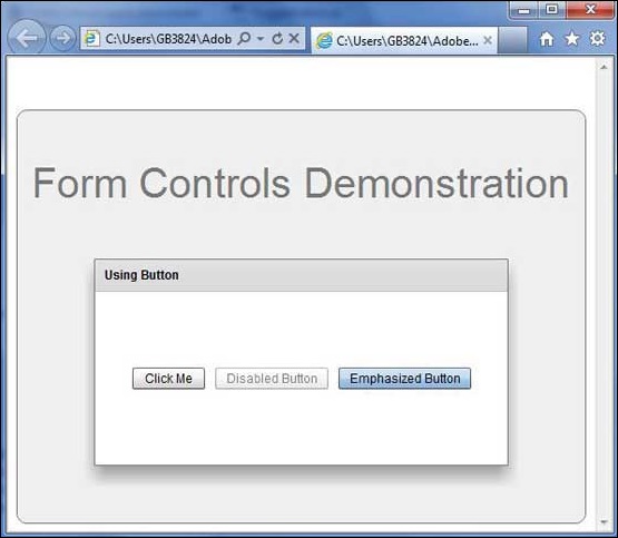
Once you are ready with all the changes done, let us compile and run the application in normal mode as we did in Flex - Create Application chapter. If everything is fine with your application, it will produce the following result: [ Try it online ]