- Flex - Home
- Flex - Overview
- Flex - Environment
- Flex - Applications
- Flex - Create Application
- Flex - Deploy Application
- Flex - Life Cycle Phases
- Flex - Style with CSS
- Flex - Style with Skin
- Flex - Data Binding
- Flex - Basic Controls
- Flex - Form Controls
- Flex - Complex Controls
- Flex - Layout Panels
- Flex - Visual Effects
- Flex - Event Handling
- Flex - Custom Controls
- Flex - RPC Services
- Flex - FlexUnit Integration
- Flex - Debug Application
- Flex - Internationalization
- Flex - Printing Support
Flex - AnimateProperties Effect
Introduction
This Animate effect animates an arbitrary set of properties between values. Specify the properties and values to animate by setting the motionPaths property.
Class Declaration
Following is the declaration for spark.effects.Animate class −
public class Animate
   extends Effect
Public Properties
| Sr.No | Property & Description |
|---|---|
| 1 | disableLayout : Boolean If true, the effect disables layout on its targets' parent containers, setting the containers autoLayout property to false, and also disables any layout constraints on the target objects. |
| 2 | easer : IEaser The easing behavior for this effect. |
| 3 | interpolator : IInterpolator The interpolator used by this effect to calculate values between the start and end values of a property. |
| 4 | motionPaths : Vector.<MotionPath> A Vector of MotionPath objects, each of which holds the name of a property being animated and the values that the property takes during the animation. |
| 5 | repeatBehavior : String The behavior of a repeating effect, which means an effect with repeatCount equal to either 0 or > 1. |
Public Methods
| Sr.No | Method & Description |
|---|---|
| 1 | Animate(target:Object = null) Constructor. |
Events
| Sr.No | Event & Description |
|---|---|
| 1 | effectRepeat Dispatched when the effect begins a new repetition, for any effect that is repeated more than once. |
| 2 | effectUpdate Dispatched every time the effect updates the target. |
Methods Inherited
This class inherits methods from the following classes −
- mx.effects.Effect
- flash.events.EventDispatcher
- Object
Flex Animate Effect Example
Let us follow the following steps to check usage of Animate Effect in a Flex application by creating a test application −
| Step | Description |
|---|---|
| 1 | Create a project with a name HelloWorld under a package com.tutorialspoint.client as explained in the Flex - Create Application chapter. |
| 2 | Modify HelloWorld.mxml as explained below. Keep rest of the files unchanged. |
| 3 | Compile and run the application to make sure business logic is working as per the requirements. |
Following is the content of the modified mxml file src/com.tutorialspoint/HelloWorld.mxml.
<?xml version = "1.0" encoding = "utf-8"?>
<s:Application xmlns:fx = "http://ns.adobe.com/mxml/2009"
   xmlns:s = "library://ns.adobe.com/flex/spark"
   xmlns:mx = "library://ns.adobe.com/flex/mx
   width = "100%" height = "100%" minWidth = "500" minHeight = "500">

   <fx:Style source = "/com/tutorialspoint/client/Style.css" />
   <fx:Script>
      <![CDATA[
         private function applyAnimateProperties():void {
            animateEffect.play();
         }
      ]]>
   </fx:Script>

   <fx:Declarations>
      <s:Animate id = "animateEffect" duration = "750" target = "{mainHGroup}" >
         <s:SimpleMotionPath valueFrom = "1" valueTo = "15" property = "gap" />
         <s:SimpleMotionPath valueFrom = "0" valueTo = "-50" property = "z" />
      </s:Animate>
   </fx:Declarations>

   <s:BorderContainer width = "630" height = "480" id = "mainContainer"
      styleName = "container">
      <s:VGroup width = "100%" height = "100%" gap = "50"
         horizontalAlign = "center" verticalAlign = "middle">
         <s:Label id = "lblHeader" text = "Effects Demonstration"
            fontSize = "40" color = "0x777777" styleName = "heading" />

         <s:Panel id = "animatePanel" title = "Using Animate"
            width = "500" height = "300" >
            <s:layout>
               <s:VerticalLayout  gap = "10" verticalAlign = "middle"
                  horizontalAlign = "center" />
            </s:layout>

            <s:Button label = "Start Animation" click = "applyAnimateProperties()" />

            <s:HGroup id = "mainHGroup">
               <s:BorderContainer width = "50" height = "50"
                  borderWeight = "2" color = "0x323232" />
               <s:BorderContainer width = "50" height = "50"
                  borderWeight = "2" color = "0x323232" />
               <s:BorderContainer width = "50" height = "50"
                  borderWeight = "2" color = "0x323232" />
            </s:HGroup>
         </s:Panel>
      </s:VGroup>
   </s:BorderContainer>
</s:Application>
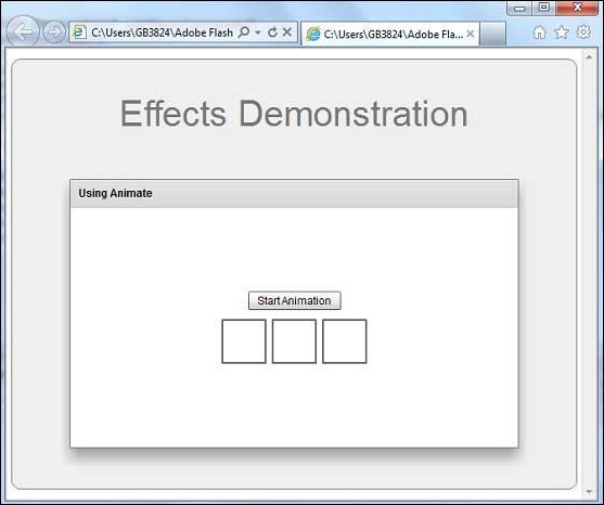
Once you are ready with all the changes done, let us compile and run the application in normal mode as we did in Flex - Create Application chapter. If everything is fine with your application, this will produce following result: [ Try it online ]