- Flex - Home
- Flex - Overview
- Flex - Environment
- Flex - Applications
- Flex - Create Application
- Flex - Deploy Application
- Flex - Life Cycle Phases
- Flex - Style with CSS
- Flex - Style with Skin
- Flex - Data Binding
- Flex - Basic Controls
- Flex - Form Controls
- Flex - Complex Controls
- Flex - Layout Panels
- Flex - Visual Effects
- Flex - Event Handling
- Flex - Custom Controls
- Flex - RPC Services
- Flex - FlexUnit Integration
- Flex - Debug Application
- Flex - Internationalization
- Flex - Printing Support
Flex - AdvancedDataGrid Control
Introduction
The AdvancedDataGrid control added multiple functionalities to the standard DataGrid control to add data visualization features to Flex application. These features provide greater control of data display, data aggregation, and data formatting.
Class Declaration
Following is the declaration for mx.controls.AdvancedDataGrid class −
public class AdvancedDataGrid
   extends AdvancedDataGridBaseEx
Public Properties
| Sr.No | Property & Description |
|---|---|
| 1 | displayDisclosureIcon : Boolean Controls the creation and visibility of disclosure icons in the navigation tree. |
| 2 | displayItemsExpanded : Boolean If true, expand the navigation tree to show all items. |
| 3 | firstVisibleItem : Object The data provider element that corresponds to the item that is currently displayed in the top row of the AdvancedDataGrid control. |
| 4 | groupedColumns : Array An Array that defines the hierarchy of AdvancedDataGridColumn instances when performing column grouping. |
| 5 | groupIconFunction : Function A user-supplied callback function to run on each group item to determine its branch icon in the navigation tree. |
| 6 | groupItemRenderer : IFactory Specifies the item renderer used to display the branch nodes in the navigation tree that correspond to groups. |
| 7 | groupLabelFunction : Function A callback function to run on each item to determine its label in the navigation tree. |
| 8 | groupRowHeight : Number The height of the grouped row, in pixels. |
| 9 | hierarchicalCollectionView : IHierarchicalCollectionView The IHierarchicalCollectionView instance used by the control. |
| 10 | itemIcons : Object An object that specifies the icons for the items. |
| 11 | lockedColumnCount : int [override] The index of the first column in the control that scrolls. |
| 12 | lockedRowCount : int [override] The index of the first row in the control that scrolls. |
| 13 | rendererProviders : Array Array of AdvancedDataGridRendererProvider instances. |
| 14 | selectedCells : Array Contains an Array of cell locations as row and column indices. |
| 15 | treeColumn : AdvancedDataGridColumn The column in which the tree is displayed. |
Protected Properties
| Sr.No | Property & Description |
|---|---|
| 1 | anchorColumnIndex : int = -1 The column index of the current anchor. |
| 2 | caretColumnIndex : int = -1 The column name of the item under the caret. |
| 3 | cellSelectionTweens : Object A hash table of selection tweens. |
| 4 | highlightColumnIndex : int = -1 The column index of the item that is currently rolled over or under the cursor. |
| 5 | selectedColumnIndex : int = -1 The column of the selected cell. |
| 6 | treeColumnIndex : int [read-only] The tree column number. |
| 7 | tween : Object The tween object that animates rows Users can add event listeners to this Object to get notified when the tween starts, updates and ends. |
| 8 | visibleCellRenderers : Object A hash table of data provider item renderers currently in view. |
Public Methods
| Sr.No | Method & Description |
|---|---|
| 1 | AdvancedDataGrid() Constructor. |
| 2 | collapseAll():void Collapses all the nodes of the navigation tree. |
| 3 | expandAll():void Expands all the nodes of the navigation tree in the control. |
| 4 | expandChildrenOf(item:Object, open:Boolean):void Opens or closes all the nodes of the navigation tree below the specified item. |
| 5 | expandItem(item:Object, open:Boolean, animate:Boolean = false, dispatchEvent:Boolean = false, cause:Event = null):void Opens or closes a branch node of the navigation tree. |
| 6 | getParentItem(item:Object):* Returns the parent of a child item. |
| 7 | isItemOpen(item:Object):Boolean Returns true if the specified branch node is open. |
| 8 | setItemIcon(item:Object, iconID:Class, iconID2:Class):void Sets the associated icon in the navigation tree for the item. |
Protected Methods
| Sr.No | Method & Description |
|---|---|
| 1 | addCellSelectionData (uid:String, columnIndex:int, selectionData:AdvancedDataGridBaseSelectionData):void Adds cell selection information to the control, as if you used the mouse to select the cell. |
| 2 | applyCellSelectionEffect (indicator:Sprite, uid:String, columnIndex:int, itemRenderer:IListItemRenderer):void Sets up the effect for applying the selection indicator. |
| 3 | applyUserStylesForItemRenderer (givenItemRenderer:IListItemRenderer):void Applies styles from the AdvancedDataGrid control to an item renderer. |
| 4 | atLeastOneProperty(o:Object):Boolean Returns true if the Object has at least one property, which means that the dictionary has at least one key. |
| 5 | clearCellSelectionData():void Clears information on cell selection. |
| 6 | clearIndicators():void [override] Removes all selection and highlight and caret indicators. |
| 7 | clearSelectedCells(transition:Boolean = false):void Clears the selectedCells property. |
| 8 | dragCompleteHandler(event:DragEvent):void [override] Handler for the DragEvent.DRAG_COMPLETE event. |
| 9 | dragDropHandler(event:DragEvent):void [override] Handler for the DragEvent.DRAG_DROP event. |
| 10 | drawVerticalLine (s:Sprite, colIndex:int, color:uint, x:Number):void [override] Draws a vertical line between columns. |
| 11 | finishKeySelection():void [override] Sets selected items based on the caretIndex and anchorIndex properties. |
| 12 | initListData (item:Object, adgListData:AdvancedDataGridListData):void Initializes an AdvancedDataGridListData object that is used by the AdvancedDataGrid item renderer. |
| 13 | moveIndicators(uid:String, offset:int, absolute:Boolean):void [override] Moves the cell and row selection indicators up or down by the given offset as the control scrolls its display. |
| 14 | removeCellSelectionData(uid:String, columnIndex:int):void Removes cell selection information from the control. |
| 15 | selectCellItem (item:IListItemRenderer, shiftKey:Boolean, ctrlKey:Boolean, transition:Boolean = true):Boolean Updates the list of selected cells, assuming that the specified item renderer was clicked by the mouse, and the keyboard modifiers are in the specified state. |
| 16 | selectItem (item:IListItemRenderer, shiftKey:Boolean, ctrlKey:Boolean, transition:Boolean = true):Boolean [override] Updates the set of selected items given that the item renderer provided was clicked by the mouse and the keyboard modifiers are in the given state. |
| 17 | treeNavigationHandler(event:KeyboardEvent):Boolean Handler for keyboard navigation for the navigation tree. |
Events
| Sr.No | Event & Description |
|---|---|
| 1 | headerDragOutside Dispatched when the user drags a column outside of its column group. |
| 2 | headerDropOutside Dispatched when the user drops a column outside of its column group. |
| 3 | itemClose Dispatched when a branch of the navigation tree is closed or collapsed. |
| 4 | itemOpen Dispatched when a branch of the navigation tree is opened or expanded. |
| 5 | itemOpening Dispatched when a tree branch open or close operation is initiated. |
Methods Inherited
This class inherits methods from the following classes −
- mx.controls.AdvancedDataGridBaseEx
- mx.controls.AdvancedDataGridBase
- mx.controls.listClasses.AdvancedDataGridBase
- mx.core.ScrollControlBase
- mx.core.UIComponent
- mx.core.FlexSprite
- flash.display.Sprite
- flash.display.DisplayObjectContainer
- flash.display.InteractiveObject
- flash.display.DisplayObject
- flash.events.EventDispatcher
- Object
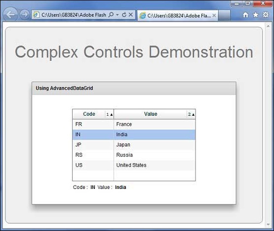
Flex AdvancedDataGrid Control Example
Let us follow the following steps to check usage of AdvancedDataGrid control in a Flex application by creating a test application −
| Step | Description |
|---|---|
| 1 | Create a project with a name HelloWorld under a package com.tutorialspoint.client as explained in the Flex - Create Application chapter. |
| 2 | Modify HelloWorld.mxml as explained below. Keep rest of the files unchanged. |
| 3 | Compile and run the application to make sure business logic is working as per the requirements. |
Following is the content of the modified mxml file src/com.tutorialspoint/HelloWorld.mxml.
<?xml version = "1.0" encoding = "utf-8"?>
<s:Application xmlns:fx = "http://ns.adobe.com/mxml/2009"
   xmlns:s = "library://ns.adobe.com/flex/spark"
   xmlns:mx = "library://ns.adobe.com/flex/mx
   width = "100%" height = "100%" minWidth = "500" minHeight = "500">

   <fx:Style source = "/com/tutorialspoint/client/Style.css" />
   <fx:Script>
      <![CDATA[
         import mx.collections.ArrayCollection;
         [Bindable]
         public var data:ArrayCollection = new ArrayCollection ([
            {value:"France", code:"FR"},
            {value:"Japan", code:"JP"},
            {value:"India", code:"IN"},
            {value:"Russia", code:"RS"},
            {value:"United States", code:"US"}
         ]);
      ]]>
   </fx:Script>

   <s:BorderContainer width = "630" height = "480" id = "mainContainer"
      styleName = "container">
      <s:VGroup width = "100%" height = "100%" gap = "50"
         horizontalAlign = "center" verticalAlign = "middle">
         <s:Label id = "lblHeader" text = "Complex Controls Demonstration"
            fontSize = "40" color = "0x777777" styleName = "heading" />

         <s:Panel id = "dataGridPanel" title = "Using DataGrid"
            width = "500" height = "300">
            <s:layout>
               <s:VerticalLayout  gap = "10" verticalAlign = "middle"
                  horizontalAlign = "center" />
            </s:layout>

            <mx:AdvancedDataGrid dataProvider = "{data}" id = "advancedDataGrid" >
               <mx:columns>
                  <mx:AdvancedDataGridColumn dataField = "code" width = "100"
                     headerText = "Code" />
                  <mx:AdvancedDataGridColumn dataField = "value" width = "200"
                     headerText = "Value" />
               </mx:columns>
            </mx:AdvancedDataGrid>

            <s:HGroup width = "60%">
               <s:Label text = "Code :" />
               <s:Label text = "{advancedDataGrid.selectedItem.code}"
                  fontWeight = "bold" />
               <s:Label text = "Value :" />
               <s:Label text = "{advancedDataGrid.selectedItem.value}"
                  fontWeight = "bold" />
            </s:HGroup>
         </s:Panel>
      </s:VGroup>
   </s:BorderContainer>
</s:Application>
Once you are ready with all the changes done, let us compile and run the application in normal mode as we did in Flex - Create Application chapter. If everything is fine with your application, it will produce the following result: [ Try it online ]