- Flex - Home
- Flex - Overview
- Flex - Environment
- Flex - Applications
- Flex - Create Application
- Flex - Deploy Application
- Flex - Life Cycle Phases
- Flex - Style with CSS
- Flex - Style with Skin
- Flex - Data Binding
- Flex - Basic Controls
- Flex - Form Controls
- Flex - Complex Controls
- Flex - Layout Panels
- Flex - Visual Effects
- Flex - Event Handling
- Flex - Custom Controls
- Flex - RPC Services
- Flex - FlexUnit Integration
- Flex - Debug Application
- Flex - Internationalization
- Flex - Printing Support
Flex - Accordian Control
Introduction
The Accordian control is a navigator container which has a collection of child containers, but only one of them at a time is visible.
Class Declaration
Following is the declaration for mx.containers.Accordian class −
public class Accordion
   extends Container
      implements IHistoryManagerClient, IFocusManagerComponent
Public Properties
| Sr.No | Property & Description |
|---|---|
| 1 | headerRenderer : IFactory A factory used to create the navigation buttons for each child. |
| 2 | historyManagementEnabled : Boolean If set to true, this property enables history management within this Accordion container. |
| 3 | resizeToContent : Boolean If set to true, this Accordion automatically resizes to the size of its current child. |
| 4 | selectedChild : INavigatorContent A reference to the currently visible child container. |
| 5 | selectedIndex : int The zero-based index of the currently visible child container. |
Protected Properties
| Sr.No | Property & Description |
|---|---|
| 1 | contentHeight : Number [read-only] The height of the area, in pixels, in which content is displayed. |
| 2 | contentWidth : Number [read-only] The width of the area, in pixels, in which content is displayed. |
Public Methods
| Sr.No | Method & Description |
|---|---|
| 1 | Accordion() Constructor. |
| 2 | getHeaderAt(index:int):Button Returns a reference to the navigator button for a child container. |
| 3 | loadState(state:Object):void Loads the state of this object. |
| 4 | saveState():Object Saves the state of this object. |
Events
| Sr.No | Event & Description |
|---|---|
| 1 | change Dispatched when the selected child container changes. |
Methods Inherited
This class inherits methods from the following classes −
- mx.core.Container
- mx.core.UIComponent
- mx.core.FlexSprite
- flash.display.Sprite
- flash.display.DisplayObjectContainer
- flash.display.InteractiveObject
- flash.display.DisplayObject
- flash.events.EventDispatcher
- Object
Flex Accordian Control Example
Let us follow the following steps to check usage of Accordian control in a Flex application by creating a test application −
| Step | Description |
|---|---|
| 1 | Create a project with a name HelloWorld under a package com.tutorialspoint.client as explained in the Flex - Create Application chapter. |
| 2 | Modify HelloWorld.mxml as explained below. Keep rest of the files unchanged. |
| 3 | Compile and run the application to make sure business logic is working as per the requirements. |
Following is the content of the modified mxml file src/com.tutorialspoint/HelloWorld.mxml.
<?xml version = "1.0" encoding = "utf-8"?>
<s:Application xmlns:fx = "http://ns.adobe.com/mxml/2009"
   xmlns:s = "library://ns.adobe.com/flex/spark"
   xmlns:mx = "library://ns.adobe.com/flex/mx
   width = "100%" height = "100%" minWidth = "500" minHeight = "500">

   <fx:Style source = "/com/tutorialspoint/client/Style.css" />
   <s:BorderContainer width = "630" height = "480" id = "mainContainer"
      styleName = "container">
      <s:VGroup width = "100%" height = "100%" gap = "50"
         horizontalAlign = "center" verticalAlign = "middle">
         <s:Label id = "lblHeader" text = "Complex Controls Demonstration"
            fontSize = "40" color = "0x777777" styleName = "heading" />

         <s:Panel id = "accordianPanel" title = "Using Accordian"
            width = "500" height = "300" >
            <s:layout>
               <s:HorizontalLayout  gap = "10" verticalAlign = "middle"
                  horizontalAlign = "center" />
            </s:layout>

            <mx:Accordion id = "accordion" width = "95%" height = "90%">
               <s:NavigatorContent label = "Section 1" width = "100%"
                  height = "100%">
                  <s:VGroup verticalAlign = "middle" horizontalAlign = "center"
                     width = "100%" height = "100%">
                     <s:Label text = "Contents for Section 1" />
                  </s:VGroup>
               </s:NavigatorContent>

               <s:NavigatorContent label = "Section 2" width = "100%"
                  height = "100%">
                  <s:VGroup verticalAlign = "middle" horizontalAlign = "center"
                     width = "100%" height = "100%">
                     <s:Label text = "Contents for Section 2" />
                  </s:VGroup>
               </s:NavigatorContent>

               <s:NavigatorContent label = "Section 3" width = "100%"
                  height = "100%">
                  <s:VGroup verticalAlign = "middle" horizontalAlign = "center"
                     width = "100%" height = "100%">
                     <s:Label text = "Contents for Section 3" />
                  </s:VGroup>
               </s:NavigatorContent>

               <s:NavigatorContent label = "Section 4" width = "100%"
                  height = "100%">
                  <s:VGroup verticalAlign = "middle" horizontalAlign = "center"
                     width = "100%" height = "100%">
                     <s:Label text = "Contents for Section 4" />
                  </s:VGroup>
               </s:NavigatorContent>
            </mx:Accordion>
         </s:Panel>
      </s:VGroup>
   </s:BorderContainer>
</s:Application>
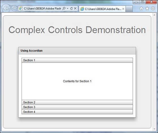
Once you are ready with all the changes done, let us compile and run the application in normal mode as we did in Flex - Create Application chapter. If everything is fine with your application, it will produce the following result: [ Try it online ]