
Article Categories
- All Categories
-
 Data Structure
-
 Networking
-
 RDBMS
RDBMS
-
 Operating System
-
 Java
Java
-
 MS Excel
-
 iOS
iOS
-
 HTML
HTML
-
 CSS
CSS
-
 Android
-
 Python
-
 C Programming
-
 C++
C++
-
 C#
C#
-
 MongoDB
-
 MySQL
MySQL
-
 Javascript
-
 PHP
PHP
-
 Economics & Finance
Creating a Customizable Modal in React JS
In this article, we will see how to make a customizable modal in React JS with multiple buttons which can be used in many types of projects like on landing pages or travel websites. A modal is a message box that is displayed on top of the screen. We can use Modals as a subscription box; we can also add animation to a Modal using CSS.
Example
First create a React project −
npx create-react-app tutorialpurpose
Go to the project directory −
cd tutorialpurpose
Download and install the react-modal package −
npm i --save react-modal
We can use this package to add simple premade modals inside any React project. It also gives you access to add default stylings.
Add the following lines of code in App.js −
import React from "react";
import Modal from "react-modal";

const customStyles = {
   content: {
      top: "50%",
      left: "50%",
      right: "auto",
      bottom: "auto",
      marginRight: "-50%",
      transform: "translate(-50%, -50%)",
   },
};

export default function App() {
   let subtitle;
   const [modalIsOpen, setIsOpen] = React.useState(false);
   function openModal() {
      //This function tell what should do when clicked open
      setIsOpen(true);
   }

   function afterOpenModal() {
      // references are now sync'd and can be accessed.
      subtitle.style.color = "#f00";
   }
   function closeModal() {
      //This function tell what should do when clicked close
      setIsOpen(false);
   }

   return (
      <div>
         <button onClick={openModal}>Open Modal</button>
         <Modal
            isOpen={modalIsOpen} //if modal is open
            onAfterOpen={afterOpenModal} //what to do after modal open
            onRequestClose={closeModal} //what to do after modal close
            style={customStyles}
            contentLabel="Example Modal">

            <h2 ref={(_subtitle) => (subtitle = _subtitle)}>Hello</h2>
            <button onClick={closeModal}>close</button>
            <div>I am a modal</div>
            <form>
               <input />
               <button>tab navigation</button>
               <button>stays</button>
               <button>inside</button>
               <button>the modal</button>
            </form>
         </Modal>
      </div>
   );
}
Explanation
The concept is simple. On clicking the button, the state changes to true and when it is true, the modal opens. On the modal, there is button, clicking on which changes the state to false and it closes the modal.
We also added simple styling and a set of buttons on the modal for different functionalities.
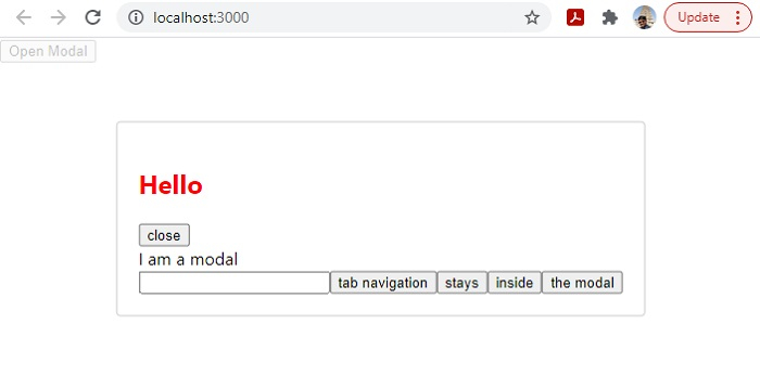
Output
On execution, it will produce the following output −

679 Views
