
Article Categories
- All Categories
-
 Data Structure
-
 Networking
-
 RDBMS
RDBMS
-
 Operating System
-
 Java
Java
-
 MS Excel
-
 iOS
iOS
-
 HTML
HTML
-
 CSS
CSS
-
 Android
-
 Python
-
 C Programming
-
 C++
C++
-
 C#
C#
-
 MongoDB
-
 MySQL
MySQL
-
 Javascript
-
 PHP
PHP
-
 Economics & Finance
Selected Reading
Bold font weight for LaTeX axes label in Matplotlib
To make bold font weight LaTeX axes labels in Matplotlib, you can use LaTeX formatting with the \bf{} command. This technique allows you to create bold tick labels on both x and y axes.
Steps to Create Bold LaTeX Axes Labels
- Create x and y data points using NumPy
- Use
subplot()method to add a subplot to the current figure - Set x and y ticks with data points using
set_xticks()andset_yticks()methods - Plot the data using
plot()method - Apply LaTeX formatting with
\bf{}for bold font weight in tick labels - Display the figure using
show()method
Example
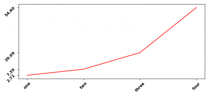
Here's a complete example showing how to create bold LaTeX tick labels ?
import numpy as np
from matplotlib import pyplot as plt

# Set figure properties
plt.rcParams["figure.figsize"] = [7.50, 3.50]
plt.rcParams["figure.autolayout"] = True

# Create data
x = np.array([1, 2, 3, 4])
y = np.exp(x)

# Create subplot
ax1 = plt.subplot()

# Set ticks
ax1.set_xticks(x)
ax1.set_yticks(y)

# Plot data
ax1.plot(x, y, c="red", linewidth=2, marker='o')

# Set bold LaTeX tick labels for x-axis
ax1.set_xticklabels(["$\bf{one}$", "$\bf{two}$", "$\bf{three}$",
                     "$\bf{four}$"], rotation=45)

# Set bold LaTeX tick labels for y-axis with formatted values
ax1.set_yticklabels(["$\bf{%.2f}$" % y[0], "$\bf{%.2f}$" % y[1],
                     "$\bf{%.2f}$" % y[2], "$\bf{%.2f}$" % y[3]], rotation=45)

# Add labels
plt.xlabel("$\bf{X Values}$", fontsize=12)
plt.ylabel("$\bf{Y Values}$", fontsize=12)
plt.title("$\bf{Bold LaTeX Axes Labels}$", fontsize=14)

plt.tight_layout()
plt.show()
Key LaTeX Commands
The following LaTeX formatting options are useful for bold text ?
-
\bf{text}− Makes text bold -
\mathbf{text}− Alternative bold formatting for mathematical text -
\textbf{text}− Bold formatting for regular text in LaTeX
Alternative Approach with set_xlabel and set_ylabel
You can also apply bold formatting directly to axis labels ?
import numpy as np
import matplotlib.pyplot as plt

x = np.linspace(0, 10, 100)
y = np.sin(x)

plt.figure(figsize=(8, 4))
plt.plot(x, y, 'b-', linewidth=2)

# Bold axis labels using LaTeX
plt.xlabel(r'$\bf{Time \ (seconds)}$', fontsize=12)
plt.ylabel(r'$\bf{Amplitude}$', fontsize=12)
plt.title(r'$\bf{Sine \ Wave \ with \ Bold \ Labels}$', fontsize=14)

plt.grid(True, alpha=0.3)
plt.tight_layout()
plt.show()
Output
Conclusion
Use LaTeX formatting with \bf{} command to create bold axes labels in Matplotlib. This approach works for both tick labels and axis titles, giving you professional-looking plots with emphasized text elements.

Updated on: 2026-03-25T20:10:58+05:30
3K+ Views

Advertisements