
Article Categories
- All Categories
-
 Data Structure
-
 Networking
-
 RDBMS
RDBMS
-
 Operating System
-
 Java
Java
-
 MS Excel
-
 iOS
iOS
-
 HTML
HTML
-
 CSS
CSS
-
 Android
-
 Python
-
 C Programming
-
 C++
C++
-
 C#
C#
-
 MongoDB
-
 MySQL
MySQL
-
 Javascript
-
 PHP
PHP
-
 Economics & Finance
Selected Reading
How to label and change the scale of a Seaborn kdeplot's axes? (Matplotlib)
To label and change the scale of a Seaborn kdeplot's axes, we can customize both the axis labels and scale using matplotlib functions. This is useful for creating more informative and professionally formatted density plots.
Basic Steps
- Set the figure size and adjust the padding between and around the subplots
- Create random data points using numpy
- Plot Kernel Density Estimate (KDE) using kdeplot() method
- Set axis scale and labels using matplotlib functions
- Display the figure using show() method
Example
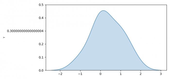
Here's how to create a KDE plot with customized axis labels and scale ?
import numpy as np
import seaborn as sns
from matplotlib import pyplot as plt

plt.rcParams["figure.figsize"] = [7.50, 3.50]
plt.rcParams["figure.autolayout"] = True

# Generate random data
data = np.random.randn(100)

# Create KDE plot
k = sns.kdeplot(x=data, fill=True)

# Customize Y-axis
plt.yticks(k.get_yticks(), [f'{tick:.2f}' for tick in k.get_yticks()])
plt.ylabel('Density', fontsize=12)

# Customize X-axis
plt.xlabel('Value', fontsize=12)

plt.show()
Advanced Customization
You can further customize the plot with different scales and formatting ?
import numpy as np
import seaborn as sns
from matplotlib import pyplot as plt

plt.rcParams["figure.figsize"] = [8.00, 4.00]
plt.rcParams["figure.autolayout"] = True

# Generate sample data
data = np.random.exponential(2, 200)

# Create KDE plot
ax = sns.kdeplot(x=data, fill=True, color='skyblue')

# Set logarithmic scale for x-axis
ax.set_xscale('log')

# Customize labels
ax.set_xlabel('Log Scale Values', fontsize=12, fontweight='bold')
ax.set_ylabel('Density', fontsize=12, fontweight='bold')
ax.set_title('KDE Plot with Logarithmic Scale', fontsize=14)

# Format tick labels
ax.tick_params(axis='both', labelsize=10)

plt.show()
Key Parameters
| Function | Purpose | Example |
|---|---|---|
set_xlabel() |
Set X-axis label | ax.set_xlabel('Values') |
set_ylabel() |
Set Y-axis label | ax.set_ylabel('Density') |
set_xscale() |
Set X-axis scale | ax.set_xscale('log') |
tick_params() |
Format tick appearance | ax.tick_params(labelsize=10) |
Output
Conclusion
Use matplotlib functions like set_xlabel(), set_ylabel(), and set_xscale() to customize Seaborn KDE plot axes. This allows for better data presentation and improved plot readability.

Updated on: 2026-03-25T22:34:11+05:30
2K+ Views

Advertisements