- JSF Tutorial
- JSF - Home
- JSF - Overview
- JSF - Environment Setup
- JSF - Architecture
- JSF - Life Cycle
- JSF - First Application
- JSF - Managed Beans
- JSF - Page Navigation
- JSF - Basic Tags
- JSF - Facelet Tags
- JSF - Convertor Tags
- JSF - Validator Tags
- JSF - DataTable
- JSF - Composite Components
- JSF - Ajax
- JSF - Event Handling
- JSF - JDBC Integration
- JSF - Spring Integration
- JSF - Expression Language
- JSF - Internationalization
- JSF Useful Resources
- JSF - Quick Guide
- JSF - Useful Resources
- JSF - Discussion
JSF - h:messages
The h:messages tag shows all the messages at one place corresponding to UI elements.
JSF Tag
<h:messages style = "color:red;margin:8px;" />
Rendered Output
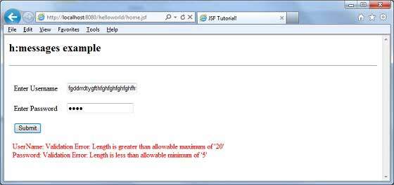
Case: Username entered is more than 20 characters and password entered is less than 5 characters.
<ul style = "color:red;margin:8px;">
   <li> UserName: Validation Error:
      Length is greater than allowable maximum of '20' </li>
   <li> Password: Validation Error:
      Length is less than allowable minimum of '5' </li>
</ul>
Tag Attributes
| S.No | Attribute & Description |
|---|---|
| 1 | id Identifier for a component |
| 2 | binding Reference to the component that can be used in a backing bean |
| 3 | rendered A boolean; false suppresses rendering |
| 4 | styleClass Cascading stylesheet (CSS) class name |
| 5 | for The ID of the component whose message is displayed, applicable only to h:message |
| 6 | errorClass CSS class applied to error messages |
| 7 | errorStyle CSS style applied to error messages |
| 8 | fatalClass CSS class applied to fatal messages |
| 9 | fatalStyle CSS style applied to fatal messages |
| 10 | globalOnly Instruction to display only global messages, applicable only to h:messages. Default: false |
| 11 | infoClass CSS class applied to information messages |
| 12 | infoStyle CSS style applied to information messages |
| 13 | layout Specification for message layout: table or list, applicable only to h:messages |
| 14 | showDetail A boolean that determines whether message details are shown. Defaults are false for h:messages, true for h:message |
| 15 | showSummary A boolean that determines whether message summaries are shown. Defaults are true for h:messages, false for h:message |
| 16 | tooltip A boolean that determines whether message details are rendered in a tooltip; the tooltip is only rendered if showDetail and showSummary are true |
| 17 | warnClass CSS class for warning messages |
| 18 | warnStyle CSS style for warning messages |
| 19 | style Inline style information |
| 20 | title A title, used for accessibility, that describes an element. Visual browsers typically create tooltips for the title’s value |
Example Application
Let us create a test JSF application to test the above tag.
| Step | Description |
|---|---|
| 1 | Create a project with a name helloworld under a package com.tutorialspoint.test as explained in the JSF - First Application chapter. |
| 2 | Modify home.xhtml as explained below. Keep rest of the files unchanged. |
| 3 | Compile and run the application to make sure business logic is working as per the requirements. |
| 4 | Finally, build the application in the form of war file and deploy it in Apache Tomcat Webserver. |
| 5 | Launch your web application using appropriate URL as explained below in the last step. |
home.xhtml
<!DOCTYPE html PUBLIC "-//W3C//DTD XHTML 1.0 Transitional//EN"
   "http://www.w3.org/TR/xhtml1/DTD/xhtml1-transitional.dtd">

<html xmlns = "http://www.w3.org/1999/xhtml">
   <head>
      <title>JSF Tutorial!</title>
   </head>

   <body>
      <h2>h:messages example</h2>
      <hr />

      <h:form>
         <h:panelGrid id = "panel" columns = "2" border = "0" cellpadding = "10"
         cellspacing = "1">
            <h:outputLabel value = "Enter Username" />

            <h:inputText  id = "username"  size = "20" label = "UserName"
               required = "true">
               <f:validateLength for = "username" minimum = "5" maximum = "20" />
            </h:inputText>
            <h:outputLabel value = "Enter Password" />

            <h:inputSecret id = "password" size = "20" label = "Password"
               required = "true" redisplay = "true" >
               <f:validateLength for = "password" minimum = "5" maximum = "10" />
            </h:inputSecret>
            <h:commandButton id = "submit" value = "Submit" action = "result"/>
         </h:panelGrid>
         <h:messages style = "color:red;margin:8px;" />
      </h:form>

   </body>
</html>
Once you are ready with all the changes done, let us compile and run the application as we did in JSF - First Application chapter. If everything is fine with your application, this will produce following result: