- XGBoost - Home
- XGBoost - Overview
- XGBoost - Architecture
- XGBoost - Installation
- XGBoost - Hyper-parameters
- XGBoost - Tuning with Hyper-parameters
- XGBoost - Using DMatrix
- XGBoost - Classification
- XGBoost - Regressor
- XGBoost - Regularization
- XGBoost - Learning to Rank
- XGBoost - Over-fitting Control
- XGBoost - Quantile Regression
- XGBoost - Bootstrapping Approach
- XGBoost - Python Implementation
- XGBoost vs Other Boosting Algorithms
- XGBoost Useful Resources
- XGBoost - Quick Guide
- XGBoost - Useful Resources
- XGBoost - Discussion
XGBoost - Quantile Regression
XGBoost is used to predict one primary value at a time, like the average of all possible outcomes. At times, we try to understand every possibility, including the worst-case and best-case situations. This is how Quantile Regression is used.
This is how quantile loss functions are used to train independent XGBoost models. For example- you can train models for the 0.05, 0.5, and 0.95 quantiles to get the lower and upper bounds of the prediction interval.
Because of quantile regression, we can predict other points in the data, or "quantiles," in addition to the mean (average). As an example: 10th percentile (a poor outcome), 50th percentile (average outcome), and 90th percentile (acceptable outcome).
How does Quantile Regression work in XGBoost?
XGBoost regularly reduces errors by focusing its predictions on average. When we use XGBoost combined with Quantile Regression, we adjust the error measurement. Rather than focusing on total errors, we highlight the gap between specific quantiles and predictions.
In simple terms, using Quantile Regression with XGBoost −
It predicts a value for a given percentile.
For a number of cases, we can calculate possible outcomes (bad, average, and good).
For example, this can be useful when creating strategies for both the best and worst case scenarios when it comes to financial estimates.
Quantile Regression with XGBoost
We will import the required libraries to build quantile regression with the help of XGBoost to produce prediction intervals.
import xgboost as xgb
import numpy as np
import matplotlib.pyplot as plt
For training and testing, targets and features are generated from random distributions with the help of synthetic data.
# Generate synthetic data
np.random.seed(42)
X_train = np.random.rand(100, 10)
y_train = np.random.rand(100)
X_test = np.random.rand(20, 10)
To calculate the gradient and Hessian needed to satisfy the XGBoost regressor's objective, a customized quantile loss function is created. Three different quantiles are used to train the models- 0.05, 0.5 (median), and 0.95. These quantiles relate to the lower, median, and upper boundaries of the prediction interval, respectively. After training, each quantile makes predictions on the test set.
def quantile_loss(quantile_value):
   def loss(true_values, predicted_values):
      error = true_values - predicted_values
      gradient = np.where(error > 0, quantile_value, quantile_value - 1)
      # Hessian is constant
      hessian = np.ones_like(error)
      return gradient, hessian
   return loss

quantile_levels = [0.05, 0.5, 0.95]
regression_models = {}

for quantile in quantile_levels:
   regressor = xgb.XGBRegressor(objective=quantile_loss(quantile))
   regressor.fit(X_train, y_train)
   regression_models[quantile] = regressor

# Predicting quantiles
predictions_05 = regression_models[0.05].predict(X_test)
predictions_50 = regression_models[0.5].predict(X_test)
predictions_95 = regression_models[0.95].predict(X_test)

# Lower and upper bounds
lower_prediction = predictions_05
upper_prediction = predictions_95
median_prediction = predictions_50
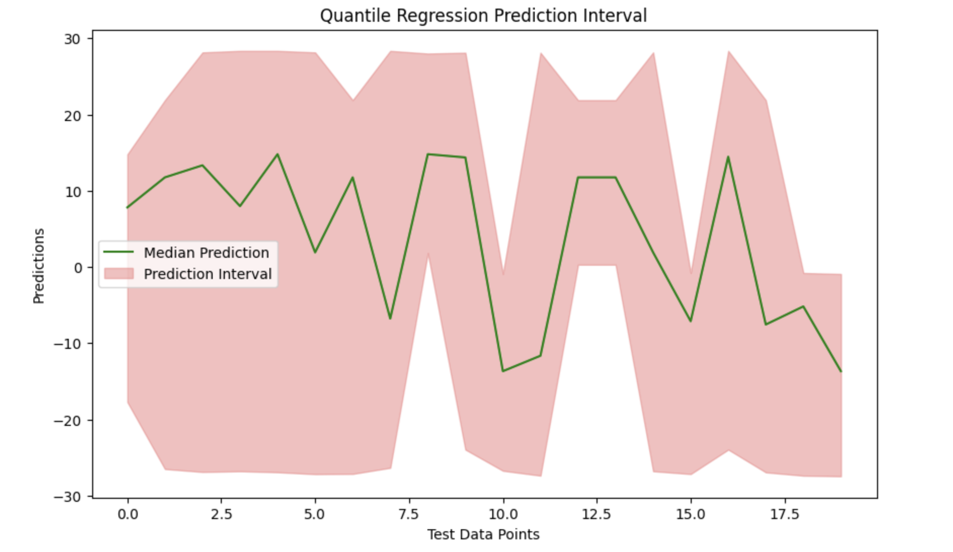
We can see the data and effectively display the prediction interval around the median predictions by plotting the median prediction and filling the gap between the lower and upper boundaries.
# Visualization
plt.figure(figsize=(10, 6))
plt.plot(median_prediction, label='Median Prediction', color='green')
plt.fill_between(range(len(median_prediction)), lower_prediction, upper_prediction, color='lightcoral', alpha=0.5, label='Prediction Interval')
plt.title('Quantile Regression Prediction Interval')
plt.xlabel('Test Data Points')
plt.ylabel('Predictions')
plt.legend()
plt.show()
Output
Here is the outcome of the above model −