- Less - Nested Rules
- Less - Nested Directives and Bubbling
- Less - Operations
- Less - Escaping
- Less - Functions
- Less - Namespaces and Accessors
- Less - Scope
- Less - Comments
- Less - Importing
- Less - Variables
- Less - Extend
- Less - Mixins
- Less - Parametric Mixins
- Less - Mixins as Functions
- Less - Passing Rulesets to Mixins
- Less - Import Directives
- Less - Import Options
- Less - Mixin Guards
- Less - CSS Guards
- Less - Loops
- Less - Merge
- Less - Parent Selectors
- Functions
- Less - Misc Functions
- Less - String Functions
- Less - List Functions
- Less - Math Functions
- Less - Type Functions
- Less - Color Defination Functions
- Less - Color Channel Functions
- Less - Color Operation
- Less - Color Blending Functions
- Usage
- Less - Command Line Usage
- Using Less In The Browser
- Less - Browser support
- Less - Plugins
- Less - Programmatic Usage
- Less - Online Compilers
- Less - GUIs
- Less - Editors and Plugins
- Less - Third Party Compilers
- Less - Frameworks
- Less Useful Resources
- Less - Quick Guide
- Less - Cheatsheet
- Less - Useful Resources
- Less - Discussion
LESS - Mixins
Mixins are similar to functions in programming languages. Mixins are a group of CSS properties that allow you to use properties of one class for another class and includes class name as its properties. In LESS, you can declare a mixin in the same way as CSS style using class or id selector. It can store multiple values and can be reused in the code whenever necessary.
The following table demonstrates the use of LESS mixins in detail.
| Sr.No. | Mixins usage & Description |
|---|---|
| 1 | Not Outputting the Mixin
Mixins can be made to disappear in the output by simply placing the parentheses after it. |
| 2 | Selectors in Mixins
The mixins can contain not just properties, but they can contain selectors too. |
| 3 | Namespaces
Namespaces are used to group the mixins under a common name. |
| 4 | Guarded Namespaces
When guard is applied to namespace, mixins defined by it are used only when the guard condition returns true. |
| 5 | The !important keyword
The !important keyword is used to override the particular property. |
Example
The following example demonstrates the use of mixins in the LESS file −
<html>
   <head>
      <link rel = "stylesheet" href = "style.css" type = "text/css" />
      <title>LESS Mixins</title>
   </head>

   <body>
      <h1>Welcome to Tutorialspoint</h1>
      <p class = "p1">LESS is a CSS pre-processor that enables customizable,
      manageable and reusable style sheet for web site.</p>
      <p class = "p2">LESS is a dynamic style sheet language that extends the capability of CSS.</p>
      <p class = "p3">LESS is cross browser friendly.</p>
   </body>
</html>
Next, create the style.less file.
style.less
.p1 {
   color:red;
}

.p2 {
   background : #64d9c0;
   .p1();
}

.p3 {
   background : #LESS520;
  .p1;
}
You can compile the style.less to style.css by using the following command −
lessc style.less style.css
Execute the above command; it will create the style.css file automatically with the following code −
style.css
.p1 {
   color: red;
}

.p2 {
   background: #64d9c0;
   color: red;
}

.p3 {
   background: #LESS520;
   color: red;
}
Output
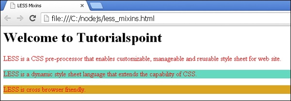
Follow these steps to see how the above code works −
Save the above html code in the less_mixins.html file.
Open this HTML file in a browser, the following output will get displayed.
The parentheses are optional when calling mixins. In the above example, both statements .p1(); and .p1; do the same thing.