- Matplotlib - Home
- Matplotlib - Introduction
- Matplotlib - Vs Seaborn
- Matplotlib - Environment Setup
- Matplotlib - Anaconda distribution
- Matplotlib - Jupyter Notebook
- Matplotlib - Pyplot API
- Matplotlib - Simple Plot
- Matplotlib - Saving Figures
- Matplotlib - Markers
- Matplotlib - Figures
- Matplotlib - Styles
- Matplotlib - Legends
- Matplotlib - Colors
- Matplotlib - Colormaps
- Matplotlib - Colormap Normalization
- Matplotlib - Choosing Colormaps
- Matplotlib - Colorbars
- Matplotlib - Working With Text
- Matplotlib - Text properties
- Matplotlib - Subplot Titles
- Matplotlib - Images
- Matplotlib - Image Masking
- Matplotlib - Annotations
- Matplotlib - Arrows
- Matplotlib - Fonts
- Matplotlib - Font Indexing
- Matplotlib - Font Properties
- Matplotlib - Scales
- Matplotlib - LaTeX
- Matplotlib - LaTeX Text Formatting in Annotations
- Matplotlib - PostScript
- Matplotlib - Mathematical Expressions
- Matplotlib - Animations
- Matplotlib - Celluloid Library
- Matplotlib - Blitting
- Matplotlib - Toolkits
- Matplotlib - Artists
- Matplotlib - Styling with Cycler
- Matplotlib - Paths
- Matplotlib - Path Effects
- Matplotlib - Transforms
- Matplotlib - Ticks and Tick Labels
- Matplotlib - Radian Ticks
- Matplotlib - Dateticks
- Matplotlib - Tick Formatters
- Matplotlib - Tick Locators
- Matplotlib - Basic Units
- Matplotlib - Autoscaling
- Matplotlib - Reverse Axes
- Matplotlib - Logarithmic Axes
- Matplotlib - Symlog
- Matplotlib - Unit Handling
- Matplotlib - Ellipse with Units
- Matplotlib - Spines
- Matplotlib - Axis Ranges
- Matplotlib - Axis Scales
- Matplotlib - Axis Ticks
- Matplotlib - Formatting Axes
- Matplotlib - Axes Class
- Matplotlib - Twin Axes
- Matplotlib - Figure Class
- Matplotlib - Multiplots
- Matplotlib - Grids
- Matplotlib - Object-oriented Interface
- Matplotlib - PyLab module
- Matplotlib - Subplots() Function
- Matplotlib - Subplot2grid() Function
- Matplotlib - Anchored Artists
- Matplotlib - Manual Contour
- Matplotlib - Coords Report
- Matplotlib - AGG filter
- Matplotlib - Ribbon Box
- Matplotlib - Fill Spiral
- Matplotlib - Findobj Method
- Matplotlib - Hyperlinks
- Matplotlib - Image Thumbnail
- Matplotlib - Plotting with Keywords
- Matplotlib - Create Logo
- Matplotlib - Multipage PDF
- Matplotlib - Multiprocessing
- Matplotlib - Print Stdout
- Matplotlib - Compound Path
- Matplotlib - Sankey Class
- Matplotlib - MRI with EEG
- Matplotlib - Stylesheets
- Matplotlib - Background Colors
- Matplotlib - Basemap
Matplotlib Events
- Matplotlib - Event Handling
- Matplotlib - Close Event
- Matplotlib - Mouse Move
- Matplotlib - Click Events
- Matplotlib - Scroll Event
- Matplotlib - Keypress Event
- Matplotlib - Pick Event
- Matplotlib - Looking Glass
- Matplotlib - Path Editor
- Matplotlib - Poly Editor
- Matplotlib - Timers
- Matplotlib - Viewlims
- Matplotlib - Zoom Window
Matplotlib Widgets
- Matplotlib - Cursor Widget
- Matplotlib - Annotated Cursor
- Matplotlib - Button Widget
- Matplotlib - Check Buttons
- Matplotlib - Lasso Selector
- Matplotlib - Menu Widget
- Matplotlib - Mouse Cursor
- Matplotlib - Multicursor
- Matplotlib - Polygon Selector
- Matplotlib - Radio Buttons
- Matplotlib - RangeSlider
- Matplotlib - Rectangle Selector
- Matplotlib - Ellipse Selector
- Matplotlib - Slider Widget
- Matplotlib - Span Selector
- Matplotlib - Textbox
Matplotlib Plotting
- Matplotlib - Line Plots
- Matplotlib - Area Plots
- Matplotlib - Bar Graphs
- Matplotlib - Histogram
- Matplotlib - Pie Chart
- Matplotlib - Scatter Plot
- Matplotlib - Box Plot
- Matplotlib - Arrow Demo
- Matplotlib - Fancy Boxes
- Matplotlib - Zorder Demo
- Matplotlib - Hatch Demo
- Matplotlib - Mmh Donuts
- Matplotlib - Ellipse Demo
- Matplotlib - Bezier Curve
- Matplotlib - Bubble Plots
- Matplotlib - Stacked Plots
- Matplotlib - Table Charts
- Matplotlib - Polar Charts
- Matplotlib - Hexagonal bin Plots
- Matplotlib - Violin Plot
- Matplotlib - Event Plot
- Matplotlib - Heatmap
- Matplotlib - Stairs Plots
- Matplotlib - Errorbar
- Matplotlib - Hinton Diagram
- Matplotlib - Contour Plot
- Matplotlib - Wireframe Plots
- Matplotlib - Surface Plots
- Matplotlib - Triangulations
- Matplotlib - Stream plot
- Matplotlib - Ishikawa Diagram
- Matplotlib - 3D Plotting
- Matplotlib - 3D Lines
- Matplotlib - 3D Scatter Plots
- Matplotlib - 3D Contour Plot
- Matplotlib - 3D Bar Plots
- Matplotlib - 3D Wireframe Plot
- Matplotlib - 3D Surface Plot
- Matplotlib - 3D Vignettes
- Matplotlib - 3D Volumes
- Matplotlib - 3D Voxels
- Matplotlib - Time Plots and Signals
- Matplotlib - Filled Plots
- Matplotlib - Step Plots
- Matplotlib - XKCD Style
- Matplotlib - Quiver Plot
- Matplotlib - Stem Plots
- Matplotlib - Visualizing Vectors
- Matplotlib - Audio Visualization
- Matplotlib - Audio Processing
Matplotlib Useful Resources
- Matplotlib - Quick Guide
- Matplotlib - Cheatsheet
- Matplotlib - Useful Resources
- Matplotlib - Discussion
Matplotlib vs SeaBorn
Matplotlib and Seaborn are both powerful Python libraries used for data visualization but they have different strengths that are suited for different purposes.
What is Matplotlib?
Matplotlib is a comprehensive and widely used Python library for creating static, interactive and publication-quality visualizations. It provides a versatile toolkit for generating various types of plots and charts which makes it an essential tool for data scientists, researchers, engineers and analysts. The following are the features of the matplotlib library.
Core Library
Matplotlib is the foundational library for plotting in Python. It provides low-level control over visualizations by allowing users to create a wide variety of plots from basic to highly customize.
Customization
It offers extensive customization options by allowing users to control every aspect of a plot. This level of control can sometimes result in more code for creating complex plots.
Basic Plotting
While it's highly flexible for creating certain complex plots might require more effort and code compared to specialized libraries like Seaborn.
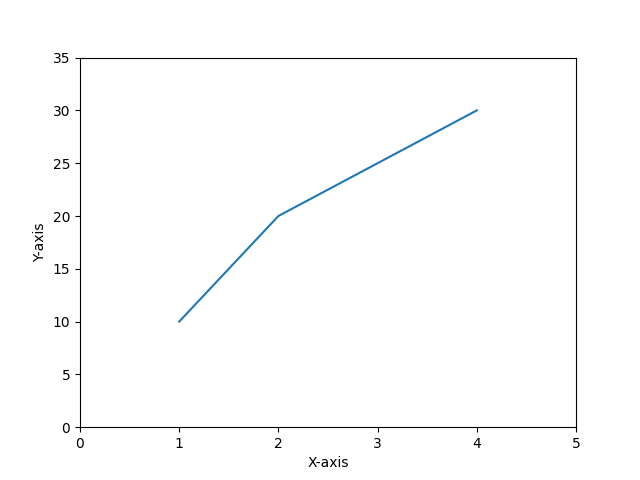
Simple plot by matplotlib
The following is the simple line plot created by using the matplotlib lbrary pyplot module.
Example - Usage of matplotlib
import matplotlib.pyplot as plt
# Creating a plot
plt.plot([1, 2, 3, 4], [10, 20, 25, 30])

# Customizing axis limits and labels
plt.xlim(0, 5)
plt.ylim(0, 35)
plt.xlabel('X-axis')
plt.ylabel('Y-axis')
plt.show()
Output
What is Seaborn?
Seaborn is a Python data visualization library that operates as an abstraction layer over Matplotlib. It's designed to create visually appealing and informative statistical graphics, simplifying the process of generating complex visualizations from data. The following are the key features of the seaborn library.
Statistical Data Visualization
Seaborn is built on top of Matplotlib and is particularly well-suited for statistical data visualization. It simplifies the process of creating complex plots by providing high-level abstractions.
Default Aesthetics
Seaborn comes with attractive default styles and color palettes that make plots aesthetically pleasing with minimal effort.
Specialized Plots
It specializes in certain types of plots like violin plots, box plots, pair plots and more which are easier to create in Seaborn compared to Matplotlib.
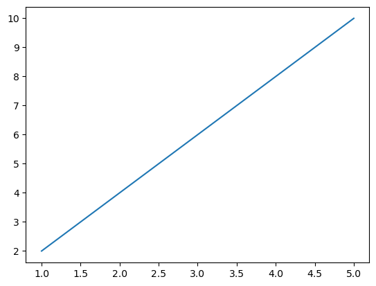
Basic seaborn plot
The following is the basic seaborn line plot.
Example
import seaborn as sns
import matplotlib.pyplot as plt

# Sample data
x_values = [1, 2, 3, 4, 5]
y_values = [2, 4, 6, 8, 10]

# Creating a line plot using Seaborn
sns.lineplot(x=x_values, y=y_values)
plt.show()
Output
| Matplotlib | Seaborn | |
|---|---|---|
| Level of Abstraction | Matplotlib is more low-level and requires more code for customizations. |
Seaborn abstracts some complexities by enabling easier creation of complex statistical plots. |
| Default Styles |
Matplotlib doesnt have better default styles and color palettes when compared to seaborn. |
Seaborn has better default styles and color palettes by making its plots visually appealing without much customization. |
| Specialized Plots | Matplotlib require more effort to plot certain plots readily. |
Seaborn offers certain types of plots that are not readily available or require more effort in Matplotlib. |
| When to use each library | We can use this library when we need fine-grained control over the appearance of our plots or when creating non-standard plots that may not be available in other libraries. |
We can use this library when working with statistical data especially for quick exploration and visualization of distributions, relationships and categories within the data. Seaborn's high-level abstractions and default styles make it convenient for this purpose. |
Both libraries are valuable in their own way and sometimes they can be used together to combine the strengths of both for advanced visualization tasks.
