
Article Categories
- All Categories
-
 Data Structure
-
 Networking
-
 RDBMS
RDBMS
-
 Operating System
-
 Java
Java
-
 MS Excel
-
 iOS
iOS
-
 HTML
HTML
-
 CSS
CSS
-
 Android
-
 Python
-
 C Programming
-
 C++
C++
-
 C#
C#
-
 MongoDB
-
 MySQL
MySQL
-
 Javascript
-
 PHP
PHP
-
 Economics & Finance
Selected Reading
Show decimal places and scientific notation on the axis of a Matplotlib plot
To show decimal places and scientific notation on the axis of a matplotlib, we can use scalar formatter by overriding _set_format() method.
Steps
Create x and y data points using numpy.
Plot x and y using plot() method.
Using gca() method, get the current axis.
Instantiate the format tick values as a number class, i.e., ScalarFormatter.
Set size thresholds for scientific notation, using set_powerlimits((0, 0)) method.
Using set_major_formatter() method, set the formatter of the major ticker.
To display the figure, use show() method.
Example
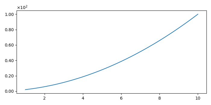
import numpy as np
from matplotlib.ticker import ScalarFormatter
from matplotlib import pyplot as plt
plt.rcParams["figure.figsize"] = [7.00, 3.50]
plt.rcParams["figure.autolayout"] = True

class ScalarFormatterClass(ScalarFormatter):
   def _set_format(self):
      self.format = "%1.2f"

x = np.linspace(1, 10)
y = np.linspace(2,10)
y = x * y
plt.plot(x, y)
ax = plt.gca()
yScalarFormatter = ScalarFormatterClass(useMathText=True)
yScalarFormatter.set_powerlimits((0,0))
ax.yaxis.set_major_formatter(yScalarFormatter)
plt.show()
Output

Updated on: 2021-05-08T09:06:19+05:30
8K+ Views

Advertisements