- Python XlsxWriter - Home
- Python XlsxWriter - Overview
- Python XlsxWriter - Environment Setup
- Python XlsxWriter - Hello World
- Python XlsxWriter - Important classes
- Python XlsxWriter - Cell Notation & Ranges
- Python XlsxWriter - Defined Names
- Python XlsxWriter - Formula & Function
- Python XlsxWriter - Date and Time
- Python XlsxWriter - Tables
- Python XlsxWriter - Applying Filter
- Python XlsxWriter - Fonts & Colors
- Python XlsxWriter - Number Formats
- Python XlsxWriter - Border
- Python XlsxWriter - Hyperlinks
- Python XlsxWriter - Conditional Formatting
- Python XlsxWriter - Adding Charts
- Python XlsxWriter - Chart Formatting
- Python XlsxWriter - Chart Legends
- Python XlsxWriter - Bar Chart
- Python XlsxWriter - Line Chart
- Python XlsxWriter - Pie Chart
- Python XlsxWriter - Sparklines
- Python XlsxWriter - Data Validation
- Python XlsxWriter - Outlines & Grouping
- Python XlsxWriter - Freeze & Split Panes
- Python XlsxWriter - Hide/Protect Worksheet
- Python XlsxWriter - Textbox
- Python XlsxWriter - Insert Image
- Python XlsxWriter - Page Setup
- Python XlsxWriter - Header & Footer
- Python XlsxWriter - Cell Comments
- Python XlsxWriter - Working with Pandas
- Python XlsxWriter - VBA Macro
Python XlsxWriter - Pie Chart
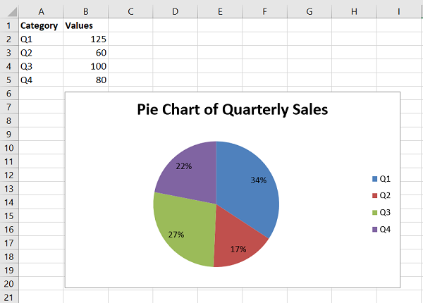
A pie chart is a representation of a single data series into a circle, which is divided into slices corresponding to each data item in the series. In a pie chart, the arc length of each slice is proportional to the quantity it represents. In the following worksheet, quarterly sales figures of a product are displayed in the form of a pie chart.
Working with XlsxWriter Pie Chart
To generate the above chart programmatically using XlsxWriter, we first write the following data in the worksheet.
headings = ['Category', 'Values']
data = [
   ['Q1', 'Q2', 'Q3', 'Q4'],
   [125, 60, 100, 80],
]
worksheet.write_row('A1', headings, bold)
worksheet.write_column('A2', data[0])
worksheet.write_column('B2', data[1])
A Chart object with type=pie is declared and the cell range B1:D1 is used as value parameter for add_series() method and the quarters (Q1, Q2, Q3 and Q4) in column A are the categories.
chart1.add_series({
   'name': 'Quarterly sales data',
   'categories': ['Sheet1', 1, 0, 4, 0],
   'values': ['Sheet1', 1, 1, 4, 1],
})
chart1.set_title({'name': 'Pie Chart of Quarterly Sales'})
In the pie chart, we can use data_labels property to represent the percent value of each pie by setting percentage=True.
Example
The complete program for pie chart generation is as follows −
import xlsxwriter

wb = xlsxwriter.Workbook('hello.xlsx')
worksheet = wb.add_worksheet()

headings = ['Category', 'Values']
data = [
   ['Q1', 'Q2', 'Q3', 'Q4'],
   [125, 60, 100, 80],
]
bold=wb.add_format({'bold':True})
worksheet.write_row('A1', headings, bold)
worksheet.write_column('A2', data[0])
worksheet.write_column('B2', data[1])

chart1 = wb.add_chart({'type': 'pie'})
chart1.add_series({
   'name': 'Quarterly sales data',
   'categories': ['Sheet1', 1, 0, 4, 0],
   'values': ['Sheet1', 1, 1, 4, 1],
   'data_labels': {'percentage':True},
})
chart1.set_title({'name': 'Pie Chart of Quarterly Sales'})

worksheet.insert_chart('D2', chart1)

wb.close()
Output
Have a look at the pie chart that the above program produces.
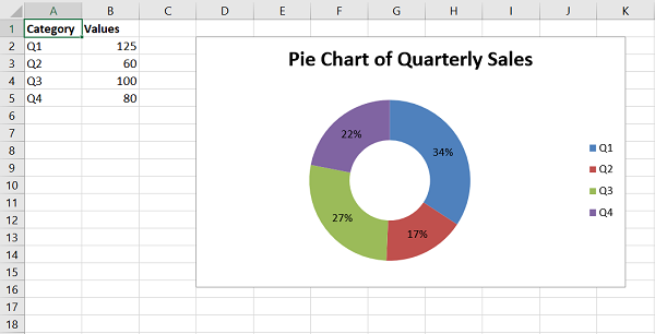
Doughnut Chart
The doughnut chart is a variant of the pie chart, with a hole in its center, and it displays categories as arcs rather than slices. Both make part-to-whole relationships easy to grasp at a glance. Just change the chart type to doughnut.
chart1 = workbook.add_chart({'type': 'doughnut'})
The doughnut chart of the data in above example appears as below −