- Python XlsxWriter - Home
- Python XlsxWriter - Overview
- Python XlsxWriter - Environment Setup
- Python XlsxWriter - Hello World
- Python XlsxWriter - Important classes
- Python XlsxWriter - Cell Notation & Ranges
- Python XlsxWriter - Defined Names
- Python XlsxWriter - Formula & Function
- Python XlsxWriter - Date and Time
- Python XlsxWriter - Tables
- Python XlsxWriter - Applying Filter
- Python XlsxWriter - Fonts & Colors
- Python XlsxWriter - Number Formats
- Python XlsxWriter - Border
- Python XlsxWriter - Hyperlinks
- Python XlsxWriter - Conditional Formatting
- Python XlsxWriter - Adding Charts
- Python XlsxWriter - Chart Formatting
- Python XlsxWriter - Chart Legends
- Python XlsxWriter - Bar Chart
- Python XlsxWriter - Line Chart
- Python XlsxWriter - Pie Chart
- Python XlsxWriter - Sparklines
- Python XlsxWriter - Data Validation
- Python XlsxWriter - Outlines & Grouping
- Python XlsxWriter - Freeze & Split Panes
- Python XlsxWriter - Hide/Protect Worksheet
- Python XlsxWriter - Textbox
- Python XlsxWriter - Insert Image
- Python XlsxWriter - Page Setup
- Python XlsxWriter - Header & Footer
- Python XlsxWriter - Cell Comments
- Python XlsxWriter - Working with Pandas
- Python XlsxWriter - VBA Macro
Python XlsxWriter - Adding Charts
One of the most important features of Excel is its ability to convert data into chart. A chart is a visual representation of data. Different types of charts can be generated from the Chart menu.
To generate charts programmatically, XlsxWriter library has a Chart class. Its object is obtained by calling add_chart() method of the Workbook class. It is then associated with the data ranges in the worksheet with the help of add_series() method. The chart object is then inserted in the worksheet using its insert_chart() method.
Example - Displaying Column Chart
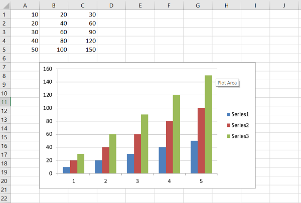
Given below is the code for displaying a simple column chart.
main.py
import xlsxwriter
wb = xlsxwriter.Workbook('hello.xlsx')
worksheet = wb.add_worksheet()
chart = wb.add_chart({'type': 'column'})

data = [
   [10, 20, 30,  40,  50],
   [20, 40, 60,  80, 100],
   [30, 60, 90, 120, 150],
]
worksheet.write_column('A1', data[0])
worksheet.write_column('B1', data[1])
worksheet.write_column('C1', data[2])

chart.add_series({'values': '=Sheet1!$A$1:$A$5'})
chart.add_series({'values': '=Sheet1!$B$1:$B$5'})
chart.add_series({'values': '=Sheet1!$C$1:$C$5'})

worksheet.insert_chart('B7', chart)

wb.close()
Output
The generated chart is embedded in the worksheet and appears as follows −
The add_series() method has following additional parameters −
Values − This is the most important property mandatory option. It links the chart with the worksheet data that it displays.
Categories − This sets the chart category labels. If not given, the chart will just assume a sequential series from 1n.
Name − Set the name for the series. The name is displayed in the formula bar.
Line − Set the properties of the series line type such as color and width.
Border − Set the border properties of the series such as color and style.
Fill − Set the solid fill properties of the series such as color.
Pattern − Set the pattern fill properties of the series.
Gradient − Set the gradient fill properties of the series.
data_labels − Set data labels for the series.
Points − Set properties for individual points in a series.
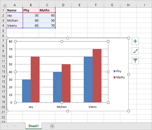
In the following examples, while adding the data series, the value and categories properties are defined. The data for the example is −
# Add the worksheet data that the charts will refer to.
headings = ['Name', 'Phy', 'Maths']
data = [
   ["Jay",   30, 60],
   ["Mohan", 40, 50],
   ["Veeru", 60, 70],
]
After creating the chart object, the first data series corresponds to the column with phy as the value of name property. Names of the students in the first column are used as categories
chart1.add_series({
   'name': '=Sheet1!$B$1',
   'categories': '=Sheet1!$A$2:$A$4',
   'values': '=Sheet1!$B$2:$B$4',
})
The second data series too refers to names in column A as categories and column C with heading as Maths as the values property.
chart1.add_series({
   'name': ['Sheet1', 0, 2],
   'categories': ['Sheet1', 1, 0, 3, 0],
   'values': ['Sheet1', 1, 2, 3, 2],
})
Example - Using Multiple Data Series
Here is the complete example code −
main.py
import xlsxwriter
wb = xlsxwriter.Workbook('hello.xlsx')
worksheet = wb.add_worksheet()
chart1 = wb.add_chart({'type': 'column'})

# Add the worksheet data that the charts will refer to.
headings = ['Name', 'Phy', 'Maths']
data = [
   ["Jay",   30, 60],
   ["Mohan", 40, 50],
   ["Veeru", 60, 70],
]

worksheet.write_row(0,0, headings)
worksheet.write_row(1,0, data[0])
worksheet.write_row(2,0, data[1])
worksheet.write_row(3,0, data[2])

chart1.add_series({
   'name': '=Sheet1!$B$1',
   'categories': '=Sheet1!$A$2:$A$4',
   'values': '=Sheet1!$B$2:$B$4',
})

chart1.add_series({
   'name': ['Sheet1', 0, 2],
   'categories': ['Sheet1', 1, 0, 3, 0],
   'values': ['Sheet1', 1, 2, 3, 2],
})

worksheet.insert_chart('B7', chart1)

wb.close()
Output
The worksheet and the chart based on it appears as follows −
The add_series() method also has data_labels property. If set to True, values of the plotted data points are displayed on top of each column.
Example- Using add_series() method
Here is the complete code example for add_series() method −
main.py
import xlsxwriter
wb = xlsxwriter.Workbook('hello.xlsx')
worksheet = wb.add_worksheet()
chart1 = wb.add_chart({'type': 'column'})

# Add the worksheet data that the charts will refer to.
headings = ['Name', 'Phy', 'Maths']
data = [
   ["Jay",   30, 60],
   ["Mohan", 40, 50],
   ["Veeru", 60, 70],
]

worksheet.write_row(0,0, headings)
worksheet.write_row(1,0, data[0])
worksheet.write_row(2,0, data[1])
worksheet.write_row(3,0, data[2])

chart1.add_series({
   'name': '=Sheet1!$B$1',
   'categories': '=Sheet1!$A$2:$A$4',
   'values': '=Sheet1!$B$2:$B$4',
   'data_labels': {'value':True},
})
chart1.add_series({
   'name': ['Sheet1', 0, 2],
   'categories': ['Sheet1', 1, 0, 3, 0],
   'values': ['Sheet1', 1, 2, 3, 2],
   'data_labels': {'value':True},
})
worksheet.insert_chart('B7', chart1)

wb.close()
Output
Execute the code and open Hello.xlsx. The column chart now shows the data labels.
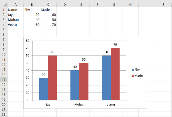
The data labels can be displayed for all types of charts. Position parameter of data label can be set to top, bottom, left or right.
XlsxWriter supports the following types of charts −
Area − Creates an Area (filled line) style chart.
Bar − Creates a Bar style (transposed histogram) chart.
Column − Creates a column style (histogram) chart.
Line − Creates a Line style chart.
Pie − Creates a Pie style chart.
Doughnut − Creates a Doughnut style chart.
Scatter − Creates a Scatter style chart.
Stock − Creates a Stock style chart.
Radar − Creates a Radar style chart.
Many of the chart types also have subtypes. For example, column, bar, area and line charts have sub types as stacked and percent_stacked. The type and subtype parameters can be given in the add_chart() method.
workbook.add_chart({'type': column, 'subtype': 'stacked'})
The chart is embedded in the worksheet with its insert_chart() method that takes following parameters −
worksheet.insert_chart(location, chartObj, options)
The options parameter is a dictionary that configures the position and scale of chart. The option properties and their default values are −
{
   'x_offset':        0,
   'y_offset':        0,
   'x_scale':         1,
   'y_scale':         1,
   'object_position': 1,
   'description':     None,
   'decorative':      False,
}
The x_offset and y_offset values are in pixels, whereas x_scale and y_scale values are used to scale the chart horizontally / vertically. The description field can be used to specify a description or "alt text" string for the chart.
The decorative parameter is used to mark the chart as decorative, and thus uninformative, for automated screen readers. It has to be set to True/False. Finally, the object_position parameter controls the object positioning of the chart. It allows the following values −
1 − Move and size with cells (the default).
2 − Move but don't size with cells.
3 − Don't move or size with cells.
