- Python XlsxWriter - Home
- Python XlsxWriter - Overview
- Python XlsxWriter - Environment Setup
- Python XlsxWriter - Hello World
- Python XlsxWriter - Important classes
- Python XlsxWriter - Cell Notation & Ranges
- Python XlsxWriter - Defined Names
- Python XlsxWriter - Formula & Function
- Python XlsxWriter - Date and Time
- Python XlsxWriter - Tables
- Python XlsxWriter - Applying Filter
- Python XlsxWriter - Fonts & Colors
- Python XlsxWriter - Number Formats
- Python XlsxWriter - Border
- Python XlsxWriter - Hyperlinks
- Python XlsxWriter - Conditional Formatting
- Python XlsxWriter - Adding Charts
- Python XlsxWriter - Chart Formatting
- Python XlsxWriter - Chart Legends
- Python XlsxWriter - Bar Chart
- Python XlsxWriter - Line Chart
- Python XlsxWriter - Pie Chart
- Python XlsxWriter - Sparklines
- Python XlsxWriter - Data Validation
- Python XlsxWriter - Outlines & Grouping
- Python XlsxWriter - Freeze & Split Panes
- Python XlsxWriter - Hide/Protect Worksheet
- Python XlsxWriter - Textbox
- Python XlsxWriter - Insert Image
- Python XlsxWriter - Page Setup
- Python XlsxWriter - Header & Footer
- Python XlsxWriter - Cell Comments
- Python XlsxWriter - Working with Pandas
- Python XlsxWriter - VBA Macro
Python XlsxWriter - Chart Legends
Depending upon the type of chart, the data is visually represented in the form of columns, bars, lines, arcs, etc. in different colors or patterns. The chart legend makes it easy to quickly understand which color/pattern corresponds to which data series.
Working with Chart Legends
To set the legend and configure its properties such as position and font, XlsxWriter has set_legend() method. The properties are −
None − In Excel chart legends are on by default. The none=True option turns off the chart legend.
Position − Set the position of the chart legend. It can be set to top, bottom, left, right, none.
Font − Set the font properties (like name, size, bold, italic etc.) of the chart legend.
Border − Set the border properties of the legend such as color and style.
Fill − Set the solid fill properties of the legend such as color.
Pattern − Set the pattern fill properties of the legend.
Gradient − Set the gradient fill properties of the legend.
Some of the legend properties are set for the chart as below −
chart1.set_legend(
   {'position':'bottom', 'font': {'name':'calibri','size': 9, 'bold': True}}
)
Example - Displaying Legends for Charts
Here is the complete code to display legends as per the above characteristics −
main.py
import xlsxwriter

wb = xlsxwriter.Workbook('hello.xlsx')
worksheet = wb.add_worksheet()
chart1 = wb.add_chart({'type': 'column'})

# Add the worksheet data that the charts will refer to.
headings = ['Name', 'Phy', 'Maths']
data = [
   ["Jay", 30, 60],
   ["Mohan", 40, 50],
   ["Veeru", 60, 70],
]

worksheet.write_row(0,0, headings)
worksheet.write_row(1,0, data[0])
worksheet.write_row(2,0, data[1])
worksheet.write_row(3,0, data[2])
chart1.add_series({
   'name': '=Sheet1!$B$1',
   'categories': '=Sheet1!$A$2:$A$4',
   'values': '=Sheet1!$B$2:$B$4',
})
chart1.add_series({
   'name': ['Sheet1', 0, 2],
   'categories': ['Sheet1', 1, 0, 3, 0],
   'values': ['Sheet1', 1, 2, 3, 2],
})
chart1.set_title ({'name': 'Marklist', 'name_font':
   {'name':'Times New Roman', 'size':24}})

chart1.set_x_axis({'name': 'Students', 'name_font':
   {'name':'Arial', 'size':16, 'bold':True},})

chart1.set_y_axis({'name': 'Marks','name_font':
   {'name':'Arial', 'size':16, 'bold':True},
   'num_font':{'name':'Arial', 'italic':True}})

chart1.set_legend({'position':'bottom', 'font':
   {'name':'calibri','size': 9, 'bold': True}})

worksheet.insert_chart('B7', chart1)

wb.close()
Output
The chart shows the legend below the caption of the X axis.
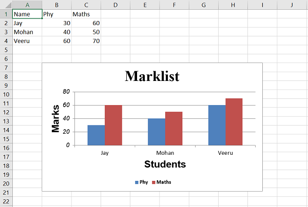
In the chart, the columns corresponding to physics and maths are shown in different colors. The small colored box symbols to the right of the chart are the legends that show which color corresponds to physics or maths.
