- Python Data Science - Home
- Python Data Science - Getting Started
- Python Data Science - Environment Setup
- Python Data Science - Pandas
- Python Data Science - Numpy
- Python Data Science - SciPy
- Python Data Science - Matplotlib
- Python Data Operations
- Python Data cleansing
- Python Processing CSV Data
- Python Processing JSON Data
- Python Processing XLS Data
- Python Relational databases
- Python NoSQL Databases
- Python Date and Time
- Python Data Wrangling
- Python Data Aggregation
- Python Reading HTML Pages
- Python Processing Unstructured Data
- Python word tokenization
- Python Stemming and Lemmatization
- Python Data Visualization
- Python Chart Properties
- Python Chart Styling
- Python Box Plots
- Python Heat Maps
- Python Scatter Plots
- Python Bubble Charts
- Python 3D Charts
- Python Time Series
- Python Geographical Data
- Python Graph Data
- Statistical Data Analysis
- Python Measuring Central Tendency
- Python Measuring Variance
- Python Normal Distribution
- Python Binomial Distribution
- Python Poisson Distribution
- Python Bernoulli Distribution
- Python P-Value
- Python Correlation
- Python Chi-square Test
- Python Linear Regression
Selected Reading
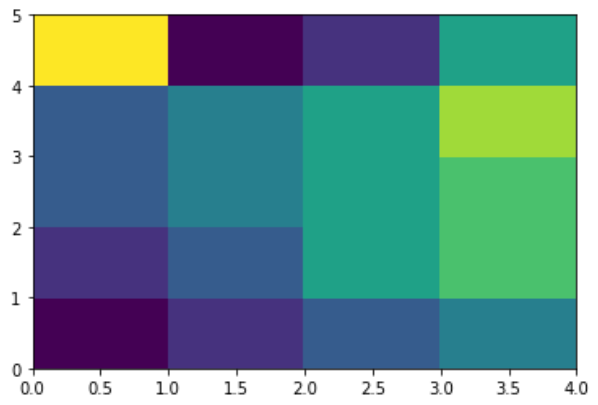
Python - Heat Maps
A heatmap contains values representing various shades of the same colour for each value to be plotted. Usually the darker shades of the chart represent higher values than the lighter shade. For a very different value a completely different colour can also be used.
The below example is a two-dimensional plot of values which are mapped to the indices and columns of the chart.
from pandas import DataFrame
import matplotlib.pyplot as plt

data=[{2,3,4,1},{6,3,5,2},{6,3,5,4},{3,7,5,4},{2,8,1,5}]
Index= ['I1', 'I2','I3','I4','I5']
Cols = ['C1', 'C2', 'C3','C4']
df = DataFrame(data, index=Index, columns=Cols)

plt.pcolor(df)
plt.show()
Its output is as follows −

Advertisements