- Python Data Science - Home
- Python Data Science - Getting Started
- Python Data Science - Environment Setup
- Python Data Science - Pandas
- Python Data Science - Numpy
- Python Data Science - SciPy
- Python Data Science - Matplotlib
- Python Data Operations
- Python Data cleansing
- Python Processing CSV Data
- Python Processing JSON Data
- Python Processing XLS Data
- Python Relational databases
- Python NoSQL Databases
- Python Date and Time
- Python Data Wrangling
- Python Data Aggregation
- Python Reading HTML Pages
- Python Processing Unstructured Data
- Python word tokenization
- Python Stemming and Lemmatization
- Python Data Visualization
- Python Chart Properties
- Python Chart Styling
- Python Box Plots
- Python Heat Maps
- Python Scatter Plots
- Python Bubble Charts
- Python 3D Charts
- Python Time Series
- Python Geographical Data
- Python Graph Data
- Statistical Data Analysis
- Python Measuring Central Tendency
- Python Measuring Variance
- Python Normal Distribution
- Python Binomial Distribution
- Python Poisson Distribution
- Python Bernoulli Distribution
- Python P-Value
- Python Correlation
- Python Chi-square Test
- Python Linear Regression
Selected Reading
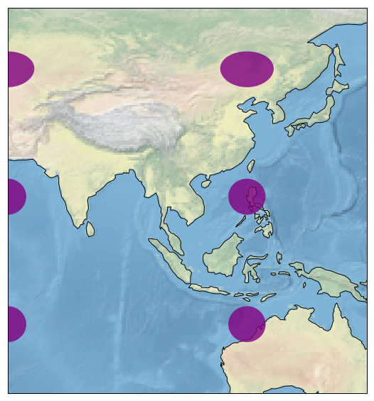
Python - Geographical Data
Many open source python libraries now have been created to represent the geographical maps. They are highly customizable and offer a varierty of maps depicting areas in different shapes and colours. One such package is Cartopy. You can download and install this package in your local environment from Cartopy. You can find numerous examples in its gallery.
In the below example we show a portion of the world map showing parts of Asia and Australia. You can adjust the values of the parameters in the method set_extent to locate different areas of world map.
import matplotlib.pyplot as plt
import cartopy.crs as ccrs

fig = plt.figure(figsize=(15, 10))
ax = fig.add_subplot(1, 1, 1, projection=ccrs.PlateCarree())

    # make the map global rather than have it zoom in to
    # the extents of any plotted data

ax.set_extent((60, 150, 55, -25))

ax.stock_img()
ax.coastlines()

ax.tissot(facecolor='purple', alpha=0.8)

plt.show()
Its output is as follows −

Advertisements