- Python Data Science - Home
- Python Data Science - Getting Started
- Python Data Science - Environment Setup
- Python Data Science - Pandas
- Python Data Science - Numpy
- Python Data Science - SciPy
- Python Data Science - Matplotlib
- Python Data Operations
- Python Data cleansing
- Python Processing CSV Data
- Python Processing JSON Data
- Python Processing XLS Data
- Python Relational databases
- Python NoSQL Databases
- Python Date and Time
- Python Data Wrangling
- Python Data Aggregation
- Python Reading HTML Pages
- Python Processing Unstructured Data
- Python word tokenization
- Python Stemming and Lemmatization
- Python Data Visualization
- Python Chart Properties
- Python Chart Styling
- Python Box Plots
- Python Heat Maps
- Python Scatter Plots
- Python Bubble Charts
- Python 3D Charts
- Python Time Series
- Python Geographical Data
- Python Graph Data
- Statistical Data Analysis
- Python Measuring Central Tendency
- Python Measuring Variance
- Python Normal Distribution
- Python Binomial Distribution
- Python Poisson Distribution
- Python Bernoulli Distribution
- Python P-Value
- Python Correlation
- Python Chi-square Test
- Python Linear Regression
Selected Reading
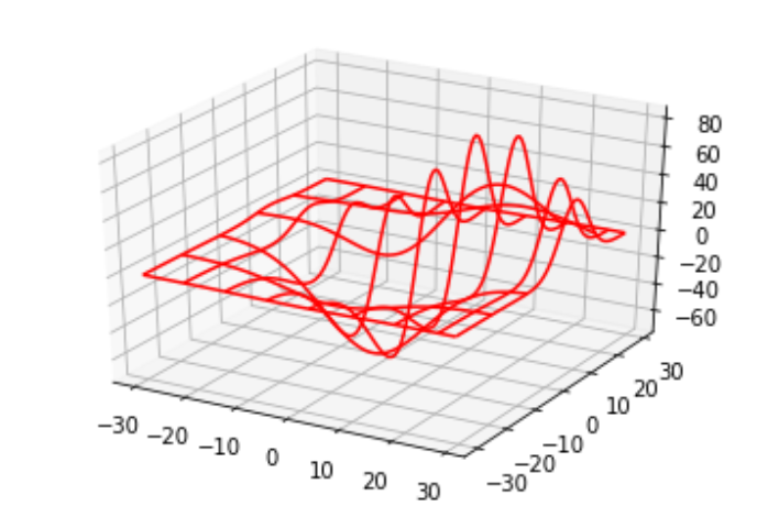
Python - 3D Charts
Python is also capable of creating 3d charts. It involves adding a subplot to an existing two-dimensional plot and assigning the projection parameter as 3d.
Drawing a 3D Plot
3dPlot is drawn by mpl_toolkits.mplot3d to add a subplot to an existing 2d plot.
from mpl_toolkits.mplot3d import axes3d
import matplotlib.pyplot as plt


chart = plt.figure()
chart3d = chart.add_subplot(111, projection='3d')

# Create some test data.
X, Y, Z = axes3d.get_test_data(0.08)

# Plot a wireframe.
chart3d.plot_wireframe(X, Y, Z, color='r',rstride=15, cstride=10)

plt.show()
Its output is as follows −

Advertisements