- Pentaho - Home
- Pentaho - Overview
- Pentaho - Installation
- Pentaho - Navigation
- Pentaho - Data Sources & Queries
- Pentaho - Reporting Elements
- Pentaho - Page Footer Fields
- Pentaho - Groups
- Pentaho - Chart Report
- Formatting Report Elements
- Pentaho - Functions
Pentaho - Quick Guide
Pentaho - Overview
What is Pentaho Reporting?
Pentaho Reporting is a suite (collection of tools) for creating relational and analytical reporting. Using Pentaho, we can transform complex data into meaningful reports and draw information out of them. Pentaho supports creating reports in various formats such as HTML, Excel, PDF, Text, CSV, and xml.
Pentaho can accept data from different data sources including SQL databases, OLAP data sources, and even the Pentaho Data Integration ETL tool.
Features of Pentaho
Pentaho Reporting primarily includes a Reporting Engine, a Report Designer, a Business Intelligence (BI) Server. It comes loaded with the following features −
Report Designer − Used for creating pixel perfect report.
Metadata Editor − Allows to add user-friendly metadata domain to a data source.
Report Designer and Design Studio − Used for fine-tuning of reports and ad-hoc reporting.
Pentaho user console web interface − Used for easily managing reports and analyzing views.
Ad-Hoc reporting interface − Offers a step-by-step wizard for designing simple reports. Output formats include PDF, RTF, HTML, and XLS.
A complex scheduling sub-system − Allows users to execute reports at given intervals.
Mailing − Users can email a published report to other users.
Connectivity − Connectivity between the reporting tools and the BI server, which allows to publish the content directly to the BI server.
Pentaho - Installation
Let us now learn how to install and configure Pentaho Reporting Designer.
Prerequisites
The Pentaho Reporting engine requires Java environment. Therefore, before installing Pentaho Reporting, make sure you have Java on your system. Based on the platform you are working on, use a command from the following table to verify your Java installation.
| OS | Command | Output |
|---|---|---|
| Windows |
Open command prompt: \>java -version |
java version "1.7.0_60" Java(TM) SE Runtime Environment (build 1.7.0_60b19) Java HotSpot(TM) 64-Bit Server VM (build 24.60-b09, mixed mode) |
| Linux |
Open terminal: $ java version |
java version "1.7.0_60" OpenJDK Runtime Environment (rhel-2.3.10.4.el6_4x86_64) OpenJDK 64-Bit Server VM (build 60.7-b01, mixed mode) |
| Mac OS |
Open terminal: $ java version |
java version "1.7.0_60" Java(TM) SE Runtime Environment (build 1.7.0_60b19) Java HotSpot(TM) 64-Bit Server VM (build 24.60-b09, mixed mode) |
If you do not have Java installed on your system, then download and install the same using the following link Download and Install Java.
Download Pentaho Reporting
Download the latest versions of Pentaho Reporting Designer using the following links. For this tutorial, we are using version 3.7.0.
| OS | URL link for download Pentaho Report Designer |
|---|---|
| Windows | Pentaho Report Designer 3.7 for Windows |
| Linux | Pentaho Report Designer 3.7 for Linux |
| Mac OS | Pentaho Report Designer 3.7 for Mac OS |
Install Pentaho Reporting
After downloading the files, you will find an archive file of Pentaho Reporting Designer named prd-ce-3.7.0-stable. That archive should be extracted as explained in the following table.
| OS | Installation Instructions |
|---|---|
| Windows |
|
| Linux |
$ tar zxvf prd-ce-3.7.0-stable.tar.gz
# mv prd-ce-3.7.0-stable /usr/local/
$ cd /usr/local/prd-ce-3.7.0-stable/report-designer $ report-designer.sh |
| Mac |
$ report-designer.sh |
Install Database Driver
Pentaho Reporting Designer requires a database connection to generate relational reports, therefore you need to have a JDBC driver to communicate with the database. By default, Pentaho provides some JDBC drivers of different vendors to support different databases such as MySQL, H2, HypersonicSQL, Hive, etc.
All the default database drivers are available in the /lib/ directory of the Pentaho Reporting Designer. If you want to use any other database, then download the respective JDBC driver and copy it into the /lib/ directory of Pentaho Reporting Designer. Otherwise, you can use ODBC driver via JDBC-ODBC bridge driver that comes with the JDK and this bridge driver (JDBC-ODBC) is suitable for all database servers.
For this tutorial, we are using MySQL database server and its respective drivers are already downloaded with the Pentaho lib (/lib/ directory of the Pentaho Reporting Designer) files.
Install Additional Fonts
Pentaho Reporting uses different fonts to display text inside reports. When generating PDF files, the Pentaho Reporting Engine needs access to the physical font files. The reporting engine searches system dependent font paths to locate all usable fonts. In addition to these fonts, your Java Runtime Environment may offer additional fonts, depending on your Java and Operating system version.
If you plan to create PDF documents with embedded fonts, please ensure that you only use fonts that are physically accessible for the reporting engine.
Regardless of your operating system, all font files located in JRE/lib/fonts/ are always usable for all exports.
Pentaho - Navigation
This chapter will provide a brief introduction on the user interfaces available in Pentaho and how to navigate through them.
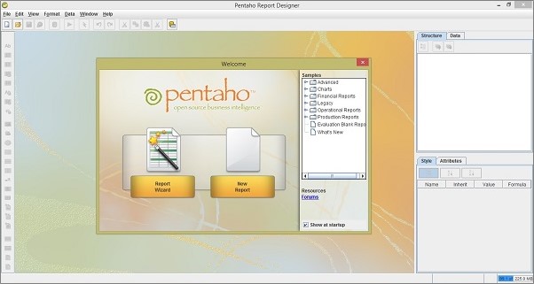
The Welcome Screen
The welcome screen provides two ways to create reports of different types. Those two options are Report Wizard and New Report.
Report Wizard − It provides an easy-to-use four steps process that walk you through creating a new Report.
New Report − If you choose this option, then you can create customized reports based on your requirement.
Pentaho has a set of sample reports to help you figure out how to use a certain Report Designer. The following screenshot shows the welcome page of Pentaho.
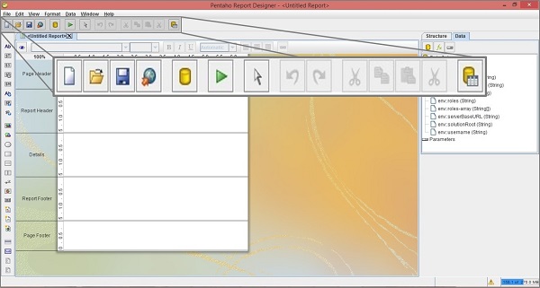
The Main Toolbar
The main toolbar is at the top of the window. Take a look at the following screenshot the maximized box is the main tollbar. It contains button to carry out the following actions − New File, Open File, Save File, Publish the Report, Add Data Source, Run the Report, Select Object, Undo, Redo, Cut Element, Copy Element, Paste Element, Delete Selected Element, and Toggle the Field-Selector Palette.
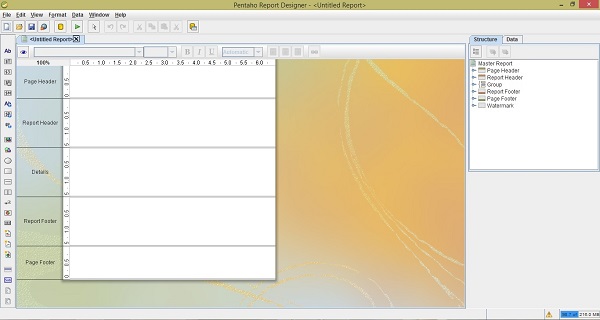
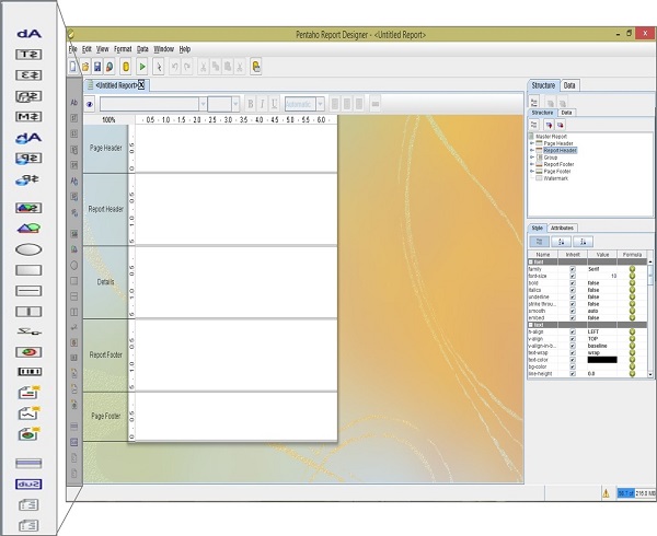
The Report Workspace
The workspace is the main working area where we can design the reports. Take a look at the following screenshot the white area at the center is the workspace. It is divided into five bands − Page Header, Report Header, Details, Report Footer, and Page Footer.
Page Header − You can use any type of data here that is suitable to print on top of every report page. It does not allow any dynamic values or page breaks.
Report Header − The second band from top is the Report Header. It contains the report elements. It appears once per report, that is on the first page of the report.
Details − The Details band is the largest portion of your page because most of the report data is presented in this area.
Report Footer − Just like the Report Header, the Report Footer appears just once per report, that is on the last page of the report.
Page Footer − The last band is the Page Footer which appears at the absolute bottom of every page in the report.
You can also create groups for various report elements. Each group has its own Header and Footer bands in the workspace.
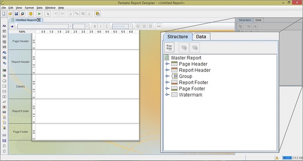
The Structure Pane
The structure tab shares a pane with the Data tab in the upper right section of the Report Designer. Take a look at the following screenshot; it shows the exact hierarchy of every element included in a report workspace.
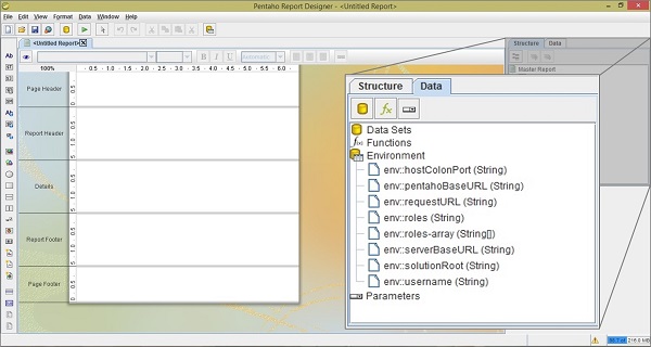
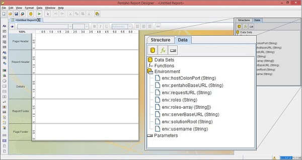
The Data Pane
The Data Pane enables you to add data sources and view individual queries, functions, and parameters in each report. The three buttons at the top of the pane are meant for adding new data sources, functions, and parameters, respectively.
Datasources − All the data sources and queries that you have defined for the current report will be listed here. If you want to add a new data source, then rightclick on the leftmost button (the yello cylinder) click add.
Functions − All the functions (mathematical and conditional) elements that you added to a report will be listed in this category. You can add a function by clicking the (fx) button.
Parameters − You can add a parameter to your report, which will enable the report readers to customize the content of the output.
Take a look at the following screenshot.
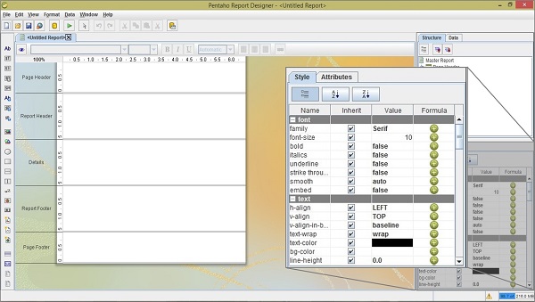
The Style Pane
The style pane displays all the visual and positional style options for any given item in the structure pane. Click any structure element, and the composition of the Style Pane will be adjusted to show all the available style properties listed by group. Take a look at the following screenshot.
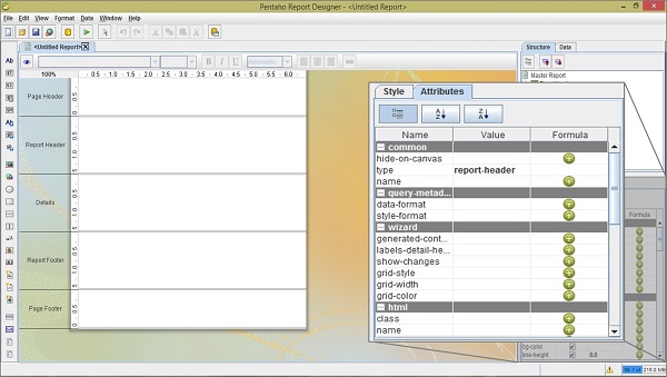
The Attribute Pane
The Attribute Pane displays all the low-level properties, and input and output options for any given item in the Structure Pane.
The Palette
The palette contains all the elements that you can use to build a report. To add an element, click on a layout band to select it, then drag and drop an element from the palette to the selected band. We have explained the role of each of the report elements in the following table.
| Element icon | Element name | Description |
|---|---|---|
 |
Label | A static text string. It cannot change dynamically. |
 |
Text-Field | A Textual report element and changed dynamically based on the query. |
 |
Number-Field | Displays dynamic numerical data from a query. |
 |
Date-Field | Handles date information form a query. |
 |
Message | An element that combines multiple static and dynamic report elements. |
 |
Resource-label | Static text string that maps to a resource bundle |
 |
Resource-Field | Dynamic text string that maps to a resource bundle, allowing you to localize any database field. |
 |
Resource - Message | Dynamic text string that concatenates data from multiple types, and dynamically maps to a resource bundle. |
 |
Image-Field | A reference to an image stored in a database. |
 |
Image | A static image embedded into a report. |
 |
Ellipse | A vector graphical element in the shape of eclipse. |
 |
Rectangle | A vector graphical element in the shape of rectangle. |
 |
Horizontal-Line | A vector graphical line, drawn horizontally. |
 |
Vertical-Line | A vector graphical line, drawn vertically. |
 |
Survey-Scale | A simple sliding scale chart element. |
 |
Chart | A chart or graph that shows your query results graphically. |
 |
Simple-Barcodes | A barcode chart element. |
 |
Bar-Sparkline | A Bar Sparkline chart element. |
 |
Line-Sparkline | A line Sparkline chart element. |
 |
Pie-Sparkline | A Pie Sparkline chart element. |
 |
Band | A method of grouping elements. |
 |
Sub-Report | An element that references another report. |
 |
Table-Of-Content | A table of content report element. |
 |
Index | An Index report element. |
Take a look at the following screenshot; the highlighted box on the left side is the palette of reporting elements.
Pentaho - Data Sources & Queries
In this chapter, we will learn to use the Pentaho Reporting Designer by taking an example. We will create a report on the employee database to produce a quick overview of every employee. We will create our first report by adding a data source and passing queries to the Pentaho Designer.
Before using Pentaho Report Designer, create a database named employeedb and in that database, create a table named employee using the following query.
CREATE TABLE 'employee' (
   'id' integer NOT NULL,
   'name' varchar(20),
   'designation' varchar(20),
   'department' varchar(20),
   'age' integer,
   PRIMARY KEY ('id')
)
Insert the following records into the table.
| Id | Name | Designation | Department | age |
|---|---|---|---|---|
| 1201 | 'satish' | 'writer' | 'Tuto_Write' | 24 |
| 1202 | 'krishna' | 'writer' | 'Tuto_Write' | 26 |
| 1203 | 'prasanth' | 'php developer' | 'Tuto_develop' | 28 |
| 1204 | 'khaleel' | 'php developer' | 'Tuto_develop' | 29 |
| 1205 | 'raju' | 'HTML developer' | 'Tuto_develop' | 24 |
| 1206 | 'javed' | 'HTML developer' | 'Tuto_develop' | 22 |
| 1207 | 'kiran' | 'Proof Reader' | 'Tuto_Reader' | 28 |
| 1208 | 'pravenya' | 'Proof Reader' | 'Tuto_Reader' | 30 |
| 1209 | 'mukesh' | 'Proof Reader' | 'Tuto_Reader' | 28 |
| 1210 | 'sai' | 'writer' | 'Tuto_writer' | 25 |
| 1211 | 'sathish' | 'graphics designer' | 'Tuto_designer' | 26 |
| 1212 | 'viswani' | 'graphics designer' | 'Tuto_designer' | 24 |
| 1213 | 'gopal' | 'manager' | 'Tuto_develop' | 29 |
| 1214 | 'omer' | 'manager' | 'Tuto_writer' | 32 |
| 1215 | 'shirjeel' | 'manager' | 'Tuto_Reader' | 32 |
If you want to manipulate the data contained inside the table, the best choice is to use SQL. But if you want to create a report based on the data, Pentaho Reporting is the best option. Our task is to pass an SQL query to the Pentaho Reporting designer tool and select respective fields (which are presented in the report) and present it on the Details of the report sheet.
Before moving further, make sure you are well versed with all the navigation options available in Pentaho (explained in the previous chapter). Now that we have a data source, let us proceed further and try to understand how to use Pentaho to generate a professional report.
Steps to Generate a Report using Pentaho
Follow the steps given below to create a report from scratch without using Report Design Wizard.
Step 1 : Create a New Report
You can create a new report definition file by clicking "new report" on the welcome pane or go to "File → new".
Step 2 : Add a Data Source
The Structure Pane on the right-hand side provides a view of the visual elements of a report. The definition of the data source will be on the Data tab; it allows to define where the report data comes from and how this data is processed during the report processing.
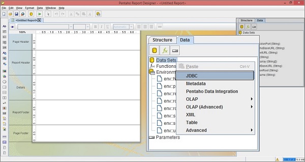
A report generally displays the data that is supplied by a data source in the form of a table, whereas a report definition defines how the report is to be formatted or printed. As shown in the following screenshot, select the Data tab from structure pane.
In the Data tab, right-click on the Data Sets and select JDBC to add a data source. Generally, in the list of options, you can select any other option based on the requirement. It means, if you have an XML file as your data source, then choose XML option from the list. Take a look at the following screenshot. Here we are selecting the JDBC option to add a database as data source.
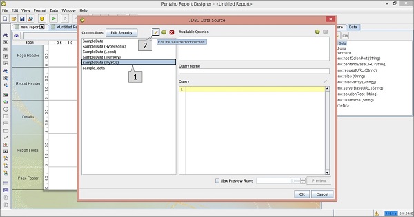
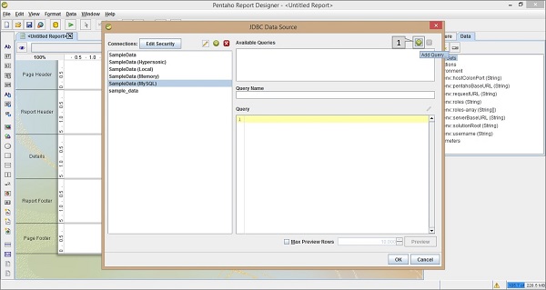
After having selected the JDBC option as the data source, you will find a dialog box as shown in the following screenshot.
We have already chosen MySQL database for the data source, therefore we have to select the SampleData (MySQL) option in the left-side panel of the dialog box (marked as pointer "1") in the given screenshot. Pointer "2" is meant for editing the connection statement and URL to interact with the database.
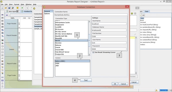
The following screenshot shows a dialog box where you can define your connection statement and the URL for the database. We need to carry out four operations on the following screen (which are highlighted using pointers).
In the connection type list, select MySQL − We have already chosen MySQL as the database (data source).
In the Access list, select Native (JDBC) − Through JDBC connection, we can access the database.
In the Settings section, we must mention the Host Name (localhost), Database name (employeedb), port number (3306), username (root), and the password (as per you system).
Test the connection statement by clicking the Test button.
Finally, click the OK button to confirm the database connection.
Step 3 : Add a Query
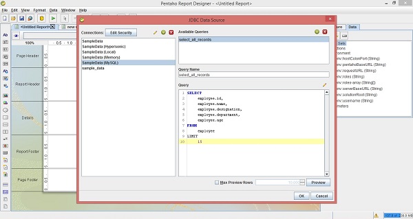
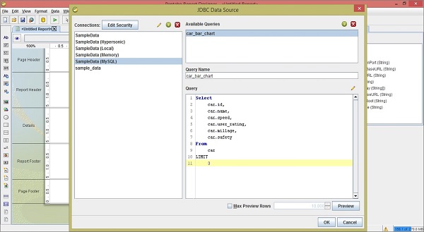
Take a look at the following screenshot. The dialog box presents the available saved queries available through the database connection.
The Available Queries block on the right side of the dialog box displays a list of all the available queries.
The Query Name block displays the selected query name which is selected in the above available queries list.
The Query block displays the query statement. If no queries are available or if you want to create a new query, click the + button which is highlighted as pointer 1 in the following screenshot.
While clicking the + button, you can create a query by editing a name on the Query Name block as select_all_records and use the following query statement in the Query block.
SELECT
   employee.id,
   employee.name,
   employee.designation,
   employee.department,
   employee.age
FROM
   employee
LIMIT
   15
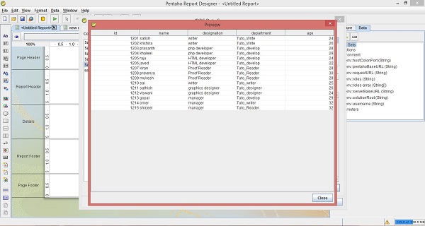
After adding the query, you should get the following dialogue box. Click the preview button.
After clicking the preview button, you will find all the employee table records in a separate dialog box as shown in the following screenshot. Click the close button.
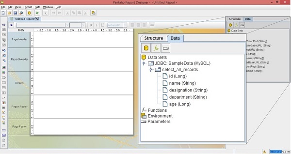
Then, click the OK button to submit the query. After submitting the query, you will find all the table field names and their datatypes under the query name on the right-side structure pane, as shown in the following screenshot. Here, the maximized box is the structure pane which is placed on the right side of the screen.
We have so far added a data source and a query to the Pentaho Reporting Designer. Now, we have to add elements into the workspace to create a report. The same example is extended to the next chapter "Reporting Elements".
Pentaho - Reporting Elements
Most reporting elements can easily be added by dragging and dropping them from the Data pane to any of the bands on the workspace (mostly Details band).
Let us continue with the same example taken from the previous chapter. There we have added a data source and a query to the Reporting Designer. Here we will design the report based on the output produced by the query.
The resultant query fields are the reporting elements which are highlighted in the following screenshot. Those are − id, name, designation, department, and age.
Adding Reporting Elements
After adding the query to the Reporting designer, the resultant fields appear in the data pane, as shown in the following screenshot.
Now, drag the required fields (fields you want to display in the report) from the Structure Pane into the Details Band at the center of the main workspace.
Take a look at the following screenshot. It shows the direction to drag the age field from the structure pane.
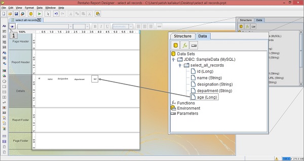
After arranging all the fields in the Details band, you can see the report view by clicking the view button which is pointed as 1 in the above screenshot.
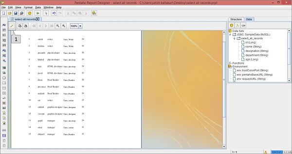
After clicking the view button, the result report will be as shown in the following screenshot. In the workspace, you will find the values of all the fields (which are specified in the Details tab).

Now, if you want to go back to the design mode, then click the Design symbol marked as 1 in the following screenshot.
Pentaho - Page Footer Fields
Each page of a report contains two special areas. At the top of every page, you will find the page-header area. And at the bottom of the page, you will find the page-footer area. The remaining page is available for the actual report content.
Adding Page Footer Fields in Pentaho
The page footer tab is used to present some attributes and functions. For example, you can use the page footer tab to print the max value of the age field at the bottom of the page. The reporting engine allows these features by using reporting functions.
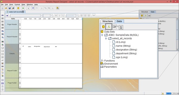
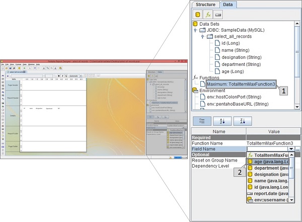
Take a look at the following screenshot. Here the Data tab in the structure pane includes a symbol fx (marked as 1). It is the add function button. Click this button to add different functions into the report.
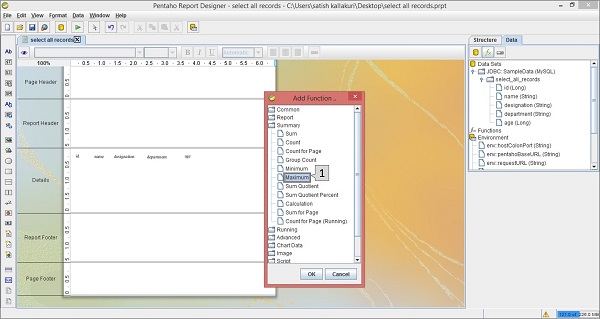
Then, you will find a dialog box with different functions segregated into different groups. To print the maximum age of an employee at the page footer, we should choose the Maximum function in the Summary group which is marked as 1 in the following screenshot. Select it and click OK.
Once you click the Ok button, the function will be added to the Functions label in the Structure Pane which is placed at the right side of the screen.
Once you select the added function (i.e. Maximum), you will find another pane below the structure pane containing the properties of that function.
Take a look at the following screen. The maximized box contains two pointers (Pointer 1 and Pointer 2).
Pointer 1 − Select the function in the data tab of the structure pane.
Pointer 2 − Edit the Field name in the properties section by selecting the age field from the dropdown list. It is because we have to print the maximum age of an employee.
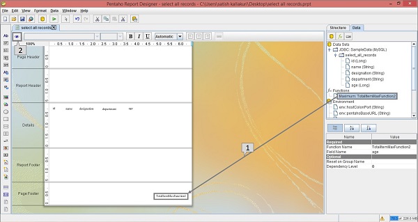
Now, the function is ready with the customized properties. Now you can use that function in your report as a page footer attribute.
Take a look at the following screenshot. Again, it contains two pointers (Pointer 1 and Pointer 2).
Pointer 1 − Select and drag the Maximum function from the Structure pane to the page footer band in the workspace, as shown in the following screenshot. Now the design of your report is ready.
Pointer 2 − Select the Preview button on the left side of the screen.
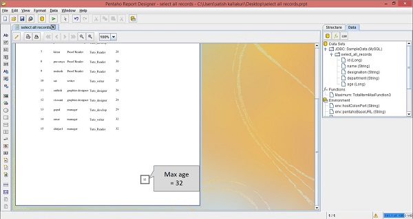
Take a look at the following screen. It shows the preview of the report. The maximum age of an employee is marked and shown in a maximized box.
Pentaho - Groups
Pentaho offers various functionalities and features to convert raw data into meaningful information. Here, we will learn how to use one such feature Groups. You can use this feature to segregate raw row-set data into groups so that the user can easily understand the report.
Grouping is a great way to divide long lists of data along meaningful separators.
With groups, you can keep similar items together and visually separate these items from other groups of items.
You will also need groups to perform various aggregations over the data, like printing the number of items in a group or calculating sums or averages.
Adding Groups in Pentaho
We already have a report based on the employee data. Here the query is to group all employee records according to "department". Follow the procedure given below to fulfill the given requirement.
First of all, you start the process by clicking the Add group button on the Structure pane. The Add group button is marked as "1" in the following screenshot.
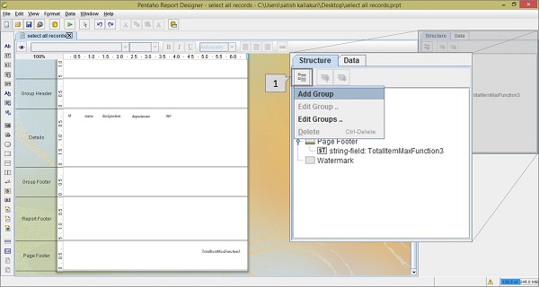
You will get a list of options by clicking the Add group button. Then, click the Add group option from the list.
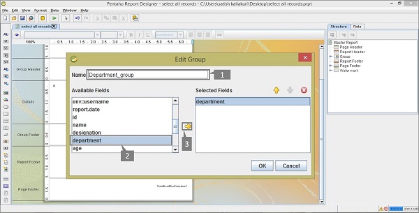
After clicking Add Group, you will find a dialogue box using which you can add a group field from the given available fields.
Take a look at the following screenshot. The three activities are highlighted in the dialog box which we have marked as 1, 2, and 3.
Pointer 1 − Enter a user-defined name for this group.
Pointer 2 − Select the department field from the available fields list.
Pointer 3 − Click the arrow (→) button so that the selected field gets copied to the selected Fields list.
Select that department field in the selected fields list and click OK to confirm.
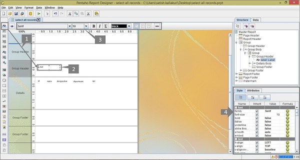
After adding the group, you will find it in the Structure tab of the Structure pane. And you will find the Group Header and Group Footer bands in the workspace.
Take a look at the following screenshot. Add a static label to your report by dragging the label icon from the palette on the left side of the Report Designer into the group header (in the screenshot, this activity has been marked as 1).
By double-clicking the label, you can edit it and change the name to Department. By using the Formatting Toolbar or the Formatting Palette (marked as "3" and "4" respectively), you can change the format of the label.
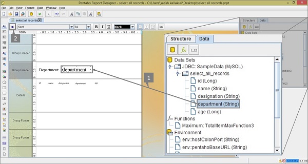
Let us now proceed further. Switch the Structure pane to Data tab. Select and drag the department field from the Structure pane to the Group Header (this activity is marked as 1 in the following screenshot). To see a preview of your report, click the preview button on the left side of the screen which is highlighted and marked as 2 in the following screenshot.
After clicking the preview button, you will find the result report as shown in the following screenshot. You will find the records have now been grouped together according to department.
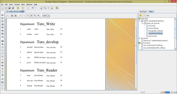
The report does not look very appealing at this stage. You can add a touch of color and make the heading more effective using the Formatting Toolbar or the Formatting Palette.
You are now ready to generate different types of reports using Pentaho. Just follow the steps discussed so far and try to use all the features and options available in Pentaho.
Pentaho - Chart Report
A chart, also called a graph, is a graphical representation of data. Pentaho Reporting Designer offers a wide variety of chart types. You can design a chart using the chart-element option available in the palette of Pentaho Reporting Designer.
There are three requirements to create a chart −
A data-collector to extract the charting-data from the data sources.
A chart-expression to produce a chart from the collected data.
A report element to display the resulting chart object.
Let us now take an example and try to understand the process of creating charts in Pentaho.
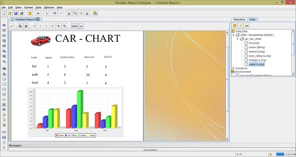
The following table contains data regarding the features of three car brands. We will depict this data using a bar chart.
| Car | Speed | User Rating | Mileage | Safety |
|---|---|---|---|---|
| Fiat | 1 | 3 | 5 | 5 |
| Audi | 5 | 6 | 10 | 4 |
| Ford | 4 | 2 | 3 | 6 |
First of all, create a table named car based on the given table data. We are using MySQL database as the data source. Add that (data source) to the Pentaho Reporting Designer. We have already discussed how to add a data source and a query to the Pentaho Reporting Designer in the chapter "Pentaho Data Sources and Queries".
Steps to Create a Chart in Pentaho
Now, follow the steps given below to create a chart based on the given scenario.
Step 1 - Add a Query
The query will retrieve all the records from the table car. Therefore the query should be as follows −
Select
   car.id,
   car.name,
   car.speed,
   car.user_rating,
   car.millage,
   car.safety
From
   car
LIMIT
   3
The following screenshot shows how to add the given query to the data source.
Step 2 - Add an Image to the Page Header
This is an optional step, however it is important because images play an important role in improving the aesthetics of a report.
Take a look at the following screenshot. We have highlighted the following five activities here −
After adding a query, you will find the query fields on the Structure pane. From the Structure pane, select the respective fields, drag and drop into the Details tab of the report workspace.
The Details tab presents only the field values. Add those respective heading Labels to the Report Header tab by selecting the label field from the palette.
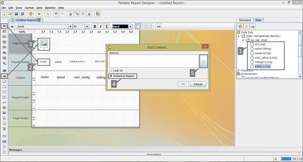
Add an image taken from the palette and place it on the Page Header Tab. Add another label in the Page Header for Report Heading and use a suitable heading, for example CAR CHART, for effective presentation. Double-click on the image element you will find a dialogue box called Edit Content.
You have two options to insert an image. Either link the image URL to the report or embed the image into the report. We chose to embed the image by selecting the option Embed in Report.
Download some sample car image from the internet to put into the Page Header. Click on the button to locate the sample car image with the location URL. Click the OK button to confirm.
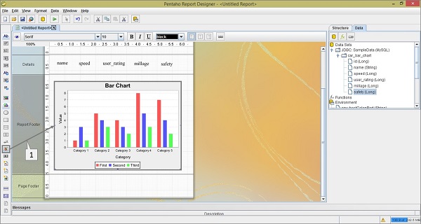
Step 3 - Add Chart into Report Footer
Add the chart by clicking select and dragging it from the left-side palette to the Report. It is marked as "1" in the following screenshot. Double-click on the Bar chart element on the Report Footer.
Step 4 - Add Chart Properties
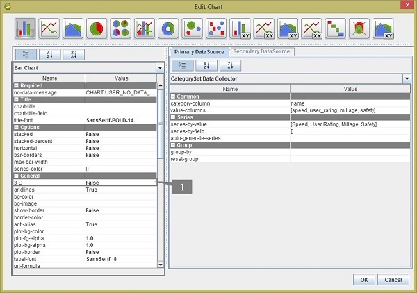
After double-clicking on the chart element, you will find a dialogue box where you have to provide the data collected details and chart expression details.
Take a look at the following screenshot. The tab Primary Data Source contains two markers −
Marker 1 is a dropdown list where you have to select the Category Set Data Collector.
Marker 2 is also a dropdown list of the category-column where you have to select the name field.
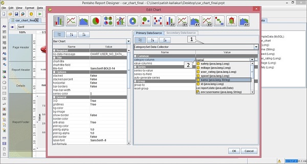
There are three sections in the Primary Data Source − Common, Series, and Group. Here, we dont require to add anything on the Groups section because we are not using any Groups in our query.
Common − There are two fields in this section − category-column and value-column. We already filled the category-column value with the name field in the above section. The second one is value-column.
Click on the empty value; you will find a dialogue box as shown in the following screenshot. There are two activities (1 and 2) marked in it.
Click the (+) button to add the value fields in the column.
By clicking on the empty value, you will find a dropdown list from where you need to select the speed field.
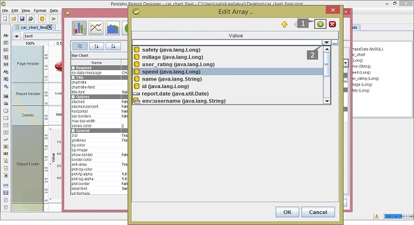
Repeat the above two activities to add user_rating, mileage, and safety fields into the column. After adding all these fields, the screen will appear as shown below. Click OK to confirm.
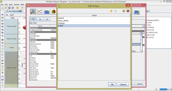
The next column in the Primary Data source section is the Series section.
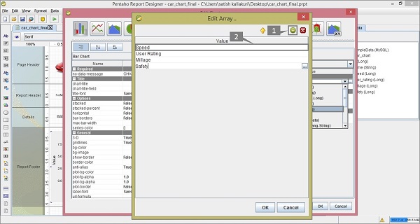
Series − In the Series field, click the series-by-value option. You will find a dialogue box as shown in the following screenshot. There are two markers (1 and 2) in it.
- Click the (+) button to add a new field in the column.
- By double-clicking on it, you can edit that field.
Repeat these two activities for adding field names such as Speed, User Rating, Mileage, and Safety.
These are the user-defined names to present in the particular section of report chart. But here you have follow the same order that you have given on the Value-column fields in the Common section. Click OK after adding all the fields as shown below.
After adding all the sections, you will get the Edit Chart dialogue box as shown in the following screenshot. The Bar Chart pane contains different properties which are used for changing the chart format.
In the General section of the Bar Chart, we have changed the 3-D value as true (marked as "1"). Click OK to confirm the chart properties.
Click on the Preview button on the Formatting Toolbar to see a preview of the report. It will appear as shown in the following screenshot −
You can implement different types of charts in your report by using different types of data models and by providing different values to the chart properties. Pentaho provides almost 18 types of charts in the report designer.
Pentaho - Formatting Report Elements
Once you have placed a report element in the workspace, it can be formatted in different ways. Pentaho Reporting Designer provides various features to format the reporting elements as per our requirement.
Text Formatting
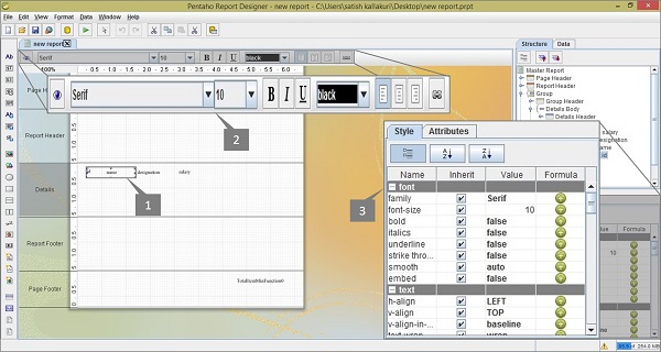
All the text-based elements such as text, number, date, and labels can be easily formatted using the Formatting Toolbar that appears just above the Report Canvas.
Take a look at the following screenshot. Here, we have marked and highlighted three objects −
- Selected Report Element
- Formatting toolbar
- Style Pane tab for formatting the report elements
First of all, select the Report Element on the workspace. Thereafter, you can format that element in many ways using the Formatting toolbar or using the properties from the Style Tab pane.
Adding Hyperlinks
Pentaho Report Designer allows you to add hyperlinks to your report data. Here we will take a general example to explain how to add hyperlinks in your report.
Assume that we have already added a query in the employee table to fetch the fields id, name, and designation. We have also added these fields to the Reporting workspace. Here our requirement is to pass the individual values of the designation field to www.google.co.in as a parameter value using a hyperlink.
First, select the designation field in the workspace. Right click on it and select Hyperlink from the list. Take a look at the following screenshot.
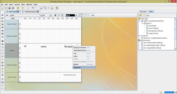
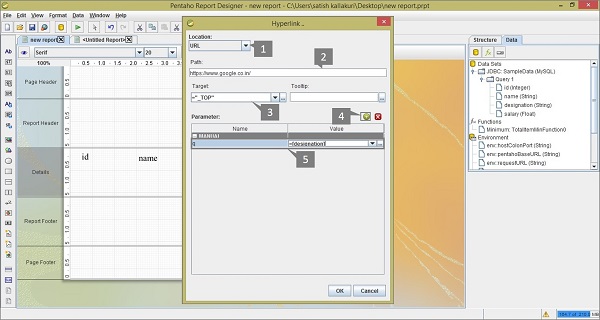
After clicking the Hyperlink option, you will find a dialog box where you have to provide details such as Type of the hyperlink location, URL, Target, Parameter name, and Value.
Take a look at the following screenshot. Here we have marked and highlighted the following five activities −
Provide the type of Hyperlink Location. Generally there are four types of locations −
Self − Linking to the same report field.
URL − Provide a URL for that reference location.
Pentaho Repository − If you install Pentaho Repository, then provide that file URL in the localhost (Login is required).
Manual Link − Create a link or a formula manually and provide it as Hyperlink.
For this example, we have used URL type location.
Provide the URL of the website or the file. For this option, we have used https://www.google.co.in.
Provide the Target location, that is, _TOP, _BLANK, or _PARENT. We have used _TOP. If you want to provide any information to the user when the mouse pointer moves over the hyperlink text, then type the information in the tooltip box which is placed just beside the Target box.
Select the plus (+) symbol to add a Parameter name and value to the parameter list.
Provide a Parameter name and a value to the URL of the Hyperlink. Here we have used q as the Parameter name and Designation field as the Parameter value.
Finally, click OK to confirm the Hyperlink properties.
Click the Preview button on the formatting toolbar to see a preview of the report. After clicking the Preview button, you will find the following screenshot. Place the mouse pointer on any designation value either HR or Admin to see its respective URL.
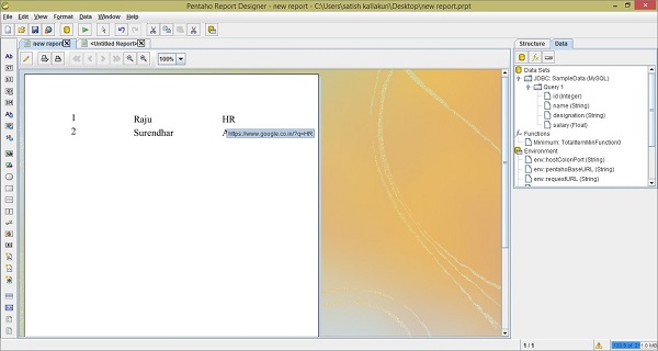
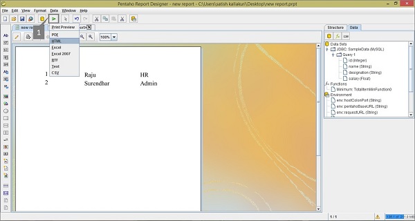
In this Pentaho Report Designer preview, the hyperlink is meant for redirecting the user to another URL. For that, you have to run this report on HTML by clicking the Run button on the Main toolbar (marked as "1" in the following screenshot) and select the HTML option on it.
Take a look at the following screenshot. There are different options for running the report, but we have chosen to display the report in HTML format.
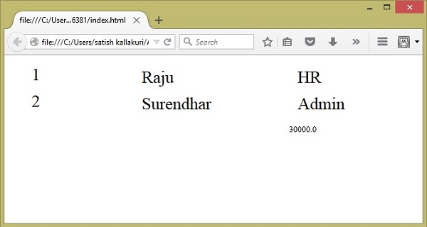
After selecting the HTML option, you will find the report data in a separate HTML page, as shown in the following screenshot. Click on any Designation value to understand how a hyperlink works in Pentaho Reporting.
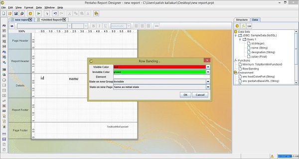
Row Banding
Pentaho Report Designer has a row banding property that allows you to color the alternate rows of your report. Let us take our previous example to understand how it works.
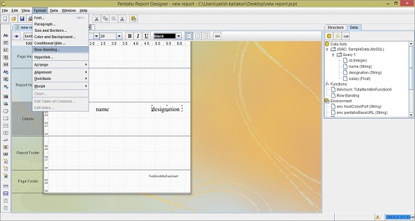
After adding the elements into the workspace, click the report workspace → go to the Format menu → select Row Banding. Take a look at the following screenshot.
After selecting the Row Banding option, you will find a dialog box. Here, you can select a color from the dropdown list. We have selected red and green as the alternate colors. Now, click the OK button to confirm. Take a look at the following screenshot.
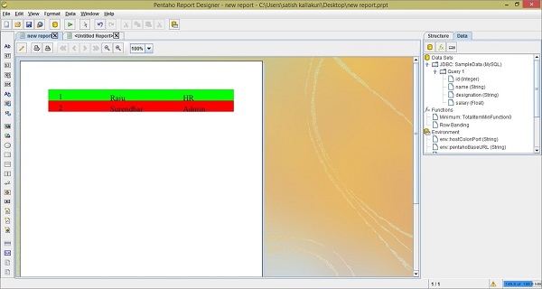
Click the Preview button to see how your report appears with alternate row colors. It will appear as shown in the following screenshot.
Pentaho - Functions
Each page of a report contains a Page-header area and a Page-footer area. The remaining page is available for the actual report content.
The page footer tab is used to present some attributes and functions. For example, we can print the max value of the age field of an employee in the Page-footer. The reporting engine allows these features by using functions.
Let us use the same employee table which we have used in the previous chapters. After adding all the fields into the report workspace, let us now add a function into the Page-footer tab to find out the maximum age of an employee.
Follow the steps given below to add a predefined function to your report.
Step 1 - Click the Function Button (fx)
Take a look at the following screenshot. Here the Data tab in the structure pane includes a symbol fx (marked as 1). It is the add function button. Click this button to add different functions into the report.
Step 2 - Select a Particular Function
Then, you will find a dialog box with different functions segregated into different groups. To print the maximum age of an employee at the page footer, we should choose the Maximum function in the Summary group which is marked as 1 in the following screenshot. Select it and click OK.
Once you click the Ok button, the function will be added to the Functions label in the Structure Pane which is placed at the right side of the screen.
Step 3 - Define a Field Name
Once you select the added function (i.e. Maximum), you will find another pane below the structure pane containing the properties of that function.
Take a look at the following screen. The maximized box contains two pointers (Pointer 1 and Pointer 2).
Pointer 1 − Select the function in the data tab of the structure pane.
Pointer 2 − Edit the Field name in the properties section by selecting the age field from the dropdown list. It is because we have to print the maximum age of an employee.
Step 4 - Add a Function to Report Workspace
Now, the function is ready with the customized properties. Now you can use that function in your report as a page footer attribute.
Take a look at the following screenshot. Again, it contains two pointers (Pointer 1 and Pointer 2).
Pointer 1 − Select and drag the Maximum function from the Structure pane to the page footer band in the workspace, as shown in the following screenshot. Now the design of your report is ready.
Pointer 2 − Select the Preview button on the left side of the screen.
Step 5 - Check Preview
Take a look at the following screen. It shows the preview of the report. The maximum age of an employee is marked and shown in a maximized box.
Pentaho - Additional Functions
The following table provides an additional list of functions that you can use in your reports.
| Common Functions | ||
|---|---|---|
| S.No. | Function Name | Purpose |
| 1 | Open Formula | Enables you to create your own custom Open Formula function using the built-in Formula Editor. |
| 2 | Page | Count the number of page used in report before rendering. |
| 3 | Total Page Count | List the total number of pages in the rendered report. |
| 4 | Page of Pages | Prints the current page number along with the total number of pages in the render report. |
| Report Functions | ||
| S.No. | Function Name | Purpose |
| 1 | Is Export Type | Tests whether the given export type has been selected for this report. |
| 2 | Row Banding | Alternates the background color of each item band in a group. |
| 3 | Hide Repeating | Hides equal values in a group. Only the first changed value is printed. |
| 4 | Hide Page Header and Footer | Hides the page header and footer bands when the output type is not pageable. |
| 5 | Show Page Footer | Only shows the page footer on the last page rendered in the report. |
| Summary Functions | ||
| S.No. | Function Name | Purpose |
| 1 | Sum | Calculates the sum of the selected numeric column. |
| 2 | Count | Counts the total number of items contained in a group. If no group is specified, all items in the entire report are counted. |
| 3 | Count by Page | Counts the total number of items contained in a group on one rendered page. If no group is specified, all items on the entire page are counted. |
| 4 | Group Count | Counts the total number of items in the selected groups. If no group is specified, all items in all groups are counted. |
| 5 | Minimum | Identifies the lowest or smallest value in a group. |
| 6 | Maximum | Identifies the highest or largest value in a group. |
| 7 | Sum Quotient | Performs simple division on the sum totals from two columns and returns a numeric value. |
| 8 | Sum Quotient Percent | Performs simple division on the sum totals from two columns and returns a percentage value. |
| 9 | Calculation | Stores the result of a calculation. This function is used in groups. |
| 10 | Count of pages | Counts items on a page according to the specified criteria. This value is reset to zero when a new page is reached. |
| 11 | Sum of Pages | Adds all of the specified items on one page and produces a total. This value is reset to zero when a new page is reached. |
| Running Functions | ||
| S.No. | Function Name | Purpose |
| 1 | Sum | Calculates a running total sum of the specified column. |
| 2 | Count | Count the items in a group or in a report. |
| 3 | Group Count | Counts the number of groups in a report. |
| 4 | Count Distinct | Counts the distinct occurrences of a certain value in a column. |
| 5 | Average | Calculates the average value in a given column. |
| 6 | Minimum | Identifies the lowest or smallest value in a column. |
| 7 | Maximum | Identifies the highest or largest value in a column. |
| 8 | Percent of Total | Calculates the percentage value of a numeric column. The total sum is divided by the number of items counted. |
| Advanced Functions | ||
| S.No. | Function Name | Purpose |
| 1 | Message Format | Formats text according to the Java Message Format specification. |
| 2 | Resource Message Format | Formats text from a resource bundle according to the Java Message Format specification. |
| 3 | Lookup | Maps a string from one column to another string. |
| 4 | Indirect Lookup | Returns a value from a mapped field. |
| 5 | Resource Bundle Lookup | Performs a resource-bundle lookup using the value from the defined field as a key in the resource bundle. |
| 6 | Open Formula | Enables you to create your own custom Open Formula function using the built-in Formula Editor. |
