- Pentaho - Home
- Pentaho - Overview
- Pentaho - Installation
- Pentaho - Navigation
- Pentaho - Data Sources & Queries
- Pentaho - Reporting Elements
- Pentaho - Page Footer Fields
- Pentaho - Groups
- Pentaho - Chart Report
- Formatting Report Elements
- Pentaho - Functions
Pentaho - Chart Report
A chart, also called a graph, is a graphical representation of data. Pentaho Reporting Designer offers a wide variety of chart types. You can design a chart using the chart-element option available in the palette of Pentaho Reporting Designer.
There are three requirements to create a chart −
A data-collector to extract the charting-data from the data sources.
A chart-expression to produce a chart from the collected data.
A report element to display the resulting chart object.
Let us now take an example and try to understand the process of creating charts in Pentaho.
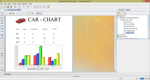
The following table contains data regarding the features of three car brands. We will depict this data using a bar chart.
| Car | Speed | User Rating | Mileage | Safety |
|---|---|---|---|---|
| Fiat | 1 | 3 | 5 | 5 |
| Audi | 5 | 6 | 10 | 4 |
| Ford | 4 | 2 | 3 | 6 |
First of all, create a table named car based on the given table data. We are using MySQL database as the data source. Add that (data source) to the Pentaho Reporting Designer. We have already discussed how to add a data source and a query to the Pentaho Reporting Designer in the chapter "Pentaho Data Sources and Queries".
Steps to Create a Chart in Pentaho
Now, follow the steps given below to create a chart based on the given scenario.
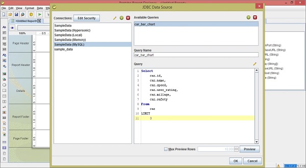
Step 1 - Add a Query
The query will retrieve all the records from the table car. Therefore the query should be as follows −
Select
   car.id,
   car.name,
   car.speed,
   car.user_rating,
   car.millage,
   car.safety
From
   car
LIMIT
   3
The following screenshot shows how to add the given query to the data source.
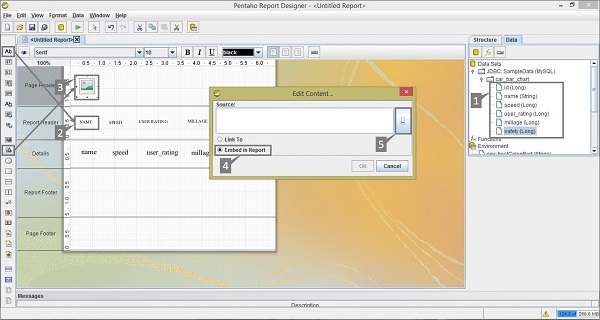
Step 2 - Add an Image to the Page Header
This is an optional step, however it is important because images play an important role in improving the aesthetics of a report.
Take a look at the following screenshot. We have highlighted the following five activities here −
After adding a query, you will find the query fields on the Structure pane. From the Structure pane, select the respective fields, drag and drop into the Details tab of the report workspace.
The Details tab presents only the field values. Add those respective heading Labels to the Report Header tab by selecting the label field from the palette.
Add an image taken from the palette and place it on the Page Header Tab. Add another label in the Page Header for Report Heading and use a suitable heading, for example CAR CHART, for effective presentation. Double-click on the image element you will find a dialogue box called Edit Content.
You have two options to insert an image. Either link the image URL to the report or embed the image into the report. We chose to embed the image by selecting the option Embed in Report.
Download some sample car image from the internet to put into the Page Header. Click on the button to locate the sample car image with the location URL. Click the OK button to confirm.
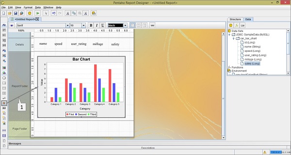
Step 3 - Add Chart into Report Footer
Add the chart by clicking select and dragging it from the left-side palette to the Report. It is marked as "1" in the following screenshot. Double-click on the Bar chart element on the Report Footer.
Step 4 - Add Chart Properties
After double-clicking on the chart element, you will find a dialogue box where you have to provide the data collected details and chart expression details.
Take a look at the following screenshot. The tab Primary Data Source contains two markers −
Marker 1 is a dropdown list where you have to select the Category Set Data Collector.
Marker 2 is also a dropdown list of the category-column where you have to select the name field.
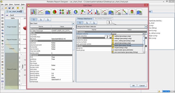
There are three sections in the Primary Data Source − Common, Series, and Group. Here, we dont require to add anything on the Groups section because we are not using any Groups in our query.
Common − There are two fields in this section − category-column and value-column. We already filled the category-column value with the name field in the above section. The second one is value-column.
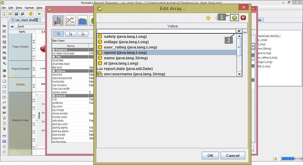
Click on the empty value; you will find a dialogue box as shown in the following screenshot. There are two activities (1 and 2) marked in it.
Click the (+) button to add the value fields in the column.
By clicking on the empty value, you will find a dropdown list from where you need to select the speed field.
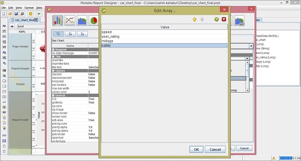
Repeat the above two activities to add user_rating, mileage, and safety fields into the column. After adding all these fields, the screen will appear as shown below. Click OK to confirm.
The next column in the Primary Data source section is the Series section.
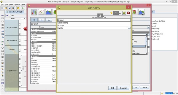
Series − In the Series field, click the series-by-value option. You will find a dialogue box as shown in the following screenshot. There are two markers (1 and 2) in it.
- Click the (+) button to add a new field in the column.
- By double-clicking on it, you can edit that field.
Repeat these two activities for adding field names such as Speed, User Rating, Mileage, and Safety.
These are the user-defined names to present in the particular section of report chart. But here you have follow the same order that you have given on the Value-column fields in the Common section. Click OK after adding all the fields as shown below.
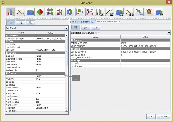
After adding all the sections, you will get the Edit Chart dialogue box as shown in the following screenshot. The Bar Chart pane contains different properties which are used for changing the chart format.
In the General section of the Bar Chart, we have changed the 3-D value as true (marked as "1"). Click OK to confirm the chart properties.
Click on the Preview button on the Formatting Toolbar to see a preview of the report. It will appear as shown in the following screenshot −
You can implement different types of charts in your report by using different types of data models and by providing different values to the chart properties. Pentaho provides almost 18 types of charts in the report designer.
