- ML - Home
- ML - Introduction
- ML - Getting Started
- ML - Basic Concepts
- ML - Ecosystem
- ML - Python Libraries
- ML - Applications
- ML - Life Cycle
- ML - Required Skills
- ML - Implementation
- ML - Challenges & Common Issues
- ML - Limitations
- ML - Reallife Examples
- ML - Data Structure
- ML - Mathematics
- ML - Artificial Intelligence
- ML - Neural Networks
- ML - Deep Learning
- ML - Getting Datasets
- ML - Categorical Data
- ML - Data Loading
- ML - Data Understanding
- ML - Data Preparation
- ML - Models
- ML - Supervised Learning
- ML - Unsupervised Learning
- ML - Semi-supervised Learning
- ML - Reinforcement Learning
- ML - Supervised vs. Unsupervised
- Machine Learning Data Visualization
- ML - Data Visualization
- ML - Histograms
- ML - Density Plots
- ML - Box and Whisker Plots
- ML - Correlation Matrix Plots
- ML - Scatter Matrix Plots
- Statistics for Machine Learning
- ML - Statistics
- ML - Mean, Median, Mode
- ML - Standard Deviation
- ML - Percentiles
- ML - Data Distribution
- ML - Skewness and Kurtosis
- ML - Bias and Variance
- ML - Hypothesis
- Regression Analysis In ML
- ML - Regression Analysis
- ML - Linear Regression
- ML - Simple Linear Regression
- ML - Multiple Linear Regression
- ML - Polynomial Regression
- Classification Algorithms In ML
- ML - Classification Algorithms
- ML - Logistic Regression
- ML - K-Nearest Neighbors (KNN)
- ML - Naïve Bayes Algorithm
- ML - Decision Tree Algorithm
- ML - Support Vector Machine
- ML - Random Forest
- ML - Confusion Matrix
- ML - Stochastic Gradient Descent
- Clustering Algorithms In ML
- ML - Clustering Algorithms
- ML - Centroid-Based Clustering
- ML - K-Means Clustering
- ML - K-Medoids Clustering
- ML - Mean-Shift Clustering
- ML - Hierarchical Clustering
- ML - Density-Based Clustering
- ML - DBSCAN Clustering
- ML - OPTICS Clustering
- ML - HDBSCAN Clustering
- ML - BIRCH Clustering
- ML - Affinity Propagation
- ML - Distribution-Based Clustering
- ML - Agglomerative Clustering
- Dimensionality Reduction In ML
- ML - Dimensionality Reduction
- ML - Feature Selection
- ML - Feature Extraction
- ML - Backward Elimination
- ML - Forward Feature Construction
- ML - High Correlation Filter
- ML - Low Variance Filter
- ML - Missing Values Ratio
- ML - Principal Component Analysis
- Reinforcement Learning
- ML - Reinforcement Learning Algorithms
- ML - Exploitation & Exploration
- ML - Q-Learning
- ML - REINFORCE Algorithm
- ML - SARSA Reinforcement Learning
- ML - Actor-critic Method
- ML - Monte Carlo Methods
- ML - Temporal Difference
- Deep Reinforcement Learning
- ML - Deep Reinforcement Learning
- ML - Deep Reinforcement Learning Algorithms
- ML - Deep Q-Networks
- ML - Deep Deterministic Policy Gradient
- ML - Trust Region Methods
- Quantum Machine Learning
- ML - Quantum Machine Learning
- ML - Quantum Machine Learning with Python
- Machine Learning Miscellaneous
- ML - Performance Metrics
- ML - Automatic Workflows
- ML - Boost Model Performance
- ML - Gradient Boosting
- ML - Bootstrap Aggregation (Bagging)
- ML - Cross Validation
- ML - AUC-ROC Curve
- ML - Grid Search
- ML - Data Scaling
- ML - Train and Test
- ML - Association Rules
- ML - Apriori Algorithm
- ML - Gaussian Discriminant Analysis
- ML - Cost Function
- ML - Bayes Theorem
- ML - Precision and Recall
- ML - Adversarial
- ML - Stacking
- ML - Epoch
- ML - Perceptron
- ML - Regularization
- ML - Overfitting
- ML - P-value
- ML - Entropy
- ML - MLOps
- ML - Data Leakage
- ML - Monetizing Machine Learning
- ML - Types of Data
- Machine Learning - Resources
- ML - Quick Guide
- ML - Cheatsheet
- ML - Interview Questions
- ML - Useful Resources
- ML - Discussion
Machine Learning - Data Visualization
Data visualization is an important aspect of machine learning (ML) as it helps to analyze and communicate patterns, trends, and insights in the data. Data visualization involves creating graphical representations of the data, which can help to identify patterns and relationships that may not be apparent from the raw data.
What is Data Visualization?
Data visualization is a graphical representation of data and information. With the help of data visualization, we can see how the data looks like and what kind of correlation is held by the attributes of the data. It is the fastest way to see if the features correspond to the output.
Importance of Data Visualization in Machine Learning
The data visualization play a significant role in machine learning. We can use it in many ways in machine learning. Here are some of the ways data visualization is used in machine learning −
- Exploring Data − Data visualization is an essential tool for exploring and understanding data. Visualization can help to identify patterns, correlations, and outliers and can also help to detect data quality issues such as missing values and inconsistencies.
- Feature Selection − Data visualization can help to select relevant features for the ML model. By visualizing the data and its relationship with the target variable, you can identify features that are strongly correlated with the target variable and exclude irrelevant features that have little predictive power.
- Model Evaluation − Data visualization can be used to evaluate the performance of the ML model. Visualization techniques such as ROC curves, precision-recall curves, and confusion matrices can help to understand the accuracy, precision, recall, and F1 score of the model.
- Communicating Insights − Data visualization is an effective way to communicate insights and results to stakeholders who may not have a technical background. Visualizations such as scatter plots, line charts, and bar charts can help to convey complex information in an easily understandable format.
Popular Python Libraries for Data Visualization
Following are the most popular Python libraries for data visualization in Machine learning. These libraries provide a wide range of visualization techniques and customization options to suit different needs and preferences.
1. Matplotlib
Matplotlib is one of the most popular Python packages used for data visualization. It is a cross-platform library for making 2D plots from data in arrays. It provides an object-oriented API that helps in embedding plots in applications using Python GUI toolkits such as PyQt, WxPython, or Tkinter. It can be used in Python and IPython shells, Jupyter notebook and web application servers also.
2. Seaborn
Seaborn is an open source, BSD-licensed Python library providing high level API for visualizing the data using Python programming language.
3. Plotly
Plotly is a Montreal based technical computing company involved in development of data analytics and visualisation tools such as Dash and Chart Studio. It has also developed open source graphing Application Programming Interface (API) libraries for Python, R, MATLAB, Javascript and other computer programming languages.
4. Bokeh
Bokeh is a data visualization library for Python. Unlike Matplotlib and Seaborn, they are also Python packages for data visualization, Bokeh renders its plots using HTML and JavaScript. Hence, it proves to be extremely useful for developing web based dashboards.
Types of Data Visualization
Data visualization for machine learning data can be classified into two different categories as follows -
- Univariate Plots
- Multivariate Plots
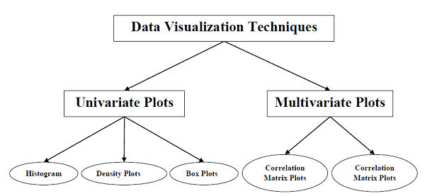
Let's understand each of the above two type of data visualization plots in detail.
Univariate Plots: Understanding Attributes Independently
The simplest type of visualization is single-variable or univariate visualization. With the help of univariate visualization, we can understand each attribute of our dataset independently. The following are some techniques in Python to implement univariate visualization −
We will learn the above techniques in detail in their respective chapters. Let's look at these techniques in brief.
Example - Histograms
Histograms group the data in bins and is the fastest way to get an idea about the distribution of each attribute in the dataset. The following are some of the characteristics of histograms −
- It provides us a count of the number of observations in each bin created for visualization.
- From the shape of the bin, we can easily observe the distribution, i.e., whether it is Gaussian, skewed, or exponential.
- Histograms also help us to see possible outliers.
The code below is an example of a Python script creating the histogram. Here, we will be using hist() function on NumPy Array to generate histograms and matplotlib for plotting them.
import matplotlib.pyplot as plt
import numpy as np
# Generate some random data
data = np.random.randn(1000)
# Create the histogram
plt.hist(data, bins=30, color='skyblue', edgecolor='black')
plt.xlabel('Values')
plt.ylabel('Frequency')
plt.title('Histogram Example')
plt.show()
Output

Because of random number generation, you may notice a slight difference between the outputs when you execute the above program.
Example - Density Plots
Density Plot is another quick and easy technique for getting each attribute distribution. It is also like histogram but having a smooth curve drawn through the top of each bin. We can call them as abstracted histograms.
In the following example, the Python script will generate Density Plots for the distribution of attributes of the iris dataset.
import seaborn as sns
import matplotlib.pyplot as plt
# Load a sample dataset
df = sns.load_dataset("iris")
# Create the density plot
sns.kdeplot(data=df, x="sepal_length", fill=True)
# Add labels and title
plt.xlabel("Sepal Length")
plt.ylabel("Density")
plt.title("Density Plot of Sepal Length")
# Show the plot
plt.show()
Output

From the above output, the difference between Density plots and Histograms can be easily understood.
Example - Box and Whisker Plots
Box and Whisker Plots, also called boxplots in short, is another useful technique to review the distribution of each attributes distribution. The following are the characteristics of this technique −
- It is univariate in nature and summarizes the distribution of each attribute.
- It draws a line for the middle value i.e. for median.
- It draws a box around the 25% and 75%.
- It also draws whiskers which will give us an idea about the spread of the data.
- The dots outside the whiskers signifies the outlier values. Outlier values would be 1.5 times greater than the size of the spread of the middle data.
In the following example, the Python script will generate a Box and Whisker Plot for the distribution of attributes of the Iris dataset.
import matplotlib.pyplot as plt
# Sample data
data = [10, 15, 18, 20, 22, 25, 28, 30, 32, 35]
# Create a figure and axes
fig, ax = plt.subplots()
# Create the boxplot
ax.boxplot(data)
# Set the title
ax.set_title('Box and Whisker Plot')
# Show the plot
plt.show()
Output

Multivariate Plots: Interaction Among Multiple Variables
Another type of visualization is multi-variable or multivariate visualization. With the help of multivariate visualization, we can understand the interaction between multiple attributes of our dataset. The following are some techniques in Python to implement multivariate visualization −
Example - Correlation Matrix Plot
Correlation is an indication of the changes between two variables. We can plot correlation matrix plot to show which variable is having a high or low correlation in respect to another variable.
In the following example, the Python script will generate a correlation matrix plot. It can be generated with the help of corr() function on Pandas DataFrame and plotted with the help of Matplotlib pyplot.
import pandas as pd
import seaborn as sns
import matplotlib.pyplot as plt
# Sample data
data = {'A': [1, 2, 3, 4, 5],
        'B': [5, 4, 3, 2, 1],
        'C': [2, 3, 1, 4, 5]}
df = pd.DataFrame(data)
# Calculate the correlation matrix
c_matrix = df.corr()
# Create a heatmap
sns.heatmap(c_matrix, annot=True, cmap='coolwarm')
plt.title("Correlation Matrix")
plt.show()
Output

From the above output of the correlation matrix, we can see that it is symmetrical i.e. the bottom left is same as the top right.
Example - Scatter Matrix Plot
Scatter matrix plot shows how much one variable is affected by another or the relationship between them with the help of dots in two dimensions. Scatter plots are very much like line graphs in the concept that they use horizontal and vertical axes to plot data points.
In the following example, the Python script will generate and plot the Scatter matrix for the Iris dataset. It can be generated with the help of scatter_matrix() function on Pandas DataFrame and plotted with the help of pyplot.
import pandas as pd
import matplotlib.pyplot as plt
from sklearn import datasets
# Load the iris dataset
iris = datasets.load_iris()
df = pd.DataFrame(iris.data, columns=iris.feature_names)
# Create the scatter matrix plot
pd.plotting.scatter_matrix(df, diagonal='hist', figsize=(8, 7))
plt.show()
Output

In the next few chapters, we will look at some of the popular and widely used visualization techniques available in machine learning.
