- ML - Home
- ML - Introduction
- ML - Getting Started
- ML - Basic Concepts
- ML - Ecosystem
- ML - Python Libraries
- ML - Applications
- ML - Life Cycle
- ML - Required Skills
- ML - Implementation
- ML - Challenges & Common Issues
- ML - Limitations
- ML - Reallife Examples
- ML - Data Structure
- ML - Mathematics
- ML - Artificial Intelligence
- ML - Neural Networks
- ML - Deep Learning
- ML - Getting Datasets
- ML - Categorical Data
- ML - Data Loading
- ML - Data Understanding
- ML - Data Preparation
- ML - Models
- ML - Supervised Learning
- ML - Unsupervised Learning
- ML - Semi-supervised Learning
- ML - Reinforcement Learning
- ML - Supervised vs. Unsupervised
- Machine Learning Data Visualization
- ML - Data Visualization
- ML - Histograms
- ML - Density Plots
- ML - Box and Whisker Plots
- ML - Correlation Matrix Plots
- ML - Scatter Matrix Plots
- Statistics for Machine Learning
- ML - Statistics
- ML - Mean, Median, Mode
- ML - Standard Deviation
- ML - Percentiles
- ML - Data Distribution
- ML - Skewness and Kurtosis
- ML - Bias and Variance
- ML - Hypothesis
- Regression Analysis In ML
- ML - Regression Analysis
- ML - Linear Regression
- ML - Simple Linear Regression
- ML - Multiple Linear Regression
- ML - Polynomial Regression
- Classification Algorithms In ML
- ML - Classification Algorithms
- ML - Logistic Regression
- ML - K-Nearest Neighbors (KNN)
- ML - Naïve Bayes Algorithm
- ML - Decision Tree Algorithm
- ML - Support Vector Machine
- ML - Random Forest
- ML - Confusion Matrix
- ML - Stochastic Gradient Descent
- Clustering Algorithms In ML
- ML - Clustering Algorithms
- ML - Centroid-Based Clustering
- ML - K-Means Clustering
- ML - K-Medoids Clustering
- ML - Mean-Shift Clustering
- ML - Hierarchical Clustering
- ML - Density-Based Clustering
- ML - DBSCAN Clustering
- ML - OPTICS Clustering
- ML - HDBSCAN Clustering
- ML - BIRCH Clustering
- ML - Affinity Propagation
- ML - Distribution-Based Clustering
- ML - Agglomerative Clustering
- Dimensionality Reduction In ML
- ML - Dimensionality Reduction
- ML - Feature Selection
- ML - Feature Extraction
- ML - Backward Elimination
- ML - Forward Feature Construction
- ML - High Correlation Filter
- ML - Low Variance Filter
- ML - Missing Values Ratio
- ML - Principal Component Analysis
- Reinforcement Learning
- ML - Reinforcement Learning Algorithms
- ML - Exploitation & Exploration
- ML - Q-Learning
- ML - REINFORCE Algorithm
- ML - SARSA Reinforcement Learning
- ML - Actor-critic Method
- ML - Monte Carlo Methods
- ML - Temporal Difference
- Deep Reinforcement Learning
- ML - Deep Reinforcement Learning
- ML - Deep Reinforcement Learning Algorithms
- ML - Deep Q-Networks
- ML - Deep Deterministic Policy Gradient
- ML - Trust Region Methods
- Quantum Machine Learning
- ML - Quantum Machine Learning
- ML - Quantum Machine Learning with Python
- Machine Learning Miscellaneous
- ML - Performance Metrics
- ML - Automatic Workflows
- ML - Boost Model Performance
- ML - Gradient Boosting
- ML - Bootstrap Aggregation (Bagging)
- ML - Cross Validation
- ML - AUC-ROC Curve
- ML - Grid Search
- ML - Data Scaling
- ML - Train and Test
- ML - Association Rules
- ML - Apriori Algorithm
- ML - Gaussian Discriminant Analysis
- ML - Cost Function
- ML - Bayes Theorem
- ML - Precision and Recall
- ML - Adversarial
- ML - Stacking
- ML - Epoch
- ML - Perceptron
- ML - Regularization
- ML - Overfitting
- ML - P-value
- ML - Entropy
- ML - MLOps
- ML - Data Leakage
- ML - Monetizing Machine Learning
- ML - Types of Data
- Machine Learning - Resources
- ML - Quick Guide
- ML - Cheatsheet
- ML - Interview Questions
- ML - Useful Resources
- ML - Discussion
Machine Learning - AUC-ROC Curve
The AUC-ROC curve is a commonly used performance metric in machine learning that is used to evaluate the performance of binary classification models. It is a plot of the true positive rate (TPR) against the false positive rate (FPR) at different threshold values.
What is the AUC-ROC Curve?
The AUC-ROC curve is a graphical representation of the performance of a binary classification model at different threshold values. It plots the true positive rate (TPR) on the y-axis and the false positive rate (FPR) on the x-axis. The TPR is the proportion of actual positive cases that are correctly identified by the model, while the FPR is the proportion of actual negative cases that are incorrectly classified as positive by the model.
The AUC-ROC curve is a useful metric for evaluating the overall performance of a binary classification model because it takes into account the trade-off between TPR and FPR at different threshold values. The area under the curve (AUC) represents the overall performance of the model across all possible threshold values. A perfect classifier would have an AUC of 1.0, while a random classifier would have an AUC of 0.5.
Why is the AUC-ROC Curve Important?
The AUC-ROC curve is an important performance metric in machine learning because it provides a comprehensive measure of a model's ability to distinguish between positive and negative cases.
It is particularly useful when the data is imbalanced, meaning that one class is much more prevalent than the other. In such cases, accuracy alone may not be a good measure of the model's performance because it can be skewed by the prevalence of the majority class.
The AUC-ROC curve provides a more balanced view of the model's performance by taking into account both TPR and FPR.
Implementing the AUC ROC Curve in Python
Now that we understand what the AUC-ROC curve is and why it is important, let's see how we can implement it in Python. We will use the Scikit-learn library to build a binary classification model and plot the AUC-ROC curve.
First, we need to import the necessary libraries and load the dataset. In this example, we will be using the breast cancer dataset from scikit-learn.
import numpy as np
import pandas as pd
from sklearn.datasets import load_breast_cancer
from sklearn.model_selection import train_test_split
from sklearn.linear_model import LogisticRegression
from sklearn.metrics import roc_auc_score, roc_curve
import matplotlib.pyplot as plt

# load the dataset
data = load_breast_cancer()
X = data.data
y = data.target

# split the data into train and test sets
X_train, X_test, y_train, y_test = train_test_split(X, y, test_size=0.2, random_state=42)
Next, we will fit a logistic regression model to the training set and make predictions on the test set.
# fit a logistic regression model
lr = LogisticRegression()
lr.fit(X_train, y_train)

# make predictions on the test set
y_pred = lr.predict_proba(X_test)[:, 1]
After making predictions, we can calculate the AUC-ROC score using the roc_auc_score() function from scikit-learn.
# calculate the AUC-ROC score
auc_roc = roc_auc_score(y_test, y_pred)
print("AUC-ROC Score:", auc_roc)
This will output the AUC-ROC score for the logistic regression model.
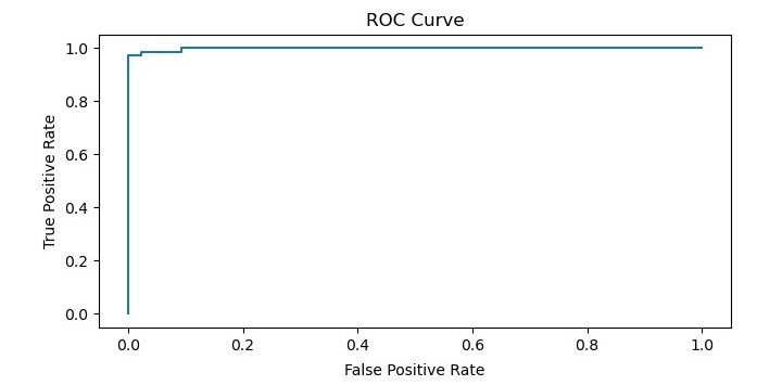
Finally, we can plot the ROC curve using the roc_curve() function and matplotlib library.
# plot the ROC curve
fpr, tpr, thresholds = roc_curve(y_test, y_pred)
plt.plot(fpr, tpr)
plt.title('ROC Curve')
plt.xlabel('False Positive Rate')
plt.ylabel('True Positive Rate')
plt.show()
Complete Example
 import numpy as np
import pandas as pd
from sklearn.datasets import load_breast_cancer
from sklearn.model_selection import train_test_split
from sklearn.linear_model import LogisticRegression
from sklearn.metrics import roc_auc_score, roc_curve
import matplotlib.pyplot as plt

# load the dataset
data = load_breast_cancer()
X = data.data
y = data.target

# split the data into train and test sets
X_train, X_test, y_train, y_test = train_test_split(X, y, test_size=0.2, random_state=42)

# fit a logistic regression model
lr = LogisticRegression()
lr.fit(X_train, y_train)

# make predictions on the test set
y_pred = lr.predict_proba(X_test)[:, 1]

# calculate the AUC-ROC score
auc_roc = roc_auc_score(y_test, y_pred)
print("AUC-ROC Score:", auc_roc)

# plot the ROC curve
fpr, tpr, thresholds = roc_curve(y_test, y_pred)
plt.plot(fpr, tpr)
plt.title('ROC Curve')
plt.xlabel('False Positive Rate')
plt.ylabel('True Positive Rate')
plt.show()
Output
When you execute this code, it will plot the ROC curve for the logistic regression model.
In addition, it will print the AUC-ROC score on the terminal −
AUC-ROC Score: 0.9967245332459875
