- ML - Home
- ML - Introduction
- ML - Getting Started
- ML - Basic Concepts
- ML - Ecosystem
- ML - Python Libraries
- ML - Applications
- ML - Life Cycle
- ML - Required Skills
- ML - Implementation
- ML - Challenges & Common Issues
- ML - Limitations
- ML - Reallife Examples
- ML - Data Structure
- ML - Mathematics
- ML - Artificial Intelligence
- ML - Neural Networks
- ML - Deep Learning
- ML - Getting Datasets
- ML - Categorical Data
- ML - Data Loading
- ML - Data Understanding
- ML - Data Preparation
- ML - Models
- ML - Supervised Learning
- ML - Unsupervised Learning
- ML - Semi-supervised Learning
- ML - Reinforcement Learning
- ML - Supervised vs. Unsupervised
- Machine Learning Data Visualization
- ML - Data Visualization
- ML - Histograms
- ML - Density Plots
- ML - Box and Whisker Plots
- ML - Correlation Matrix Plots
- ML - Scatter Matrix Plots
- Statistics for Machine Learning
- ML - Statistics
- ML - Mean, Median, Mode
- ML - Standard Deviation
- ML - Percentiles
- ML - Data Distribution
- ML - Skewness and Kurtosis
- ML - Bias and Variance
- ML - Hypothesis
- Regression Analysis In ML
- ML - Regression Analysis
- ML - Linear Regression
- ML - Simple Linear Regression
- ML - Multiple Linear Regression
- ML - Polynomial Regression
- Classification Algorithms In ML
- ML - Classification Algorithms
- ML - Logistic Regression
- ML - K-Nearest Neighbors (KNN)
- ML - Naïve Bayes Algorithm
- ML - Decision Tree Algorithm
- ML - Support Vector Machine
- ML - Random Forest
- ML - Confusion Matrix
- ML - Stochastic Gradient Descent
- Clustering Algorithms In ML
- ML - Clustering Algorithms
- ML - Centroid-Based Clustering
- ML - K-Means Clustering
- ML - K-Medoids Clustering
- ML - Mean-Shift Clustering
- ML - Hierarchical Clustering
- ML - Density-Based Clustering
- ML - DBSCAN Clustering
- ML - OPTICS Clustering
- ML - HDBSCAN Clustering
- ML - BIRCH Clustering
- ML - Affinity Propagation
- ML - Distribution-Based Clustering
- ML - Agglomerative Clustering
- Dimensionality Reduction In ML
- ML - Dimensionality Reduction
- ML - Feature Selection
- ML - Feature Extraction
- ML - Backward Elimination
- ML - Forward Feature Construction
- ML - High Correlation Filter
- ML - Low Variance Filter
- ML - Missing Values Ratio
- ML - Principal Component Analysis
- Reinforcement Learning
- ML - Reinforcement Learning Algorithms
- ML - Exploitation & Exploration
- ML - Q-Learning
- ML - REINFORCE Algorithm
- ML - SARSA Reinforcement Learning
- ML - Actor-critic Method
- ML - Monte Carlo Methods
- ML - Temporal Difference
- Deep Reinforcement Learning
- ML - Deep Reinforcement Learning
- ML - Deep Reinforcement Learning Algorithms
- ML - Deep Q-Networks
- ML - Deep Deterministic Policy Gradient
- ML - Trust Region Methods
- Quantum Machine Learning
- ML - Quantum Machine Learning
- ML - Quantum Machine Learning with Python
- Machine Learning Miscellaneous
- ML - Performance Metrics
- ML - Automatic Workflows
- ML - Boost Model Performance
- ML - Gradient Boosting
- ML - Bootstrap Aggregation (Bagging)
- ML - Cross Validation
- ML - AUC-ROC Curve
- ML - Grid Search
- ML - Data Scaling
- ML - Train and Test
- ML - Association Rules
- ML - Apriori Algorithm
- ML - Gaussian Discriminant Analysis
- ML - Cost Function
- ML - Bayes Theorem
- ML - Precision and Recall
- ML - Adversarial
- ML - Stacking
- ML - Epoch
- ML - Perceptron
- ML - Regularization
- ML - Overfitting
- ML - P-value
- ML - Entropy
- ML - MLOps
- ML - Data Leakage
- ML - Monetizing Machine Learning
- ML - Types of Data
- Machine Learning - Resources
- ML - Quick Guide
- ML - Cheatsheet
- ML - Interview Questions
- ML - Useful Resources
- ML - Discussion
Machine Learning - Density Plots
A density plot is a type of plot that shows the probability density function of a continuous variable. It is similar to a histogram, but instead of using bars to represent the frequency of each value, it uses a smooth curve to represent the probability density function. The xaxis represents the range of values of the variable, and the y-axis represents the probability density.
Density plots are useful for identifying patterns in data, such as skewness, modality, and outliers. Skewness refers to the degree of asymmetry in the distribution of the variable. Modality refers to the number of peaks in the distribution. Outliers are data points that fall outside of the range of typical values for the variable.
Python Implementation of Density Plots
Python provides several libraries for data visualization, such as Matplotlib, Seaborn, Plotly, and Bokeh. For our example given below, we will use Seaborn to implement density plots.
We will use the breast cancer dataset from the Sklearn library for this example. The breast cancer dataset contains information about the characteristics of breast cancer cells and whether they are malignant or benign. The dataset has 30 features and 569 samples.
Example - Density Plots
Let's start by importing the necessary libraries and loading the dataset −
import matplotlib.pyplot as plt
import seaborn as sns
from sklearn.datasets import load_breast_cancer
data = load_breast_cancer()
Next, we will create a density plot of the mean radius feature of the dataset −
import matplotlib.pyplot as plt
import seaborn as sns
from sklearn.datasets import load_breast_cancer
data = load_breast_cancer()

plt.figure(figsize=(7.2, 3.5))
sns.kdeplot(data.data[:,0], shade=True)
plt.xlabel('Mean Radius')
plt.ylabel('Density')
plt.show()
In this code, we have used the kdeplot() function from Seaborn to create a density plot of the mean radius feature of the dataset. We have set the shade parameter to True to shade the area under the curve. We have also added labels to the x and y axes using the xlabel() and ylabel() functions.
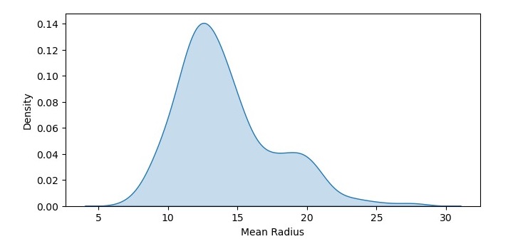
Output
The resulting density plot shows the probability density function of mean radius values in the dataset. We can see that the data is roughly normally distributed, with a peak around 12-14.
Example - Density Plot with Multiple Data Sets
We can also create a density plot with multiple data sets to compare their probability density functions. Let's create density plots of the mean radius feature for both the malignant and benign samples −
import matplotlib.pyplot as plt
import seaborn as sns
from sklearn.datasets import load_breast_cancer
data = load_breast_cancer()

plt.figure(figsize=(7.5, 3.5))
sns.kdeplot(data.data[data.target==0,0], shade=True, label='Malignant')
sns.kdeplot(data.data[data.target==1,0], shade=True, label='Benign')
plt.xlabel('Mean Radius')
plt.ylabel('Density')
plt.legend()
plt.show()
In this code, we have used the kdeplot() function twice to create two density plots of the mean radius feature, one for the malignant samples and one for the benign samples. We have set the shade parameter to True to shade the area under the curve, and we have added labels to the plots using the label parameter. We have also added a legend to the plot using the legend() function.
Output
On executing this code, you will get the following plot as the output −
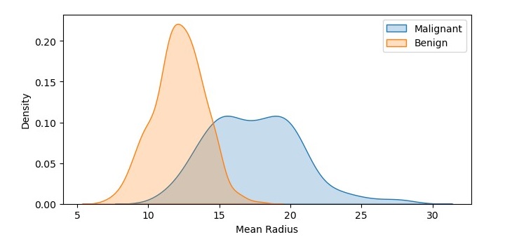
The resulting density plot shows the probability density functions of mean radius values for both the malignant and benign samples. We can see that the probability density function for the malignant samples is shifted to the right, indicating a higher mean radius value.
