- Matplotlib - Home
- Matplotlib - Introduction
- Matplotlib - Vs Seaborn
- Matplotlib - Environment Setup
- Matplotlib - Anaconda distribution
- Matplotlib - Jupyter Notebook
- Matplotlib - Pyplot API
- Matplotlib - Simple Plot
- Matplotlib - Saving Figures
- Matplotlib - Markers
- Matplotlib - Figures
- Matplotlib - Styles
- Matplotlib - Legends
- Matplotlib - Colors
- Matplotlib - Colormaps
- Matplotlib - Colormap Normalization
- Matplotlib - Choosing Colormaps
- Matplotlib - Colorbars
- Matplotlib - Working With Text
- Matplotlib - Text properties
- Matplotlib - Subplot Titles
- Matplotlib - Images
- Matplotlib - Image Masking
- Matplotlib - Annotations
- Matplotlib - Arrows
- Matplotlib - Fonts
- Matplotlib - Font Indexing
- Matplotlib - Font Properties
- Matplotlib - Scales
- Matplotlib - LaTeX
- Matplotlib - LaTeX Text Formatting in Annotations
- Matplotlib - PostScript
- Matplotlib - Mathematical Expressions
- Matplotlib - Animations
- Matplotlib - Celluloid Library
- Matplotlib - Blitting
- Matplotlib - Toolkits
- Matplotlib - Artists
- Matplotlib - Styling with Cycler
- Matplotlib - Paths
- Matplotlib - Path Effects
- Matplotlib - Transforms
- Matplotlib - Ticks and Tick Labels
- Matplotlib - Radian Ticks
- Matplotlib - Dateticks
- Matplotlib - Tick Formatters
- Matplotlib - Tick Locators
- Matplotlib - Basic Units
- Matplotlib - Autoscaling
- Matplotlib - Reverse Axes
- Matplotlib - Logarithmic Axes
- Matplotlib - Symlog
- Matplotlib - Unit Handling
- Matplotlib - Ellipse with Units
- Matplotlib - Spines
- Matplotlib - Axis Ranges
- Matplotlib - Axis Scales
- Matplotlib - Axis Ticks
- Matplotlib - Formatting Axes
- Matplotlib - Axes Class
- Matplotlib - Twin Axes
- Matplotlib - Figure Class
- Matplotlib - Multiplots
- Matplotlib - Grids
- Matplotlib - Object-oriented Interface
- Matplotlib - PyLab module
- Matplotlib - Subplots() Function
- Matplotlib - Subplot2grid() Function
- Matplotlib - Anchored Artists
- Matplotlib - Manual Contour
- Matplotlib - Coords Report
- Matplotlib - AGG filter
- Matplotlib - Ribbon Box
- Matplotlib - Fill Spiral
- Matplotlib - Findobj Method
- Matplotlib - Hyperlinks
- Matplotlib - Image Thumbnail
- Matplotlib - Plotting with Keywords
- Matplotlib - Create Logo
- Matplotlib - Multipage PDF
- Matplotlib - Multiprocessing
- Matplotlib - Print Stdout
- Matplotlib - Compound Path
- Matplotlib - Sankey Class
- Matplotlib - MRI with EEG
- Matplotlib - Stylesheets
- Matplotlib - Background Colors
- Matplotlib - Basemap
Matplotlib Events
- Matplotlib - Event Handling
- Matplotlib - Close Event
- Matplotlib - Mouse Move
- Matplotlib - Click Events
- Matplotlib - Scroll Event
- Matplotlib - Keypress Event
- Matplotlib - Pick Event
- Matplotlib - Looking Glass
- Matplotlib - Path Editor
- Matplotlib - Poly Editor
- Matplotlib - Timers
- Matplotlib - Viewlims
- Matplotlib - Zoom Window
Matplotlib Widgets
- Matplotlib - Cursor Widget
- Matplotlib - Annotated Cursor
- Matplotlib - Button Widget
- Matplotlib - Check Buttons
- Matplotlib - Lasso Selector
- Matplotlib - Menu Widget
- Matplotlib - Mouse Cursor
- Matplotlib - Multicursor
- Matplotlib - Polygon Selector
- Matplotlib - Radio Buttons
- Matplotlib - RangeSlider
- Matplotlib - Rectangle Selector
- Matplotlib - Ellipse Selector
- Matplotlib - Slider Widget
- Matplotlib - Span Selector
- Matplotlib - Textbox
Matplotlib Plotting
- Matplotlib - Line Plots
- Matplotlib - Area Plots
- Matplotlib - Bar Graphs
- Matplotlib - Histogram
- Matplotlib - Pie Chart
- Matplotlib - Scatter Plot
- Matplotlib - Box Plot
- Matplotlib - Arrow Demo
- Matplotlib - Fancy Boxes
- Matplotlib - Zorder Demo
- Matplotlib - Hatch Demo
- Matplotlib - Mmh Donuts
- Matplotlib - Ellipse Demo
- Matplotlib - Bezier Curve
- Matplotlib - Bubble Plots
- Matplotlib - Stacked Plots
- Matplotlib - Table Charts
- Matplotlib - Polar Charts
- Matplotlib - Hexagonal bin Plots
- Matplotlib - Violin Plot
- Matplotlib - Event Plot
- Matplotlib - Heatmap
- Matplotlib - Stairs Plots
- Matplotlib - Errorbar
- Matplotlib - Hinton Diagram
- Matplotlib - Contour Plot
- Matplotlib - Wireframe Plots
- Matplotlib - Surface Plots
- Matplotlib - Triangulations
- Matplotlib - Stream plot
- Matplotlib - Ishikawa Diagram
- Matplotlib - 3D Plotting
- Matplotlib - 3D Lines
- Matplotlib - 3D Scatter Plots
- Matplotlib - 3D Contour Plot
- Matplotlib - 3D Bar Plots
- Matplotlib - 3D Wireframe Plot
- Matplotlib - 3D Surface Plot
- Matplotlib - 3D Vignettes
- Matplotlib - 3D Volumes
- Matplotlib - 3D Voxels
- Matplotlib - Time Plots and Signals
- Matplotlib - Filled Plots
- Matplotlib - Step Plots
- Matplotlib - XKCD Style
- Matplotlib - Quiver Plot
- Matplotlib - Stem Plots
- Matplotlib - Visualizing Vectors
- Matplotlib - Audio Visualization
- Matplotlib - Audio Processing
Matplotlib Useful Resources
- Matplotlib - Quick Guide
- Matplotlib - Cheatsheet
- Matplotlib - Useful Resources
- Matplotlib - Discussion
Matplotlib - Line Plots
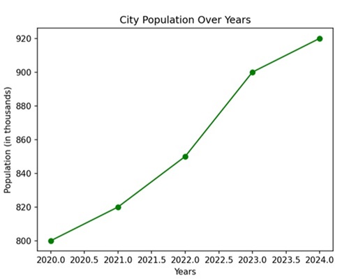
A line plot is a type of graph that displays data points called markers connected by straight line segments. It is generally used to visualize the relationship between two variables; one variable on the x-axis and another on the y-axis.
Line plots are useful for showing trends, patterns, or fluctuations in data over a continuous interval or time. For instance, let us create a graph where we have the population data of a city over several years. The x-axis will represent the years, and the y-axis will represent the population in thousands −
Line Plots in Matplotlib
We can use the plot() function in Matplotlib to draw a line plot by specifying the x and y coordinates of the data points. This function is used to create line plots, which are graphical representations of data points connected by straight lines.
The Plot() Function
The plot() function takes the x and y coordinates of the data points as an input and returns a line plot based on those coordinates.
Following is the syntax of plot() function in Matplotlib −
matplotlib.pyplot.plot(*args, scalex=True, scaley=True, data=None, **kwargs)
Where,
- *args represents the positional arguments.
- scalex and scaley are Boolean values that control whether the x-axis and y-axis should be automatically adjusted to fit the data.
- data allows you to pass a DataFrame or similar structure for plotting.
- **kwargs represents the additional keyword arguments that allow you to customize the appearance of the plot, such as line style, color, markers, etc.
Lets start by drawing a basic line plot.
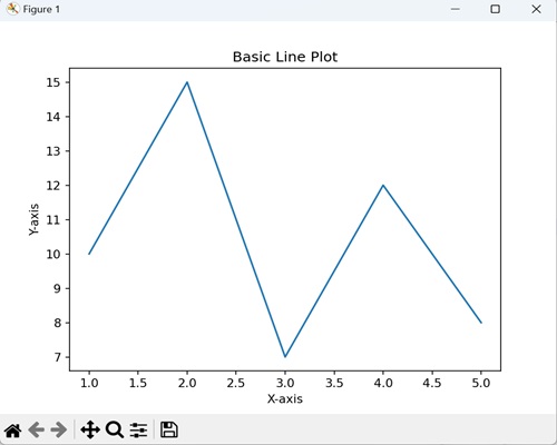
Example - Creating a Basic Line Plot
A basic line plot in Matplotlib connects data points with a line. For instance, if you have pairs of x and y values, the plot() function helps visualize how y changes with respect to x. By specifying these coordinates, you can create a simple line graph to observe trends or patterns.
In the following example, we are drawing a basic line plot using Matplotlib, where x and y are lists representing data points −
import matplotlib.pyplot as plt
# data points
x = [1, 2, 3, 4, 5]
y = [10, 15, 7, 12, 8]
# Create a line plot
plt.plot(x, y)
# Add labels to the axes
plt.xlabel('X-axis')
plt.ylabel('Y-axis')
# Add a title to the plot
plt.title('Basic Line Plot')
# Display the plot
plt.show()
Output
Following is the output of the above code −
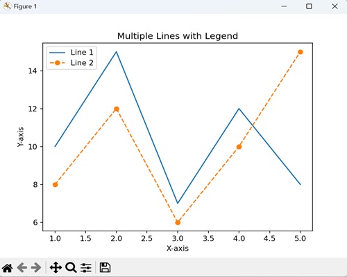
Example - Line plot with Multiple lines
In a line plot with multiple lines using Matplotlib, you can compare and visualize various datasets simultaneously on a single graph. The legend provide labels for each line on the plot, which helps in identifying each line.
The following example determine a plot with two sets of data represented by lines. The legend labels these lines as 'Line 1' and 'Line 2', helping to identify which line corresponds to which dataset −
import matplotlib.pyplot as plt

x = [1, 2, 3, 4, 5]
y1 = [10, 15, 7, 12, 8]
y2 = [8, 12, 6, 10, 15]

plt.plot(x, y1, label='Line 1')
plt.plot(x, y2, label='Line 2', linestyle='--', marker='o')
plt.xlabel('X-axis')
plt.ylabel('Y-axis')
plt.title('Multiple Lines with Legend')
plt.legend()
plt.show()
Output
After executing the above code, we get the following output −
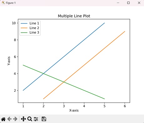
Example - Line Plot using numpy Array
In this example, we are plotting the lines with the help of numpy array instead of lists to represent our datasets −
import numpy as np
import matplotlib.pyplot as plt
# Data points of line 1
x1 = np.array([1, 2, 3, 4, 5])
y1 = np.array([2, 4, 6, 8, 10])
# Data points of line 2
x2 = np.array([2,
 3, 4, 5, 6])
y2 = np.array([1, 3, 5, 7, 9])
# Data points of line 3
x3 = np.array([1, 2, 3, 4, 5])
y3 = np.array([5, 4, 3, 2, 1])
# Plotting all lines with labels
plt.plot(x1, y1, label='Line 1')
plt.plot(x2, y2, label='Line 2')
plt.plot(x3, y3, label='Line 3')
# Adding legend, x and y labels, and title for the lines
plt.legend()
plt.xlabel('X-axis')
plt.ylabel('Y-axis')
plt.title('Multiple Line Plot')
# Displaying the plot
plt.show()
Output
We get the output as shown below −
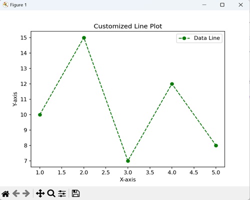
Creating Customized Line Plot
In a customized line plot using Matplotlib, you can control the appearance by specifying details like color, linestyle, and markers, enhancing the visual representation of data −
- Color − You can choose a color for the line, such as 'red' or '#FF0000' (hexadecimal RGB value).
- Linestyle − It determines the pattern of the line, whether it is solid ('-'), dashed ('--'), dotted (':'), or something else.
- Markers − These are symbols placed at data points. They can be customized with various shapes, such as circles ('o'), squares ('s'), or stars ('*').
Example - Line Plot with Green Dashed Line
In here, we are retrieving a line plot with a green dashed line, circular markers, and a labeled legend −
import matplotlib.pyplot as plt

x = [1, 2, 3, 4, 5]
y = [10, 15, 7, 12, 8]

plt.plot(x, y, color='green', linestyle='--', marker='o', label='Data Line')
plt.xlabel('X-axis')
plt.ylabel('Y-axis')
plt.title('Customized Line Plot')
plt.legend()
plt.show()
Output
Output of the above code is as follows −
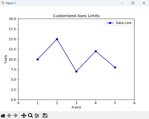
Example - Line plot with customized axes limits
You can also customize axes limits of a line plot using Matplotlib by defining the range of values for the x and y axes. This enables you to focus on specific portions of the data for a more detailed view.
We can customize axes limits using the functions plt.xlim() and plt.ylim() for the x-axis and y-axis respectively.
Following is the basic syntax of the xlim() function −
plt.xlim(left, right)
Where, left is the leftmost value of the x-axis and rightis the rightmost value of the x-axis.
Similarly, you can use the ylim() function for the y-axis to set specific limits.
Now, we are using the xlim() and ylim() functions to set the range of the x-axis as (0, 10) and y-axis as (0, 20) and ensure that only values within this specified range are displayed −
import matplotlib.pyplot as plt

x = [1, 2, 3, 4, 5]
y = [10, 15, 7, 12, 8]

plt.plot(x, y, marker='o', linestyle='-', color='blue', label='Data Line')
plt.xlabel('X-axis')
plt.ylabel('Y-axis')
plt.title('Customized Axes Limits')
plt.legend()
# Set x-axis limits
plt.xlim(0, 6)
# Set y-axis limits
plt.ylim(0, 20)
plt.show()
Output
The output obtained is as shown below −