
Article Categories
- All Categories
-
 Data Structure
-
 Networking
-
 RDBMS
RDBMS
-
 Operating System
-
 Java
Java
-
 MS Excel
-
 iOS
iOS
-
 HTML
HTML
-
 CSS
CSS
-
 Android
-
 Python
-
 C Programming
-
 C++
C++
-
 C#
C#
-
 MongoDB
-
 MySQL
MySQL
-
 Javascript
-
 PHP
PHP
How to plot Timeseries based charts using Pandas?
Often in our daily life, we come across various interactive graphical data. In our daily work life or business, we come across several data sets or charts that help us in decision making, future predictions and much more. One such set of data that we come across in our daily encounters is Time Series data.
A series of data or data points collected in regular intervals of time, such a time bound data set is called Time Series data. These data sets are collected at fixed intervals of time. A simple example can be our weather data, or may be the data in an ECG report, etc. These data sets are all indexed in time and are recorded over a period of time.
Analysis of this data and predicting the future or current scenario is the primary motive of this data. This makes it one of the most widely used forms of data.
In this article, we will try to find out the ways we can explore or visualize these datasets by plotting them into charts using a very popular library in Python called the Pandas. There are several ways we can implement these data sets and gain valuable insights on the data. Visualizing time-based data through charts is crucial for gaining insights and understanding trends within temporal datasets.
Getting started
First, we need to make sure we have a working system with python installed (ver 3.xx or higher preferred). As we are working with Pandas library and matplotlib we need to get these packages ready for python. A simple process is just open a cmd window and run the commands:
pip install pandas
pip install matplotlib
To import these packages later on in our code, we can simply use the import keyword as below:
import pandas as pd
import matplotlib.pyplot as plt
Loading Time Series Data
Now, before plotting the time-series data, we need the data. It can be from a source or we can create and load it into Pandas DataFrame. It is important to ensure the data contains a specific column representing the date and time information (time series data). You can load data into the data frame from various sources such as a .csv file, web apis or databases.
If we have a CSV file named data.csv containing the time series data, we can load it as:
data = pd.read_csv('data.csv', parse_dates=['timestamp_column'])
*Make sure you replace ?data.csv? with the actual file path and ?timestamp_column? with the name of the column containing the time information as per the names or paths on your system.
Setting Timestamp as index
To make sure the data is handled properly for a time series data set, it is crucial to set the timestamp column as the index of the DataFrame. This step is basically to let Pandas know we are working with time series data. You can set the timestamp by a single liner:
data.set_index('timestamp_column', inplace=True)
*Do remember to replace ?timestamp_column? with the name of the column that contains time information on your data sheet.
Using a sample DataSet
For this article we will create a Data Set to avoid any confusion and all our results will be based primarily on this data set, which means the actual code to demonstrate plotting starts from here on. We will create a dataset of 10 rows and 4 columns. Here?s how to create one:
import pandas as pd
ts_data = { 'Date': ['2022-01-01', '2022-02-01','2022-03-01', '2022-04-01',       '2022-05-01', '2022-06-01', '2022-07-01', '2022-08-01','2022-09-01', '2022-10-01'],
'A': [302, 404, 710, 484, 641, 669, 897, 994,1073, 944],'B': [849, 1488, 912, 855,        445, 752, 699, 1045, 1232, 974], 'C': [715, 355,284, 543, 112, 1052, 891, 776,      924, 786]}
dataframe = pd.DataFrame( ts_data,columns=[ 'Date', 'A', 'B', 'C'])
# Changing the datatype of Date
dataframe["Date"] = dataframe["Date"].astype("datetime64[ns]")
# Setting the Date as index
dataframe = dataframe.set_index("Date")
print(dataframe)
Output
               A     B     C
Date
2022-01-01   302   849   715
2022-02-01   404  1488   355
2022-03-01   710   912   284
2022-04-01   484   855   543
2022-05-01   641   445   112
2022-06-01   669   752  1052
2022-07-01   897   699   891
2022-08-01   994  1045   776
2022-09-01  1073  1232   924
2022-10-01   944   974   786
Plotting the Time Series data using pandas
There are several ways in which we can implement or plot these data sets in python using pandas. We have Line charts, Bar charts, Area and Scatter plots and many more.
Let?s look into some of the majorly used plots ahead:
Plotting a Line Chart
This is a very common way of representing time series data. It represents the relation between the two axes X and Y displaying the data points connected by a line.
To create a basic line chart using Pandas and Matplotlib, use the following code:
import matplotlib.pyplot as plt
import pandas as pd
ts_data = { 'Date': ['2022-01-01', '2022-02-01','2022-03-01', '2022-04-01',       '2022-05-01', '2022-06-01', '2022-07-01', '2022-08-01','2022-09-01', '2022-10-01'],
'A': [302, 404, 710, 484, 641, 669, 897, 994,1073, 944],'B': [849, 1488, 912, 855,        445, 752, 699, 1045, 1232, 974], 'C': [715, 355,284, 543, 112, 1052, 891, 776,      924, 786]}
dataframe = pd.DataFrame( ts_data,columns=[ 'Date', 'A', 'B', 'C'])
# Changing the datatype of Date
dataframe["Date"] = dataframe["Date"].astype("datetime64[ns]")
# Setting the Date as index
dataframe = dataframe.set_index("Date")
dataframe.plot(figsize=(10, 6))
plt.title('Timeseries Data')
plt.xlabel('Time')
plt.ylabel('Value')
plt.show()
Output
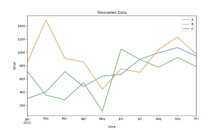
* The figsize determines the size of the chart the the labels can be set accordingly by changing xlabel and ylabel values.
Plotting a Bar Chart
A bar chart is a graphical representation of data with rectangular bars that proportionately represents the respective values. It is more suitable for representing time series data dealing with categorical or discrete values. One axis denotes the comparing categories and the other denotes the respective values. To create a bar chart, use the following code:
Example
import matplotlib.pyplot as plt
import pandas as pd
ts_data = { 'Date': ['2022-01-01', '2022-02-01','2022-03-01', '2022-04-01',       '2022-05-01', '2022-06-01', '2022-07-01', '2022-08-01','2022-09-01', '2022-10-01'],
'A': [302, 404, 710, 484, 641, 669, 897, 994,1073, 944],'B': [849, 1488, 912, 855,        445, 752, 699, 1045, 1232, 974], 'C': [715, 355,284, 543, 112, 1052, 891, 776,      924, 786]}
dataframe = pd.DataFrame( ts_data,columns=[ 'Date', 'A', 'B', 'C'])
# Changing the datatype of Date
dataframe["Date"] = dataframe["Date"].astype("datetime64[ns]")
# Setting the Date as index
dataframe = dataframe.set_index("Date")
dataframe.plot(kind='bar', figsize=(10, 6))
plt.title('Timeseries Data')
plt.xlabel('Time')
plt.ylabel('Value')
plt.show()
Output
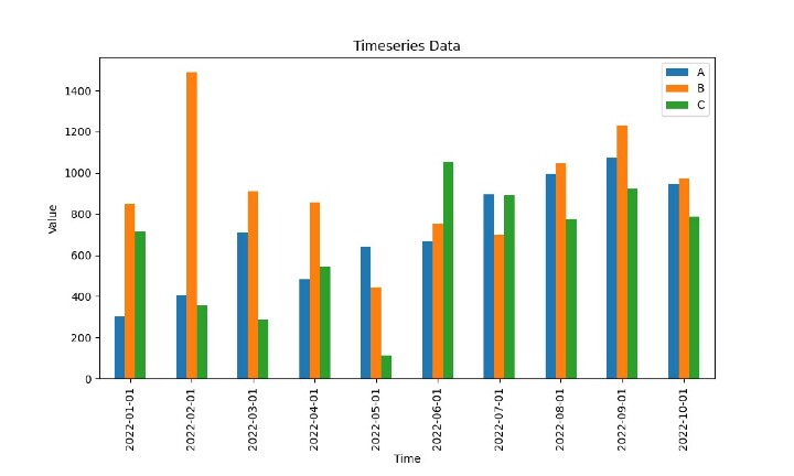
*This is just a representation of the sample data frame.
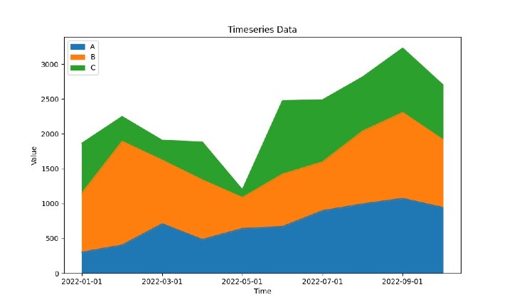
Plotting an Area Chart
Area charts are used to visualize the magnitude and proportion of different variables over time. They are created by filling the area below the line plot. Using pandas, we generate such plots as:
Example
import matplotlib.pyplot as plt
import pandas as pd
ts_data = { 'Date': ['2022-01-01', '2022-02-01','2022-03-01', '2022-04-01',       '2022-05-01', '2022-06-01', '2022-07-01', '2022-08-01','2022-09-01', '2022-10-01'],
'A': [302, 404, 710, 484, 641, 669, 897, 994,1073, 944],'B': [849, 1488, 912, 855,        445, 752, 699, 1045, 1232, 974], 'C': [715, 355,284, 543, 112, 1052, 891, 776,      924, 786]}
dataframe = pd.DataFrame( ts_data,columns=[ 'Date', 'A', 'B', 'C'])
# Changing the datatype of Date
dataframe["Date"] = dataframe["Date"].astype("datetime64[ns]")
# Setting the Date as index
dataframe = dataframe.set_index("Date")
dataframe.plot(kind='area', figsize=(10, 6))
plt.title('Timeseries Data')
plt.xlabel('Time')
plt.ylabel('Value')
plt.show()
Output
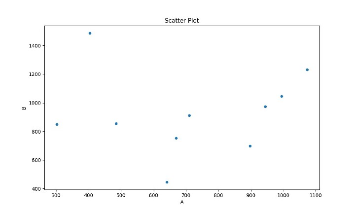
Plotting Scatter Plots
Scatter plots are effective for understanding the relationship between two continuous variables. They help us understand trends, correlations and clusters from the dataset. Simple syntax to generate scatter plots from given dataset is:
Example
import matplotlib.pyplot as plt
import pandas as pd
ts_data = { 'Date': ['2022-01-01', '2022-02-01','2022-03-01', '2022-04-01',       '2022-05-01', '2022-06-01', '2022-07-01', '2022-08-01','2022-09-01', '2022-10-01'],
'A': [302, 404, 710, 484, 641, 669, 897, 994,1073, 944],'B': [849, 1488, 912, 855,        445, 752, 699, 1045, 1232, 974], 'C': [715, 355,284, 543, 112, 1052, 891, 776,      924, 786]}
dataframe = pd.DataFrame( ts_data,columns=[ 'Date', 'A', 'B', 'C'])
# Changing the datatype of Date
dataframe["Date"] = dataframe["Date"].astype("datetime64[ns]")
# Setting the Date as index
dataframe = dataframe.set_index("Date")
dataframe.plot(kind='scatter', x='A', y='B', figsize=(10, 6))
plt.title('Scatter Plot')
plt.xlabel('A')
plt.ylabel('B')
plt.show()
Output
Customizing Time Series Plots
Pandas and Matplotlib gives us the flexibility where we can customize our time series plots. You can adjust aspects including line styles, marker styles, color schemes, and axis formatting.
Let's quickly explore a few customization options, we will try to make simple changes::
Example
import matplotlib.pyplot as plt
import pandas as pd
ts_data = { 'Date': ['2022-01-01', '2022-02-01','2022-03-01', '2022-04-01',       '2022-05-01', '2022-06-01', '2022-07-01', '2022-08-01','2022-09-01', '2022-10-01'],
'A': [302, 404, 710, 484, 641, 669, 897, 994,1073, 944],'B': [849, 1488, 912, 855,        445, 752, 699, 1045, 1232, 974], 'C': [715, 355,284, 543, 112, 1052, 891, 776,      924, 786]}
dataframe = pd.DataFrame( ts_data,columns=[ 'Date', 'A', 'B', 'C'])
# Changing the datatype of Date
dataframe["Date"] = dataframe["Date"].astype("datetime64[ns]")
# Setting the Date as index
dataframe = dataframe.set_index("Date")
dataframe.plot(figsize=(10, 6), linewidth=2, linestyle='--', marker='o', markersize=5, color='red')
plt.title('Customized Timeseries Plot')
plt.xlabel('Time')
plt.ylabel('Value')
plt.grid(True)  # Add grid lines
plt.legend(['Data'], loc='upper right')  # Add legend
plt.show()
Output
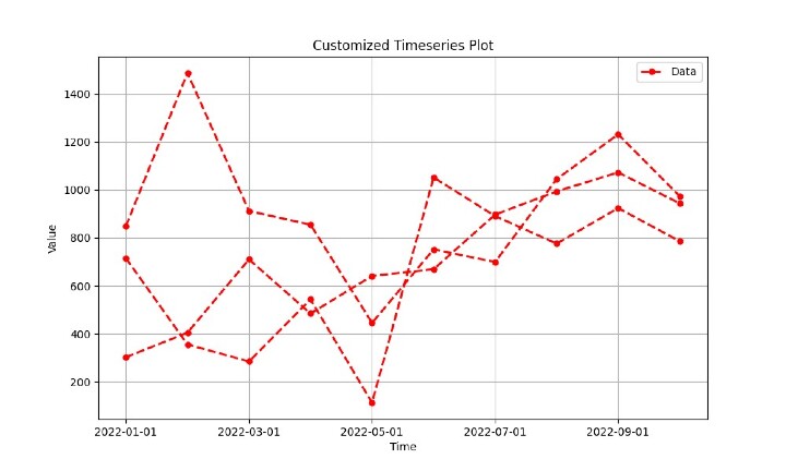
*We have customized the line width, line style, marker style, marker size, color, grid lines, and legend here
Conclusion
Time Series data is very vital and is widely used for research and analysis. Pandas gives us the power to visualize and analyze these data sets to get meaningful results.
In this article, we have explored various chart plots available in Pandas and Matplotlib for visualizing time series data. We have covered area charts, scatter plots, bar and line charts. Each chart type has a unique purpose and can provide great insights into your datasets.
Do explore the vast pandas library, check out the time-series decomposition, rolling means and several analytic and visual tools it provides. Python and its power of libraries really makes it a go to language for developers and analysts.

190 Views
