
Article Categories
- All Categories
-
 Data Structure
-
 Networking
-
 RDBMS
RDBMS
-
 Operating System
-
 Java
Java
-
 MS Excel
-
 iOS
iOS
-
 HTML
HTML
-
 CSS
CSS
-
 Android
-
 Python
-
 C Programming
-
 C++
C++
-
 C#
C#
-
 MongoDB
-
 MySQL
MySQL
-
 Javascript
-
 PHP
PHP
-
 Economics & Finance
Selected Reading
How to create a plot using ggplot2 by including values greater than a certain value in R?
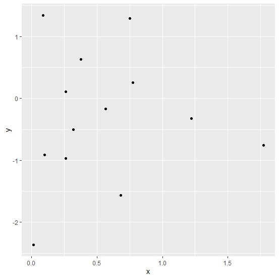
To create a plot using ggplot2 by excluding values greater than a certain value, we can use subsetting with single square brackets and which function. For example, if we have a data frame called df that contains two columns say x and y, then the point chart by including values of x that are greater than 0 can be created by using the command −
ggplot(df[which(df$x>0),],aes(x,y))+geom_point()
Example
Consider the below data frame −
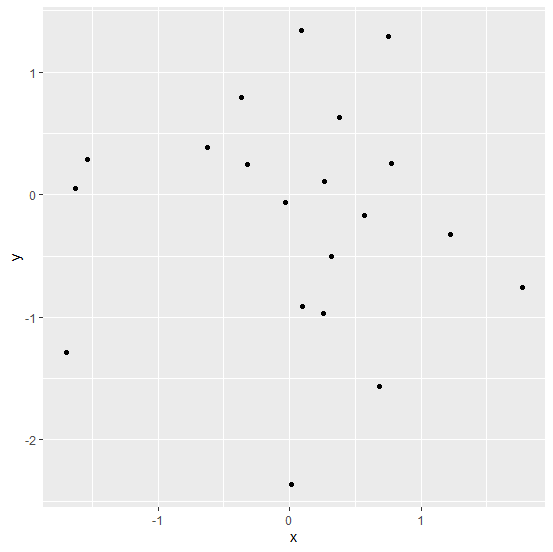
> x<-rnorm(20)
> y<-rnorm(20)
> df<-data.frame(x,y)
> df
Output
             x           y
1  -0.62160328  0.38477515
2   0.68287365 -1.56169067
3   0.75259774  1.28849990
4   0.56688920 -0.17014225
5   1.22351113 -0.32446764
6  -1.54210099  0.29001967
7   0.08800284  1.34342269
8   1.77498480 -0.75239348
9  -0.31916824  0.24433868
10  0.09802049 -0.91107863
11 -1.63060088  0.05336120
12  0.01328284 -2.36494891
13 -1.69921881 -1.29001305
14 -0.02819300 -0.06126524
15  0.77405426  0.25468262
16 -0.36423968  0.79130216
17  0.26224330  0.10437648
18  0.31894879 -0.50317250
19  0.37739488  0.62952910
20  0.26141716 -0.97143860
Loading ggplot2 package and creating scatterplot between x and y −
> library(ggplot2)
> ggplot(df,aes(x,y))+geom_point()
Output
Creating scatterplot between x and y by including only x values that are greater than 0 −
> ggplot(df[which(df$x>0),],aes(x,y))+geom_point()
Output

Updated on: 2026-03-11T22:50:56+05:30
3K+ Views

Advertisements