
Article Categories
- All Categories
-
 Data Structure
-
 Networking
-
 RDBMS
RDBMS
-
 Operating System
-
 Java
Java
-
 MS Excel
-
 iOS
iOS
-
 HTML
HTML
-
 CSS
CSS
-
 Android
-
 Python
-
 C Programming
-
 C++
C++
-
 C#
C#
-
 MongoDB
-
 MySQL
MySQL
-
 Javascript
-
 PHP
PHP
-
 Economics & Finance
How to compute the average monthly income for employees and illustrate it in a card visualization
Introduction
Power BI is an awesome tool for creating interactive reports and modeling data. Various built-in visuals are exclusive in the Visualization pane where measures, aggregation functions, and so on can be applied to construct the specific model. A card visual is one of the crucial visuals where a computed solitary value like average salary, maximum salary, or total production in a specific year is to be highlighted on a card. In this article, we will explore how to compute the average monthly income for employees and illustrate it in card visualization.
Computation of Average Monthly Salary
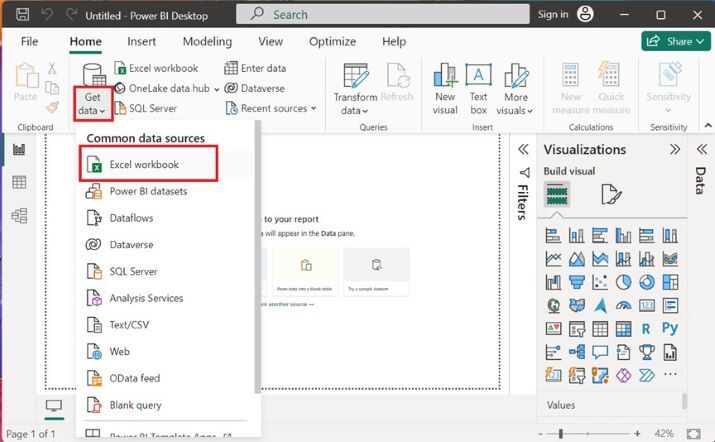
Step 1
You can click on the "Power BI Desktop" icon, navigate to the "Home" tab select the "Get data" tile, and click on the "Excel workbook" to load the table named Employee.xls.
Step 2
Users need to choose the specified file name from the location of the system and then click on the "Open" button.

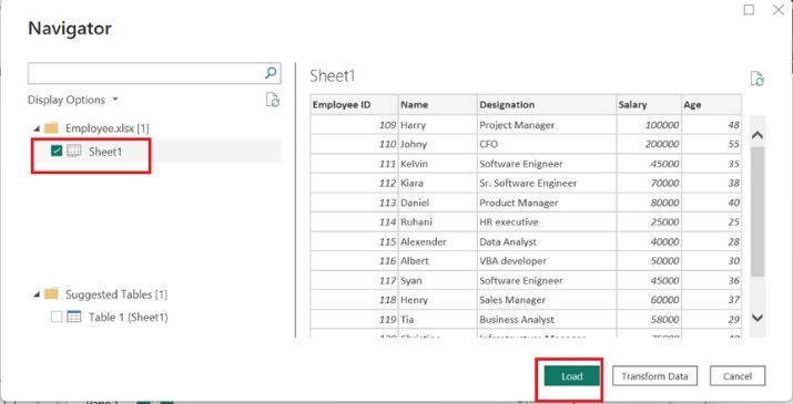
Step 3
The preview of the Employee table is shown in the Navigator window box. Now, click on the "Sheet1" checkbox and press the "Load" button as given below
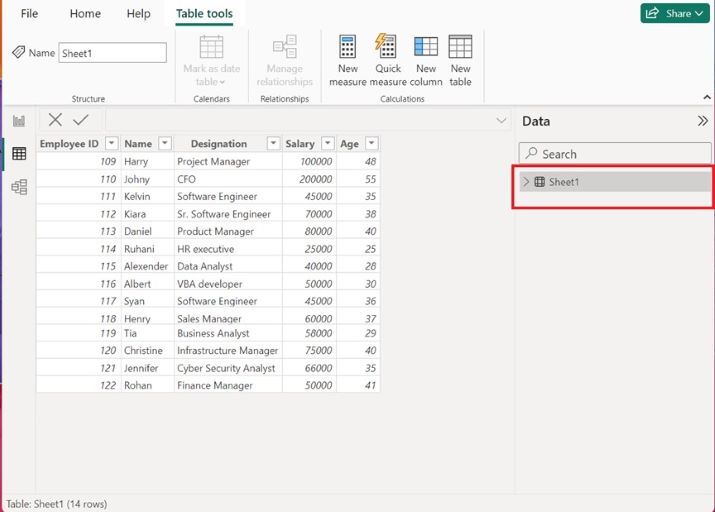
Step 4
Moreover, the employee table is inserted in the Power BI desktop. All the tables are shown under the "Data" section.
Step 5
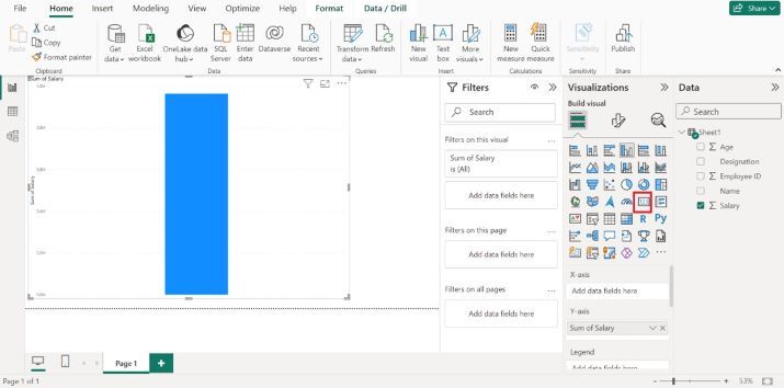
You may click on the Report Editor, expand Sheet1, and select the "Salary" column as highlighted below image
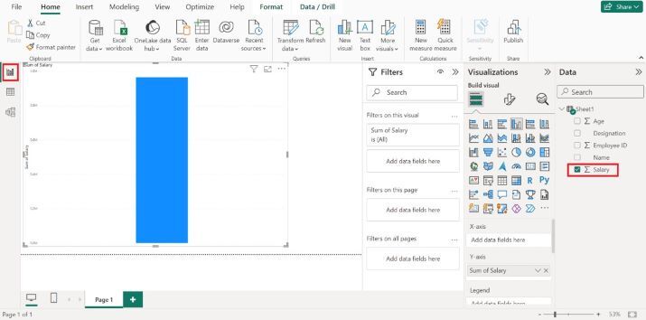
Step 6
After switching to the Report Editor, by default, the sum of the salary column chart graph is automatically displayed on the window. Now, select the Card visual icon.

Step 7
Click on the lower arrow adjacent to the "Sum of Salary" under the Fields section and select the Average option from the drop-down menu as given below
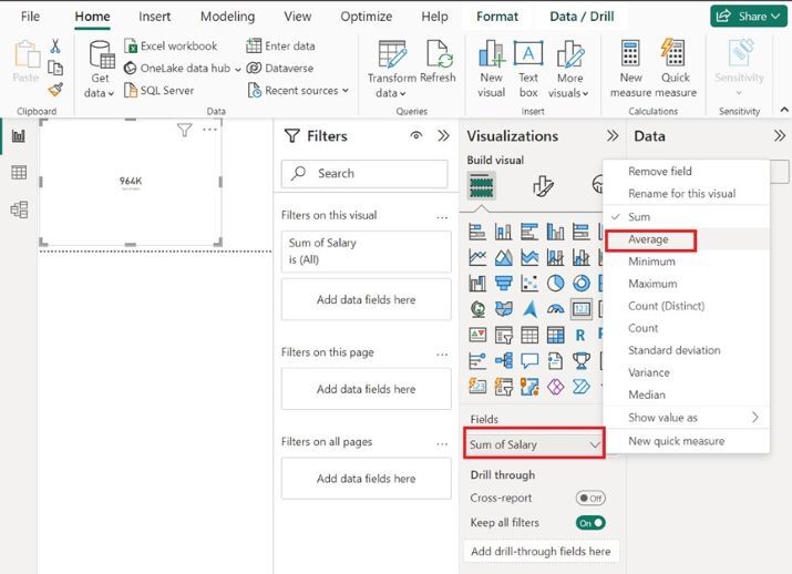
Step 8
Therefore, the average employee?s salary that is 68.86K is showcased through a Card visual icon as shown below

Conclusion
Sometimes, beginners encounter difficulty in evaluating the complex datasets in Power BI. As they are not aware of the crucial functionality of this tool, encounter difficulty in understanding DAX measures and the usage of the calculated column. However, with the assistance of Card Visual, they can seamlessly view the result without any interruption. Users may practice more on numerous visuals to improve their data analytics skills.

418 Views
