
Article Categories
- All Categories
-
 Data Structure
-
 Networking
-
 RDBMS
RDBMS
-
 Operating System
-
 Java
Java
-
 MS Excel
-
 iOS
iOS
-
 HTML
HTML
-
 CSS
CSS
-
 Android
-
 Python
-
 C Programming
-
 C++
C++
-
 C#
C#
-
 MongoDB
-
 MySQL
MySQL
-
 Javascript
-
 PHP
PHP
-
 Economics & Finance
Selected Reading
How can I plot NaN values as a special color with imshow in Matplotlib?
First, we can create an array matrix with some np.nan value, and using imshow method, we can create a diagram for that matrix.
Steps
Create a new figure, or activate an existing figure.
Add an `~.axes.Axes` to the figure as part of a subplot arrangement, nrows = 1, ncols = 1, index = 1.
Create a 2D array with np.nan.
Display data as an image, i.e., on a 2D regular raster.
Use the draw() method which draws the drawing at the given location.
To show the figure, use the plt.show() method.
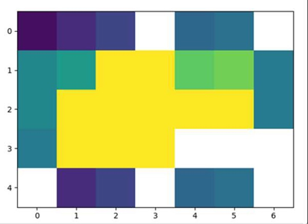
Example
import numpy as np
import matplotlib.pyplot as plt

f = plt.figure()
ax = f.add_subplot(111)
a = [
      [1, 3, 5, np.nan, 8, 9, np.nan],
      [11, 13, 51, 71, 18, 19, 10],
      [11, 31, 51, 71, 81, 91, 10],
      [10, 30, 50, 70, np.nan, np.nan, np.nan],
      [np.nan, 3, 5, np.nan, 8, 9, np.nan]
   ]
ax.imshow(a, interpolation='nearest', vmin=0, vmax=24)
f.canvas.draw()
plt.show()
Output

Updated on: 2021-03-16T10:42:30+05:30
1K+ Views

Advertisements