
Article Categories
- All Categories
-
 Data Structure
-
 Networking
-
 RDBMS
RDBMS
-
 Operating System
-
 Java
Java
-
 MS Excel
-
 iOS
iOS
-
 HTML
HTML
-
 CSS
CSS
-
 Android
-
 Python
-
 C Programming
-
 C++
C++
-
 C#
C#
-
 MongoDB
-
 MySQL
MySQL
-
 Javascript
-
 PHP
PHP
-
 Economics & Finance
Explain ReactNative SwitchSelector Component
SwitchSelector is a React Native component that functions like a radio toggle button, allowing users to select from multiple options (more than 2). It's particularly useful for creating segmented controls and option selectors in mobile applications.
Installation
To work with SwitchSelector, you need to install the package:
npm i react-native-switch-selector --save-dev
Basic Syntax
The basic SwitchSelector structure looks as follows:
<SwitchSelector
    options={yourOptions}
    initial={0}
    onPress={value => console.log(`value selected is : ${value}`)}
/>
Properties
Here are the important properties of SwitchSelector:
| Props | Description |
|---|---|
| options | An array with label, value and imageIcon id required |
| initial | The initial item from the array that will be selected |
| value | The switch value that will be available with onPress event |
| onPress | The event with callback function that will get called when the Switch is changed |
| fontSize | The fontSize to be considered for the label |
| selectedColor | The color of the selected item |
| buttonColor | Background color for the selected item |
| textColor | The label color for the items not selected |
| backgroundColor | The backgroundColor for the switch selector component |
| borderColor | Border color to be given for the component |
Example: SwitchSelector with Images
To work with SwitchSelector, first import the component:
import SwitchSelector from "react-native-switch-selector";
In this example, we'll create a gender selector with Female/Male options using images:
import React, { Component } from 'react';
import { StyleSheet, SafeAreaView } from 'react-native';
import SwitchSelector from "react-native-switch-selector";

let male = require('./assets/male.png');
let female = require('./assets/female.png');

const images = {
    "female": female,
    "male": male,
};

const options = [
    { label: "Female", value: "f", imageIcon: images.female },
    { label: "Male", value: "m", imageIcon: images.male }
];

export default class MySwitchSelectorComponent extends Component {
    render() {
        return (
            <SafeAreaView style={styles.container}>
                <SwitchSelector
                    initial={0}
                    onPress={value => this.setState({ gender: value })}
                    textColor='#ccceeaa'
                    selectedColor='#7a44cf'
                    buttonColor='#ccc'
                    borderColor='#ccc'
                    hasPadding
                    options={options}
                />
            </SafeAreaView>
        )
    }
}

const styles = StyleSheet.create({
    container: {
        flex: 1,
        alignItems: "center",
        justifyContent: "center"
    },
});

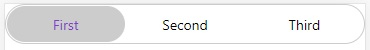
Example: SwitchSelector with Three Options
Here's an example with three text-based options:
import React, { Component } from 'react';
import { StyleSheet, SafeAreaView } from 'react-native';
import SwitchSelector from "react-native-switch-selector";

const options = [
    { label: "First", value: "a"},
    { label: "Second", value: "b" },
    { label: "Third", value: "c" }
];

export default class MySwitchSelectorComponent extends Component {
    render() {
        return (
            <SafeAreaView style={styles.container}>
                <SwitchSelector
                    initial={0}
                    onPress={value => this.setState({ selection: value })}
                    textColor='#ccceeaa'
                    selectedColor='#7a44cf'
                    buttonColor='#ccc'
                    borderColor='#ccc'
                    fontSize='30'
                    hasPadding
                    options={options}
                />
            </SafeAreaView>
        )
    }
}

const styles = StyleSheet.create({
    container: {
        flex: 1
    }
});
Key Points
- SwitchSelector requires an
optionsarray with at least label and value properties - Use
imageIconproperty to add icons to options - The
initialprop sets which option is selected by default - Customize appearance using color and styling props
Conclusion
SwitchSelector provides an elegant way to create segmented controls in React Native apps. It's highly customizable and supports both text and image-based options for better user experience.

472 Views
