
Article Categories
- All Categories
-
 Data Structure
-
 Networking
-
 RDBMS
RDBMS
-
 Operating System
-
 Java
Java
-
 MS Excel
-
 iOS
iOS
-
 HTML
HTML
-
 CSS
CSS
-
 Android
-
 Python
-
 C Programming
-
 C++
C++
-
 C#
C#
-
 MongoDB
-
 MySQL
MySQL
-
 Javascript
-
 PHP
PHP
-
 Economics & Finance
Selected Reading
Drawing average line in histogram in Matplotlib
We can plot some expressions using the hist method. After that, we will plot the average graph for the expression using the plot method and bins that are returned while creating the hist.
Steps
Get the data for x using some equations, set num_bins = 50.
Create fig and ax variables using subplots method, where default nrows and ncols are 1.
Get n, bins, patches value using ax.hist() method.
Plot average lines using bins and y data that is obtained from some equations.
Set the X-axis label using plt.xlabel() method.
Set the Y-axis label using plt.ylabel() method.
Set a title for the axes.
Using tight_layout(), we can adjust the padding between and around subplots.
To show the figure, use plt.show() method.
Example
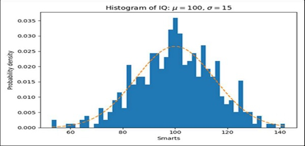
import numpy as np
import matplotlib.pyplot as plt

np.random.seed(19680801)

# example data
mu = 100 # mean of distribution
sigma = 15 # standard deviation of distribution
x = mu + sigma * np.random.randn(437)

num_bins = 50

fig, ax = plt.subplots()

# the histogram of the data
n, bins, patches = ax.hist(x, num_bins, density=True)

# add a 'best fit' line
y = ((1 / (np.sqrt(2 * np.pi) * sigma)) *
np.exp(-0.5 * (1 / sigma * (bins - mu))**2))
ax.plot(bins, y, '--')
ax.set_xlabel('Smarts')
ax.set_ylabel('Probability density')
ax.set_title(r'Histogram of IQ: $\mu=100$, $\sigma=15$')

fig.tight_layout()
plt.show()

Updated on: 2021-03-17T08:18:07+05:30
2K+ Views

Advertisements