
 Data Structure
 Networking
 RDBMS
RDBMS Operating System
 Java
Java MS Excel
 iOS
iOS HTML
HTML CSS
CSS Android
 Python
 C Programming
 C++
C++ C#
C# MongoDB
 MySQL
MySQL Javascript
 PHP
PHP
- Selected Reading
- UPSC IAS Exams Notes
- Developer's Best Practices
- Questions and Answers
- Effective Resume Writing
- HR Interview Questions
- Computer Glossary
- Who is Who
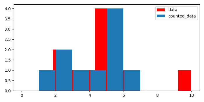
Plotting a histogram from pre-counted data in Matplotlib
To plot a histogram from pre-counted data in matplotlib, we can take the following steps −
Create a list of numbers.
Make a pre-counted list with the help of input data.
Plot a histogram with data, color=red, and label=data, using hist() method.
Plot another histogram with counted data, color=default, and label=counted_data, using hist() method.
To place the legend, use legend() method.
To display the figure, use show() method.
Example
from matplotlib import pyplot as plt
plt.rcParams["figure.figsize"] = [7.00, 3.50]
plt.rcParams["figure.autolayout"] = True
data = [1, 2, 2, 3, 4, 5, 5, 5, 5, 6, 10]
counted_data = {1: 1, 2: 2, 3: 1, 4: 1, 5: 4, 6: 1, 10: 1}
hh = plt.hist(data, bins=len(data), rwidth=.95, color='red', label="data")
hh1 = plt.hist(counted_data.keys(), weights=counted_data.values(),
   bins=range(10), rwidth=.95, label="counted_data")
plt.legend()
plt.show()
Output

Updated on: 2021-05-07T08:09:01+05:30
3K+ Views

Advertisements