- DC.js - Home
- DC.js - Introduction
- DC.js - Installation
- DC.js - Concepts
- Introduction to Crossfilter
- Introduction to D3.js
- DC.js - Mixins
- DC.js - baseMixin
- DC.js - capMixin
- DC.js - colorMixin
- DC.js - marginMixin
- DC.js - coordinateGridMixin
- DC.js - Pie Chart
- DC.js - Line Chart
- DC.js - Bar Chart
- DC.js - Composite Chart
- DC.js - Series Chart
- DC.js - Scatter Plot
- DC.js - Bubble Chart
- DC.js - Heat Map
- DC.js - Data Count
- DC.js - Data Table
- DC.js - Data Grid
- DC.js - Legend
- DC.js - Dashboard Working Example
DC.js - Scatter Plot
A scatter plot is a type of mathematical diagram. It is represented using the Cartesian coordinates to display values for typically two variables for a set of data. The data is displayed as a collection of points and the points maybe colored. This chapter explains about a scatter plot in detail.
Scatter Plot Methods
Before moving on to draw a scatter plot, we should understand the dc.scatterPlot class and its methods. The dc.scatterPlot uses mixins to get the basic functionality of drawing a chart. The mixin used by dc.scatterPlot is given below −
- dc.coordinateGridMixin
The complete class diagram of the dc.scatterPlot is as follows −
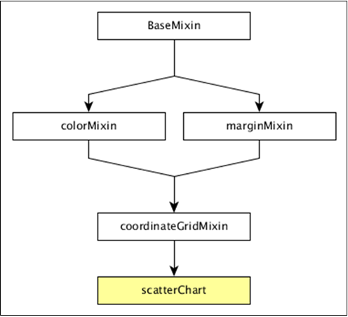
The dc.scatterPlot gets all the methods of the above-specified mixins. It has its own methods to draw the scatter plot, which are explained as follows.
customSymbol( [symbol])
This method is used get or set the symbol generator.
emptySize( [size])
This method is used to set or get the radius for symbols when the group is empty.
excludedColor( [color])
This method is used to get or set the color for symbols excluded from the chart's filter.
excludedOpacity( [opacity])
This method is used to get or set the opacity for symbols excluded from the chart's filter.
excludedSize( [size])
It is used to set or get size for symbols excluded from the chart's filter.
highlightedSize( [size])
It is used to set or get radius for highlighted symbols.
symbol( [type])
It is used to get or set the symbol type used for each point.
Draw a Scatter Plot
Let us draw a scatter plot in DC. In this example, let us take a dataset named as howell1.csv file. The sample data file is as follows −
"height","weight","age","male"
151.765,47.8256065,63,1
139.7,36.4858065,63,0
136.525,31.864838,65,0
156.845,53.0419145,41,1
145.415,41.276872,51,0
163.83,62.992589,35,1
149.225,38.2434755,32,0
168.91,55.4799715,27,1
147.955,34.869885,19,0
165.1,54.487739,54,1
154.305,49.89512,47,0

...............
...............
The above sample file contains many records. We can download the file by clicking the following link and saving it to our DC location.
Now, let us follow the subsequent steps to draw a Scatter chart in DC.
Step 1: Define a variable
Let us define a variable as shown below −
var chart = dc.scatterPlot('#scatter');
Here, the scatterplot() function is mapped with the id scatter.
Step 2: Read the data
Read data from the howell1.csv file as shown below −
d3.csv("data/howell1.csv", function(errors, people) {
   var mycrossfilter = crossfilter(people);
}
If the data is not present, then it returns an error. Later, assign the data to a crossfilter.
Step 3: Fetch the records
Let us fetch the records using the coding given below −
people.forEach(function(x) {
   if(x.male == 1) {
      x.gender = "Male";
   } else {
      x.gender = "Female";
   }
});
Here, we have checked the gender.
Step 4: Set the dimension
You can set the dimension using the coding given below −
var hwDimension = mycrossfilter.dimension(function(data) {
   return [Math.floor(data.height), Math.floor(data.weight)];
});
After the dimension has been assigned, group the gender using the coding given below −
var hwGroup = hwDimension.group().reduceCount();
Step 5: Generate a chart
Now, generate a heatmap using the coding given below −
chart
   .width(800)
   .height(600)
   .x(d3.scale.linear().domain([0,180]))
   .y(d3.scale.linear().domain([0,100]))
   .brushOn(false)
   .xAxisLabel("Height")
   .yAxisLabel("Weight")
   .symbolSize(8)
   .clipPadding(10)
   .dimension(hwDimension)
   .group(hwGroup);
Here,
- We have assigned the chart width as 800 and height as 600.
- Applied the d3.scale.linear() function for both x and y axis.
- Enabled brushOn value as false.
- Then, assigned x-axis label as height and y-axis label as weight.
- Set the symbol size as eight and padding value as 10.
- Finally, group the data and render the chart.
Step 6: Working example
The complete code listing is as follows. Create a web page scatter.html and add the following changes to it.
<html>
   <head>
   <title>Scatter plot Sample</title>
   <link rel = "stylesheet" type = "text/css" href = "css/bootstrap.css">
   <link rel = "stylesheet" type = "text/css" href = "css/dc.css"/>

   <script src = "js/d3.js"></script>
   <script src = "js/crossfilter.js"></script>
   <script src = "js/dc.js"></script>
   </head>

   <body>
      <div>
         <div id = "scatter"></div>
      </div>

      <script language = "javascript">
         var chart = dc.scatterPlot('#scatter');

         d3.csv("data/howell1.csv", function(errors, people) {
            var mycrossfilter = crossfilter(people);

            people.forEach(function(x) {
               if(x.male == 1) {
                  x.gender = "Male";
               } else {
                  x.gender = "Female";
               }
            });

            var hwDimension = mycrossfilter.dimension(function(data) {
               return [Math.floor(data.height), Math.floor(data.weight)];
            });
            var hwGroup = hwDimension.group().reduceCount();

            chart
               .width(800)
               .height(600)
               .x(d3.scale.linear().domain([0,180]))
               .y(d3.scale.linear().domain([0,100]))
               .brushOn(false)
               .xAxisLabel("Height")
               .yAxisLabel("Weight")
               .symbolSize(8)
               .clipPadding(10)
               .dimension(hwDimension)
               .group(hwGroup);

            chart.render();
         });
      </script>
   </body>
</html>
Now, request the browser and we will see the following response.
