- DC.js - Home
- DC.js - Introduction
- DC.js - Installation
- DC.js - Concepts
- Introduction to Crossfilter
- Introduction to D3.js
- DC.js - Mixins
- DC.js - baseMixin
- DC.js - capMixin
- DC.js - colorMixin
- DC.js - marginMixin
- DC.js - coordinateGridMixin
- DC.js - Pie Chart
- DC.js - Line Chart
- DC.js - Bar Chart
- DC.js - Composite Chart
- DC.js - Series Chart
- DC.js - Scatter Plot
- DC.js - Bubble Chart
- DC.js - Heat Map
- DC.js - Data Count
- DC.js - Data Table
- DC.js - Data Grid
- DC.js - Legend
- DC.js - Dashboard Working Example
DC.js - Quick Guide
DC.js - Introduction
DC.js is an excellent JavaScript library for data analysis in the browser, mobile devices and ultimately helps in creating data visualization. Data visualization is the presentation of data in a pictorial or graphical format. The primary goal of data visualization is to communicate information clearly and efficiently via statistical graphics, plots and information graphics. Data visualizations can be developed and integrated in regular web and even mobile applications using different JavaScript frameworks.
What is DC.js?
DC.js is a charting library for exploring large multi-dimensional datasets. It relies on the D3.js engine to render charts in a CSS-friendly SVG format. It allows complex data visualization to be rendered and has a designed dashboard having Bar Charts, Scatter Plots, Heat Maps, etc. DC.js is built to work with Crossfilter for data manipulation. DC.js enables a single (large) dataset to be visualized with many interconnected charts with an advanced auto-filtering option.
Why Do We Need DC.js?
In general, data visualization is quite a complex process and carrying it out on the client side requires extra skill. DC.js enables us to create almost any kind of complex data visualization using a simpler programming model. It is an open source, extremely easy to pick up JavaScript library, which allows us to implement neat custom visualizations in a very short time.
DC.js charts are data driven and very reactive. In addition, it delivers instant feedback to user interaction using the Crossfilter Library.
DC.js Features
DC.js is one of the best data visualization framework and it can be used to generate simple as well as complex visualizations. Some of the salient features are listed below −
- Extremely flexible.
- Easy to use.
- Fast rendering of the charts.
- Supports large multi-dimensional datasets.
- Open source JavaScript library.
Dc.js Benefits
DC.js is an open source project and it requires lesser code when compared to others. It comes with the following benefits −
- Great data visualization.
- Performs graphical filtering.
- Fast creation of charts and dashboards.
- Creation of highly interactive dashboards.
In the next chapter, we will understand how to install D3.js on our system.
DC.js - Installation
In this chapter, we will learn how to setup the DC.js development environment. Before we start, we need the following components −
- DC.js library
- Editor
- Web browser
- Web server
Let us go through the steps one by one in detail.
DC.js Installation
DC installation is very easy to set up. Follow the below steps to install DC on your machine.
Download DC Library
DC is an open-source library; use the link https://github.com/dc-js/dc.js/releases to download the file.
Download the latest version of the DC file. (As of now, the latest version is 2.0.2.). After the download is completed, unzip the DC folder and paste it to your project's root folder or any other folder, where you want to keep all your library files.
The sample HTML page is as shown below.
<!DOCTYPE html>
<html lang = "en">
   <head>
      <script src = "js/d3.js"></script>
      <script src = "js/crossfilter.js"></script>
      <script src = "js/dc.js"></script>
   </head>

   <body>
      <script>
         // write your dc code here..
      </script>
   </body>
</html>
DC is a JavaScript code, so we have to write all the DC codes within the script tag. We may need to manipulate the existing DOM elements, hence it is advisable to write the DC code just before the end of the body tag.
DC.js Editor
We will need an editor to start writing the code. There are some great IDEs (Integrated Development Environment) with support for JavaScript such as −
- Visual Studio Code
- WebStorm
- Eclipse
- SublimeText
These IDEs provide intelligent code completion as well as support some of the modern JavaScript frameworks. If we do not have any fancy IDE, we can always use a basic editor such as Notepad, VI, etc.
Web Browser
DC.js works on all browsers except IE8 and lower.
Web Server
Most browsers serve local HTML files directly from the local file system. However, there are certain restrictions when it comes to loading external data files. In the subsequent chapters of this tutorial, we will be loading data from external files such as CSV and JSON. Therefore, it will be easier for us, if we set up the web server right from the beginning.
We can use any web server, which we are comfortable with. For example IIS, Apache, etc.
Viewing a Page
In most cases, we can just open the HTML file in a web browser to view it. However, when loading external data sources, it is more reliable to run a local webserver and view the page from the server (http://localhost:8080).
DC.js - Concepts
DC.js is simple and easy for most front-end developers. It enables building basic charts quickly, even without any knowledge of D3.js. Before, we start using DC.js to create visualization; we need to get familiar with web standards. The following web standards are heavily used in D3.js, which is the foundation of DC.js for rendering charts.
- Hypertext Markup Language (HTML)
- Document Object Model (DOM)
- Cascading Style Sheets (CSS)
Let us understand each of these web standards in detail.
Hypertext Markup Language (HTML)
As we know, HTML is used to structure the content of the webpage. It is stored in a text file with the extension .html.
A typical basic HTML example looks like as shown below −
<!DOCTYPE html>
<html lang = "en">
   <head>
      <meta charset = "UTF-8">
      <title></title>
   </head>

   <body>

   </body>
</html>
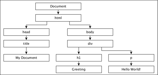
Document Object Model (DOM)
When a HTML page is loaded by a browser, it is converted to a hierarchical structure. Every tag in HTML is converted to an element / object in the DOM with a parent-child hierarchy. It makes our HTML more logically structured. Once the DOM is formed, it becomes easier to manipulate (add/modify/remove) the elements on the page.
Let us understand the DOM using the following HTML document −
<!DOCTYPE html>
<html lang = "en">
   <head>
      <title>My Document</title>
   </head>

   <body>
      <div>
         <h1>Greeting</h1>
         <p>Hello World!</p>
      </div>
   </body>
</html>
The document object model of the above HTML document is as follows −
Cascading Style Sheets (CSS)
While HTML gives a structure to the webpage, CSS styles make the webpage more pleasant to look at. CSS is a style sheet language used to describe the presentation of a document written in HTML or XML (including XML dialects such as SVG or XHTML). CSS describes how elements should be rendered on a webpage.
JavaScript
JavaScript is a loosely typed client side scripting language that executes in the user's browser. JavaScript interacts with html elements (DOM elements) in order to make the web user interface interactive. JavaScript implements the ECMAScript standards, which includes core features based on ECMA-262 specification as well as other features, which are not based on ECMAScript standards. JavaScript knowledge is a prerequisite for DC.js.
Components
DC.js is based on two excellent JavaScript libraries, which are −
- Crossfilter
- D3.js
Crossfilter
Crossfilter is a JavaScript library for exploring large multivariate datasets in the browser. It is used for Grouping, Filtering, and Aggregating tens or hundreds of thousands of rows of raw data very quickly.
D3.js
D3.js stands for Data-Driven Documents. D3.js is a JavaScript library for manipulating documents based on data. D3 is Dynamic, Interactive, Online Data Visualizations Framework and used in large number of websites. D3.js is written by Mike Bostock, created as a successor to an earlier visualization toolkit called Protovis. D3.js is used on hundreds of thousands of websites.
DC.js - Introduction to Crossfilter
Crossfilter is a multi-dimensional dataset. It supports extremely fast interaction with datasets containing a million or more records.
Basic Concepts
Crossfilter is defined under the crossfilter namespace. It uses semantic versioning. Consider a crossfilter object loaded with a collection of fruits that is defined below −
var fruits = crossfilter ([
   { name: Apple, type: fruit, count: 20 },
   { name: Orange, type: "fruit, count: 10 },
   { name: Grapes, type: fruit, count: 50 },
   { name: Mango,  type: fruit, count: 40 }
]);
If we need to perform the total records in a group, we can use the following function −
var count = fruits.groupAll().reduceCount().value();
If we want to filter by a specific type −
var filtering = fruits.dimension(function(d) { return d.type; });
filtering.filter(Grapes)
Similarly, we can perform grouping with Crossfilter. To do this, we can use the following function −
var grouping = filtering.group().reduceCount();
var first = grouping.top(2);
Hence, Crossfilter is built to be extremely fast. If you want to recalculate groups as filters are applied, it calculates incrementally. Crossfilter dimensions are very expensive.
Crossfilter API
Let us go through the notable Crossfilter APIs in detail.
crossfilter([records]) − It is used to construct a new crossfilter. If the record is specified, then it simultaneously adds the specified records. Records can be any array of JavaScript objects or primitives.
crossfilter.add(records) − Adds the specified records to the crossfilter.
crossfilter.remove() − Removes all records that match the current filters from the crossfilter.
crossfilter.size() − Returns the number of records in the crossfilter.
crossfilter.groupAll() − It is a function for grouping all records and reducing to a single value.
crossfilter.dimension(value) − It is used to construct a new dimension using the specified value accessor function.
dimension.filter(value) − It is used to filter records for dimension's match value, and returns the dimension.
dimension.filterRange(range) − Filters records for dimension's value that are greater than or equal to range[0], and less than range[1].
dimension.filterAll() − Clears any filters on this dimension.
dimension.top(k) − It is used to return a new array containing the top k records, according to the natural order of this dimension.
dimension.bottom(k) − It is used to return a new array containing the bottom k records, according to the natural order of this dimension.
dimension.dispose() − It is used to remove the dimension from the crossfilter.
In the next chapter, we will understand in brief about D3.js.
DC.js - Introduction to D3.js
D3.js is a JavaScript library used to create interactive visualizations in the browser. The D3 library allows us to manipulate elements of a webpage in the context of a dataset. These elements can be HTML, SVG, or Canvas elements, and can be introduced, removed, or edited according to the contents of the dataset. It is a library for manipulating DOM objects. D3.js can be a valuable aid in data exploration. It gives you control over your data's representation and lets you add data interactivity.
D3.js is one of the premier framework when compared to other libraries. This is because; it works on the web and data visualizations and is of enterprise grade. Another reason is its great flexibility, which enables developers around the world to create many advanced charts. Also, it has extended its functionality to a great extent.
Let us understand the basic concepts of D3.js, which are as follows −
- Selections
- Data join
- SVG
- Transition
- Animation
- D3.js API
Let us understand each of these concepts in detail.
Selections
Selections is one of the core concept in D3.js. It is based on the CSS Selector concept. Those who have used and are aware of JQuery already can easily understand the selections. It enables us to select the DOM based on CSS selectors and then provide options to modify or append and remove the elements of DOM.
Data Join
Data join is another important concept in D3.js. It works along with selections and enables us to manipulate the HTML document with respect to our dataset (a series of numerical values). By default, D3.js gives dataset the highest priority in its methods and each item in the dataset corresponds to a HTML element.
SVG
SVG stands for Scalable Vector Graphics. SVG is an XML based vector graphics format. It provides options to draw different shapes such as Lines, Rectangles, Circles, Ellipses, etc. Hence, designing visualizations with SVG gives you more power and flexibility.
Transformation
SVG provides options to transform a single SVG shape element or group of SVG elements. SVG transform supports Translate, Scale, Rotate and Skew.
Transition
Transition is the process of changing from one state to another of an item. D3.js provides a transition() method to perform transition in the HTML page.
Animation
D3.js supports animation through transition. Animation can be done with the proper use of transition. Transitions are a limited form of key frame animation with only two key frames: start and end. The starting key frame is typically the current state of the DOM, and the ending key frame is a set of attributes, styles and other properties you specify. Transitions are well suited for transitioning to a new view without a complicated code that depends on the starting view.
D3.js API
Let us understand some of the important D3.js API's methods in brief.
Collections API
A collection is simply an object that groups multiple elements into a single unit. It is also called as a container. It contains Objects, Maps, Sets and Nests.
Paths API
Paths are used to draw rectangles, circles, ellipses, polylines, polygons, straight lines and curves. SVG Paths represent the outline of a shape that can be stroked, filled, used as a clipping path, or any combination of all three.
Axis API
D3.js provides functions to draw axes. An axis is made of lines, ticks and labels. An axis uses scale, thus each axis will need to be given a scale to work with.
Zooming API
Zooming helps to scale your content. You can focus on a particular region using the click-and-drag approach.
Delimiter-Separated Values API
A delimiter is a sequence of one or more characters used to specify the boundary between separate, independent regions in plain text or other data. A field delimiter is a sequence of comma-separated values. In short, the delimiter-separated values are Comma-Separated Values (CSV) or Tab-Separated Values (TSV).
DC.js - Mixins
Mixin is an abstract functional object having a lot of pre-defined functions, which can be mixed and used in JavaScript classes. However, they cannot be used as stand-alone. For example, DC.js has a Mixin and dc.baseMixin, which cannot be used as it is, but is used by all the DC chart classes such as the Line Chart, Pie Chart, etc. DC.js has a limited set of useful Mixins to create charts easily and efficiently. They are as follows −
baseMixin − baseMixin provides common functionality for all type of charts. It integrates crossfilter and d3.js JavaScript library and provides a simple set of function to create charts with limited knowledge of D3.js.
capMixin − capMixin provides grouping support for the data elements below a limit (cap).
colorMixin − colorMixin provides color support for the charts.
marginMixin − marginMixin provides margin support for the charts.
coordinateGridMixin − coordinateGridMixin provides coordinate support for the charts.
stackMixin − stackMixin provides stacking support using the d3.layout.stack.
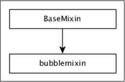
bubbleMixin − bubbleMixin provides bubble support for the charts.
Let us understand all these mixins in detail in the subsequent chapters.
DC.js - baseMixin
baseMixin provides basic methods needed to create any type of a chart. It ranges from setting the width of the chart to advanced filtering of the chart.
General Chart Options
The basicMixin provides many chart methods to get / set the properties of the charts. They are as follows,
chartID() − Returns the internal numeric ID of the chart.
chartGroup( [chartGroup]) − Gets or sets the group to which the chart belongs. In DC.js, charts can be grouped into a single set. All charts in a group are expected to share the same Crossfilter dataset. They are rendered as well as redrawn simultaneously.
mychart.chartGroup('dashboard');
minWidth( [minWidth]) − Sets the minimum width of the chart.
mychart.minWidth(300);
width( [width]) − Gets or sets the width of the chart.
mychart.width(600);
minHeight( [minHeight]) − Gets or sets the minimum height of the chart.
mychart.minHeight(300);
height( [height]) − Gets or sets the height of the chart.
mychart.height(300);
title( [titleFunction]) − Gets or sets the title function. Title is the SVG Element's title of the child element in the chart (e.g. a single bar in a bar chart). Title in the charts are represented as tooltip in the browser.
mychart.title(function(data) {
   return d.key + ': ' + d.value;
});
label( labelFunction[??]) − Similar to the title() method, but it sets the label instead of the title.
mychart.label(function(data) {
   return d.key + ': ' + d.value;
});
options(opts) − Sets any chart option using the JavaScript object. Each key represents the corresponding method available in the charts and the matched method will be invoked with the relevant value.
mychart.options ({
   'width' : 300,
   'height' : 300
});
Here, width() and height() method will be fired with the specified value.
legend( [legend]) − Attaches a legend to the chart. The legend can be created using the d3.legend() method.
mychart.legend (
   dc.legend()
      .x(500)
      .y(50)
      .itemHeight(12)
      .gap(4))
anchor( parent[??]) − Sets the root SVGElement to be either an existing chart's root or any valid D3 single selectors. Optionally, the chart group can also be set using the second argument.
anchorName() − Gets the DOM ID of the chart's anchored location.
svg( [svgElement]) − Returns the SVGElement of the chart.
resetSvg() − Resets the SVG container in the DOM.
root( [rootElement]) − Gets the root container of the chart.
Data Options
basicMixin provides methods to set the data for the charts. The data is set as Crossfilter dimension and group. In addition, it provides an option to get the underlying dataset.
dimension( [dimension]) − Sets or gets the dimension of the chart. A dimension is any valid Crossfilter dimension.
var mycrossfilter = crossfilter([]);
var ageDimension = mycrossfilter.dimension(dc.pluck('age'));
mychart.dimension(ageDimension);
group( group[??]) − Sets or gets the group of the chart. A group is any valid Crossfilter group. The group can be named using the second argument to use it later in the code.
var mycrossfilter = crossfilter([]);
var ageDimension = mycrossfilter.dimension(dc.pluck('age'));
mychart.dimension(ageDimension);
mychart.group(ageDimension.group(crossfilter.reduceCount()));
data( [callback]) − Sets the data callback and enables us to get the underlying chart's data set.
// get all groups
mychart.data(function (group) {
   return group.all();
});

// get top five groups
mychart.data(function (group) {
   return group.top(5);
});
keyAccessor( [keyAccessor]) − Gets or sets the key accessor function. It is used to retrieve the key from the underlying Crossfilter group. The key is used for slices in a pie chart and x-axis in the line / bar chart. The default key accessor function is as follows −
chart.keyAccessor(function(d) { return d.key; });
valueAccessor( [valueAccessor]) − Gets or sets the value accessor function. It is used to retrieve the value from the underlying Crossfilter group. The value is used for slice size in the pie chart and y-axis position in the line / bar chart. The default value accessor function is as follows −
chart.valueAccessor(function(d) { return d.value; });
ordering( [orderFunction]) − Gets or sets an ordering function to order ordinal dimension. By default, a chart uses crossfilter.quicksort.by to sort the elements.
_chart.ordering(dc.pluck('key'));
Filter Options
Filtering is one of the highlights of DC.js. We can apply one or more filters directly on the chart object using the filter() method and call chart's redrawGroup() or dc.redrawAll() method to see the filtering effect on the chart. By default, a chart object takes one or more filters using the filter() method, applies it on the underlying Crossfilter() data set, gets the filtered data from the Crossfilter and redraws the charts using the filtered data. DC.js provides the following methods to handle filtering in the chart.
Filter( [filter])
Gets or sets the filter for the chart. If a supplied filter is new, then it will be added to the chart's filter collection and applied on the underlying dataset. If the filter supplied is already available in the chart's filter collection, then it will remove the filter and do the relevant filtering on the underlying data. In short, filter method will toggle the supplied filters.
mychart.filter(10);
To remove all filters, call the filter method with null value. The filter may be any one of the following items −
null − Chart will remove all the filters previously applied.
single value − Chart will call the underlying Crossfilter's filter method and send the supplied value.
dc.filters.RangedFilter − It accepts two values, low and high. Chart will filter out all the data, except the value in the range between low and high value.
dc.filters.TwoDimensionalFilter − It accepts two-dimensional values that are used in the heat map.
dc.filters.RangedTwoDimensionalFilter − It is similar to the dc.filters.RangedFilter, except that it accepts a two-dimensional value only used in scatter plots.
hasFilter( [filter])
Checks whether the supplied filter is available or not in the chart.
replaceFilter( [filter])
Replaces the current filter of the chart with the supplied filter.
filters()
Returns all current filters associated with the chart.
filterAll()
Clears all filters associated with the chart.
filterHandler( [filterHandler])
Gets or sets a filter handler function. Filter handler function is used by the chart to filter the underlying dataset using the filter. Chart has a Default Filter Handler Function and it can be replaced by a Custom Filter Handler Function using this method. The default filter handler is as follows −
chart.filterHandler(function (dimension, filters) {
   if (filters.length === 0) {

      // the empty case (no filtering)
      dimension.filter(null);
   } else if (filters.length === 1 && !filters[0].isFiltered) {

      // single value and not a function-based filter
      dimension.filterExact(filters[0]);
   } else if (filters.length === 1 && filters[0].filterType === 'RangedFilter') {

      // single range-based filter
      dimension.filterRange(filters[0]);
   } else {

      // an array of values, or an array of filter objects
      dimension.filterFunction(function (d) {

         for (var i = 0; i < filters.length; i++) {
            var filter = filters[i];

            if (filter.isFiltered && filter.isFiltered(d)) {
               return true;
            } else if (filter <= d && filter >= d) {
               return true;
            }
         }
         return false;
      });
   }
   return filters;
});
hasFilterHandler( [hasFilterHandler])
Gets or sets a has-filter handler function. This function is used by the chart to check whether a filter is available in the chart's filter collection or not. The default has-filter handler is as follows −
chart.hasFilterHandler(function (filters, filter) {
   if (filter === null || typeof(filter) === 'undefined') {
      return filters.length > 0;
   }

   return filters.some(function (f) {
      return filter <= f && filter >= f;
   });
});
addFilterHandler( [addFilterHandler])
Gets or sets the add-filter handler function. This function is used by the chart to add the filter into the chart's filter collection. The default add-filter handler is as follows −
chart.addFilterHandler(function (filters, filter) {
   filters.push(filter);
   return filters;
});
removeFilterHandler( [removeFilterHandler])
Gets or sets the remove-filter handler function. This function is used by the chart to remove the filter from the chart's filter collection. The default remove-filter is as follows −
chart.removeFilterHandler(function (filters, filter) {
   for (var i = 0; i < filters.length; i++) {

      if (filters[i] <= filter && filters[i] >= filter) {
         filters.splice(i, 1);
         break;
      }

   }
   return filters;
});
resetFilterHandler( [resetFilterHandler])
Gets or sets the reset-filter handler function. This function is used by the chart to reset the chart's filter collection. The default reset-filter is as follows −
function (filters) {
   return [];
}
filterPrinter( [filterPrinterFunction])
Gets or sets the printer-filter function. This function is used by the chart to print the filter information.
commitHandler()
Gets or sets the commit handler. The purpose of the commit handler is to send the filtered data to the server asynchronously.
Event Options
DC.js defines a limited set of events to do some functionalities such as Filtering, Zooming, etc. The list of events defined in the DC.js are as follows −
renderlet − Fired after transitions are redrawn and rendered.
pretransition − Fired before the transitions start.
preRender − Fired before the chart rendering.
postRender − Fired after the chart finishes rendering including all the renderlet's logic.
preRedraw − Fired before chart redrawing.
postRedraw − Fired after the chart finishes redrawing including all the renderlet's logic.
filtered − Fired after a filter is applied, added or removed.
zoomed − Fired after a zoom is triggered.
basicMixin provides a method, on(event, listener) to set the callback function for all the above defined events.
on(event, listener) − Sets the callback or listener function for the specific event.
onClick(datum) − It is passed to D3 as the onClick handler for each chart. The default behavior is to filter on the clicked datum (passed to the callback) and redraw the chart group.
Rendering Options
The basicMixin provides a list of methods to render the charts. They are used to draw the chart and they are as follows −
render() − Renders the chart. Generally, it will be used first, when the chart is drawn.
renderGroup() − Renders all the charts in the group as this chart belongs.
renderLabel( [renderLabel]) − Turns on/off label rendering.
renderTitle( [renderTitle]) − Turns on/off title rendering.
redraw() − Redraws the entire chart.
redrawGroup() − Redraws all charts in the group as this chart belongs.
Transition Options
The basicMixin provides methods to set the transition effect of the chart and they are as follows −
transitionDelay( [delay]) − Sets or gets the animation transition delay (in milliseconds) for this chart instance.
transitionDuration( [duration]) − Sets or gets the animation transition duration (in milliseconds) for this chart instance.
useViewBoxResizing( [useViewBoxResizing]) − If set, resizes the chart according to the SVG viewbox attributes.
controlsUseVisibility( [controlsUseVisibility]) − if set, uses the visibility attribute instead of the display attribute to show / hide a chart reset and filter controls.
In the next chapter, we will understand capMixin.
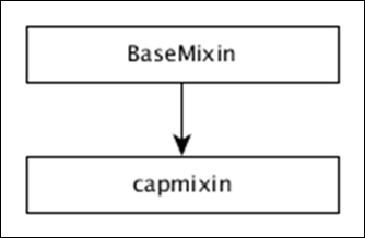
DC.js - capMixin
capMixin enables to group the list of data element below a certain value as Others. It is applicable in both row and pie charts. The hierarchy of the capMixin is as defined in the diagram below.
capMixin provides four methods to find the Others section and they are as follows −
Method 1: cap( [count]) − Gets or sets the count of elements that will be included in the cap.
Method 2: othersGrouper( [grouperFunction]) − Gets or sets the function to do the Others group. The default function provided is as follows.
chart.othersGrouper(function (topItems, restItems) {
   var restItemsSum = d3.sum(restItems, _chart.valueAccessor()),
   restKeys = restItems.map(_chart.keyAccessor());

   if (restItemsSum > 0) {
      return topItems.concat([{
         others: restKeys,
         key: _chart.othersLabel(),
         value: restItemsSum
      }]);
   }
   return topItems;
});
Method 3: othersLabel( [label]) − Gets or sets the label for Others group.
Method 4: takeFront( [takeFront]) − Gets or sets the direction of capping. If set, the chart takes the front items from the sorted array of data elements; otherwise it will take the last items.
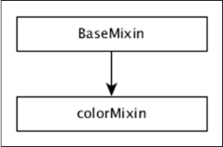
DC.js - colorMixin
colorMixin provides the color support for all the charts, which need to visualize using colors. The hierarchy of the colorMixin is defined in the diagram below.
colorMixin provides the following list of methods to work with colors and they are as follows −
colorAccessor( [colorAccessor])
Gets or sets the color accessor function. This will map a distinct color value in the color scale for each data point in the underlying Crossfilter group. The default color accessor is as follows −
mychart.colorAccessor(function (d, i){return i;})
colorDomain( [domain])
Gets or sets the current domain for the color mapping function and it must be supplied as an array.
calculateColorDomain()
Sets the color domain by determining the min and max values of the data element found using the colorAccessor() function.
colors( [colorScale])
Gets or sets a color scale. It accepts the d3.scale.
chart.colors(d3.scale.category20b());
chart.colors(d3.scale.ordinal().range(['red','green','blue']));
linearColors(r)
A shortcut method to set interpolated linear color scale.
chart.linearColors(["#4575b4", "#ffffbf", "#a50026"]);
ordinalColors(r)
A shortcut method to set the ordinal color scale.
chart.ordinalColors(['red','green','blue']);
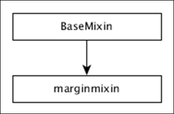
DC.js - marginMixin
marginMixin provides margin utility functions for both the Row Chart and Coordinate Grid Charts. The hierarchy of the marginMixin is defined in the diagram below.
marginMixin provides a single method to set the margin for coordinated axis based charts.
margins( [margins])
Gets or sets the left, right, top and bottom margin of the chart. The default margin of the chart is as follows −
a. Right - 50
a. Left - 30
a. Top - 10
a. Bottom - 30
var rightMargin = chart.margins().right; // 50 by default
chart.margins().bottom = 60;
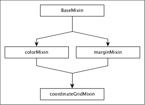
DC.js - coordinateGridMixin
The Coordinate & Axis also termed as coordinateGridMixin is designed to support a number of coordinate grid based concrete chart types such as Bar Chart, Line Chart, etc. The hierarchy of coordinateGridMixin is defined in the diagram below.
The coordinateGridMixin supports a number of methods to reduce the workload in creating the coordinate axis and they are as follows −
- brushOn( [brushOn])
- chartBodyG( [body])
- clipPadding( [pad])
- elasticX( [X])
- focus( [range])
- g( [root])
- isOrdinal()
- mouseZoomable( [Zoom])
- rangeChart( [range])
- round(r)
- xAxisMax()
- xAxisMin()
- xUnitCount()
Let us discuss each of these methods in brief.
brushOn( [brushOn])
It is a brush-based range filter. You can set it On/Off. If brushing is on, the user can drag the mouse across a chart. Turning on can disable other interactive elements on the chart such as highlighting, tool tips and reference lines. It is defined below −
chart.brushOn = function (brushOn) {
   if (!arguments.length) {
      return _brushOn;
   }
   _brushOn = brushOn;
   return chart;
};
chartBodyG( [body])
It is used to retrieve the SVG group for the chart body. You can call this function as shown below −
chart.chartBodyG = function (body) {
   if (!arguments.length) {
      return _chartBodyG;
   }
};
clipPadding( [pad])
It is used to get or set the padding in pixels for the clip path. It is defined below −
chart.clipPadding = function (pad) {
   if (!arguments.length) {
      return _clipPadding;
   }
};
elasticX( [X])
This method is used to turn on/off elastic x-axis behavior. If the x-axis elasticity is turned on, then the grid chart will attempt to recalculate the x-axis range. It triggers a redraw event that is defined below −
chart.elasticX = function (X) {
   if (!arguments.length) {
      return _x;
   }
}
Similarly, you can perform elasticY( [Y]).
focus( [range])
This method is used to zoom the chart to focus on the given range. The given range should be an array containing only two elements ([start, end]).
g( [root])
This method is used to get or set the root g element.
isOrdinal()
This method is used to return the chart ordinal xUnits. Most charts behave differently with ordinal data and use the result of this method to trigger the appropriate logic.
mouseZoomable( [Zoom])
This method is used to set or get mouse zoom capability.
rangeChart( [range])
It is used to get or set the range selection chart associated with the instance.
round(r)
This method is used to set or get the rounding function used to quantize the selection when brushing is enabled.
xAxisMax()
Calculates the maximum x value to display in the chart. Similarly, we can perform for Y-axis.
xAxisMin()
Calculates the minimum x value to display in the chart. Similarly, we can perform for Y-axis.
xUnitCount()
Returns the number of units displayed on the x-axis. Similarly, we can perform for Y-axis.
DC.js - Pie Chart
A pie chart is a circular statistical graph. It is divided into slices to show a numerical proportion. This chapter explains how to draw a pie chart using DC.js in detail.
Pie Chart Methods
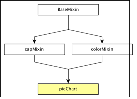
Before moving on to draw a pie chart, we should understand the dc.pieChart class and its methods. The dc.pieChart uses mixins to get the basic functionality of drawing a chart. The mixins used by dc.pieChart are as follows −
- baseMixin
- capMixin
- colorMixin
The complete class diagram of a dc.pieChart is as follows −
The dc.pieChart gets all the methods of the above specified mixins as well as has its own methods to specifically draw the pie chart. They are as follows −
- cx( [cx])
- drawPaths( [path])
- emptyTitle( [title])
- externalLabels( [label])
- innerRadius( [innerRadius])
- minAngleForLabel( [minAngleForLabel])
- radius( [radius])
- slicesCap( [cap])
Let us discuss each of these in detail.
cx( [cx])
It is used to get or set the center x coordinate position, which is defined below −
chart.cx = function (cx) {
   if (!arguments.length) {
      return (_cx ||  _chart.width() / 2);
   }
};
Similarly, you can perform the y-coordinate position.
drawPaths( [path])
This method is used to draw paths for a pie chart and is defined below −
chart.drawPaths = function (path) {
   if (arguments.length === 0) {
      return path;
   }
};
emptyTitle( [title])
This method is used to set the title when there is no data. It is defined below −
chart.emptyTitle = function (title) {
   if (arguments.length === 0) {
      return title;
   }
};
externalLabels( [label])
It is used to position slice labels offset from the outer edge of the chart. It is defined below −
chart.externalLabels = function (label) {
   if (arguments.length === 0) {
      return label;
   }
};
innerRadius( [innerRadius])
This method is used to get or set the inner radius of the pie chart. If the inner radius is greater than 0px, then the pie chart will be rendered as a doughnut chart. It is defined below −
_chart.innerRadius = function (innerRadius) {
   if (!arguments.length) {
      return _innerRadius;
   }
};
minAngleForLabel( [minAngleForLabel])
This method is used to get or set the minimal slice angle for label rendering. It is defined below −
 _chart.minAngleForLabel = function (minAngleForLabel) {
   if (!arguments.length) {
      return _minAngleForLabel;
   }
   _minAngleForLabel = minAngleForLabel;
   return _chart;
};
radius( [radius])
This method is used to get or set the outer radius. If the radius is not specified, then it will take half of the minimum chart width and height. It is defined below −
_chart.radius = function (radius) {
   if (!arguments.length) {
      return _givenRadius;
   }
   _givenRadius = radius;
   return _chart;
};
slicesCap( [cap])
Gets or sets the maximum number of slices the pie chart will generate. The top slices are determined by a value from high to low. Other slices exceeding the cap will be rolled up into one single Others slice.
Draw a Pie Chart
Let us create a pie chart in DC. In this pie chart example, let us take a dataset named people.csv file. The sample data file is as follows −
id,name,gender,DOB,MaritalStatus,CreditCardType
1,Damaris,Female,1973-02-18,false,visa-electron
2,Barbe,Female,1969-04-10,true,americanexpress
3,Belia,Female,1960-04-16,false,maestro
4,Leoline,Female,1995-01-19,true,bankcard
5,Valentine,Female,1992-04-16,false,
6,Rosanne,Female,1985-01-05,true,bankcard
7,Shalna,Female,1956-11-01,false,jcb
8,Mordy,Male,1990-03-27,true,china-unionpay

....................
....................
....................
The above sample contains many records. You can download the file by clicking the following link and save it to the DC location.
Now, let us adhere to the following steps to draw a pie chart in DC.
Step 1: Include a Script
Let us add D3, DC and Crossfilter using the following code −
<script src = "js/d3.js"></script>
<script src = "js/crossfilter.js"></script>
<script src = "js/dc.js"></script>
Step 2: Define a Variable
Create an object of type, dc.pieChart as shown below −
var pieChart = dc.pieChart('#pie');
Here, the Pie id is mapped with a pie.
Step 3: Read the Data
Read your data (say, from people.csv) using the d3.csv() function. It is defined as follows −
d3.csv("data/people.csv", function(errors, people) {
   console.log(people);
}
Here, if the data file is not available in the specified location, then the d3.csv() function returns an error.
Step 4: Define the Crossfilter
Define a variable for Crossfilter and assign the data to Crossfilter. It is defined below −
var mycrossfilter = crossfilter(people);
Step 5: Create a Dimension
Create a dimension for gender using the function below −
var genderDimension = mycrossfilter.dimension(function(data) {
   return data.gender;
});
Here, the Gender of the people is used for dimension.
Step 6: reduceCount()
Create a Crossfilter group by applying the group() and the reduceCount() function on the above created gender dimension - groupDimension.
var genderGroup = genderDimension.group().reduceCount();
Step 7: Generate Pie
Generate the pie using the function below −
pieChart
   .width(800)
   .height(300)
   .dimension(genderDimension)
   .group(genderGroup)
   .on('renderlet', function(chart) {
      chart.selectAll('rect').on('click', function(d) {
         console.log('click!', d);
      });
   });

dc.renderAll();
Here,
Width of the pie chart is set to 800.
Height of the pie chart is set to 300.
Dimension of the pie chart is set to genderDimension using the dimension() method.
Group of the pie chart is set to genderGroup using the group() method.
Added a click event to log the data using the DC.js built-in event, renderlet(). The renderlet is invoked, whenever the chart is rendered or drawn.
Step 8: Working Example
Create a new html file, pie.html and include all the above steps as shown below −
<html>
   <head>
      <title>DC.js Pie Chart Sample</title>
      <link rel = "stylesheet" type = "text/css" href = "css/bootstrap.min.css">
      <link rel = "stylesheet" type = "text/css" href = "css/dc.css"/>

      <script src = "js/d3.js"></script>
      <script src = "js/crossfilter.js"></script>
      <script src = "js/dc.js"></script>
   </head>

   <body>
      <div>
         <div id = "pie"></div>
      </div>

      <script language = "javascript">
         var pieChart = dc.pieChart('#pie');

         d3.csv("data/people.csv", function(errors, people) {
            console.log(people);
            var mycrossfilter = crossfilter(people);

            // gender dimension
            var genderDimension = mycrossfilter.dimension(function(data) {
               return data.gender;
            });
            var genderGroup = genderDimension.group().reduceCount();

            pieChart
               .width(800)
               .height(300)
               .dimension(genderDimension)
               .group(genderGroup)
               .on('renderlet', function(chart) {
                  chart.selectAll('rect').on('click', function(d) {
                     console.log('click!', d);
                  });
               });

            dc.renderAll();
         });
      </script>
   </body>
</html>
Now, request the browser and we will see the following response.
DC.js - Line Chart
A line chart is used to display information as a series of data points connected by straight lines. A data point represents two values, one plotted along the horizontal axis and another along the vertical axis. For example, the popularity of food items can be drawn as a line chart in such a way that the food item is represented along the x-axis and its popularity is represented along the y-axis. This chapter explains about line charts in detail.
Line Chart Methods
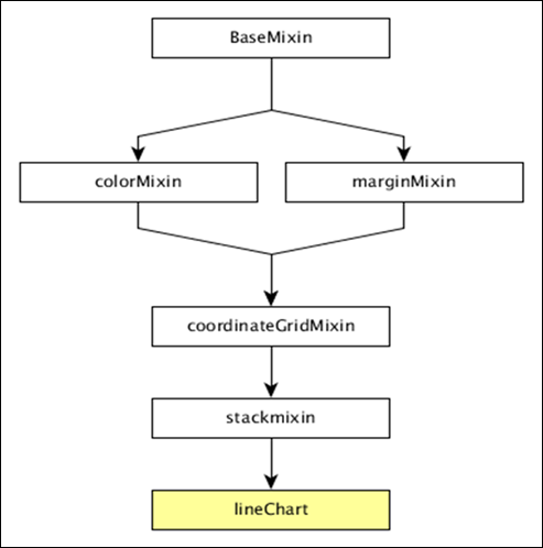
Before moving on to draw a line chart, we should understand the dc.lineChart class and its methods. The dc.lineChart uses mixins to get the basic functionality of drawing a chart. The mixins used by dc.lineChart are as follows −
- dc.stackMixin
- dc.coordinateGridMixin
The complete class diagram of the dc.lineChart is as follows −
The dc.lineChart gets all the methods of the above-specified mixins as well as it has its own methods to draw the line chart. They are explained as follows.
dashStyle( [style])
This method is used to set the dash style for a line chart.
dotRadius( [radius])
This method is used to get or set the radius (in PX) for dots displayed on the data points. It is defined as follows −
chart.dotRadius = function (radius) {
   if (!arguments.length) {
      return radius;
   }
};
interpolate( [i])
This method is used to get or set the interpolator for a line.
renderArea( [area])
This method is used to get or set the render area.
renderDataPoints( [options])
This method is used to render individual dots for each data point.
tension( [tension])
This method is used get or set the tension for the lines drawn. It is in the range from 0 to 1.
xyTipsOn( [xyTipsOn])
This method is used to change the mouse behavior of an individual data point.
Draw a Line Chart
Let us draw a line chart in DC. To do this, we need to follow the steps given below −
Step 1: Define a variable
Let us define a variable as shown below −
var chart = dc.lineChart('#line');
Here, the dc.linechart function is mapped with the container having an id line.
Step 2: Read the data
Read data from the people.csv file −
d3.csv("data/people.csv", function(errors, people) {
   var mycrossfilter = crossfilter(people);
}
Here, if we used the same dataset people.csv, the sample data file will be as follows −
id,name,gender,DOB,MaritalStatus,CreditCardType
1,Damaris,Female,1973-02-18,false,visa-electron
2,Barbe,Female,1969-04-10,true,americanexpress
3,Belia,Female,1960-04-16,false,maestro
4,Leoline,Female,1995-01-19,true,bankcard
5,Valentine,Female,1992-04-16,false,
6,Rosanne,Female,1985-01-05,true,bankcard
7,Shalna,Female,1956-11-01,false,jcb
8,Mordy,Male,1990-03-27,true,china-unionpay

...............
................
................
Step 3: Create an age dimension
Now, create dimension for age as shown below −
var ageDimension = mycrossfilter.dimension(function(data) {
    return ~~((Date.now() - new Date(data.DOB)) / (31557600000))
});
Here, we assigned the age from the Crossfilter data.
The ~~ is a double NOT bitwise operator. It is used as a faster substitute for the Math.floor() function.
Now, group it using the reduceCount() function, which is defined below −
var ageGroup = ageDimension.group().reduceCount();
Step 4: Generate a chart
Now, generate a line chart using the coding given below −
chart
   .width(800)
   .height(300)
   .x(d3.scale.linear().domain([15,70]))
   .brushOn(false)
   .yAxisLabel("Count")
   .xAxisLabel("Age")
   .dimension(ageDimension)
   .group(ageGroup)
   .on('renderlet', function(chart) {
      chart.selectAll('rect').on('click', function(d) {
         console.log('click!', d);
      });
   });

chart.render();
Here,
Chart width is 800 and height is 300.
The d3.scale.linear function is used to construct a new linear scale with the specified domain range [15, 70].
Next, we set the brushOn value to false.
We assign the y-axis label as count and x-axis label as age.
Finally, group the age using ageGroup.
Step 5: Working example
The complete code listing is shown in the following code block. Create a web page line.html and add the following changes to it.
<html>
   <head>
      <title>DC.js Line Chart Sample</title>
      <link rel = "stylesheet" type = "text/css" href = "css/bootstrap.min.css">
      <link rel = "stylesheet" type = "text/css" href = "css/dc.css"/>

      <script src = "js/d3.js"></script>
      <script src = "js/crossfilter.js"></script>
      <script src = "js/dc.js"></script>
   </head>

   <body>
      <div>
         <div id = "line"></div>
      </div>

      <script language = "javascript">
         var chart = dc.lineChart('#line');

         d3.csv("data/people.csv", function(errors, people) {
            var mycrossfilter = crossfilter(people);

            var ageDimension = mycrossfilter.dimension(function(data) {
               return ~~((Date.now() - new Date(data.DOB)) / (31557600000))
            });
            var ageGroup = ageDimension.group().reduceCount();

            chart
               .width(800)
               .height(300)
               .x(d3.scale.linear().domain([15,70]))
               .brushOn(false)
               .yAxisLabel("Count")
               .xAxisLabel("Age")
               .dimension(ageDimension)
               .group(ageGroup)
               .on('renderlet', function(chart) {
                  chart.selectAll('rect').on('click', function(d) {
                     console.log('click!', d);
                  });
               });
            chart.render();
         });
      </script>
   </body>
</html>
Now, request the browser and we will see the following response.
DC.js - Bar Chart
Bar chart is one of the most commonly used types of graph and are used to display and compare the number, frequency or other measure (e.g. mean) for different discrete categories or groups. The graph is constructed such that the heights or lengths of the different bars are proportional to the size of the category they represent.
The x-axis (the horizontal axis) represents the different categories it has no scale. The y axis (the vertical axis) does have a scale and this indicates the units of measurement. The bars can be drawn either vertically or horizontally depending upon the number of categories and length or complexity of the category.
Bar Chart Methods
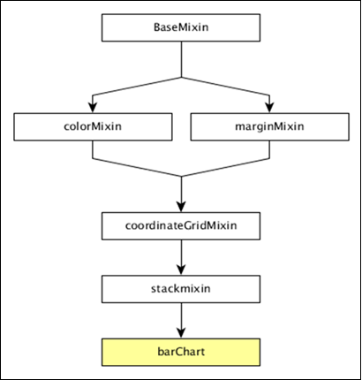
Before moving to draw a bar chart, we should understand the dc.barChart class and its methods. The dc.barChart uses mixins to get the basic functionality of drawing a chart. The mixins used by the dc.barChart are as follows −
- dc.stackMixin
- dc.coordinateGridMixin
The complete class diagram of the dc.barChart is as follows −
The dc.barChart gets all the methods of the above specified mixins. In addition, it also has its own methods to draw the bar chart. They are explained as follows −
alwaysUseRounding( [round])
This method is used to get or set whether rounding is enabled when the bars are centered.
barPadding( [pad])
This method is used to get or set the spacing between bars as a fraction of bar size. The possible padding values are between 0-1.
centerBar( [centerBar])
This method is used to set the bar, centered around the data position on the x-axis.
gap( [gap])
This method is used to set a fixed gap between the bars.
outerPadding( [pad])
This method is used to set the outer padding on an ordinal bar chart.
Draw a Bar Chart
Let us draw a bar chart in DC. To do this, we should follow the steps given below −
Step 1: Define a variable
Let us define a chart variable as shown below −
var chart = dc.barChart('#bar');
Here, the dc.barChart function is mapped with a container having bar as the id.
Step 2: Read the data
Read data from the people.csv file.
d3.csv("data/people.csv", function(errors, people) {
   var mycrossfilter = crossfilter(people);
}
If the data is not present, then it returns an error. Now, assign the data to Crossfilter. For this example, we will use the same people.csv file, which looks as follows −
id,name,gender,DOB,MaritalStatus,CreditCardType
1,Damaris,Female,1973-02-18,false,visa-electron
2,Barbe,Female,1969-04-10,true,americanexpress
3,Belia,Female,1960-04-16,false,maestro
4,Leoline,Female,1995-01-19,true,bankcard
5,Valentine,Female,1992-04-16,false,
6,Rosanne,Female,1985-01-05,true,bankcard
7,Shalna,Female,1956-11-01,false,jcb
8,Mordy,Male,1990-03-27,true,china-unionpay
..................
..................
..................
Step 3: Create an age dimension
Now, create a dimension for age as shown below −
var ageDimension = mycrossfilter.dimension(function(data) {
   return ~~((Date.now() - new Date(data.DOB)) / (31557600000))
});
Here, we assigned the age from the Crossfilter data. The ~~ is a double NOT bitwise operator. It is used as a faster substitute for the Math.floor() function.
Now, group it using the reduceCount() function that is shown below −
var ageGroup = ageDimension.group().reduceCount();
Step 4: Generate a chart
Now, generate a bar chart using the coding given below −
chart
   .width(800)
   .height(300)
   .x(d3.scale.linear().domain([15,70]))
   .brushOn(false)
   .yAxisLabel("Count")
   .xAxisLabel("Age")
   .dimension(ageDimension)
   .group(ageGroup)
   .on('renderlet', function(chart) {
      chart.selectAll('rect').on('click', function(d) {
         console.log('click!', d);
      });
   });

chart.render();
Here,
Chart width is 800 and height is 300.
The d3.scale.linear function is used to construct a new linear scale with the specified domain range [15, 70].
Next, we set the brushOn value to false.
We assign the y-axis label as count and x-axis label as age.
Finally, group the age using the ageGroup function.
Step 5: Working example
The complete code listing is as follows. Create a web page bar.html and add the following changes to it.
<html>
   <head>
      <title>DC Bar chart Sample</title>
      <link rel = "stylesheet" type = "text/css" href = "css/bootstrap.min.css">
      <link rel = "stylesheet" type = "text/css" href = "css/dc.css"/>

      <script src = "js/d3.js"></script>
      <script src = "js/crossfilter.js"></script>
      <script src = "js/dc.js"></script>
   </head>

   <body>
      <div>
         <div id = "bar"></div>
      </div>

      <script language = "javascript">
         var chart = dc.barChart('#bar');

         d3.csv("data/people.csv", function(errors, people) {
            var mycrossfilter = crossfilter(people);

            var ageDimension = mycrossfilter.dimension(function(data) {
               return ~~((Date.now() - new Date(data.DOB)) / (31557600000))
            });
            var ageGroup = ageDimension.group().reduceCount();

            chart
               .width(800)
               .height(300)
               .x(d3.scale.linear().domain([15,70]))
               .brushOn(false)
               .yAxisLabel("Count")
               .xAxisLabel("Age")
               .dimension(ageDimension)
               .group(ageGroup)
               .on('renderlet', function(chart) {
                  chart.selectAll('rect').on('click', function(d) {
                     console.log('click!', d);
                  });
               });
            chart.render();
         });
      </script>
   </body>
</html>
Now, request the browser and we will see the following response.
DC.js - Composite Chart
Composite chart is a special type of chart provided by DC.js. It provides an option to render multiple charts in the same coordinate grid. Composite chart enables advanced chart visualization options with a minimum line of code.
Composite Chart Methods
Before moving on to draw a composite chart, we need to understand the dc.compositeChart class and its methods. The dc.compositeChart uses mixins to get the basic functionality of drawing a chart. The mixins used by the dc.compositeChart are as follows −
- dc.baseMixin
- dc.marginMixin
- dc.colorMixin
- dc.coordinateGridMixin
The complete class diagram of the dc.barChart is as follows −
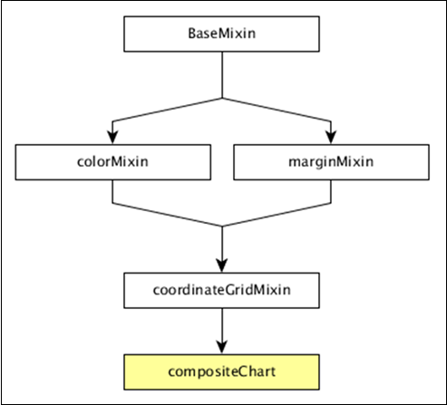
The dc.compositeChart gets all the methods of the above-specified mixins. It has its own method to draw the composite chart, which is explained below −
compose( [subChartArray])
Set the collection of charts to be rendered in the same coordinate grid chart.
chart.compose([
   dc.lineChart(chart)
   dc.barChart(chart)
]);
children()
Gets all the charts composed in the same coordinate grid.
childOptions( [childOptions])
Gets or sets the chart options for all the child charts composed in the same coordinate grid.
shareTitle( [shareTitle])
Gets or sets the shared title of the chart. If set, it will be shared with all the children charts composed in the same coordinate grid.
shareColors( [shareColors])
Similar to the shareTitle() function, except it shares the colors instead of the title.
rightY( [yScale])
Gets or sets the y-scale for the right axis of the composite chart.
rightYAxis( [rightYAxis])
Gets or sets the right y-axis of the composite chart.
rightYAxisLabel( rightYAxisLabel[??])
Gets or sets the right y-axis label.
alignYAxes( [alignYAxes])
Gets or sets the alignment between the left and right y-axis.
useRightAxisGridLines( [useRightAxisGridLines])
Gets or sets whether to draw gridlines from the right y-axis of the composite chart. The default behavior is to draw from the left y-axis.
Draw a Composite Chart
Let us draw a composite chart using DC.js. To do this, we should follow the steps given below −
Step 1: Define a variable
Let us define a chart variable as shown below −
var chart = dc.compositeChart('#compoiste');
Here, the dc.compositeChart function is mapped with a container having composite as its id.
Step 2: Read the data
Read data from the people.csv file −
d3.csv("data/people.csv", function(errors, people) {

}
If data is not present, then it returns an error. We will use the same people.csv file. The sample data file is as follows −
id,name,gender,DOB,MaritalStatus,CreditCardType
1,Damaris,Female,1973-02-18,false,visa-electron
2,Barbe,Female,1969-04-10,true,americanexpress
3,Belia,Female,1960-04-16,false,maestro
4,Leoline,Female,1995-01-19,true,bankcard
5,Valentine,Female,1992-04-16,false,
6,Rosanne,Female,1985-01-05,true,bankcard
7,Shalna,Female,1956-11-01,false,jcb
8,Mordy,Male,1990-03-27,true,china-unionpay

.............
.............
..............
Step 3: Map the data
Now, map the data as shown below −
var ndx = crossfilter();

ndx.add(people.map(function(data) {
   return {
      age: ~~((Date.now() - new Date(data.DOB)) / (31557600000)),
      male: data.gender == 'Male' ? 1 : 0,
      female: data.gender == 'Male' ? 0 : 1
   };
}));
Here, we assigned the age from the Crossfilter data. The ~~ is a double NOT bitwise operator. It is used as a faster substitute.
Now, apply the dimension age and group the gender data using the coding given below −
var dim  = ndx.dimension(dc.pluck('age')),

grp1 = dim.group().reduceSum(dc.pluck('male')),
grp2 = dim.group().reduceSum(dc.pluck('female'));
Step 4: Generate a chart
Now, generate a composite chart using the coding given below −
composite
   .width(768)
   .height(480)
   .x(d3.scale.linear().domain([15,70]))
   .yAxisLabel("Count")
   .xAxisLabel("Age")
   .legend(dc.legend().x(80).y(20).itemHeight(13).gap(5))
   .renderHorizontalGridLines(true)
   .compose ([
      dc.lineChart(composite)
         .dimension(dim)
         .colors('red')
         .group(grp1, "Male")
         .dashStyle([2,2]),
      dc.lineChart(composite)
         .dimension(dim)
         .colors('blue')
         .group(grp2, "Female")
         .dashStyle([5,5])
   ])

.brushOn(false)
.render();
Here,
Chart width is 768 and height is 480.
The d3.scale.linear function is used to construct a new linear scale with the specified domain range [15, 70].
We assign a x-axis label as age and y-axis label as count.
Next, render horizontal grid lines as true.
Compose the line chart colors value red for male gender and blue for female.
Finally, we set the brushOn value to false and render the chart.
Step 5: Working example
The complete code is as follows. Create a web page composite.html and add the following changes to it.
<html>
   <head>
      <title>DC composite chart Sample</title>
      <link rel = "stylesheet" type = "text/css" href = "css/bootstrap.css">
      <link rel = "stylesheet" type = "text/css" href = "css/dc.css"/>

      <script src = "js/d3.js"></script>
      <script src = "js/crossfilter.js"></script>
      <script src = "js/dc.js"></script>
   </head>

   <body>
      <div>
         <div id = "composite"></div>
      </div>

      <script type = "text/javascript">
         var composite = dc.compositeChart("#composite");

         d3.csv("data/people.csv", function(errors, people) {
            var ndx = crossfilter();

            ndx.add(people.map(function(data) {
               return {
                  age: ~~((Date.now() - new Date(data.DOB)) / (31557600000)),
                  male: data.gender == 'Male' ? 1 : 0,
                  female: data.gender == 'Male' ? 0 : 1
               };
            }));

            var dim  = ndx.dimension(dc.pluck('age')),

            grp1 = dim.group().reduceSum(dc.pluck('male')),
            grp2 = dim.group().reduceSum(dc.pluck('female'));

            composite
               .width(768)
               .height(480)
               .x(d3.scale.linear().domain([15,70]))
               .yAxisLabel("Count")
               .xAxisLabel("Age")
               .legend(dc.legend().x(80).y(20).itemHeight(13).gap(5))
               .renderHorizontalGridLines(true)
               .compose ([
                  dc.lineChart(composite)
                  .dimension(dim)
                  .colors('red')
                  .group(grp1, "Male")
                  .dashStyle([2,2]),
                  dc.lineChart(composite)
                     .dimension(dim)
                     .colors('blue')
                     .group(grp2, "Female")
                     .dashStyle([5,5])
               ])
               .brushOn(false)
               .render();
         });
      </script>
   </body>
</html>
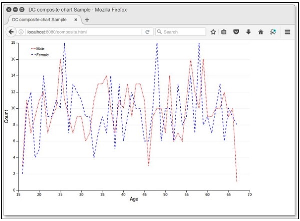
Now, request the browser and we will see the following response.
DC.js - Series Chart
A series is a set of data. You can plot a chart based on the data. This chapter explains how to draw a series chart in detail.
Series Chart Methods
Before moving on to draw a series chart, we should understand the dc.seriesChart class and its methods. The dc.seriesChart uses Mixins to get the basic functionality of drawing a chart. The mixin used by the dc.seriesChart is −
- dc.stackMixin
The complete class diagram of the dc.seriesChart is as follows −
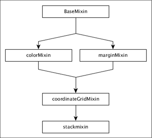
The dc.seriesChart gets all the methods of the above specified mixins. It has its own methods to draw the series chart, which are explained below −
chart( [function])
This method is used to get or set the chart function.
seriesAccessor( [accessor])
It is used to get or set the accessor function for the displayed series.
seriesSort( [sortFunction])
This method is used to get or set a function to sort the list of series by giving series values.
valueSort( [sortFunction])
This method is used to get or set a function to sort the values of each series.
Draw a Series Chart
Let us draw a series chart in DC. In this example, let us take a dataset named as people_hw.csv. The sample data file is as follows −
id,name,gender,height,weight
1,Kinsley,Male,168,90
2,Dimitry,Male,177,61
3,Martica,Female,152,76
4,Brittni,Female,156,88
5,Phillip,Male,161,78
6,Sofie,Female,161,71
7,Avril,Female,163,55
8,Allistir,Male,161,75
9,Emelda,Female,154,66
10,Camella,Female,153,52

...............
...............
The above sample file contains many records. You can download the file by clicking the following link and save it to your DC location.
Now, let us adhere to the following steps to draw a series chart in DC.
Step 1: Define a variable
Let us define the variable as shown below −
var chart = dc.seriesChart('#line');
Here, the seriesChart function is mapped with the id line.
Step 2: Read the data
Read data from the people_hw.csv file −
d3.csv("data/people_hw.csv", function(errors, people) {
   var mycrossfilter = crossfilter(people);
}
If data is not present, then it returns an error. Now, assign the data to a crossfilter. Once we get the data, we can retrieve it one by one and check the gender using the coding given below −
people.forEach(function(x) {
   if(x.gender == 'Male') {
      x.newdata = 1;
   } else {
      x.newdata = 2;
   }
});
Step 3: Create an age dimension
Now, create a dimension for age as shown below −
var hwDimension = mycrossfilter.dimension(function(data) {
   return [data.gender, data.height];
});
Here, we have assigned the dimension and it returns the gender and the height. Now, group it using the reduceCount() function, which is defined below −
var hwGroup = hwDimension.group().reduceCount();
Step 4: Generate a chart
Now, generate a series chart using the coding given below −
chart
   .width(800)
   .height(600)
   .chart(function(c) {
      return dc.lineChart(c).interpolate('cardinal').evadeDomainFilter(true);
   })

   .x(d3.scale.linear().domain([145,180]))
   .elasticY(true)
   .brushOn(false)
   .xAxisLabel("Height")
   .yAxisLabel("Count")
   .dimension(hwDimension)
   .group(hwGroup)
   .seriesAccessor(function(d) { return d.key[0];})
   .keyAccessor(function(d) { return +d.key[1]; })
   .valueAccessor(function(d) { return +d.value; })
   legend(dc.legend().x(350).y(500).itemHeight(13).gap(5).horizontal(1).legendWidth(120)\
      .itemWidth(60));

chart.render();
Here,
- Chart width is 800 and height is 600.
- Using the method d3.scale.linear(), we specify the domain value.
- Using the seriesAccessor function, it displays the series for the datum.
- Key and value accessor returns the key and value from the series.
- Legend can be used to add height and width.
Step 5: Working example
The complete code listing is as follows. Create a web page line_series.html and add the following changes in it.
<html>
   <head>
      <title>Series chart Sample</title>
      <link rel = "stylesheet" type = "text/css" href = "css/bootstrap.css">
      <link rel = "stylesheet" type = "text/css" href = "css/dc.css"/>

      <script src = "js/d3.js"></script>
      <script src = "js/crossfilter.js"></script>
      <script src = "js/dc.js"></script>
   </head>

   <body>
      <div>
         <div id = "line"></div>
      </div>

      <script language = "javascript">
         var chart = dc.seriesChart('#line');

         d3.csv("data/people_hw.csv", function(errors, people) {
            var mycrossfilter = crossfilter(people);

            people.forEach(function(x) {
               if(x.gender == 'Male') {
                  x.newdata = 1;
               } else {
                  x.newdata = 2;
               }
            });

            var hwDimension = mycrossfilter.dimension(function(data) {
               return [data.gender, data.height];
            });
            var hwGroup = hwDimension.group().reduceCount();

            chart
               .width(800)
               .height(600)
               .chart(function(c) {
                  return dc.lineChart(c).interpolate('cardinal').evadeDomainFilter(true);
               })
               .x(d3.scale.linear().domain([145,180]))
               .elasticY(true)
               .brushOn(false)
               .xAxisLabel("Height")
               .yAxisLabel("Count")
               .dimension(hwDimension)
               .group(hwGroup)
               .seriesAccessor(function(d) { return d.key[0];})
               .keyAccessor(function(d) { return +d.key[1]; })
               .valueAccessor(function(d) { return +d.value; })
               .legend(dc.legend().x(350).y(500).itemHeight(13).gap(5).horizontal(1)
                  .legendWidth(120).itemWidth(60));

            chart.render();
         });
      </script>
   </body>
</html>
Now, request the browser and we will see the following response.
DC.js - Scatter Plot
A scatter plot is a type of mathematical diagram. It is represented using the Cartesian coordinates to display values for typically two variables for a set of data. The data is displayed as a collection of points and the points maybe colored. This chapter explains about a scatter plot in detail.
Scatter Plot Methods
Before moving on to draw a scatter plot, we should understand the dc.scatterPlot class and its methods. The dc.scatterPlot uses mixins to get the basic functionality of drawing a chart. The mixin used by dc.scatterPlot is given below −
- dc.coordinateGridMixin
The complete class diagram of the dc.scatterPlot is as follows −
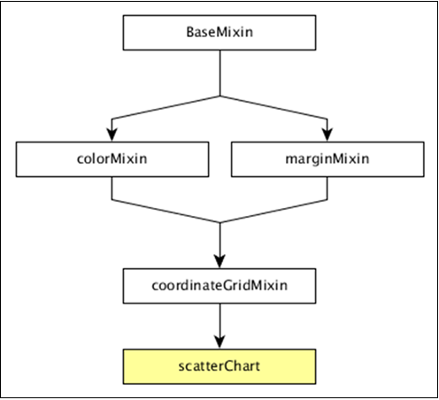
The dc.scatterPlot gets all the methods of the above-specified mixins. It has its own methods to draw the scatter plot, which are explained as follows.
customSymbol( [symbol])
This method is used get or set the symbol generator.
emptySize( [size])
This method is used to set or get the radius for symbols when the group is empty.
excludedColor( [color])
This method is used to get or set the color for symbols excluded from the chart's filter.
excludedOpacity( [opacity])
This method is used to get or set the opacity for symbols excluded from the chart's filter.
excludedSize( [size])
It is used to set or get size for symbols excluded from the chart's filter.
highlightedSize( [size])
It is used to set or get radius for highlighted symbols.
symbol( [type])
It is used to get or set the symbol type used for each point.
Draw a Scatter Plot
Let us draw a scatter plot in DC. In this example, let us take a dataset named as howell1.csv file. The sample data file is as follows −
"height","weight","age","male"
151.765,47.8256065,63,1
139.7,36.4858065,63,0
136.525,31.864838,65,0
156.845,53.0419145,41,1
145.415,41.276872,51,0
163.83,62.992589,35,1
149.225,38.2434755,32,0
168.91,55.4799715,27,1
147.955,34.869885,19,0
165.1,54.487739,54,1
154.305,49.89512,47,0

...............
...............
The above sample file contains many records. We can download the file by clicking the following link and saving it to our DC location.
Now, let us follow the subsequent steps to draw a Scatter chart in DC.
Step 1: Define a variable
Let us define a variable as shown below −
var chart = dc.scatterPlot('#scatter');
Here, the scatterplot() function is mapped with the id scatter.
Step 2: Read the data
Read data from the howell1.csv file as shown below −
d3.csv("data/howell1.csv", function(errors, people) {
   var mycrossfilter = crossfilter(people);
}
If the data is not present, then it returns an error. Later, assign the data to a crossfilter.
Step 3: Fetch the records
Let us fetch the records using the coding given below −
people.forEach(function(x) {
   if(x.male == 1) {
      x.gender = "Male";
   } else {
      x.gender = "Female";
   }
});
Here, we have checked the gender.
Step 4: Set the dimension
You can set the dimension using the coding given below −
var hwDimension = mycrossfilter.dimension(function(data) {
   return [Math.floor(data.height), Math.floor(data.weight)];
});
After the dimension has been assigned, group the gender using the coding given below −
var hwGroup = hwDimension.group().reduceCount();
Step 5: Generate a chart
Now, generate a heatmap using the coding given below −
chart
   .width(800)
   .height(600)
   .x(d3.scale.linear().domain([0,180]))
   .y(d3.scale.linear().domain([0,100]))
   .brushOn(false)
   .xAxisLabel("Height")
   .yAxisLabel("Weight")
   .symbolSize(8)
   .clipPadding(10)
   .dimension(hwDimension)
   .group(hwGroup);
Here,
- We have assigned the chart width as 800 and height as 600.
- Applied the d3.scale.linear() function for both x and y axis.
- Enabled brushOn value as false.
- Then, assigned x-axis label as height and y-axis label as weight.
- Set the symbol size as eight and padding value as 10.
- Finally, group the data and render the chart.
Step 6: Working example
The complete code listing is as follows. Create a web page scatter.html and add the following changes to it.
<html>
   <head>
   <title>Scatter plot Sample</title>
   <link rel = "stylesheet" type = "text/css" href = "css/bootstrap.css">
   <link rel = "stylesheet" type = "text/css" href = "css/dc.css"/>

   <script src = "js/d3.js"></script>
   <script src = "js/crossfilter.js"></script>
   <script src = "js/dc.js"></script>
   </head>

   <body>
      <div>
         <div id = "scatter"></div>
      </div>

      <script language = "javascript">
         var chart = dc.scatterPlot('#scatter');

         d3.csv("data/howell1.csv", function(errors, people) {
            var mycrossfilter = crossfilter(people);

            people.forEach(function(x) {
               if(x.male == 1) {
                  x.gender = "Male";
               } else {
                  x.gender = "Female";
               }
            });

            var hwDimension = mycrossfilter.dimension(function(data) {
               return [Math.floor(data.height), Math.floor(data.weight)];
            });
            var hwGroup = hwDimension.group().reduceCount();

            chart
               .width(800)
               .height(600)
               .x(d3.scale.linear().domain([0,180]))
               .y(d3.scale.linear().domain([0,100]))
               .brushOn(false)
               .xAxisLabel("Height")
               .yAxisLabel("Weight")
               .symbolSize(8)
               .clipPadding(10)
               .dimension(hwDimension)
               .group(hwGroup);

            chart.render();
         });
      </script>
   </body>
</html>
Now, request the browser and we will see the following response.
DC.js - Bubble Chart
A bubble chart is used to display three dimensions of the data. It is a variation of scatter chart, in which the data points are replaced with bubbles. The bubble sizes are represented with respect to the data dimension. It uses horizontal and vertical axes as value axes. This chapter explains about bubble chart in detail.
Bubble Chart Methods
Before moving on to draw a bubble chart, we should understand the dc.bubbleChart class and its methods. The dc.bubbleChart uses mixins to get the basic functionality of drawing a chart, which are listed below −
- dc.bubbleMixin
- dc.coordinateGridMixin
The complete class diagram of the dc.bubbleChart is as follows −
The dc.bubbleChart gets all the methods of the above-specified mixins. It also has its own methods to draw the bubble chart, which are explained below −
elasticRadius( [radius])
This method is used to enable the bubble radius. If we disable this, then the bubble radius will be rescaled automatically.
sortBubbleSize( [sortBubbleSize])
This method is used to enable the sorting feature in bubbles. Smaller bubbles will come first and then they gradually increase.
Draw a Bubble Chart
Let us draw a bubble chart in DC. To do this, we need to follow the steps given below −
Step 1: Define a variable
Let us define a variable as shown below −
var chart = dc.bubbleChart('#bubble');
Here, the bubbleChart function is mapped with the id bubble.
Step 2: Read the data
Read data from the howell1.csv file.
d3.csv("data/howell1.csv", function(errors, people) {
   var mycrossfilter = crossfilter(people);
}
If data is not present, then it returns an error. Now, assign the data to a crossfilter. Here, we have already downloaded the howell1.csv file. The same file will be used here and it will look similar to the following code block.
"height","weight","age","male"
151.765,47.8256065,63,1
139.7,36.4858065,63,0
136.525,31.864838,65,0
156.845,53.0419145,41,1
145.415,41.276872,51,0
163.83,62.992589,35,1
149.225,38.2434755,32,0
168.91,55.4799715,27,1
147.955,34.869885,19,0
165.1,54.487739,54,1
154.305,49.89512,47,0

....................
.....................
Step 3: Fetch the records
Let us fetch the records using the coding given below −
people.forEach(function(x) {
   if(x.male == 1) {
      x.gender = "Male";
   } else {
      x.gender = "Female";
   }
   x.heightRange = (((Math.floor(x.height / 10)) + 1) * 10);
   x.weightRange = (((Math.floor(x.weight / 10)) + 1) * 10);
});
Here, we have checked the gender and have set the x-axis height and width range using the above formula.
Step 4: Set the dimension
We can set the dimension using the coding given below −
var genderDimension = mycrossfilter.dimension(function(data) {
   return [ data.gender, data.heightRange, data.weightRange ];
});
After the dimension has been assigned, group the gender using the coding given below −
var genderGroup = genderDimension.group().reduceCount();
Step 5: Generate the chart
Now, generate a bubble chart using the coding given below −
chart.width(1200)
   .height(400)
   .margins({top: 10, right: 50, bottom: 30, left: 60})
   .dimension(genderDimension)
   .group(genderGroup)
   .keyAccessor(function (p) {
      return p.key[1];
   })

   .valueAccessor(function (p) {
      return p.key[2];
   })

   .radiusValueAccessor(function (p) {
      return (Math.floor((p.value / 10)) + 1);
   })
Here,
We have assigned the chart width as 1200 and the height as 400.
Next, we have specified the margin points.
Then we have assigned the gender dimension and group.
Key and value accessor returns the key and value from the bubbles.
Calculate the radius value accessor function using the formula Math.floor((p.value / 10)) + 1.
Step 6: Draw bubbles
Now, draw the bubbles using the coding given below −
.x(d3.scale.linear().domain([0, 240]))
.y(d3.scale.linear().domain([-40, 120]))
.r(d3.scale.linear().domain([0, 20]))
.minRadiusWithLabel(1000)
.yAxisPadding(100)
.xAxisPadding(200)
.maxBubbleRelativeSize(0.07)
.renderHorizontalGridLines(true)
.renderVerticalGridLines(true)
.renderLabel(true)
.renderTitle(true)
.title(function (p) {
   return p.key[0]
   + "\n"
   + "Height: " + p.key[1] + " cm\n"
   + "Weight: " + p.key[2] + " kg\n"
   + "Count: " + p.value;
});
Here,
The d3.scale.linear function is used to construct a new linear scale with the specified domain range [0,240] for the x-axis.
Similarly, we assigned y and radius linear scale values.
We specified the minimum radius label value as 1000, x-axis and y-axis padding values as 200 and 100 respectively.
Next, we have specified a maximum bubble relative size value as 0.7.
Render the horizontal and vertical grid lines, then map with the title for bubble key and values.
Step 7: Set TickFormat
Set the ticket formats for x and y-axis using the coding given below −
chart.yAxis().tickFormat(function (s) {
   return s + " cm";
});

chart.xAxis().tickFormat(function (s) {
   return s + " kg";
});
Finally, render the chart using the chart.render() method.
Step 8: Working example
The complete code listing is as shown in the following code block. Create a web page bubble.html and add the following changes to it.
<html>
   <head>
      <title>Bubble chart Sample</title>
      <link rel = "stylesheet" type = "text/css" href = "css/bootstrap.css">
      <link rel = "stylesheet" type = "text/css" href = "css/dc.css"/>

      <script src = "js/d3.js"></script>
      <script src = "js/crossfilter.js"></script>
      <script src = "js/dc.js"></script>
   </head>

   <body>
      <div>
         <div id = "bubble"></div>
      </div>

      <script language = "javascript">
         var chart = dc.bubbleChart('#bubble');

         d3.csv("data/howell1.csv", function(errors, people) {
            var mycrossfilter = crossfilter(people);

            people.forEach(function(x) {
               if(x.male == 1) {
                  x.gender = "Male";
               } else {
                  x.gender = "Female";
               }
               x.heightRange = (((Math.floor(x.height / 10)) + 1) * 10);
               x.weightRange = (((Math.floor(x.weight / 10)) + 1) * 10);
            });

            var genderDimension = mycrossfilter.dimension(function(data) {
               return [ data.gender, data.heightRange, data.weightRange ];
            });
            var genderGroup = genderDimension.group().reduceCount();

            chart.width(1200)
               .height(400)
               .margins({top: 10, right: 50, bottom: 30, left: 60})
               .dimension(genderDimension)
               .group(genderGroup)
               .keyAccessor(function (p) {
                  return p.key[1];
               })

               .valueAccessor(function (p) {
                  return p.key[2];
               })

               .radiusValueAccessor(function (p) {
                  return (Math.floor((p.value / 10)) + 1);
               })

               .x(d3.scale.linear().domain([0, 240]))
               .y(d3.scale.linear().domain([-40, 120]))
               .r(d3.scale.linear().domain([0, 20]))
               .minRadiusWithLabel(1000)
               .yAxisPadding(100)
               .xAxisPadding(200)
               .maxBubbleRelativeSize(0.07)
               .renderHorizontalGridLines(true)
               .renderVerticalGridLines(true)
               .renderLabel(true)
               .renderTitle(true)
               .title(function (p) {
                  return p.key[0]
                  + "\n"
                  + "Height: " + p.key[1] + " cm\n"
                  + "Weight: " + p.key[2] + " kg\n"
                  + "Count: " + p.value;
               });

            chart.yAxis().tickFormat(function (s) {
               return s + " cm";
            });

            chart.xAxis().tickFormat(function (s) {
               return s + " kg";
            });

            chart.render();
         });
      </script>
   </body>
</html>
Now, request the browser and we will see the following response.
DC.js - Heat Map
A Heat Map is a graphical representation of data in the form of a map, in which data values are represented as colors. This chapter explains about a heat map in detail.
Before moving on to draw a heat map, we should understand the dc.heatMap class and its methods. The dc.heatMap uses mixins to get the basic functionality of drawing a chart, which are listed below −
- dc.colorMixin
- dc.marginMixin
- dc.baseMixin
The complete class diagram of the dc.heatMap is as follows −
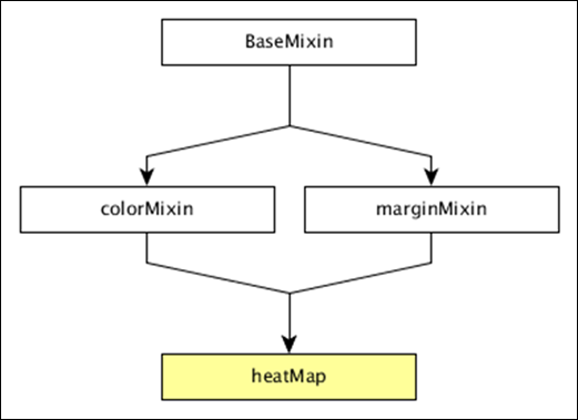
The dc.heatMap gets all the methods of the above-specified mixins. It has its own methods to draw the heat map, which are explained below −
boxOnClick( [handler])
This method is used to get or set the handler, when an individual cell is clicked in the heatmap.
cols( [cols])
This method is used get or set the keys to create the columns of the heatmap.
colsLabel( [label])
This method is used to get or set the column label, which is represented as the column name. Similarly, we can perform a row label as well.
rows( [rows])
This method is used to get or set the values used to create the rows of the heatmap.
xAxisOnClick( [handler])
This method is used to get or set the handler, when a column tick is clicked in the x-axis.
xBorderRadius( [border])
This method is used to set the X border radius. If the value is set to 0, then you will get full rectangles.
Draw a Heatmap
Let us draw a heatmap in DC. To do this, we need to follow the steps given below −
Step 1: Define a variable
Let us define a variable as shown below −
var chart = dc.heatMap('#heatmap');
Here, the heatMap function is mapped with the id heatmap.
Step 2: Read the data
Read the data from the howell1.csv file as shown below −
d3.csv("data/howell1.csv", function(errors, people) {
   var mycrossfilter = crossfilter(people);
}
Here, we have used the same howell1.csv file and it looks as shown below −
"height","weight","age","male"
151.765,47.8256065,63,1
139.7,36.4858065,63,0
136.525,31.864838,65,0
156.845,53.0419145,41,1
145.415,41.276872,51,0
163.83,62.992589,35,1
149.225,38.2434755,32,0
168.91,55.4799715,27,1
147.955,34.869885,19,0
165.1,54.487739,54,1
154.305,49.89512,47,0

......................
......................
Step 3: Fetch the records
Let us fetch the records using the coding given below −
people.forEach(function(x) {
   x.age = Math.floor(x.age) + 1;
   x.heightRange = Math.floor(x.height / 10) + 1;
   x.weightRange = Math.floor(x.weight / 10) + 1;
   if(x.male == 1) {
      x.gender = 1;
   } else {
      x.gender = 2;
   }
});
Here, we have checked the gender and have set the height and width range of the x-axis by using the above formula.
Step 4: Set the dimension
You can set the dimension using the coding given below −
var ageDimension = mycrossfilter.dimension(function(data) {
   return [+data.gender, +data.heightRange];
});
After the dimension has been assigned, group the gender using the coding given below −
var genderGroup = genderDimension.group().reduceCount();
Step 5: Generate a chart
Now, generate a heatmap using the coding given below −
chart
   .width(20 * 45 + 80)
   .height(2 * 45 + 40)
   .dimension(ageDimension)
   .group(ageGroup)
   .keyAccessor(function(d) { return +d.key[1]; })
   .valueAccessor(function(d) { return +d.key[0]; })
   .colorAccessor(function(d) { return +d.value; })
   .title(function(d) {
      return "Height Range:   " + ((d.key[1] - 1) * 10) + " - " + (d.key[1] * 10) + "cm\n" +
      "Gender:  " + (d.key[0] == 1 ? "Male" : "Female") + "\n" +
      "Count: " + (d.value) + " count";
   })
   .calculateColorDomain()

chart.render();
});
Here,
- We have assigned the chart width as 20 × 45 + 80 and height as 2 × 45 + 40.
- Then we have assigned the gender dimension and group.
- Key and value accessor returns the key and value from the heatmaps.
- We have to use the colorAccessor() function to return the color.
- Finally, set the title and render the chart.
Step 6: Working example
The complete coding is as follows. Create a web page heatmap.html and add the following changes to it.
<html>
   <head>
      <title>DC heat map Sample</title>
      <link rel = "stylesheet" type = "text/css" href = "css/bootstrap.css">
      <link rel = "stylesheet" type = "text/css" href = "css/dc.css"/>

      <script src = "js/d3.js"></script>
      <script src = "js/crossfilter.js"></script>
      <script src = "js/dc.js"></script>
   </head>

   <body>
      <div>
         <div id = "heatmap"></div>
      </div>

      <script language = "javascript">
         var chart = dc.heatMap('#heatmap');

         d3.csv("data/howell1.csv", function(errors, people) {
            var mycrossfilter = crossfilter(people);

            people.forEach(function(x) {
               x.age = Math.floor(x.age) + 1;
               x.heightRange = Math.floor(x.height / 10) + 1;
               x.weightRange = Math.floor(x.weight / 10) + 1;
               if(x.male == 1) {
                  x.gender = 1;
               } else {
                  x.gender = 2;
               }
            });

            var ageDimension = mycrossfilter.dimension(function(data) {
               return [+data.gender, +data.heightRange];
            });

            var ageGroup = ageDimension.group().reduceCount();
            chart
               .width(20 * 45 + 80)
               .height(2 * 45 + 40)
               .dimension(ageDimension)
               .group(ageGroup)
               .keyAccessor(function(d) { return +d.key[1]; })
               .valueAccessor(function(d) { return +d.key[0]; })
               .colorAccessor(function(d) { return +d.value; })
               .title(function(d) {
                  return "Height Range:   " + ((d.key[1] - 1) * 10) + " - " +
                  (d.key[1] * 10) + "cm\n" +
                  "Gender:  " + (d.key[0] == 1 ? "Male" : "Female") + "\n" +
                  "Count: " + (d.value) + " count";})
               .calculateColorDomain()

            chart.render();
         });
      </script>
   </body>
</html>
Now, request the browser and we will see the following response.
DC.js - Data Count
Data count is used to display the total number of records in the data set. It performs the following two types of count −
Total-count − total number of records.
Filter-count − number of records matched by the current filters.
Data Count Methods
Before moving on to use a data count, we should understand the dc.dataCount class and its methods. The dc.dataCount class uses a mixin to get the basic functionality of displaying a data count, which is −
- dc.baseMixin
The dc.dataCount gets all the methods of this mixin and has its own method to show the data count as explained below −
formatNumber( [formatter])
This method is used to get or set a format for the filter count and the total count.
html( [options])
It is used get or set the HTML templates to show the number of selected items.
For example −
counter.html ({
   all: 'HTML template to use if all items are selected'
})
Here, all is used to select all the items using the %total-count. If we want to only use some of the items, then we can use some records using %filter-count option.
Data count example
Let us perform the data count in DC. To do this, we need to follow the steps given below −
Step 1: Add styles
Let us add styles in the CSS using the coding given below −
.dc-chart { font-size: 12px; }
Here, we have assigned styles for the chart.
Step 2: Create a variable
Let us create a variable in DC as shown below −
var barChart = dc.barChart('#line');
var countChart = dc.dataCount("#mystats");
Here, we have assigned a barChart variable id in line, whereas the countChart id is mystats.
Step 3: Read the data
Read the data from the people.csv file as shown below −
d3.csv("data/people.csv", function(errors, people) {
   var mycrossfilter = crossfilter(people);
}
If the data is not present, then it returns an error. Now, assign the data to a crossfilter.
Here, we are using the people.csv file, which was used in our previous charting examples. It looks as shown below −
id,name,gender,DOB,MaritalStatus,CreditCardType
1,Damaris,Female,1973-02-18,false,visa-electron
2,Barbe,Female,1969-04-10,true,americanexpress
3,Belia,Female,1960-04-16,false,maestro
4,Leoline,Female,1995-01-19,true,bankcard
5,Valentine,Female,1992-04-16,false,
6,Rosanne,Female,1985-01-05,true,bankcard
7,Shalna,Female,1956-11-01,false,jcb
8,Mordy,Male,1990-03-27,true,china-unionpay

.........................................
........................................
Step 4: Set the dimension
You can set the dimension using the coding given below −
// age dimension
var ageDimension = mycrossfilter.dimension(function(data) {
   return ~~((Date.now() - new Date(data.DOB)) / (31557600000))
});
After the dimension has been assigned, group the age using the coding given below −
var ageGroup = ageDimension.group().reduceCount();
Step 5: Generate a chart
Now, generate a bar chart using the coding given below −
barChart
   .width(400)
   .height(200)
   .x(d3.scale.linear().domain([15,70]))
   .yAxisLabel("Count")
   .xAxisLabel("Age")
   .elasticY(true)
   .elasticX(true)
   .dimension(ageDimension)
   .group(ageGroup);
Here,
- We have assigned the chart width as 400 and height as 200.
- Next, we have specified the domain range as [15,70].
- We have set the x-axis label as age and y-axis label as count.
- We have specified the elasticY and X function as true.
Step 6: Create and render the count chart
Now, create and render the count chart using the coding below −
countChart
   .dimension(mycrossfilter)
   .group(mycrossfilter.groupAll());

barChart.render();
countChart.render();
Here, we have assigned the dimension to a crossfilter variable. Finally, group all the records based on the age.
Step 7: Working example
The complete code is as follows. Create a web page datacount.html and add the following changes to it.
<html>
   <head>
      <title>DC datacount sample</title>
      <link rel = "stylesheet" type = "text/css" href = "css/bootstrap.css" />
      <link rel = "stylesheet" type = "text/css" href = "css/dc.css" />

      <style>
         .dc-chart { font-size: 12px; }
      </style>

      <script src = "js/d3.js"></script>
      <script src = "js/crossfilter.js"></script>
      <script src = "js/dc.js"></script>
   </head>

   <body>
      <div>
         <div style = "width: 600px;">
            <div id = "mystats" class = "dc-data-count" style = "float: right">
               <span class = "filter-count"></span> selected out of <span
                  class = "total-count"></span> | <a href = "javascript:dc.filterAll();
                  dc.renderAll();">Reset All</a>
            </div>
         </div>

         <div style = "clear: both; padding-top: 20px;">
            <div>
               <div id = "line"></div>
            </div>
         </div>
      </div>

      <script language = "javascript">
         var barChart = dc.barChart('#line'); // , 'myChartGroup');
         var countChart = dc.dataCount("#mystats");

         d3.csv("data/people.csv", function(errors, people) {
            var mycrossfilter = crossfilter(people);

            // age dimension
            var ageDimension = mycrossfilter.dimension(function(data) {
               return ~~((Date.now() - new Date(data.DOB)) / (31557600000))
            });
            var ageGroup = ageDimension.group().reduceCount();

            barChart
               .width(400)
               .height(200)
               .x(d3.scale.linear().domain([15,70]))
               .yAxisLabel("Count")
               .xAxisLabel("Age")
               .elasticY(true)
               .elasticX(true)
               .dimension(ageDimension)
               .group(ageGroup);

            countChart
               .dimension(mycrossfilter)
               .group(mycrossfilter.groupAll());

            barChart.render();
            countChart.render();
         });
      </script>
   </body>
</html>
Now, request the browser and we will see the following response.
Data count initial page is shown below.
After selecting a particular age, it shows the counts as shown in the screenshot below.
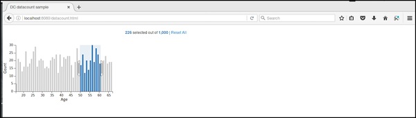
DC.js - Data Table
Data table is used to display the records in a tabular format. It lists out the crossfilter dataset records as explained in this chapter in detail.
Data Table Methods
Before moving on to draw a data table, we should understand the dc.dataTable class and its methods. It uses a mixin to get the basic functionality of drawing a data table chart, which is defined below −
- dc.baseMixin
The dc.dataTable gets all the methods of this mixin and has its own methods to draw the data table, which are explained as follows.
beginSlice( [slice])
This method is used to get or set the index of the beginning slice. This method is useful when implementing pagination.
Similarly, you can perform the endSlice() function as well.
columns( [columns])
This method is used to get or set the column functions. It uses the following method to specify the columns to display.
chart.columns([
   function(d) { return d.mark; },
   function(d) { return d.low; },
   function(d) { return d.high; },
   function(d) { return numberFormat(d.high - d.low); },
   function(d) { return d.volume; }
]);
Here, d represents a row in the data set. We can use HTML to display columns in the data table.
group(groupFunction)
This method is used to perform the group function for the data table.
order( [order])
It is used to sort the order function. If the order is ascending, then the dimension() will use .bottom() to fetch the data, otherwise it will use dimension().top().
Data Table Example
Let us make a data table in DC. To do this, we need to follow the steps given below −
Step 1: Add styles
Let us add styles in the CSS using the coding given below −
.dc-chart { font-size: 12px; }
.dc-table-group { padding-left: 10px; font-size: 14px; font-weight: bold; }
.dc-table-column { padding-left: 10px; font-size: 12px; font-weight: normal; }
Here, we have assigned styles for the chart, table-group and the grid-column.
Step 2: Create a variable
Let us create a variable in DC as shown below −
var barChart = dc.barChart('#line'); //
var countChart = dc.dataCount("#mystats");
var tableChart = dc.dataTable("#mytable");
Here, we have assigned a barChart variable id in line, countChart id is mystats and the tableChart id is mytable.
Step 3: Read the data
Read the data from the people.csv file as shown below −
d3.csv("data/people.csv", function(errors, people) {
   var mycrossfilter = crossfilter(people);
}
If the data is not present, then it returns an error. Now, assign the data to a crossfilter. Here, we have used the same people.csv file, which was used in our previous charting examples.
It looks like as follows −
id,name,gender,DOB,MaritalStatus,CreditCardType
1,Damaris,Female,1973-02-18,false,visa-electron
2,Barbe,Female,1969-04-10,true,americanexpress
3,Belia,Female,1960-04-16,false,maestro
4,Leoline,Female,1995-01-19,true,bankcard
5,Valentine,Female,1992-04-16,false,
6,Rosanne,Female,1985-01-05,true,bankcard
7,Shalna,Female,1956-11-01,false,jcb
8,Mordy,Male,1990-03-27,true,china-unionpay

..........................................
..........................................
Step 4: Set the dimension
You can set the dimension using the coding given below −
var ageDimension = mycrossfilter.dimension(function(data) {
   return ~~((Date.now() - new Date(data.DOB)) / (31557600000))
});
After the dimension has been assigned, group the age using the coding given below −
var ageGroup = ageDimension.group().reduceCount();
Step 5: Generate a chart
Now, generate a bar chart using the coding given below −
barChart
   .width(400)
   .height(200)
   .x(d3.scale.linear().domain([15,70]))
   .yAxisLabel("Count")
   .xAxisLabel("Age")
   .elasticY(true)
   .elasticX(true)
   .dimension(ageDimension)
   .group(ageGroup);
Here,
- We have assigned the chart width as 400 and height as 200.
- Next, we have specified the domain range as [15,70].
- We have set the x-axis label as age and y-axis label as count.
- We have specified the elasticY and X function as true.
Step 6: Create the data table
Now, create the data table using the coding given below −
countChart
   .dimension(mycrossfilter)
   .group(mycrossfilter.groupAll());

tableChart
   .dimension(ageDimension)
   .group(function (data) {
      return ~~((Date.now() - new Date(data.DOB)) / (31557600000));
   })
Here, we have specified the age dimension and group the data.
Step 7: Render the table
Now, render the grid using the coding below −
.size(Infinity)
   .columns(['name', 'DOB'])
   .sortBy(function (d) {
      return d.value;
   })
   .order(d3.ascending);

barChart.render();
countChart.render();
tableChart.render();
Here, we have sorted the columns using the DOB and sort the records.
Step 8: Working example
The complete code is as follows. Create a web page datatable.html and add the following changes to it.
<html>
   <head>
      <title>DC datatable sample</title>
      <link rel = "stylesheet" type = "text/css" href = "css/bootstrap.css">
      <link rel = "stylesheet" type = "text/css" href = "css/dc.css"/>

      <style>
         .dc-chart { font-size: 12px; }
         .dc-table-group { padding-left: 10px; font-size: 14px; font-weight: bold; }
         .dc-table-column { padding-left: 10px; font-size: 12px; font-weight: normal; }
      </style>

      <script src = "js/d3.js"></script>
      <script src = "js/crossfilter.js"></script>
      <script src = "js/dc.js"></script>
   </head>

   <body>
      <div>
         <div style = "width: 600px;">
            <div id = "mystats" class = "dc-data-count" style = "float: right">
               <span class = "filter-count"></span> selected out of <span
               class = "total-count"></span> | <a href = "javascript:dc.filterAll();
               dc.renderAll();">Reset All</a>
            </div>
         </div>

         <div style = "clear: both; padding-top: 20px;">
            <div>
               <div id = "line"></div>
            </div>
         </div>

         <div style = "clear: both">
            <div id = "mytable"></div>
         </div>
      </div>

      <script language = "javascript">
         var barChart = dc.barChart('#line'); // , 'myChartGroup');
         var countChart = dc.dataCount("#mystats");
         var tableChart = dc.dataTable("#mytable");

         d3.csv("data/people.csv", function(errors, people) {
            var mycrossfilter = crossfilter(people);

            // age dimension
            var ageDimension = mycrossfilter.dimension(function(data) {
               return ~~((Date.now() - new Date(data.DOB)) / (31557600000))
            });
            var ageGroup = ageDimension.group().reduceCount();

            barChart
               .width(400)
               .height(200)
               .x(d3.scale.linear().domain([15,70]))
               .yAxisLabel("Count")
               .xAxisLabel("Age")
               .elasticY(true)
               .elasticX(true)
               .dimension(ageDimension)
               .group(ageGroup);

            countChart
               .dimension(mycrossfilter)
               .group(mycrossfilter.groupAll());

            tableChart
               .dimension(ageDimension)
               .group(function (data) {
                  return ~~((Date.now() - new Date(data.DOB)) / (31557600000));
               })
               .size(Infinity)
               .columns(['name', 'DOB'])
               .sortBy(function (d) {
                  return d.value;
               })
               .order(d3.ascending);

            barChart.render();
            countChart.render();
            tableChart.render();
         });
      </script>
   </body>
</html>
Now, request the browser and you will see the following response.
After selecting an age between 20 and 30, it displays the table records as shown in the screenshot below −
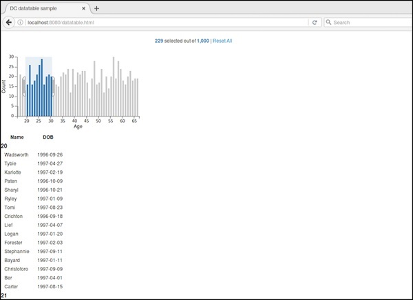
DC.js - Data Grid
Data grid is used to filter and display the records. This chapter explains about data grid in detail.
Data Grid Methods
Before moving on to draw a data grid, we should understand the dc.dataGrid class and its methods. This class uses a mixin to get the basic functionality of drawing a data grid chart, which is defined below −
- dc.baseMixin
The dc.dataGrid gets all the methods of this mixin as well as has its own methods to draw the data grid, which is explained below −
beginSlice( [slice])
This method is used to get or set the index of the beginning slice. This method is useful when implementing pagination.
Similarly, you can perform endSlice().
group(function)
This method is used to perform the group function for the data grid.
html( [html])
This method is used to get or set the function to generate a dynamic html.
order( [order])
It is used to sort the order function.
size( [size])
It is used to display the number of items in the grid.
sortBy( [sortByFunction])
This method is used to get or set the sort-by function. We can sort a particular field using this function. For example: we can sort by age, which is defined below −
chart.sortBy(function(d) {
   return d.age;
});
Data Grid Example
Let us perform a data grid in DC. To do this, we need to follow the steps given below −
Step 1: Add styles
Let us add styles in CSS using the coding below −
.dc-chart { font-size: 12px; }
.dc-grid-top { padding-left: 10px; font-size: 14px; font-weight: bold; }
.dc-grid-item { padding-left: 10px; font-size: 12px; font-weight: normal; }
Here, we have assigned the styles for the chart, grid-top and grid-item.
Step 2: Create a variable
Let us create a variable in DC as explained below −
var barChart = dc.barChart('#line');
var countChart = dc.dataCount("#mystats");
var gridChart = dc.dataGrid("#mygrid");
Here, we have assigned a barChart variable id in line, countChart id is mystats and gridChart id is mygrid.
Step 3: Read the data
Read the data from the people.csv file as shown below −
d3.csv("data/people.csv", function(errors, people) {
   var mycrossfilter = crossfilter(people);
}
If data is not present, then it returns an error. Now, assign the data to a crossfilter.
Here, we used the same people.csv file, which was used in our previous charting examples. It looks like as shown below −
id,name,gender,DOB,MaritalStatus,CreditCardType
1,Damaris,Female,1973-02-18,false,visa-electron
2,Barbe,Female,1969-04-10,true,americanexpress
3,Belia,Female,1960-04-16,false,maestro
4,Leoline,Female,1995-01-19,true,bankcard
5,Valentine,Female,1992-04-16,false,
6,Rosanne,Female,1985-01-05,true,bankcard
7,Shalna,Female,1956-11-01,false,jcb
8,Mordy,Male,1990-03-27,true,china-unionpay

..........................................
.........................................
Step 4: Set the dimension
You can set the dimension using the coding given below −
var ageDimension = mycrossfilter.dimension(function(data) {
   return ~~((Date.now() - new Date(data.DOB)) / (31557600000))
});
After the dimension has been assigned, group the age using the coding given below −
var ageGroup = ageDimension.group().reduceCount();
Step 5: Generate a chart
Now, generate a bar chart using the coding given below −
barChart
   .width(400)
   .height(200)
   .x(d3.scale.linear().domain([15,70]))
   .yAxisLabel("Count")
   .xAxisLabel("Age")
   .elasticY(true)
   .elasticX(true)
   .dimension(ageDimension)
   .group(ageGroup);
Here,
- We have assigned the chart width as 400 and height as 200.
- Next, we have specified the domain range as [15,70].
- We have set the x-axis label as age and y-axis label as count.
- We have specified the elasticY and X function as true.
Step 6: Create the grid chart
Now, create the grid chart using the coding given below −
gridChart
   .dimension(ageDimension)
   .group(function (data) {
      return ~~((Date.now() - new Date(data.DOB)) / (31557600000));
   })
Step 7: Render the grid
Now, render the grid using the coding given below −
.size(100)
   .htmlGroup (function(d) {
      return 'Age: ' + d.key +
      '; Count: ' + d.values.length +
      ' people'
   })
   .html (function(d) { return d.name; })
   .sortBy(function (d) {
      return d.name;
   })
   .order(d3.ascending);

barChart.render();
countChart.render();
gridChart.render();
Here, we have sorted the name using the html() function and have finally rendered the chart.
Step 8: Working example
The complete code is as follows. Create a webpage datagrid.html and add the following changes to it.
<html>
   <head>
      <title>DC datagrid sample</title>
      <link rel = "stylesheet" type = "text/css" href = "css/bootstrap.css">
      <link rel = "stylesheet" type = "text/css" href = "css/dc.css"/>

      <style>
         .dc-chart { font-size: 12px; }
         .dc-grid-top { padding-left: 10px; font-size: 14px; font-weight: bold; }
         .dc-grid-item { padding-left: 10px; font-size: 12px; font-weight: normal; }
      </style>

      <script src = "js/d3.js"></script>
      <script src = "js/crossfilter.js"></script>
      <script src = "js/dc.js"></script>
   </head>

   <body>
      <div>
         <div style = "width: 600px;">
            <div id = "mystats" class = "dc-data-count" style = "float: right">
               <span class = "filter-count"></span> selected out of <span
                  class = "total-count"></span> | <a href = "javascript:dc.filterAll();
                  dc.renderAll();">Reset All</a>
            </div>
         </div>

         <div style = "clear: both; padding-top: 20px;">
            <div>
               <div id = "line"></div>
            </div>
         </div>

         <div style = "clear: both">
            <div class = "dc-data-grid" id = "mygrid"></div>
         </div>
      </div>

      <script language = "javascript">
         var barChart = dc.barChart('#line');
         var countChart = dc.dataCount("#mystats");
         var gridChart = dc.dataGrid("#mygrid");

         d3.csv("data/people.csv", function(errors, people) {
            var mycrossfilter = crossfilter(people);

            // age dimension
            var ageDimension = mycrossfilter.dimension(function(data) {
               return ~~((Date.now() - new Date(data.DOB)) / (31557600000))
            });
            var ageGroup = ageDimension.group().reduceCount();

            barChart
               .width(400)
               .height(200)
               .x(d3.scale.linear().domain([15,70]))
               .yAxisLabel("Count")
               .xAxisLabel("Age")
               .elasticY(true)
               .elasticX(true)
               .dimension(ageDimension)
               .group(ageGroup);

            countChart
               .dimension(mycrossfilter)
               .group(mycrossfilter.groupAll());

            gridChart
               .dimension(ageDimension)
               .group(function (data) {
                  return ~~((Date.now() - new Date(data.DOB)) / (31557600000));
               })
               .size(100)
               .htmlGroup (function(d) {
                  return 'Age: ' + d.key +
                  '; Count: ' + d.values.length +
                  ' people'
               })
               .html (function(d) { return d.name; })
               .sortBy(function (d) {
                  return d.name;
               })
               .order(d3.ascending);

            barChart.render();
            countChart.render();
            gridChart.render();
         });
      </script>
   </body>
</html>
Now, request the browser and we will see the following response.
Initially, the grid chart looks like the following screenshot.
If you select a particular age between 63 and 66, it filters out the following records.
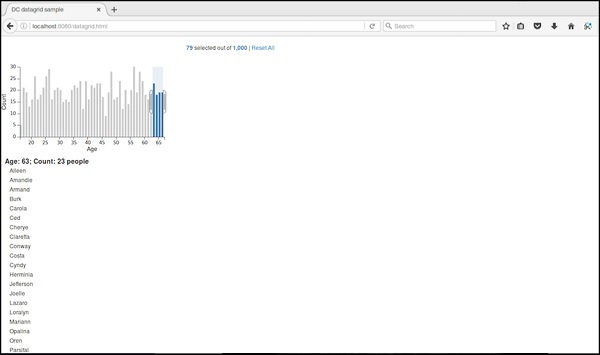
DC.js - Legend
Legend is an attachable screen customization. It can be added to other DC charts to render horizontal legend labels. This chapter explains about legend in detail.
Legend Methods
Legend supports the following important methods. Let us go through each one of them in detail.
autoItemWidth( [width])
This method is used to set an automatic width for legend items on or off. If true, itemWidth is ignored. It is defined below −
legend.autoItemWidth = function (width) {
   if (!arguments.length) {
      return _width;
   }
}
gap( [gap])
This method is used to set or get a gap between the legend items. It is defined as follows −
legend.gap = function (gap) {
   if (!arguments.length) {
      return _gap;
   }
}
horizontal( [h])
This method is used to position the legend horizontally and is defined as follows.
_legend.horizontal = function (h) {
   if (!arguments.length) {
      return _h;
   }
};
itemHeight( [itemHeight])
This method is used to set or get the legend item height.
legend.itemHeight = function (itemHeight) {
   if (!arguments.length) {
      return _itemHeight;
   }
};
itemWidth( [itemWidth])
This method is used to set or get the legend the item width for a horizontal legend.
_legend.itemWidth = function (itemWidth) {
   if (!arguments.length) {
      return _itemWidth;
   }
};
legendText( [text])
This method is used to set or get the legend text function. The legend widget uses this function to render the legend text for each item. If no function is specified, the legend widget will display the names associated with each group. A simple example is shown below −
legend.legendText(dc.pluck('name'))
maxItems( [items])
This method is used to display the maximum number of legend items.
x( [x])
It is used to set or get the x-coordinate for a legend widget and is defined below −
legend.x = function (x) {
   if (!arguments.length) {
      return _x;
   }
};
Similarly, you can also perform the y-coordinate.
DC.js - Dashboard Working Example
In this chapter, we will develop a dashboard in DC by clicking and selecting a chart.
Working Example
Now, we have the background and can start to write some code. It contains the following steps −
Step 1: Add styles
Let us add styles in the CSS using the coding given below.
<style>
   .dc-chart { font-size: 12px; }
   .dc-grid-top { padding-left: 10px; font-size: 14px; font-weight: bold; }
   .dc-grid-item { padding-left: 10px; font-size: 12px; font-weight: normal; }
</style>
Here, we have assigned styles for the chart, grid-top and the grid-item.
Step 2: Create a variable
Let us create a variable in DC as shown below.
var barChart = dc.barChart('#line');
var pieChart = dc.pieChart('#pie');
var countChart = dc.dataCount("#mystats");
var gridChart = dc.dataGrid("#mygrid");
Here, we have assigned a barChart variable id in line, countChart id is mystats, pieChart is pie and gridChart id is mygrid.
Step 3: Read the data
Read the data from the people.csv file as shown below.
d3.csv("data/people.csv", function(errors, people) {
   var mycrossfilter = crossfilter(people);
}
If the data is not present, then it returns an error. Now, assign the data to a crossfilter. Here, we have used the same people.csv file, which we have used in our previous charting examples. It looks as shown below.
id,name,gender,DOB,MaritalStatus,CreditCardType
1,Damaris,Female,1973-02-18,false,visa-electron
2,Barbe,Female,1969-04-10,true,americanexpress
3,Belia,Female,1960-04-16,false,maestro
4,Leoline,Female,1995-01-19,true,bankcard
5,Valentine,Female,1992-04-16,false,
6,Rosanne,Female,1985-01-05,true,bankcard
7,Shalna,Female,1956-11-01,false,jcb
8,Mordy,Male,1990-03-27,true,china-unionpay

.........................................
.........................................
Step 4: Set the dimension for age
You can set the dimension using the coding below.
var ageDimension = mycrossfilter.dimension(function(data) {
   return ~~((Date.now() - new Date(data.DOB)) / (31557600000))
});
After the dimension has been assigned, group the age using the coding given below.
var ageGroup = ageDimension.group().reduceCount();
Step 5: Set the dimension for gender
You can set the dimension using the coding below.
// gender dimension
var genderDimension = mycrossfilter.dimension(function(data) { return data.gender; });
var genderGroup = genderDimension.group().reduceCount();
Step 6: Generate a bar chart
Now, generate a bar chart using the coding below.
barChart
   .width(400)
   .height(200)
   .x(d3.scale.linear().domain([15,70]))
   .yAxisLabel("Count")
   .xAxisLabel("Age")
   .elasticY(true)
   .elasticX(true)
   .dimension(ageDimension)
   .group(ageGroup);
Here,
- We have assigned the chart width as 400 and height as 200.
- Next, we have specified the domain range as [15, 70].
- We have set the x-axis label as age and the y-axis label as count.
- We have specified the elasticY and X function as true.
Step 7: Generate a pie chart
Now, generate a pie chart using the coding below.
pieChart
   .width(200)
   .height(100)
   .dimension(genderDimension)
   .group(genderGroup);
Here,
- We have assigned the chart width as 200 and height as 100.
- Now, group the dimension by gender.
Step 8: Create the grid and count chart
Now, create the grid and count the chart using the coding given below.
countChart
   .dimension(mycrossfilter)
   .group(mycrossfilter.groupAll());

gridChart
   .dimension(ageDimension)
   .group(function (data) {
      return ~~((Date.now() - new Date(data.DOB)) / (31557600000));
   })
Step 9: Render the grid and count
Now, render the grid and count using the coding below.
.size(100)
   .htmlGroup (function(d) {
      return 'Age: ' + d.key +
      '; Count: ' + d.values.length +
      ' people'
   })
   .html (function(d) { return d.name; })
   .sortBy(function (d) {
      return d.name;
   })
   .order(d3.ascending);

barChart.render();
pieChart.render();
countChart.render();
gridChart.render();
Here, we have sorted the name by using the html() function and have finally rendered the chart.
Step 10: Working example
The complete code is as follows. Create a webpage dashboard.html and add the following changes to it.
<html>
   <head>
      <title>DC dashboard sample</title>
      <link rel = "stylesheet" type = "text/css" href = "css/bootstrap.css">
      <link rel = "stylesheet" type = "text/css" href = "css/dc.css"/>

      <style>
         .dc-chart { font-size: 12px; }
         .dc-grid-top { padding-left: 10px; font-size: 14px; font-weight: bold; }
         .dc-grid-item { padding-left: 10px; font-size: 12px; font-weight: normal; }
      </style>

      <script src = "js/d3.js"></script>
      <script src = "js/crossfilter.js"></script>
      <script src = "js/dc.js"></script>
   </head>

   <body>
      <div>
         <div style = "width: 600px;">
            <div id = "mystats" class = "dc-data-count" style = "float: right">
               <span class = "filter-count"></span> selected out of <span
                  class = "total-count"></span> | <a href = "javascript:dc.filterAll();
                  dc.renderAll();">Reset All</a>
            </div>
         </div>

         <div style = "clear: both; padding-top: 20px;">
            <div>
               <div id = "line"></div>
               <div id = "pie"></div>
            </div>
         </div>

         <div style = "clear: both">
            <div class = "dc-data-grid" id = "mygrid"></div>
         </div>
      </div>

      <script language = "javascript">
         var barChart = dc.barChart('#line'); // , 'myChartGroup');
         var pieChart = dc.pieChart('#pie'); //, 'myChartGroup');
         var countChart = dc.dataCount("#mystats");
         var gridChart = dc.dataGrid("#mygrid");

         d3.csv("data/people.csv", function(errors, people) {
            var mycrossfilter = crossfilter(people);

            // age dimension
            var ageDimension = mycrossfilter.dimension(function(data) {
               return ~~((Date.now() - new Date(data.DOB)) / (31557600000))
            });
            var ageGroup = ageDimension.group().reduceCount();

            // gender dimension
            var genderDimension = mycrossfilter.dimension(function(data) {
               return data.gender;
            });
            var genderGroup = genderDimension.group().reduceCount();

         barChart
            .width(400)
            .height(200)
            .x(d3.scale.linear().domain([15,70]))
            .yAxisLabel("Count")
            .xAxisLabel("Age")
            .elasticY(true)
            .elasticX(true)
            .dimension(ageDimension)
            .group(ageGroup);

         pieChart
            .width(200)
            .height(100)
            .dimension(genderDimension)
            .group(genderGroup);

         countChart
            .dimension(mycrossfilter)
            .group(mycrossfilter.groupAll());

         gridChart
            .dimension(ageDimension)
            .group(function (data) {
               return ~~((Date.now() - new Date(data.DOB)) / (31557600000));
            })
            .size(100)
            .htmlGroup (function(d) {
               return 'Age: ' + d.key +
               '; Count: ' + d.values.length +
               ' people'
            })
            .html (function(d) { return d.name; })
            .sortBy(function (d) {
               return d.name;
            })
            .order(d3.ascending);

         barChart.render();
         pieChart.render();
         countChart.render();
         gridChart.render();
      });
      </script>
   </body>
</html>
Now, request the browser and we will see the following response.
You can check yourself by clicking bar, pie charts and see how the data changes.
