- DC.js - Home
- DC.js - Introduction
- DC.js - Installation
- DC.js - Concepts
- Introduction to Crossfilter
- Introduction to D3.js
- DC.js - Mixins
- DC.js - baseMixin
- DC.js - capMixin
- DC.js - colorMixin
- DC.js - marginMixin
- DC.js - coordinateGridMixin
- DC.js - Pie Chart
- DC.js - Line Chart
- DC.js - Bar Chart
- DC.js - Composite Chart
- DC.js - Series Chart
- DC.js - Scatter Plot
- DC.js - Bubble Chart
- DC.js - Heat Map
- DC.js - Data Count
- DC.js - Data Table
- DC.js - Data Grid
- DC.js - Legend
- DC.js - Dashboard Working Example
DC.js - Heat Map
A Heat Map is a graphical representation of data in the form of a map, in which data values are represented as colors. This chapter explains about a heat map in detail.
Before moving on to draw a heat map, we should understand the dc.heatMap class and its methods. The dc.heatMap uses mixins to get the basic functionality of drawing a chart, which are listed below −
- dc.colorMixin
- dc.marginMixin
- dc.baseMixin
The complete class diagram of the dc.heatMap is as follows −
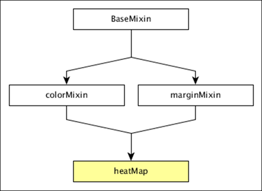
The dc.heatMap gets all the methods of the above-specified mixins. It has its own methods to draw the heat map, which are explained below −
boxOnClick( [handler])
This method is used to get or set the handler, when an individual cell is clicked in the heatmap.
cols( [cols])
This method is used get or set the keys to create the columns of the heatmap.
colsLabel( [label])
This method is used to get or set the column label, which is represented as the column name. Similarly, we can perform a row label as well.
rows( [rows])
This method is used to get or set the values used to create the rows of the heatmap.
xAxisOnClick( [handler])
This method is used to get or set the handler, when a column tick is clicked in the x-axis.
xBorderRadius( [border])
This method is used to set the X border radius. If the value is set to 0, then you will get full rectangles.
Draw a Heatmap
Let us draw a heatmap in DC. To do this, we need to follow the steps given below −
Step 1: Define a variable
Let us define a variable as shown below −
var chart = dc.heatMap('#heatmap');
Here, the heatMap function is mapped with the id heatmap.
Step 2: Read the data
Read the data from the howell1.csv file as shown below −
d3.csv("data/howell1.csv", function(errors, people) {
   var mycrossfilter = crossfilter(people);
}
Here, we have used the same howell1.csv file and it looks as shown below −
"height","weight","age","male"
151.765,47.8256065,63,1
139.7,36.4858065,63,0
136.525,31.864838,65,0
156.845,53.0419145,41,1
145.415,41.276872,51,0
163.83,62.992589,35,1
149.225,38.2434755,32,0
168.91,55.4799715,27,1
147.955,34.869885,19,0
165.1,54.487739,54,1
154.305,49.89512,47,0

......................
......................
Step 3: Fetch the records
Let us fetch the records using the coding given below −
people.forEach(function(x) {
   x.age = Math.floor(x.age) + 1;
   x.heightRange = Math.floor(x.height / 10) + 1;
   x.weightRange = Math.floor(x.weight / 10) + 1;
   if(x.male == 1) {
      x.gender = 1;
   } else {
      x.gender = 2;
   }
});
Here, we have checked the gender and have set the height and width range of the x-axis by using the above formula.
Step 4: Set the dimension
You can set the dimension using the coding given below −
var ageDimension = mycrossfilter.dimension(function(data) {
   return [+data.gender, +data.heightRange];
});
After the dimension has been assigned, group the gender using the coding given below −
var genderGroup = genderDimension.group().reduceCount();
Step 5: Generate a chart
Now, generate a heatmap using the coding given below −
chart
   .width(20 * 45 + 80)
   .height(2 * 45 + 40)
   .dimension(ageDimension)
   .group(ageGroup)
   .keyAccessor(function(d) { return +d.key[1]; })
   .valueAccessor(function(d) { return +d.key[0]; })
   .colorAccessor(function(d) { return +d.value; })
   .title(function(d) {
      return "Height Range:   " + ((d.key[1] - 1) * 10) + " - " + (d.key[1] * 10) + "cm\n" +
      "Gender:  " + (d.key[0] == 1 ? "Male" : "Female") + "\n" +
      "Count: " + (d.value) + " count";
   })
   .calculateColorDomain()

chart.render();
});
Here,
- We have assigned the chart width as 20 × 45 + 80 and height as 2 × 45 + 40.
- Then we have assigned the gender dimension and group.
- Key and value accessor returns the key and value from the heatmaps.
- We have to use the colorAccessor() function to return the color.
- Finally, set the title and render the chart.
Step 6: Working example
The complete coding is as follows. Create a web page heatmap.html and add the following changes to it.
<html>
   <head>
      <title>DC heat map Sample</title>
      <link rel = "stylesheet" type = "text/css" href = "css/bootstrap.css">
      <link rel = "stylesheet" type = "text/css" href = "css/dc.css"/>

      <script src = "js/d3.js"></script>
      <script src = "js/crossfilter.js"></script>
      <script src = "js/dc.js"></script>
   </head>

   <body>
      <div>
         <div id = "heatmap"></div>
      </div>

      <script language = "javascript">
         var chart = dc.heatMap('#heatmap');

         d3.csv("data/howell1.csv", function(errors, people) {
            var mycrossfilter = crossfilter(people);

            people.forEach(function(x) {
               x.age = Math.floor(x.age) + 1;
               x.heightRange = Math.floor(x.height / 10) + 1;
               x.weightRange = Math.floor(x.weight / 10) + 1;
               if(x.male == 1) {
                  x.gender = 1;
               } else {
                  x.gender = 2;
               }
            });

            var ageDimension = mycrossfilter.dimension(function(data) {
               return [+data.gender, +data.heightRange];
            });

            var ageGroup = ageDimension.group().reduceCount();
            chart
               .width(20 * 45 + 80)
               .height(2 * 45 + 40)
               .dimension(ageDimension)
               .group(ageGroup)
               .keyAccessor(function(d) { return +d.key[1]; })
               .valueAccessor(function(d) { return +d.key[0]; })
               .colorAccessor(function(d) { return +d.value; })
               .title(function(d) {
                  return "Height Range:   " + ((d.key[1] - 1) * 10) + " - " +
                  (d.key[1] * 10) + "cm\n" +
                  "Gender:  " + (d.key[0] == 1 ? "Male" : "Female") + "\n" +
                  "Count: " + (d.value) + " count";})
               .calculateColorDomain()

            chart.render();
         });
      </script>
   </body>
</html>
Now, request the browser and we will see the following response.
