
Article Categories
- All Categories
-
 Data Structure
-
 Networking
-
 RDBMS
RDBMS
-
 Operating System
-
 Java
Java
-
 MS Excel
-
 iOS
iOS
-
 HTML
HTML
-
 CSS
CSS
-
 Android
-
 Python
-
 C Programming
-
 C++
C++
-
 C#
C#
-
 MongoDB
-
 MySQL
MySQL
-
 Javascript
-
 PHP
PHP
-
 Economics & Finance
Creating an actual vs budget chart in Excel step by step
You may create a chart in Excel that compares the actual value of each project to the target value for that project. This article will show you how to produce an actual vs. budget chart in Excel in a step-by-step manner as well as how to make use of a powerful chart tool in order to complete this task in a timely manner.
An Actual vs Budget Chart in Excel
Let?s understand step by step with an example.
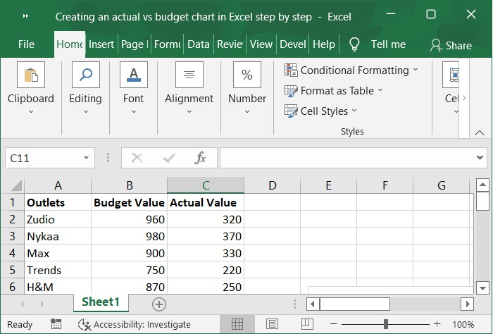
Step 1
At first, we must create a sample data for chart in an Excel sheet in columnar format as shown in the following screenshot.
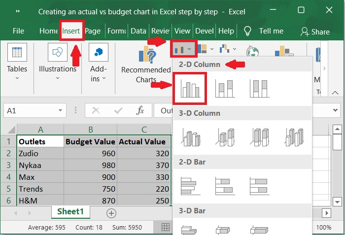
Step 2
Then, select the cells in the A2:B8 range. Click the Insert toolbar and select Insert column or Bar chart > 2-D column to display the graph.
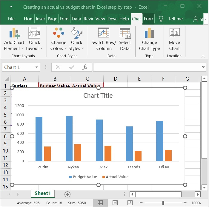
Step 3
Now, the chart is automatically populated upon selecting the above option.
Step 4
In the chart, right-click the Actual Value series, then select Format Data Series from the context menu.
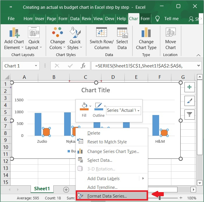
Note ? If the Budget value series is the second series in the chart, rightclick the budget Value series in this step.
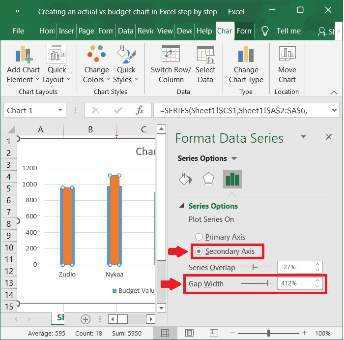
Step 5
Check the box next to Secondary Axis in the Format Data Series pane that pops up (in Excel 2010 or earlier versions, this option is found in a dialogue box that pops up), and then adjust the percentage value in the Gap Width field until the Actual Value Series appears to be narrower than the Budget Value series.
Step 6
Now, a bar chart within a bar is populated as shown in the below picture. This way, we can compute both Actual and budget values in a single bar graph.

Conclusion
In this tutorial, we explained in detail how you can produce an actual vs. budget chart in Excel in a step-by-step manner. In addition, we showed how you can use a powerful chart tool in order to complete this task in a timely manner.

1K+ Views
