
Article Categories
- All Categories
-
 Data Structure
-
 Networking
-
 RDBMS
RDBMS
-
 Operating System
-
 Java
Java
-
 MS Excel
-
 iOS
iOS
-
 HTML
HTML
-
 CSS
CSS
-
 Android
-
 Python
-
 C Programming
-
 C++
C++
-
 C#
C#
-
 MongoDB
-
 MySQL
MySQL
-
 Javascript
-
 PHP
PHP
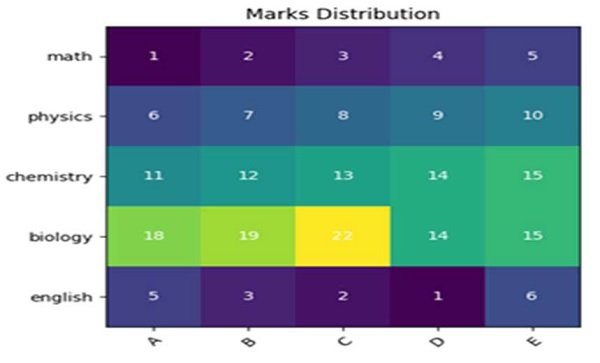
Creating a Heatmap in matplotlib with pcolor
First, we can create an image using imshow method, taking a harvest matrix. After that, we can mark those image pixels with some value.
Steps
Create a list of subjects.
Create a list of students.
Create a harvest matrix.
Create fig and ax variables using subplots method, where default nrows and ncols are 1.
Display data as an image, i.e., on a 2D regular raster, with step 1 data.
Get or set the current tick locations and labels of the X-axis, with the length of students.
Get or set the current tick locations and labels of the Y-axis, with the length of subjects.
Set X-axis tick labels of the grid, with students.
Set Y-axis tick labels of the grid, with subjects.
Set a property on an artist object, with rotation, ha and rotation_mode="anchor".
Add text to the plot using the text method.
Set a title for the axes using the set_title() method.
To show the figure, use plt.show() method.
Example
import numpy as np
import matplotlib.pyplot as plt

subjects = ["math", "physics", "chemistry", "biology", "english"]
students = ["A", "B", "C", "D", "E"]

harvest = np.array([
   [1, 2, 3, 4, 5],
   [6, 7, 8, 9, 10],
   [11, 12, 13, 14, 15],
   [18, 19, 22, 14, 15],
   [5, 3, 2, 1, 6]
])
fig, ax = plt.subplots()
im = ax.imshow(harvest)

ax.set_xticks(np.arange(len(students)))
ax.set_yticks(np.arange(len(subjects)))

ax.set_xticklabels(students)
ax.set_yticklabels(subjects)

plt.setp(ax.get_xticklabels(), rotation=45, ha="right", rotation_mode="anchor")

for i in range(len(subjects)):
   for j in range(len(students)):
      text = ax.text(j, i, harvest[i, j], ha="center", va="center", color="w")

ax.set_title("Marks Distribution")

plt.show()
Output

528 Views
