
Article Categories
- All Categories
-
 Data Structure
-
 Networking
-
 RDBMS
RDBMS
-
 Operating System
-
 Java
Java
-
 MS Excel
-
 iOS
iOS
-
 HTML
HTML
-
 CSS
CSS
-
 Android
-
 Python
-
 C Programming
-
 C++
C++
-
 C#
C#
-
 MongoDB
-
 MySQL
MySQL
-
 Javascript
-
 PHP
PHP
-
 Economics & Finance
Circular Reveal Animation using Flutter
What is Circular Reveal Animation in Flutter ?
Circular Reveal is a type of animation which is seen in many android applications when an image is being revealed in a way by adding an animation to it. In many android applications such as payments applications when a user receives any rewards for making a payment a reward is revealed with a specific animation added to it. In this way circular animation is implemented.
Implementation of Circular Reveal Animation
We will be creating a simple application for displaying a circular reveal animation in Flutter. We will be creating a button on clicking on that button and we will be animating our image. We will be following a step by step guide to implement a toast message in an android application.
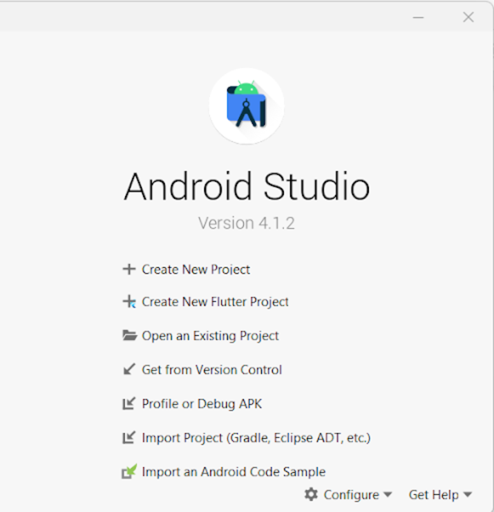
Step 1 : Creating a new flutter project in Android Studio
Navigate to Android studio as shown in below screen. In the below screen click on New Project to create a new Flutter Project.
After clicking on New Project you will get to see the below screen.
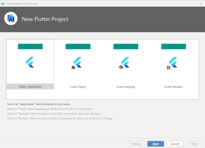
Inside this screen you have to select Flutter Application and then click on Next you will get to see the below screen.
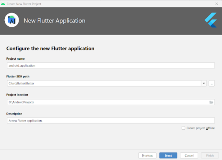
Inside this screen you have to specify the project name and then simply click on Next to create your new Flutter Project.
Step 2 : Adding a Dependency to use Circular reveal Animation in Flutter
For adding a new dependency to use circular reveal animation in flutter. Navigate to your project name from the left pane and then navigate to pubspec.yaml file and in the dev_dependencies section add below dependency to it for circular reveal animation.
dev_dependencies:
   flutter_test:
      sdk: flutter
 circular_reveal_animation: ^2.0.1
After adding your dependency we have to also add assets folder location in our project. For adding assets folder location. Go to line number 62, there you have to add assets folder inside your pubspec.yaml file.
# To add assets to your application, add an assets section, like this:
assets:
   - assets/
After adding the above code in your pubspec.yaml file. SImply click on Pub get option which will appear at the top right corner to install the dependencies. If you get to see the option of get Dependencies then click on it to install all dependencies.
Step 3 : Adding images in your Flutter Project
Now as we will be displaying images after the revealing effect we have to add images inside our project. For adding the image. Copy your image. Then navigate to your project and inside that right click on your project directory>New>Directory and name it as assets. After that paste the image which you have copied in that directory. Make sure to give the image name as logo.png as we will be using same name while specifying the image inside our code.
Step 4 : Working with main.dart file
Navigate to your project>lib>main.dart file and add below code to it. Comments are added in the code to get to know in detail.
import 'package:circular_reveal_animation/circular_reveal_animation.dart';
import 'package:flutter/material.dart';

void main() {
   runApp(const MyApp());
}

class MyApp extends StatelessWidget {
   const MyApp({Key? key}) : super(key: key);

   @override
   Widget build(BuildContext context) {
      return MaterialApp(
         // on below line adding title for our application.
         title: 'Flutter Demo',
         // on below line specifying theme data for our application
         theme: ThemeData(
            primarySwatch: Colors.blue,
         ),
         // on below line calling our home page.
         home: MyHomePage(),
         // on below line disabling our debug check mode banner
         debugShowCheckedModeBanner: false,
      );
   }
}

class MyHomePage extends StatefulWidget {
   MyHomePage({Key? key}) : super(key: key);

   @override
   _MyHomePageState createState() => _MyHomePageState();
}

class _MyHomePageState extends State<MyHomePage>
with SingleTickerProviderStateMixin {
   // on below line creating variables for animation controller, animation and button text.
   late AnimationController animationController;
   late Animation<double> animation;
   var buttonText = "Show Image";

   @override
   void initState() {
      super.initState();
      // on below line initializing animation controller.
      animationController = AnimationController(
         vsync: this,
         // on below line specifying duration
         duration: Duration(milliseconds: 1000),
      );

      // on below line creating our animation to be added on image.
      animation = CurvedAnimation(
         // on below line specifying parent and curve for it
         parent: animationController,
         curve: Curves.easeIn,
      );
   }

   @override
   Widget build(BuildContext context) {
      return Scaffold(
         // on below line creating app bar for our app
         appBar: AppBar(
         // specifying text in our app bar
         title: Text("Android Application"),
         ),
         // adding padding for it.
         body: Padding(
            padding: const EdgeInsets.all(16.0),
            // wrapping our column to center of screen.
            child: Center(
               child: Column(
                  // aligning column on below line.
                  crossAxisAlignment: CrossAxisAlignment.center,
                  mainAxisAlignment: MainAxisAlignment.center,
                  // specifying main axis size on below line.
                  mainAxisSize: MainAxisSize.min,
                  // creating childrens to be displayed on below line.
                  children: <Widget>[
                     // creating a text for circular animation on below line.
                     const Text(
                        "Circular Reveal Animation in Android",
                        // specifying text alignment, max lines, style for our text
                        textAlign: TextAlign.center,
                        maxLines: 1,
                        style: TextStyle(
                           color: Colors.black,
                           fontSize: 20.0,
                           fontWeight: FontWeight.bold),
                     ),
                     // creating a sized box on below line.
                     const SizedBox(
                        height: 10,
                     ),
                     // creating a circular reveal animation on below line.
                     CircularRevealAnimation(
                        // specifying image for it on below line.
                        child: Image.asset('assets/logo.png'),
                        // adding animation for image on below line.
                        animation: animation,
                        // adding center offset for our image on below line.
                        centerOffset: Offset(130, 100),
                     ),
                     // adding sized box for image
                     const SizedBox(
                        height: 10,
                     ),
                     // adding elevated button to start and stop our animation
                     ElevatedButton(
                        // adding text for our button
                        child: Text(
                           // on below line specifying button text and style for our button.
                           buttonText,
                           style: const TextStyle(
                              color: Colors.white, fontWeight: FontWeight.bold),
                        ),
                        // adding on pressed for our button
                        onPressed: () {
                           // checking for current image state and setting animation for it.
                           if (animationController.status == AnimationStatus.forward ||
                           animationController.status ==
                           AnimationStatus.completed) {
                              // reversing the animation for image.
                              animationController.reverse();
                              // changing the button text on below line.
                              setState(() {
                                 buttonText = "Show Image";
                              });
                           } else {
                              // changing the button text on below line.
                              setState(() {
                                 buttonText = "Hide Image";
                              });
                              // setting animation controller to animated button on below line.
                              animationController.forward();
                           }
                        }
                     )
                  ],
               ),
            ),
         ),
      );
   }
}
Explanation - In the above code we can get to see main method inside which we are calling our MyApp class which we are creating below as a stateless widget. Inside this stateless widget we are creating a build method inside which we are returning our material app. Inside the material app we are specifying the app title, app theme, home page which we have to display along with the debug check mode banner as false.
After that we are creating a Home Page state method which will extend the state of Home Page. Now inside this class we are creating variables for the animation controller, animation and the text which we have to display inside our button.
Then we are initializing our state by calling initstate method. Inside this method we are initializing our animation controller and our animation.
After that we are creating a build method inside which we are specifying our app bar and adding title to it. After that we are adding a padding for our screen from all sides. Then we are adding all the childs within our application to the center of the screen. Inside that we are specifying the column. Inside this column we are creating different childrens which will be aligned in a vertical manner. Inside this column we are firstly creating a text widget to display app heading.
After that we are creating a sized box widget to add a gap between our text widget and a circular reveal animation widget. After this widget we are creating a circular reveal animation widget in which we are specifying the image which we have to display after the animation. After that we are again adding the sized box. Then we are creating an elevated button which we will be using to display and hide our image using circular reveal animation. Inside the onPressed method for our button we are displaying our image and hiding our image. Along with that we are also updating the text for our button at the same time.
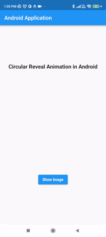
After adding the above code now we have to simply click on the green icon in the top bar to run our application on a mobile device.
Note ? Make sure you are connected to your real device or emulator.
Conclusion
In the above tutorial we learn What is Circular Reveal Animation in android and how we can use that animation within our android application using Flutter.

925 Views
