
Article Categories
- All Categories
-
 Data Structure
-
 Networking
-
 RDBMS
RDBMS
-
 Operating System
-
 Java
Java
-
 MS Excel
-
 iOS
iOS
-
 HTML
HTML
-
 CSS
CSS
-
 Android
-
 Python
-
 C Programming
-
 C++
C++
-
 C#
C#
-
 MongoDB
-
 MySQL
MySQL
-
 Javascript
-
 PHP
PHP
Circular and Linear Progress Indicators in Flutter
What are Progress Indicators in Flutter?
Progress Indicators are used to display the current progress of the specific task which is being carried out within our android application. If we are loading some data from the internet or making an API call. In that case to handle the loading task we display progress indicators within our application to inform the user that data is being loaded. There are two types of progress indicators which we can display within our application.
Linear Progress Indicator ? This indicator is used to display a linear progress bar which displays the current progress of a task.
Circular Progress Indicator ? This indicator is like a circular progress bar which is used to display the progress of specific tasks within our android application.
Implementation of Circular and Linear Progress Indicators
We will be creating a simple application for displaying both Circular and Linear Progress Indicators within our android application. We will be following a step by step guide to implement a toast message in an android application.
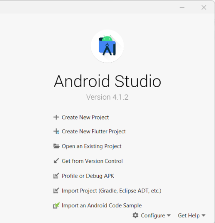
Step 1 : Creating a new Flutter Project in Android Studio
Navigate to Android studio as shown in below screen. In the below screen click on New Project to create a new Flutter Project.
After clicking on New Project you will get to see the below screen.
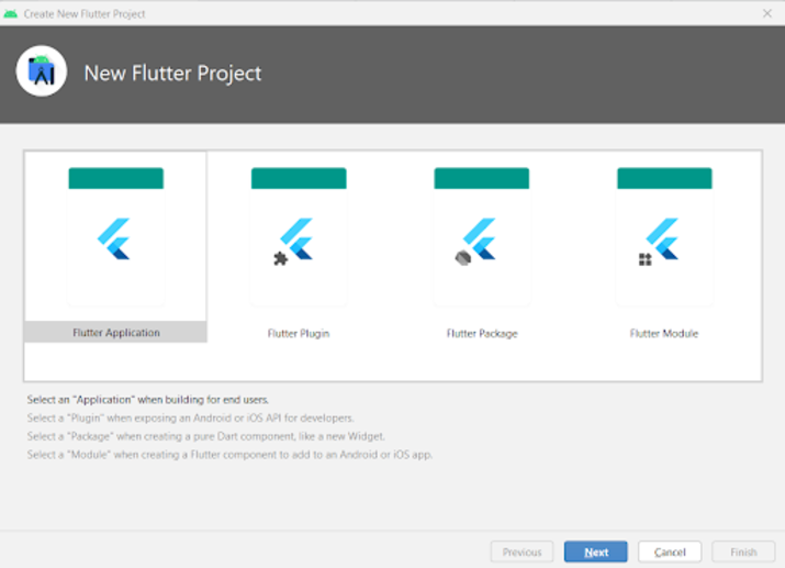
Inside this screen you have to select Flutter Application and then click on Next you will get to see the below screen.
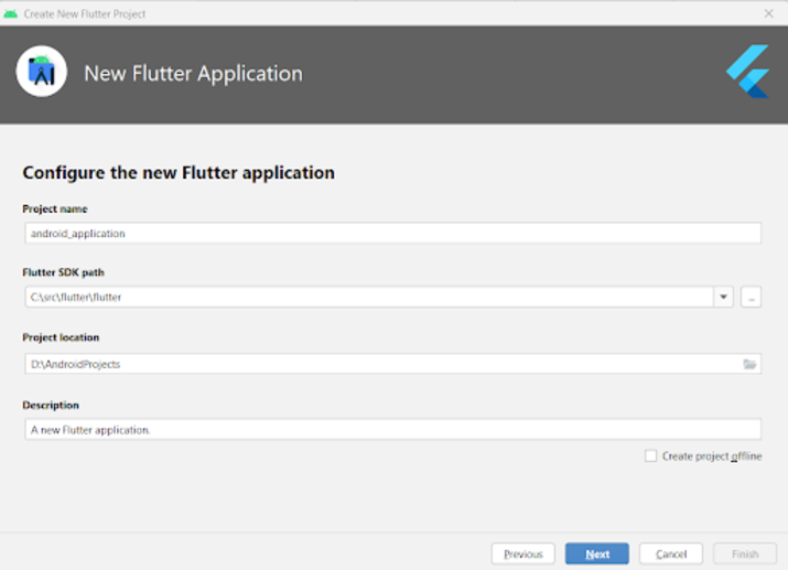
Inside this screen you have to specify the project name and then simply click on Next to
Step 2 : Working with main.dart file
Navigate to your project>lib>main.dart file and add below code to it. Comments are added in the code to get to know in detail.
import 'package:flutter/material.dart';

void main() {
   runApp(const MyApp());
}

class MyApp extends StatelessWidget {
   const MyApp({Key? key}) : super(key: key);

   @override
   Widget build(BuildContext context) {
      return MaterialApp(
         // on below line adding title for our application.
         title: 'Flutter Demo',
         // on below line specifying theme data for our application
         theme: ThemeData(
            primarySwatch: Colors.blue,
         ),
         // on below line calling our home page.
         home: MyHomePage(),
         // on below line disabling our debug check mode banner
         debugShowCheckedModeBanner: false,
      );
   }
}

class MyHomePage extends StatefulWidget {
   MyHomePage({Key? key}) : super(key: key);

   @override
   _MyHomePageState createState() => _MyHomePageState();
}

class _MyHomePageState extends State<MyHomePage>
with SingleTickerProviderStateMixin {

   @override
   Widget build(BuildContext context) {
      return Scaffold(
         // on below line creating app bar for our app
         appBar: AppBar(
            // specifying text in our app bar
            title: Text("Android Application"),
         ),
         // adding padding for it.
         body: Padding(
            padding: const EdgeInsets.all(16.0),
            // wrapping our column to center of screen.
            child: Center(
               child: Column(
                  // aligning column on below line.
                  crossAxisAlignment: CrossAxisAlignment.center,
                  mainAxisAlignment: MainAxisAlignment.center,
                  // specifying main axis size on below line.
                  mainAxisSize: MainAxisSize.min,
                  // creating childrens to be displayed on below line.
                  children: const <Widget>[
                     // creating a text for circular animation on below line.
                     Text(
                        "Progress Indicator in Flutter",
                        // specifying text alignment, max lines, style for our text
                        textAlign: TextAlign.center,
                        maxLines: 1,
                        style: TextStyle(
                           color: Colors.black,
                           fontSize: 20.0,
                           fontWeight: FontWeight.bold),
                     ),
                     // creating a sized box on below line.
                     SizedBox(
                        height: 30,
                     ),

                     Text(
                        "Linear Progress Indicator",
                        // specifying text alignment, max lines, style for our text
                        textAlign: TextAlign.center,
                        maxLines: 1,
                        style: TextStyle(
                           color: Colors.black,
                           fontSize: 20.0,
                           fontWeight: FontWeight.bold),
                     ),

                     SizedBox(
                        height: 20,
                     ),

                     // creating a linear progress bar on below line.
                     LinearProgressIndicator(),
                     // on below line creating a sized box
                     SizedBox(
                        height: 40,
                     ),
                     Text(
                        "Circular Progress Indicator",
                        // specifying text alignment, max lines, style for our text
                        textAlign: TextAlign.center,
                        maxLines: 1,
                        style: TextStyle(
                           color: Colors.black,
                           fontSize: 20.0,
                           fontWeight: FontWeight.bold),
                     ),
                     // on below line creating a sized box
                     SizedBox(
                        height: 20,
                     ),
                     // creating a circular progress bar on below line.
                     CircularProgressIndicator(),
                  ],
               ),
            ),
         ),
      );
   }
}
Explanation ? In the above code we can get to see the main method inside which we are calling our MyApp class which we are creating below as a stateless widget. Inside this stateless widget we are creating a build method inside which we are returning our material app. Inside the material app we are specifying the app title, app theme, home page which we have to display along with the debug check mode banner as false.
After that we are creating a Home Page state method which will extend the state of Home Page. After that we are creating a build method inside which we are specifying our app bar and adding title to it. After that we are adding a padding for our screen from all sides. Then we are adding all the childs within our application to the center of the screen. Inside that we are specifying the column. Inside this column we are creating different childrens which will be aligned in a vertical manner. Inside this column we are firstly creating a text widget to display app heading.
After that we are creating a sized box widget to add a gap between two widgets. Then we are again creating a text widget in which we are displaying a text as Linear Progress Indicator. After that we are specifying a sized box and then creating our Linear Progress Indicator. After creating this linear progress indicator we are again specifying a sized box and then creating a Text widget to display a text as Circular Progress Indicator. After this widget we are creating a sized box and displaying a Circular Progress Indicator after that.
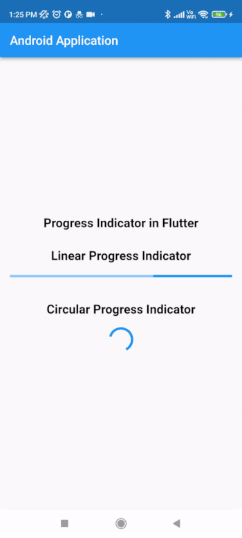
After adding the above code now we have to simply click on the green icon in the top bar to run our application on a mobile device.
Note ? Make sure you are connected to your real device or emulator.
Conclusion
In the above tutorial we learn What is Progress Indicators in Flutter and how we can use Circular and Linear Progress Indicators in Flutter application.

1K+ Views
