
- Business Analytics - Home
- Business Analytics Basics
- Business Analytics - What It Is?
- Business Analytics - History and Evolution
- Business Analytics - Key Concepts and Terminologies
- Business Analytics - Types of Data
- Business Analytics - Data Collection Methods
- Different Tools used for Data Cleaning
- Business Analytics - Data Cleaning Process
- Different Sources of Data for Data Analysis
- Business Analytics - Data Cleaning
- Business Analytics - Data Quality
- Descriptive Analytics
- Descriptive Analytics - Introduction
- How Does Descriptive Analytics Work?
- Descriptive Analytics - Challenges and Future in Data Analysis
- Descriptive Analytics Process
- Descriptive Analytics - Advantages and Disadvantages
- Descriptive Analytics - Applications
- Descriptive Analytics - Tools
- Descriptive Analytics - Data Visualization
- Descriptive Analytics - Importance of Data Visualization
- Descriptive Analytics - Data Visualization Techniques
- Descriptive Analytics - Data Visualization Tools
- Predictive Analytics
- Predictive Analytics - Introduction
- Statistical Methods & Machine Learning Techniques
- Prescriptive Analytics
- Prescriptive Analytics - Introduction
- Prescriptive Analytics - Optimization Techniques
Data Visualization Techniques Used in Descriptive Analytics
Descriptive statistics make raw data more understandable, but data visualization goes beyond that, demonstration of data using an image can rapidly communicate. For example, A pie chart conveys information more effectively than a list of statistics. A pie chart is simple, but effective when utilized correctly.
Data visualization is critical to corporate success. Data scientists can spot something valuable in raw data, but non-data scientists, who frame business strategies and are involved in decision-making in a company cannot. That is why data visualization is essential when communicating a message. It clarifies and simplifies the data, removing any ambiguities. With strong data visualization, you can achieve a lot of success and spark a discussion about what to do with the data you have.
Data Visualization Types in Descriptive Analytics
Some most commonly used data visualization types in descriptive analytics are as follows −
1. Line Charts
Useful for showing trends over time, e.g., sales growth or temperature changes. Line charts are used in descriptive analytics to visualize long-term or continuous data trends. They are especially good at recognizing patterns, changes, and trends in data by connecting individual data points with a line. Some samples of line charts are as follows −
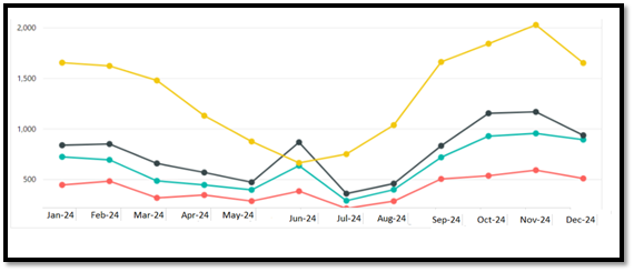
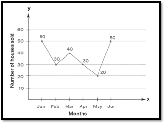
Line charts are valuable in descriptive analytics for the following purposes −
- Trend Analysis − Line charts illustrate how data changes over time. This is very useful for analyzing time-series data (such as monthly sales, stock prices, or website traffic).
- Comparing Multiple Data Sets − Multiple line charts can be used to examine multiple variables and uncover relationships or discrepancies.
- Anomaly Detection − Sudden spikes or decreases in the data are immediately seen in line charts, indicating odd events or anomalies.
- Data Smoothness − Line charts provide a continuous flow of data, by creating a smooth link between data points that aid in comprehending the general advancement or decrease of a phenomenon.
2. Bar Charts
In descriptive analytics, bar charts are commonly used to visually display and summarise data. They use rectangular bars to display categorical data, with the length of each bar representing the category's value or frequency. A bar chart is most widely used for comparing quantities across categories, like revenue from different products.
Bar charts are valuable in descriptive analytics for the following purposes −
Categorical Representation
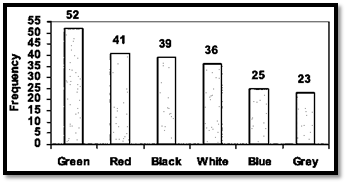
Each bar represents a distinct category or group. For example, vehicles sold color-wise are demonstrated by the following bar graph.
Comparison
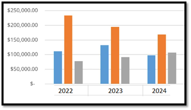
Bar charts allow quick comparison between different categories.
Length Proportionality
The length of the bar is proportional to the quantity or frequency of the data point. For example Quarter sales.
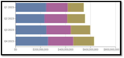
Some common types of Bar Charts − Some common types of bar charts are as follows −
Simple Bar Chart
Shows one set of categories and their values.
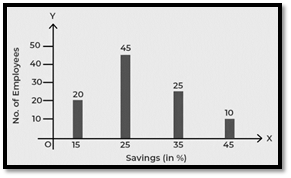
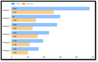
Grouped Bar Chart
Allows comparison across multiple sets of data within the same categories (e.g., Profit and discount on product).
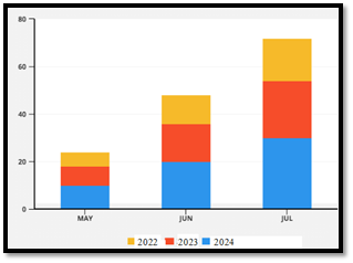
Stacked Bar Chart
Stacks different segments of the data within each bar to show part-to-whole relationships (e.g., total sales broken down by product type).
3. Pie Charts
Pie charts are often used in descriptive analytics to visualize data proportions. They are especially useful for displaying the distribution of categories within a dataset, making it easier to understand the relative sizes of portions compared to the whole. Best for illustrating proportions, such as market share by company. The following Pie charts illustrate about % of students who play Football, Cricket, Badminton, hockey and other games.
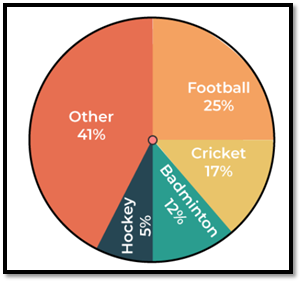
Each slice of pie indicates a category's proportion of the total. The size of each slice is proportionate to the category's share of the total. Pie charts provide a simple visual representation of how categories compare to one another, allowing viewers to easily grasp insights regarding distribution and dominance within the data. It is most widely used in market share analysis, budget allocation, survey responses distribution, and customer segmentation by demographics.
4. Heatmaps
Heatmaps are a common visualization method for descriptive analytics that communicates values via color gradients. They offer a simple and easy method for identifying patterns, trends, and anomalies across datasets, making them very useful when analyzing massive amounts of data. Heatmaps are useful for showing intensity and correlations, such as customer activity on a website.
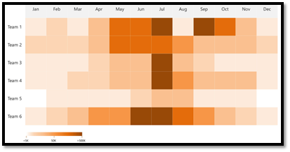
An example of a Heat Map showing sales performance by different teams in a region.
Heatmaps in Descriptive Analytics
- Visualizing Data Frequency or Density − Heatmaps can emphasize areas with high and low density, making it easier to identify clusters or patterns. In customer behavior analysis, for example, a heatmap may illustrate which pages of a website receive the most clicks or visits.
- Comparison Across Variables − Heatmaps can be used to compare several variables at once. Visualizing the relationships between variables allows you to rapidly identify correlations and outliers. In finance, for example, a heatmap may depict long-term relationships between several equities.
- Time-Series Data Analysis − Heatmaps can be used in time-series analysis to visually represent patterns across time. For example, in sales data, a heatmap may illustrate daily sales performance across months, with high and low sales easily distinguishable by color intensities.
- Geospatial Analysis − Heatmaps are commonly used in geographic data analysis to depict the concentration of occurrences over a certain area. For example, they may indicate crime hotspots in a city or client dispersion among regions.
Some common uses of Heat maps in data visualization are as follows −
- Pattern Recognition − Heat maps are powerful tools for finding patterns and trends in large data sets or pools of information. They make it simple to identify high and low activity areas, which might be important for decision-making.
- Immediate Insight − Users can gain insights quickly without having to go into large amounts of numerical data. This immediacy is especially beneficial for non-technical stakeholders.
- Data Summarization − Heat maps compress a significant quantity of data into a visually appealing manner. This makes it easier to understand the dataset's complicated nuances.
- Visual Appeal − Heat maps are visually beautiful and engaging for the audience. They are an effective tool for presenting and reporting.
- Multivariate Analysis − Heat maps may represent numerous variables at once, making them useful for different data types.
- Interaction and Exploration − Interactive heat maps allow viewers to interact with data, making them an effective tool for in-depth study.
- Anomaly Detection − Heat maps can show abnormalities and outliers in data, directing attention to areas that require additional research.
- User-Friendly − Heat maps are simple to comprehend and use. They are easy to understand, with color gradients that effectively convey information.
5. Histograms
A histogram is a bar chart that depicts the frequency distribution of a continuous variable. It displays how frequently data points fall within specific ranges, which aids in understanding the distribution of the data set. Histograms are an effective tool in descriptive analytics for visualizing data distribution by grouping values into bins or intervals.
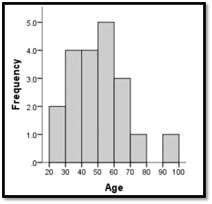
Descriptive analytics involves summarizing and comprehending the key properties of a data source, frequently employing statistical approaches. Histograms are most widely used in Descriptive Analytics for the following reasons −
- Data Distribution − Whether the data is regularly distributed, skewed, or bimodal.
- Frequency of Occurrence − How frequently certain ranges of values appear.
- Understanding Spread and Range − Data points are dispersed across the variable's whole range.
- Comparing Multiple Distributions − Overlaying histograms for different groups or periods might reveal variances in distributions.
- Outliers Detection − Values that are far beyond the average range.
- Detecting Skewness − If the data is skewed to the left or right, this indicates the presence of outliers or an unequal distribution.
6. Scatter Plots
A scatter plot (also known as a scatter chart or scatter graph) is a type of graph that employs dots to indicate data values for two different numerical variables. Each dot's position on the horizontal and vertical axes represents a single data point's value.
Scatter plots are mostly used to observe and demonstrate correlations between two quantitative variables. The dots on a scatter plot not only show the values of individual data points but also patterns when the data is seen as a group. Scatter plot is the most versatile form of charts in data analytics. This graph can identify relationships, patterns, and trends between two or more variables in a dataset.
Scatter plots are a valuable tool in descriptive analytics for visualizing correlations between two continuous variables. It is ideal for identifying relationships between two variables, such as height and weight. Scatter plots, which depict individual data points on a two-dimensional graph, allow analysts to investigate and characterize patterns, correlations, or trends that may exist among variables.
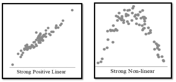
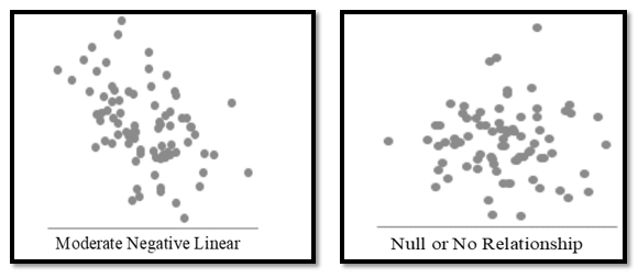
A scatter plot can help you answer questions about your data, such as whether the relationship between the variables is linear or nonlinear, how strong the association is, and whether there are any outliers or subgroups in data points. It can also tell you whether the relationship is positive or negative, which means that the variables move in the same or opposite directions. Examining a scatter plot can provide useful information about your data.
A scatter plot can be an effective data analytics tool, but it can also be misleading or confusing if not used correctly. To prevent frequent errors and mistakes, don't use a scatter plot for categorical or discrete variables like gender and income, or more than three variables like temperature, humidity, pressure, and wind speed. Also, avoid using a scatter plot for large-size datasets with millions of data points. This type of data can be analyzed using a bar chart, pie chart, box plot, matrix of scatter plots, parallel coordinates plot, radar chart, map, heat map, or histogram.
Use of Scatter Plots in Descriptive Analytics
- Identify Correlation − Scatter plots are useful for identifying correlations between variables. If the points trend higher from left to right, this indicates a positive relationship. A downward trend indicates a negative correlation.
- Identifying Patterns − Look for patterns, such as linear or nonlinear trends. A linear trend describes the relationship with a straight line, but non-linear trends may follow a curve or other shapes. Points may gather together in specific regions, indicating clusters or segments within the data.
- Detecting Outliers − Outliers are data points that differ significantly from the overall trend of the data. Scatter plots make it simple to identify these abnormalities and evaluate their significance.
Visualizing Data Distribution
Scatter plots depict the distribution of data points throughout the range of variables, revealing variability and spread. Using different colors or symbols for different categories or groups within the scatter plot allows you to compare how separate groupings behave or relate to one another.
When you combine descriptive statistics and data visualization, you transform the data into something useful for your business. Data plays a crucial role in assisting corporate leaders in making sound decisions. It promotes effectiveness and solid decisions. There are multiple ways in which you can combine them to benefit a business. It makes it simple to recognize patterns and determine how distinct points are related to one another. Business leaders also enjoy looking at historical trends and figuring out how to apply them to their own companies. The raw data makes it difficult to figure out anything, however, descriptive statistics and data visualization make it much easier to understand, revealing correlations.
