- Plotly - Home
- Plotly - Introduction
- Plotly - Environment Setup
- Plotly - Online & Offline Plotting
- Plotting Inline with Jupyter Notebook
- Plotly - Package Structure
- Plotly - Exporting to Static Images
- Plotly - Legends
- Plotly - Format Axis & Ticks
- Plotly - Subplots & Inset Plots
- Plotly - Bar Chart & Pie Chart
- Plotly - Scatter Plot, Scattergl Plot & Bubble Charts
- Plotly - Dot Plots & Table
- Plotly - Histogram
- Plotly - Box Plot Violin Plot & Contour Plot
- Plotly - Distplots, Density Plot & Error Bar Plot
- Plotly - Heatmap
- Plotly - Polar Chart & Radar Chart
- Plotly - OHLC Chart Waterfall Chart & Funnel Chart
- Plotly - 3D Scatter & Surface Plot
- Plotly - Adding Buttons/Dropdown
- Plotly - Slider Control
- Plotly - FigureWidget Class
- Plotly with Pandas and Cufflinks
- Plotly with Matplotlib and Chart Studio
- Plotly Useful Resources
- Plotly - Quick Guide
- Plotly - Cheatsheet
- Plotly - Useful Resources
- Plotly - Discussion
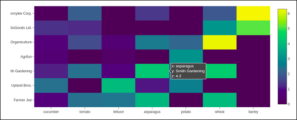
Plotly - Heatmap
A heat map (or heatmap) is a graphical representation of data where the individual values contained in a matrix are represented as colors. The primary purpose of Heat Maps is to better visualize the volume of locations/events within a dataset and assist in directing viewers towards areas on data visualizations that matter most.
Because of their reliance on color to communicate values, Heat Maps are perhaps most commonly used to display a more generalized view of numeric values. Heat Maps are extremely versatile and efficient in drawing attention to trends, and its for these reasons they have become increasingly popular within the analytics community.
Heat Maps are innately self-explanatory. The darker the shade, the greater the quantity (the higher the value, the tighter the dispersion, etc.). Plotlys graph_objects module contains Heatmap() function. It needs x, y and z attributes. Their value can be a list, numpy array or Pandas dataframe.
In the following example, we have a 2D list or array which defines the data (harvest by different farmers in tons/year) to color code. We then also need two lists of names of farmers and vegetables cultivated by them.
vegetables = [
   "cucumber",
   "tomato",
   "lettuce",
   "asparagus",
   "potato",
   "wheat",
   "barley"
]
farmers = [
   "Farmer Joe",
   "Upland Bros.",
   "Smith Gardening",
   "Agrifun",
   "Organiculture",
   "BioGoods Ltd.",
   "Cornylee Corp."
]
harvest = np.array(
   [
      [0.8, 2.4, 2.5, 3.9, 0.0, 4.0, 0.0],
      [2.4, 0.0, 4.0, 1.0, 2.7, 0.0, 0.0],
      [1.1, 2.4, 0.8, 4.3, 1.9, 4.4, 0.0],
      [0.6, 0.0, 0.3, 0.0, 3.1, 0.0, 0.0],
      [0.7, 1.7, 0.6, 2.6, 2.2, 6.2, 0.0],
      [1.3, 1.2, 0.0, 0.0, 0.0, 3.2, 5.1],
      [0.1, 2.0, 0.0, 1.4, 0.0, 1.9, 6.3]
   ]
)
trace = go.Heatmap(
   x = vegetables,
   y = farmers,
   z = harvest,
   type = 'heatmap',
   colorscale = 'Viridis'
)
data = [trace]
fig = go.Figure(data = data)
iplot(fig)
The output of the above mentioned code is given as follows −