- Matplotlib - Home
- Matplotlib - Introduction
- Matplotlib - Vs Seaborn
- Matplotlib - Environment Setup
- Matplotlib - Anaconda distribution
- Matplotlib - Jupyter Notebook
- Matplotlib - Pyplot API
- Matplotlib - Simple Plot
- Matplotlib - Saving Figures
- Matplotlib - Markers
- Matplotlib - Figures
- Matplotlib - Styles
- Matplotlib - Legends
- Matplotlib - Colors
- Matplotlib - Colormaps
- Matplotlib - Colormap Normalization
- Matplotlib - Choosing Colormaps
- Matplotlib - Colorbars
- Matplotlib - Working With Text
- Matplotlib - Text properties
- Matplotlib - Subplot Titles
- Matplotlib - Images
- Matplotlib - Image Masking
- Matplotlib - Annotations
- Matplotlib - Arrows
- Matplotlib - Fonts
- Matplotlib - Font Indexing
- Matplotlib - Font Properties
- Matplotlib - Scales
- Matplotlib - LaTeX
- Matplotlib - LaTeX Text Formatting in Annotations
- Matplotlib - PostScript
- Matplotlib - Mathematical Expressions
- Matplotlib - Animations
- Matplotlib - Celluloid Library
- Matplotlib - Blitting
- Matplotlib - Toolkits
- Matplotlib - Artists
- Matplotlib - Styling with Cycler
- Matplotlib - Paths
- Matplotlib - Path Effects
- Matplotlib - Transforms
- Matplotlib - Ticks and Tick Labels
- Matplotlib - Radian Ticks
- Matplotlib - Dateticks
- Matplotlib - Tick Formatters
- Matplotlib - Tick Locators
- Matplotlib - Basic Units
- Matplotlib - Autoscaling
- Matplotlib - Reverse Axes
- Matplotlib - Logarithmic Axes
- Matplotlib - Symlog
- Matplotlib - Unit Handling
- Matplotlib - Ellipse with Units
- Matplotlib - Spines
- Matplotlib - Axis Ranges
- Matplotlib - Axis Scales
- Matplotlib - Axis Ticks
- Matplotlib - Formatting Axes
- Matplotlib - Axes Class
- Matplotlib - Twin Axes
- Matplotlib - Figure Class
- Matplotlib - Multiplots
- Matplotlib - Grids
- Matplotlib - Object-oriented Interface
- Matplotlib - PyLab module
- Matplotlib - Subplots() Function
- Matplotlib - Subplot2grid() Function
- Matplotlib - Anchored Artists
- Matplotlib - Manual Contour
- Matplotlib - Coords Report
- Matplotlib - AGG filter
- Matplotlib - Ribbon Box
- Matplotlib - Fill Spiral
- Matplotlib - Findobj Method
- Matplotlib - Hyperlinks
- Matplotlib - Image Thumbnail
- Matplotlib - Plotting with Keywords
- Matplotlib - Create Logo
- Matplotlib - Multipage PDF
- Matplotlib - Multiprocessing
- Matplotlib - Print Stdout
- Matplotlib - Compound Path
- Matplotlib - Sankey Class
- Matplotlib - MRI with EEG
- Matplotlib - Stylesheets
- Matplotlib - Background Colors
- Matplotlib - Basemap
Matplotlib Events
- Matplotlib - Event Handling
- Matplotlib - Close Event
- Matplotlib - Mouse Move
- Matplotlib - Click Events
- Matplotlib - Scroll Event
- Matplotlib - Keypress Event
- Matplotlib - Pick Event
- Matplotlib - Looking Glass
- Matplotlib - Path Editor
- Matplotlib - Poly Editor
- Matplotlib - Timers
- Matplotlib - Viewlims
- Matplotlib - Zoom Window
Matplotlib Widgets
- Matplotlib - Cursor Widget
- Matplotlib - Annotated Cursor
- Matplotlib - Button Widget
- Matplotlib - Check Buttons
- Matplotlib - Lasso Selector
- Matplotlib - Menu Widget
- Matplotlib - Mouse Cursor
- Matplotlib - Multicursor
- Matplotlib - Polygon Selector
- Matplotlib - Radio Buttons
- Matplotlib - RangeSlider
- Matplotlib - Rectangle Selector
- Matplotlib - Ellipse Selector
- Matplotlib - Slider Widget
- Matplotlib - Span Selector
- Matplotlib - Textbox
Matplotlib Plotting
- Matplotlib - Line Plots
- Matplotlib - Area Plots
- Matplotlib - Bar Graphs
- Matplotlib - Histogram
- Matplotlib - Pie Chart
- Matplotlib - Scatter Plot
- Matplotlib - Box Plot
- Matplotlib - Arrow Demo
- Matplotlib - Fancy Boxes
- Matplotlib - Zorder Demo
- Matplotlib - Hatch Demo
- Matplotlib - Mmh Donuts
- Matplotlib - Ellipse Demo
- Matplotlib - Bezier Curve
- Matplotlib - Bubble Plots
- Matplotlib - Stacked Plots
- Matplotlib - Table Charts
- Matplotlib - Polar Charts
- Matplotlib - Hexagonal bin Plots
- Matplotlib - Violin Plot
- Matplotlib - Event Plot
- Matplotlib - Heatmap
- Matplotlib - Stairs Plots
- Matplotlib - Errorbar
- Matplotlib - Hinton Diagram
- Matplotlib - Contour Plot
- Matplotlib - Wireframe Plots
- Matplotlib - Surface Plots
- Matplotlib - Triangulations
- Matplotlib - Stream plot
- Matplotlib - Ishikawa Diagram
- Matplotlib - 3D Plotting
- Matplotlib - 3D Lines
- Matplotlib - 3D Scatter Plots
- Matplotlib - 3D Contour Plot
- Matplotlib - 3D Bar Plots
- Matplotlib - 3D Wireframe Plot
- Matplotlib - 3D Surface Plot
- Matplotlib - 3D Vignettes
- Matplotlib - 3D Volumes
- Matplotlib - 3D Voxels
- Matplotlib - Time Plots and Signals
- Matplotlib - Filled Plots
- Matplotlib - Step Plots
- Matplotlib - XKCD Style
- Matplotlib - Quiver Plot
- Matplotlib - Stem Plots
- Matplotlib - Visualizing Vectors
- Matplotlib - Audio Visualization
- Matplotlib - Audio Processing
Matplotlib Useful Resources
- Matplotlib - Quick Guide
- Matplotlib - Cheatsheet
- Matplotlib - Useful Resources
- Matplotlib - Discussion
Matplotlib - Heat Map
A heatmap is a visual representation of data where values are represented using different colors. It is like a map where colors indicate the intensity or concentration of something on a surface.
Imagine you have a table of numbers, and each number represents a specific value. In a heatmap, these numbers are translated into colors. Higher numbers might be shown in warmer colors like red or orange, while lower numbers are represented by cooler colors like blue or green −
Heatmap in Matplotlib
A heatmap in matplotlib is a graphical representation of data where values in a matrix are represented as colors. It is used to visualize the magnitude of values in a 2D space. Each cell in the matrix is assigned a color based on its numeric value, allowing you to easily identify the patterns. Higher values are often represented by warmer colors (e.g., red or yellow), while lower values are represented by cooler colors (e.g., blue or green).
In Matplotlib, we can craete a heatmap using the imshow() function to display the matrix of data as a grid of colored cells.
The imshow() Function
The imshow() function in Matplotlib is used to display images or visual representations of two-dimensional data, such as matrices or arrays. It is commonly used to create heatmaps, where the values in a matrix are represented as colors.
Syntax
Following is the syntax of the imshow() function in Matplotlib −
matplotlib.pyplot.imshow(X, cmap=None, aspect=None, interpolation=None, alpha=None, origin=None, extent=None, **kwargs)
Where,
- X is the input data, generally a 2D array or matrix, representing the image or heatmap.
- cmap is the colormap to be used for mapping data values to colors. It specifies the color scheme of the plot.
- aspect is the aspect ratio of the plot. By default, it is set to 'equal'.
- interpolation is the method used for image interpolation. Common options include 'nearest', 'bilinear', and 'bicubic'.
- alpha is the transparency of the image.
- origin specifies the origin position of the image. Default is 'upper'.
- extent specifies the image data limits along the x and y axes.
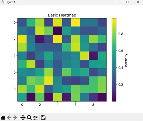
Example - Basic Heatmap
A basic heatmap is a visual representation of a matrix of data using colors. Imagine you have a grid of numbers, and each number is assigned a color based on its magnitude. The imshow() function is used to display this grid, and the colors help you quickly grasp the intensity of values. Warmer colors represents higher values, while cooler colors represents lower values.
In the following example, we are creating a simple heatmap using random 2D data. The colormap 'viridis' is applied to represent the intensity of values, and a colorbar is added for reference −
import matplotlib.pyplot as plt
import numpy as np

# Generating random 2D data
data = np.random.random((10, 10))

# Creating a basic heatmap
plt.imshow(data, cmap='viridis', aspect='auto', origin='upper')
plt.colorbar(label='Intensity')
plt.title('Basic Heatmap')
plt.show()
Output
After executing the above code, we get the following output −
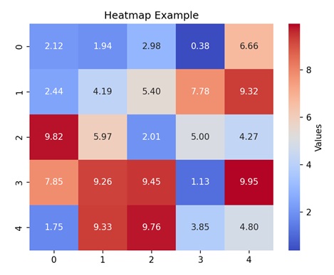
Example - Annotated Heatmap
An annotated heatmap in Matplotlib is an extension of the basic heatmap concept with an added layer of information. In addition to representing data values using colors, an annotated heatmap includes text annotations within each cell of the grid. These annotations display the numerical value corresponding to each data point, making it easier to precisely interpret the data.
In here, we are creating a heatmap with random 2D data, and adding text annotations in each cell with its numerical value. We are setting the colormap to 'plasma' −
import matplotlib.pyplot as plt
import numpy as np

# Generating random 2D data
data = np.random.random((5, 7))

# Creating an annotated heatmap with text annotations
plt.imshow(data, cmap='plasma', aspect='auto', origin='upper')

# Adding text annotations to each cell
for i in range(data.shape[0]):
    for j in range(data.shape[1]):
        plt.text(j, i, f'{data[i, j]:.2f}', ha='center', va='center', color='white')

plt.colorbar(label='Values')
plt.title('Annotated Heatmap')
plt.show()
Output
Following is the output of the above code −
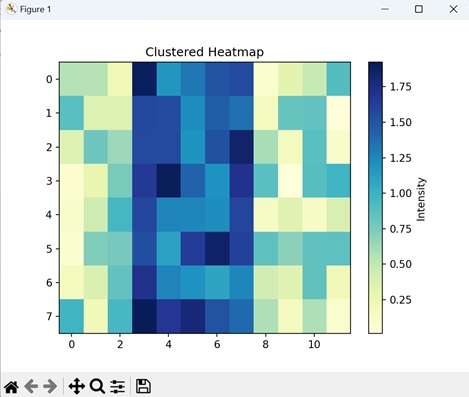
Example - Clustered Heatmap
A clustered heatmap is a heatmap that visualizes data where clusters or patterns are present. This type of heatmap highlights groups of similar values in a matrix. Clusters in a heatmap may appear as denser regions with similar color patterns, indicating that the corresponding rows or columns share similarities in their values.
Now, we are generating random 2D data and then creating clusters in a specific region. visually represents the data intensity using the 'YlGnBu' color map. The resulting plot shows the clustered patterns in the data, with a color bar indicating the intensity scale −
import matplotlib.pyplot as plt
import numpy as np

# Generating random clustered 2D data
data = np.random.random((8, 12))
# Creating clusters in a portion of the data
data[:, 3:8] += 1

# Creating a clustered heatmap
plt.imshow(data, cmap='YlGnBu', aspect='auto', origin='upper')
plt.colorbar(label='Intensity')
plt.title('Clustered Heatmap')
plt.show()
Output
Output of the above code is as follows −
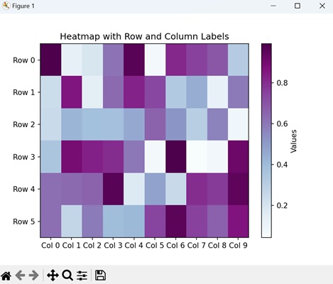
Example - Heatmap with Row and Column Labels
A Heatmap with row and column labels in Matplotlib combines a visual representation of data intensity using colors with labeled rows and columns. This enhancement makes it easier to relate specific data points to their corresponding categories along both axes.
In the example below, we are creating a heatmap with row and column labels. The data is displayed using a 'BuPu' color map, representing values transitioning from blue to purple. Additionally, a color bar is included to indicate the data range −
import matplotlib.pyplot as plt
import numpy as np

# Generating random 2D data
data = np.random.random((6, 10))

# Creating a heatmap with row and column labels
plt.imshow(data, cmap='BuPu', aspect='auto', origin='upper')
plt.colorbar(label='Values')

# Adding row and column labels
plt.xticks(range(data.shape[1]), [f'Col {i}' for i in range(data.shape[1])])
plt.yticks(range(data.shape[0]), [f'Row {i}' for i in range(data.shape[0])])

plt.title('Heatmap with Row and Column Labels')
plt.show()
Output
The output obtained is as shown below −